Crafting the Perfect Spring Color Palette
Spring brings new life to the world with blooming flowers, brighter sunlight, and a sense of renewal. The spring color palette reflects this vibrancy with soft pastels, lively greens, and vibrant hues, embodying light, joy, and nature's rebirth after winter.
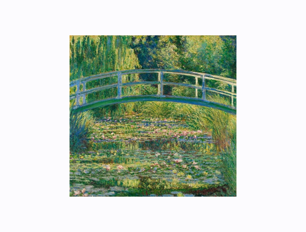
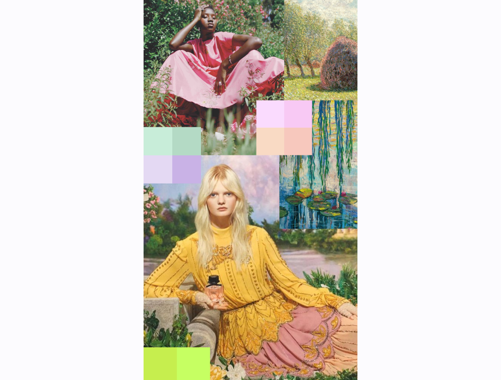
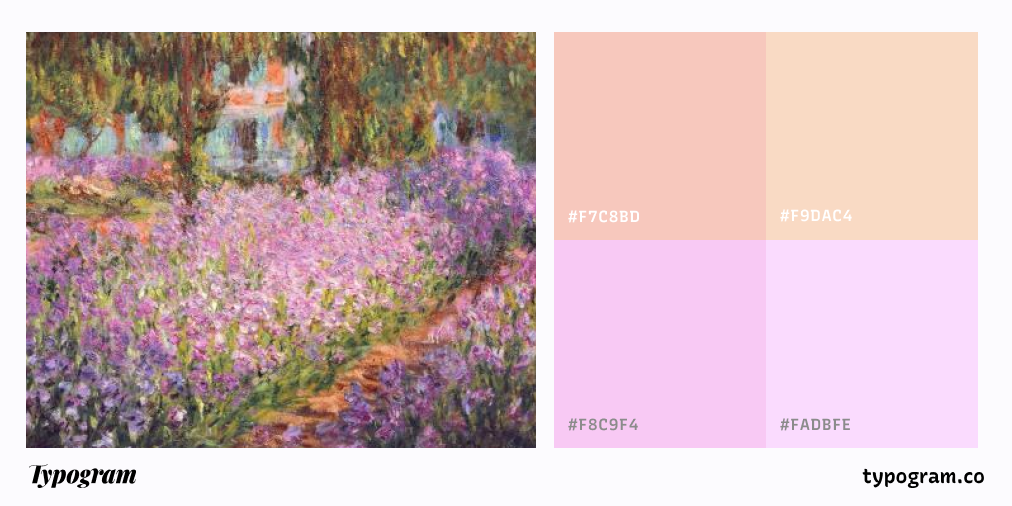
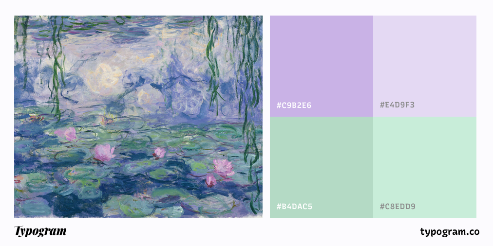
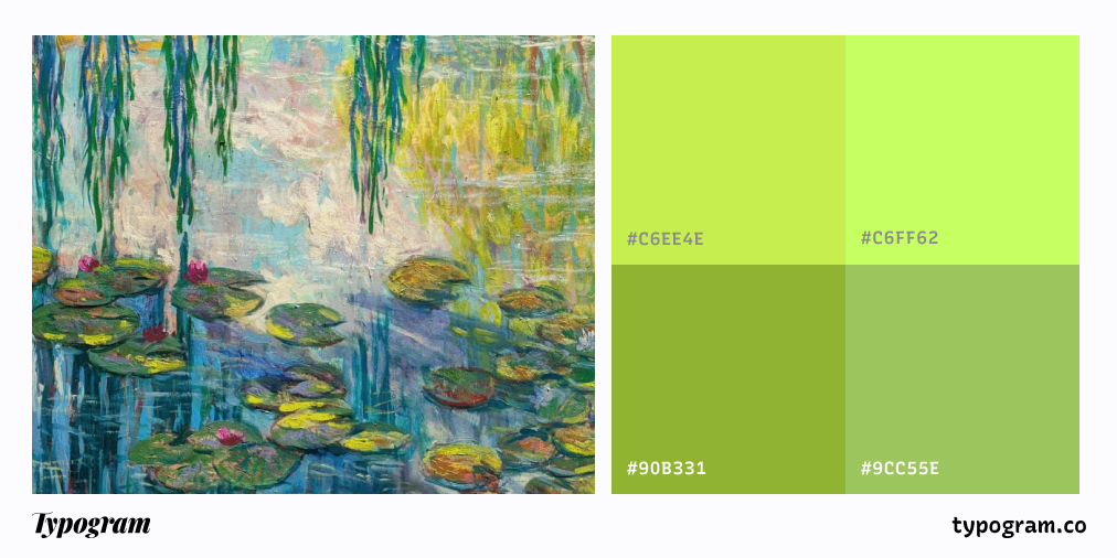
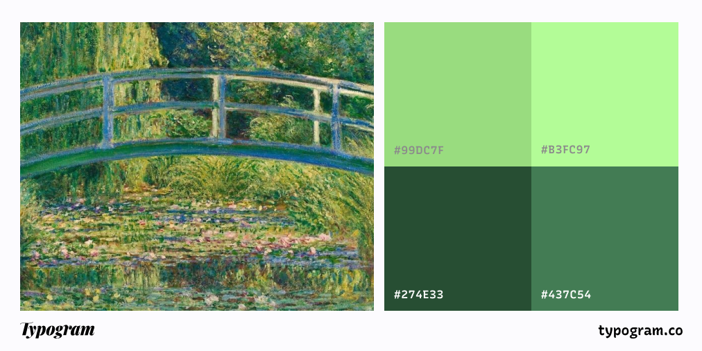
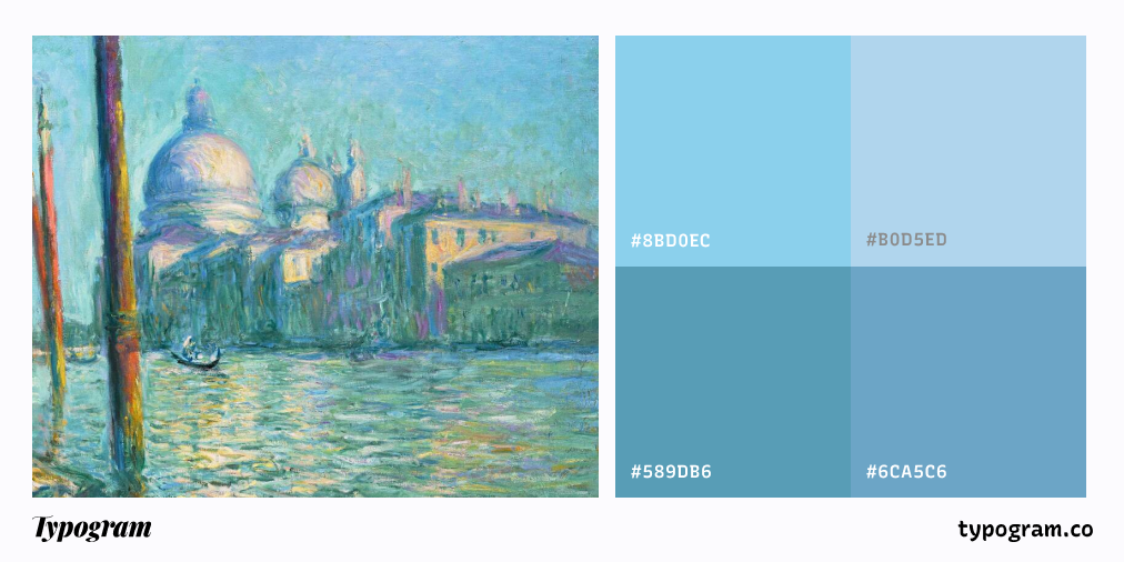
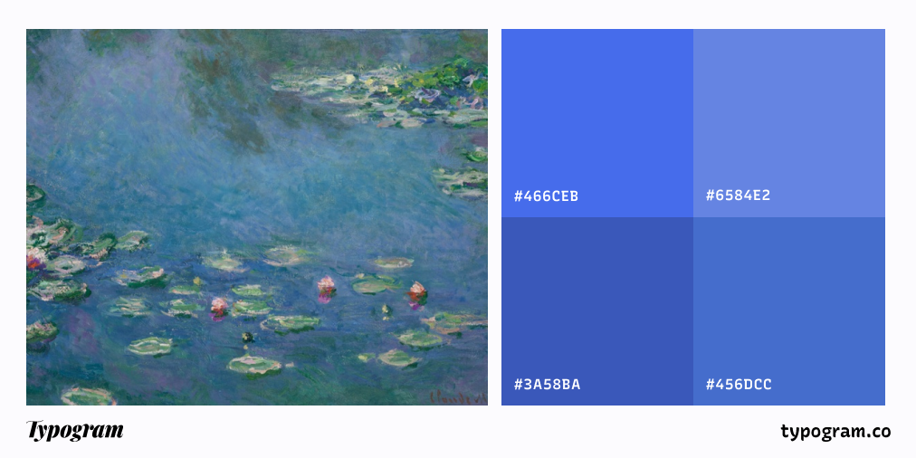
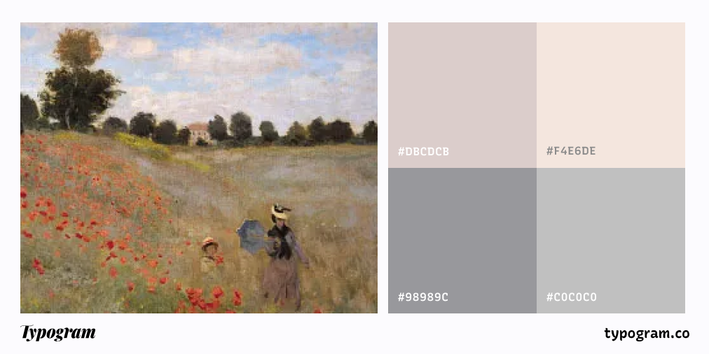
To Claude Monet, the famous French painter, his garden’s spring transformation was the muse to many of his most iconic works. His garden, filled with soft pinks, lush greens, and delicate blues, became a living palette for his Water Lilies series. Monet’s garden, now a museum, showcases the spring palette he cherished—lush greens, delicate purples, and warm pinks.
In design, the spring color palette is often used to create an atmosphere of calmness, lightness, hope, and playfulness. Spring’s colors also have a scientific effect on us, boosting positivity and reducing stress. Soft greens, in particular, are known for improving focus, which is why they’re often used in wellness design. These colors evoke renewal and optimism, making them perfect for inspiring creativity.
Whether you're designing for a spring collection, a fresh brand launch, a seasonal marketing event, wedding invitations, social media illustrations, or even videos, spring’s colors offer many potentials to evoke a sense of renewal and optimism. In this article, we’ll dive into the spring color palette and how it’s used in design. We will also provide some design inspirations using spring color palettes to inspire your next design project.
Understanding the Spring Color Palette
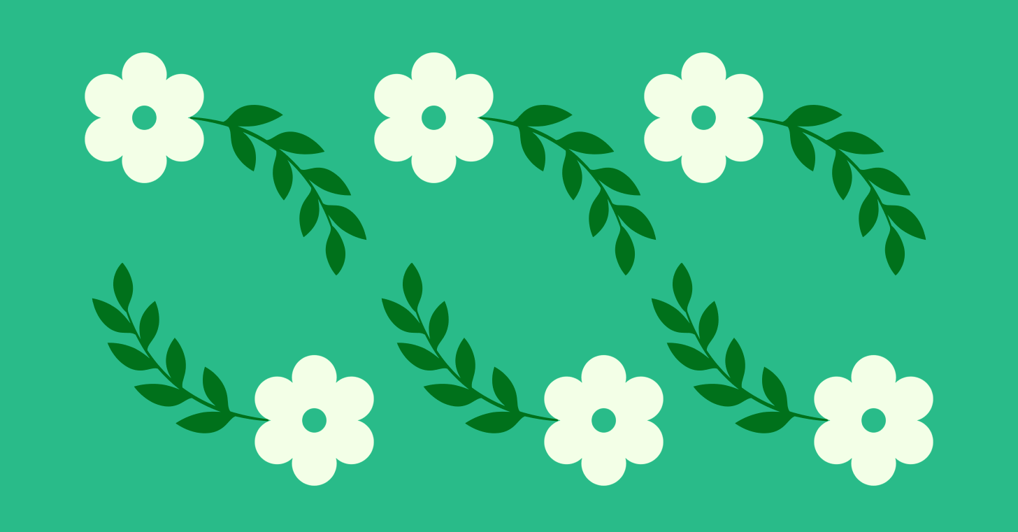
The spring color palette is defined by light, airy hues that reflect the season’s natural beauty. Pastels are a key component of this palette, from soft pinks and lavender to pale blues and mint greens. These shades represent the gentle, soft side of spring, evoking feelings of calm and freshness.
But spring colors aren’t limited to pastels—brighter, more vibrant hues also make an appearance. Bright greens, sunny yellows, and vivid pinks mirror the energetic, blossoming nature of the season. These bolder tones infuse designs with optimism, energy, and a sense of excitement.
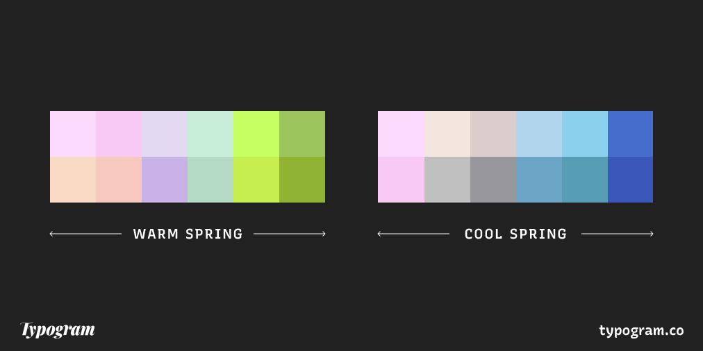
We can separate the spring color palette into two general themes, warm and cool spring color schemes.
Warm Spring Color Palette
The Warm Spring Color Palette is characterized by bright, sun-kissed hues that radiate energy and cheerfulness. Unlike the cooler, pastel tones of early spring, Warm Spring leans into golden yellows, peachy corals, fresh grassy greens, and lively turquoise blues. These colors reflect the warmth of the season as the days grow longer and nature bursts into full bloom. Inspired by blossoming wildflowers, sunlit fields, and the gentle glow of the morning sun, this palette is ideal for creating a sense of vibrancy and enthusiasm in design. Whether used in fashion, branding, or interior spaces, Warm Spring colors bring a lighthearted, joyful atmosphere that feels both fresh and invigorating.
Cool Spring Color Palette
- Light Blues and Aquas
- Soft Neutrals: Cream, Light Gray, and White
- Soft Pastels: Pink, Lavender and Mint
The Cool Spring Color Palette is fresh, crisp, and airy, featuring hues with a hint of coolness that evoke the refreshing side of the season. Unlike the golden warmth of Warm Spring, this palette leans toward soft blues, minty greens, soft lilacs, and delicate pinks—colors reminiscent of a clear spring morning or the first blossoms against a pale blue sky. These shades create an uplifting and invigorating aesthetic, perfect for designs that aim to feel light, modern, and refreshing. Whether in fashion, branding, or interiors, Cool Spring colors bring a sense of clarity and renewal, making them ideal for conveying freshness and optimism.

Key Colors in the Spring Palette
Soft Pastels: Pink, Peach, Lavender, & Mint
Soft pastels are the hallmark of the spring palette, offering light and gentle tones that evoke calm and serenity. Soft pink is reminiscent of cherry blossoms, symbolizing sweetness, femininity. Peach, with its warm yet delicate hue, brings a sense of optimism and happiness, perfect for creating cheerful yet sophisticated designs. Lavender, a soft, cool purple, brings tranquility and elegance, often used to create a soothing atmosphere.
Mint green is another essential pastel color for spring, bringing to mind fresh leaves and cool breezes. This soft green hue is refreshing and calming, making it an excellent choice for designs that need to feel relaxed and rejuvenating.
These pastels are often used in branding for beauty products, wellness brands, or anything aiming for a soft, gentle vibe. They’re also a favorite choice in interior design, particularly in bedrooms and living spaces, where they create a serene, airy atmosphere. Together, they form a light spring color palette that offers gentleness and serenity.
Vibrant Greens: Grass Green, Lime & Apple Green
As spring brings everything back to life, vibrant greens make an important appearance. These lively shades evoke the fresh growth of grass, leaves, and flowers. Grass green is one of the most refreshing colors in the spring palette, representing renewal, growth, and energy. It’s often used to convey freshness and vitality, perfect for designs that focus on health, wellness, or the environment.
Lime and apple green add a zesty, playful touch to the palette, infusing designs with a burst of energy. Lime green, with its bright, almost neon intensity, brings excitement and modernity, while apple green is a softer, more balanced tone that adds freshness without overwhelming the senses.
These greens are great for products or brands that focus on sustainability, natural beauty, or fitness, as they convey energy and a connection to nature.
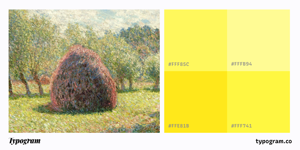
Sunny Yellows & Buttercup
Yellow is the color of sunshine, and in the spring palette, it takes on a soft, joyful quality. Sunny yellows bring a sense of optimism, happiness, and warmth, perfect for designs that need to feel lively and positive. These shades are often associated with springtime flowers like daffodils and sunflowers, capturing the bright, cheerful spirit of the season.
Buttercup yellow, a softer, more pastel version of yellow, adds a touch of sweetness and light to any design. It’s commonly used in marketing for springtime sales, seasonal products, and anything that aims to convey a lighthearted, uplifting vibe.
Yellow is often used in combination with green to create a fresh, natural feel. It pairs beautifully with pastel pinks and blues, giving designs an added layer of warmth and playfulness.
Light Blues & Aquas
Spring skies are often crisp and clear, with light blues that are bright and calming. Soft blue is a staple in the spring palette, evoking the peacefulness of a cloudless sky or the fresh feeling of spring rain. It’s a color that conveys tranquility, freshness, and clarity, making it ideal for designs that need to feel open and airy.
Aquas and turquoise are also essential in the spring palette, offering a slightly brighter and more vibrant version of blue. These shades evoke the clarity of springtime waters and are often associated with calm and relaxation. Aquas add a touch of energy without being overwhelming, making them great choices for websites, branding, or designs that need to feel modern and rejuvenating.
Soft Neutrals: Cream, Light Gray & White
While vibrant colors dominate the spring palette, soft neutrals like cream, light gray, and white are essential for balancing the palette and keeping the design focused. These colors add lightness, space, and sophistication to any design, ensuring that brighter colors don’t overwhelm the viewer.
Cream is a warm, inviting neutral that works well with pastels, while light gray adds a cool, modern touch to the palette. White is, of course, the ultimate neutral, offering crispness and clarity that makes other colors pop. These soft neutrals are perfect for backgrounds, accents, or spaces where you want to create a light, airy atmosphere without detracting from the vibrant colors around them.
How Spring Colors Are Used in Design
Spring colors are perfect for evoking a sense of renewal, freshness, and vitality. Whether you're designing for a seasonal campaign or creating a fresh brand identity, these colors can help you communicate the essence of spring. Here are a few ways in which spring colors are often used in design:
Web & Graphic Design
In web design, spring colors are often used to create fresh, welcoming websites that convey a sense of openness and possibility. Light pastels like peach, lavender, and mint green are perfect for creating soft, inviting backgrounds, while brighter greens and yellows can be used for buttons, call-to-actions, and accents. These colors work particularly well for brands in the beauty, wellness, and lifestyle industries, as they evoke health, renewal, and positivity.
Spring colors are also popular in seasonal campaigns, particularly for Easter, Mother’s Day, or spring sales. A design that uses soft pastels and bright greens can communicate the excitement and joy that comes with the season.
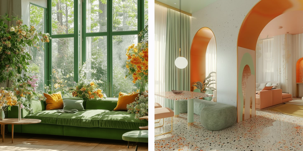
Interior Design
Spring colors are commonly used in interior design to create light, airy spaces that feel fresh and rejuvenating. Soft pastels like lavender, mint, and peach are perfect for bedrooms or living rooms, where they can create a calming and peaceful atmosphere. Brighter greens and yellows can be used as accent colors in accessories like pillows, rugs, or artwork, adding energy and optimism to the space.
Light blues and aquas are ideal for bathrooms or kitchens, where their cool, refreshing tones evoke the feeling of clean, crisp spring mornings. Soft neutrals like cream and light gray balance out the brighter colors and ensure that the overall space feels open and light.
Branding & Marketing
For brands looking to convey freshness, renewal, or optimism, the spring color palette is an excellent choice. Soft pastels and vibrant greens work well in the beauty, health, and wellness industries, where the emphasis is on growth, vitality, and rejuvenation. A company selling natural skincare products, for example, might use mint green, lavender, and soft cream to create a sense of calm and purity.
Spring colors are also perfect for seasonal campaigns or limited-edition product launches. A spring-themed marketing campaign can incorporate sunny yellows, soft pinks, and light greens to evoke a sense of joy, playfulness, and anticipation.


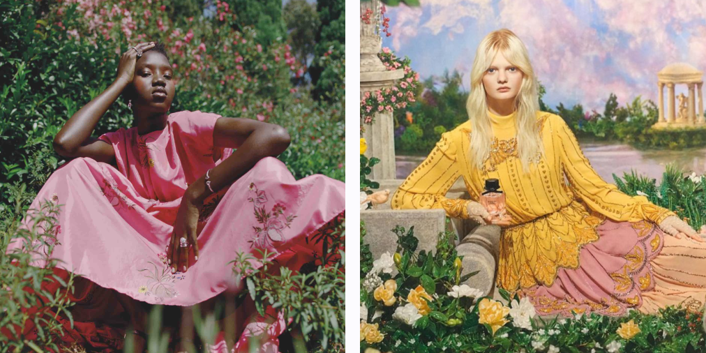
Fashion Design
Spring fashion is known for its light and airy feel, and the spring color palette plays a big role in achieving that look. Pastel pinks, lavenders, and soft blues are popular choices for spring collections, creating a look that’s feminine, delicate, and fresh. Bright greens and yellows add energy to spring wardrobes, while soft neutrals like white and light gray offer balance and sophistication.
The spring palette is often used in accessories like scarves, shoes, and handbags, where pops of color can create excitement without overwhelming the overall look. These colors work well in everything from casual wear to more formal springtime events, ensuring that the fashion feels as fresh and vibrant as the season itself.
Spring Color Palette Combinations
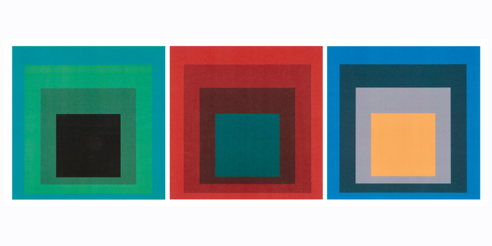
Colors demonstrate relativity and contrast when placed next to each other. In Interaction of Color (1963), Josef Albers discusses green as a color that is often perceived differently depending on its surroundings.
"If one and the same green is placed on a blue ground, it appears yellowish. Placed on a yellow ground, it appears bluish. This demonstrates that the same color can be made to appear as two different colors."
Green, being a mixture of blue and yellow, can shift in appearance depending on adjacent colors. A middle green can look more yellowish when placed next to blue or more bluish when placed next to yellow. Our perception of green (or another color) can be altered by complementary colors like red, which can make green appear more intense or dull depending on the context.
When combining colors, one should also pay attention to accessibility to ensure informations are legible.

Conclusion
The spring color palette is all about light, energy, and the beauty of renewal. Whether you’re designing for a seasonal campaign, refreshing your brand identity, or creating a vibrant space, these colors—pastels, bright greens, sunny yellows, and soft neutrals—can evoke a sense of optimism, freshness, and joy.
Ultimately, the spring palette is about creating designs that feel open, fresh, and full of possibility. It's a palette that celebrates new beginnings and invites the viewer to embrace the beauty of growth and change.