Finding Your Perfect Summer Color Palette
"The sinking sun is taking leave,
And sweetly gilds the edge of eve,
While huddling clouds of purple dye
Gloomy hang the western sky."– John Clare
Summer is synonymous with warmth, energy, and vibrant outdoor experiences. Nature is in full bloom, the sun shines bright, and the world feels alive with activity. The summer color palette reflects this dynamic energy, filled with bold, bright hues that evoke excitement, joy, and relaxation. The ocean’s deep blues, the Sun’s golden yellows, and an overgrown garden’s lush green are hues that fill the world with vitality.
In design, the summer color palette is often used to create a lively, upbeat atmosphere that captures the essence of summer’s vibrant tones. Whether it’s for a brand campaign, an event, or product packaging, summer colors energize the design and bring it to life. In this article, we’ll explore the summer color palette – how it’s used in design, and provide some examples to inspire your next creative project.
Understanding the Summer Color Palette
Summer color palettes bursts with energy, blending bold, vibrant hues with refreshing, sun-kissed tones. It’s a lively mix that captures the essence of carefree days, outdoor adventures, and the radiant warmth of summer. Tropical blues, fiery hot pinks, sunlit yellows, and lush greens take center stage: colors that feel fun, lively, and full of warmth.
Summer’s main palette is unapologetically bold and attention-grabbing. It’s about making a statement; whether through eye-catching designs, striking fashion choices, or a dynamic brand visual identity that radiates warmth and joy.
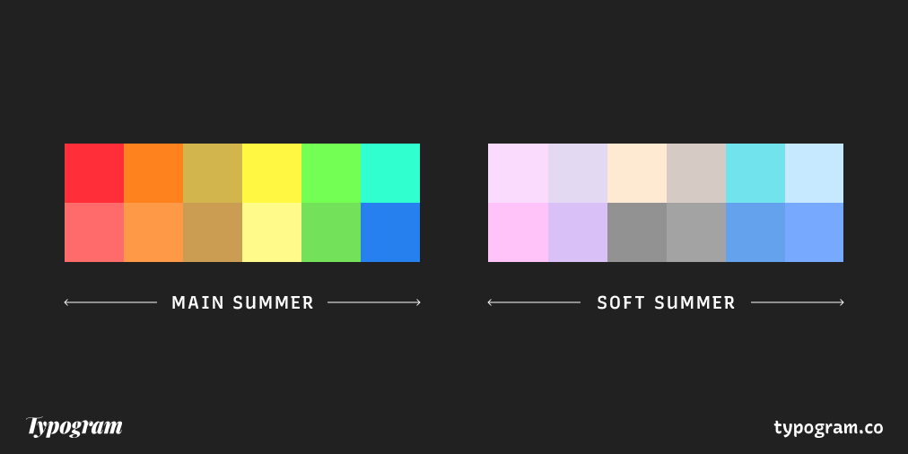
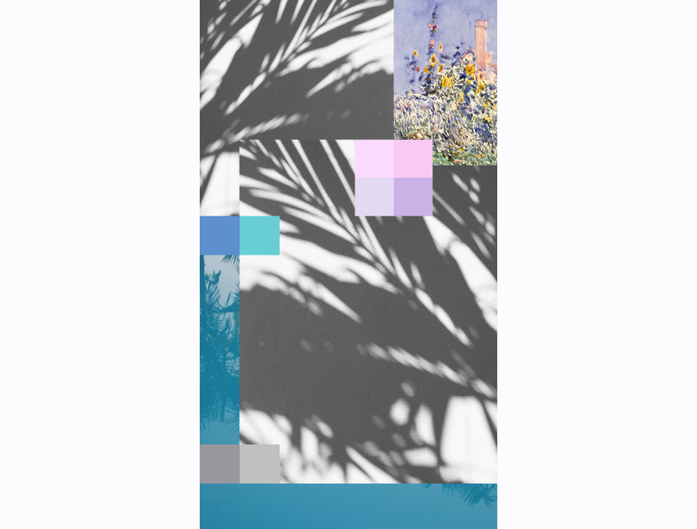
The Soft Summer Color Palette
Similar to pastel spring, the soft summer palette is a more laid-back take on the season’s usual bold and bright colors. Instead of intense, saturated hues, it leans into cooler, muted shades that still capture summer’s energy—just in a gentler way.
Think misty blues, delicate lavenders, and pastel pinks—colors that feel calm, elegant, and effortlessly stylish while holding onto that summery glow. Soft summer tones pair beautifully with neutrals like soft grays and warm whites, creating a balanced and sophisticated look.
Whether for fashion, home decor, or branding, these colors bring a refined yet relaxed summer vibe—perfect for those who love a touch of subtlety with their seasonal style.
Key Colors in the Summer Palette
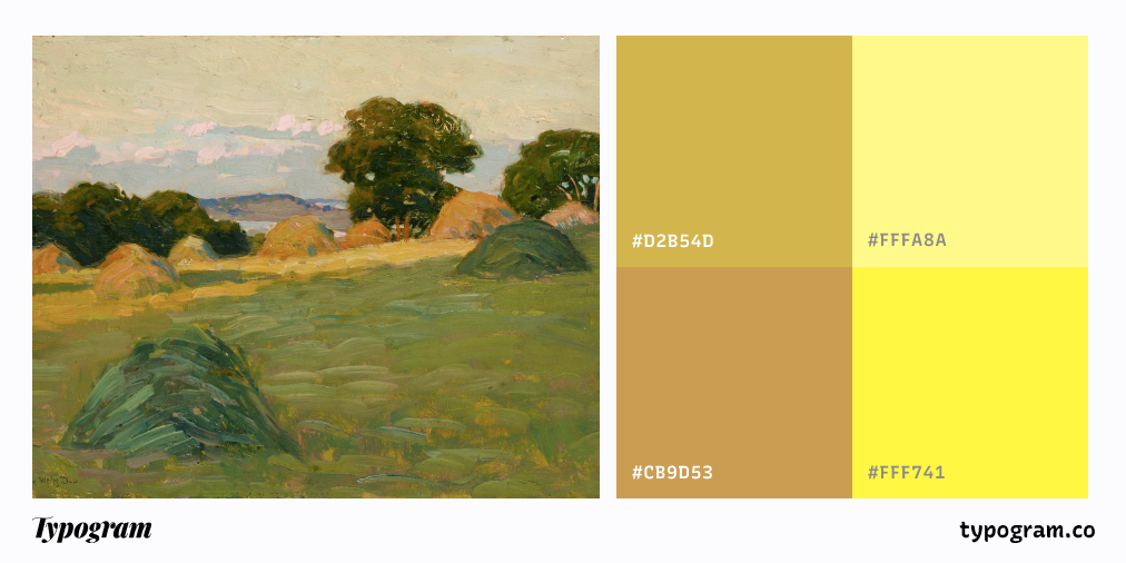
Bright Yellows and Golds
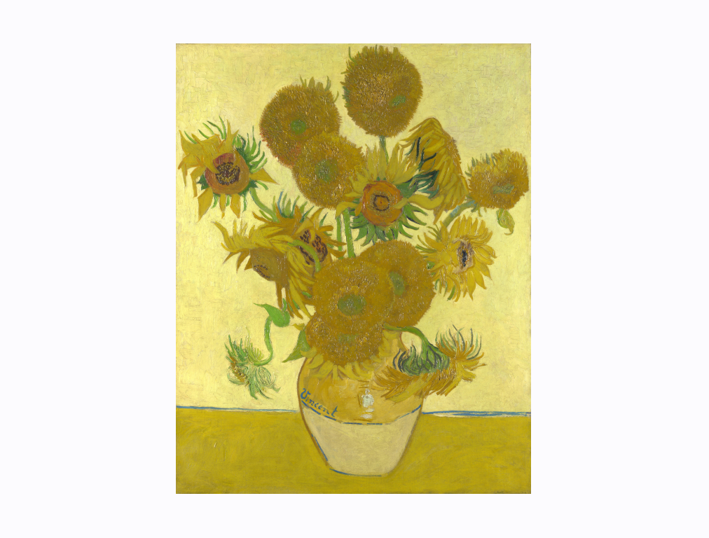
Van Gogh once praised "How wonderful yellow is. It stands for the sun." Yellow is the color of sunshine.
In the summer palette, it takes on a rich, warm quality that brings a sense of energy and optimism. Bright yellows evoke the feeling of a perfect summer day, with the sun shining high in the sky. These vibrant yellows create a sense of happiness, joy, and warmth in designs. They’re ideal for conveying a feeling of energy, optimism, and fun.
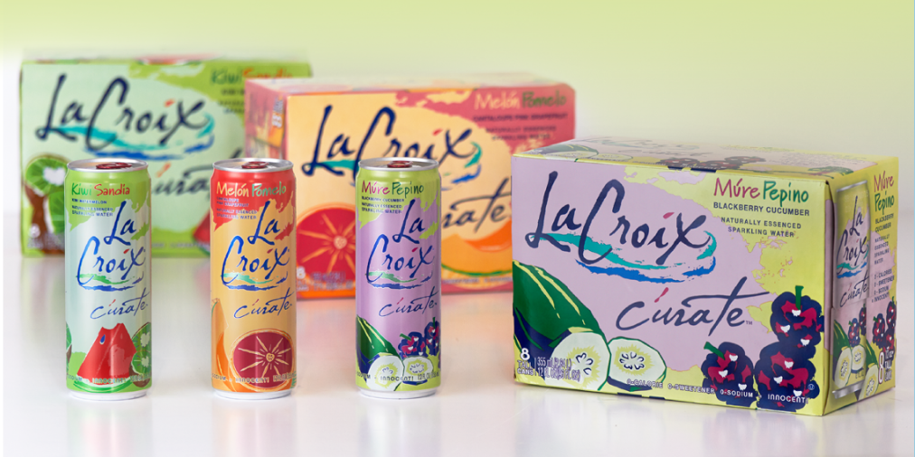
In addition, according to psychology research, yellow is often associated with stimulating appetite while evoking freshness and excitement, which makes it a popular choice for packaging in the food and beverage industry. ("Color Psychology and Food Marketing", Journal of Retailing and Consumer Services)
Golds are also a key component of the summer palette, offering a more sophisticated, luxurious take on yellow. Gold is often used for accents and highlights, bringing a touch of glamour and luxury to designs.
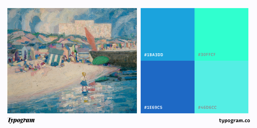
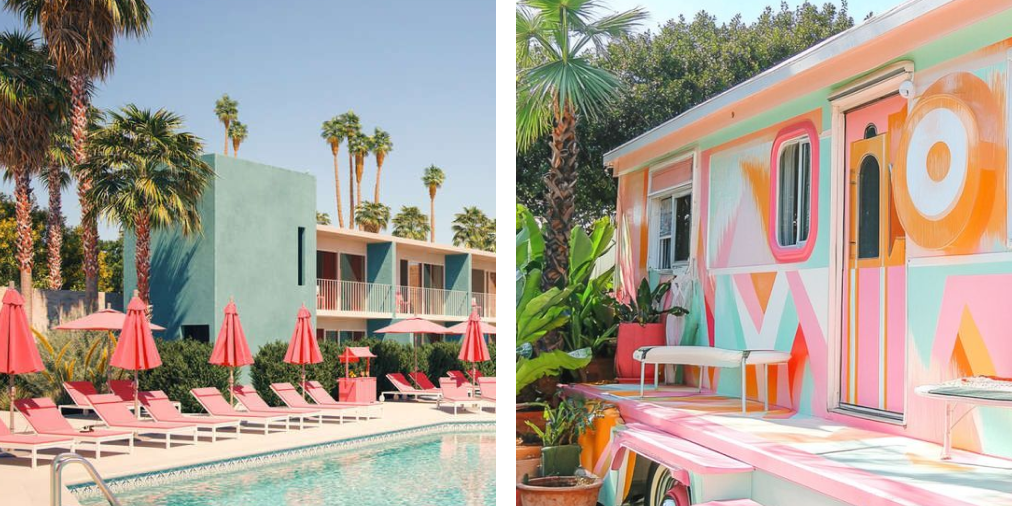
Tropical Blues and Turquoises
When we think of summer, the image of clear blue skies and sparkling oceans often comes to mind. Tropical blues and turquoises are central to the summer color palette, evoking the coolness and refreshment of summer waters. These blues are bright and vivid, representing clarity, relaxation, and tranquility.
Tropical blue is an energetic, vibrant shade that brings a sense of vitality to any design. Turquoise, with its greenish undertones, adds a refreshing quality to the palette. These blues and greens create a sense of calm, cooling off the intensity of other warmer colors like yellow and orange, or they can be paired with vibrant tones to bring balance and contrast.
In design, tropical blues and turquoises are often used in the travel and leisure industries, conveying a sense of adventure, escapism, and relaxation. They also work well in fashion, especially for swimwear and resort wear, as they capture the essence of vacation vibes and coastal living.
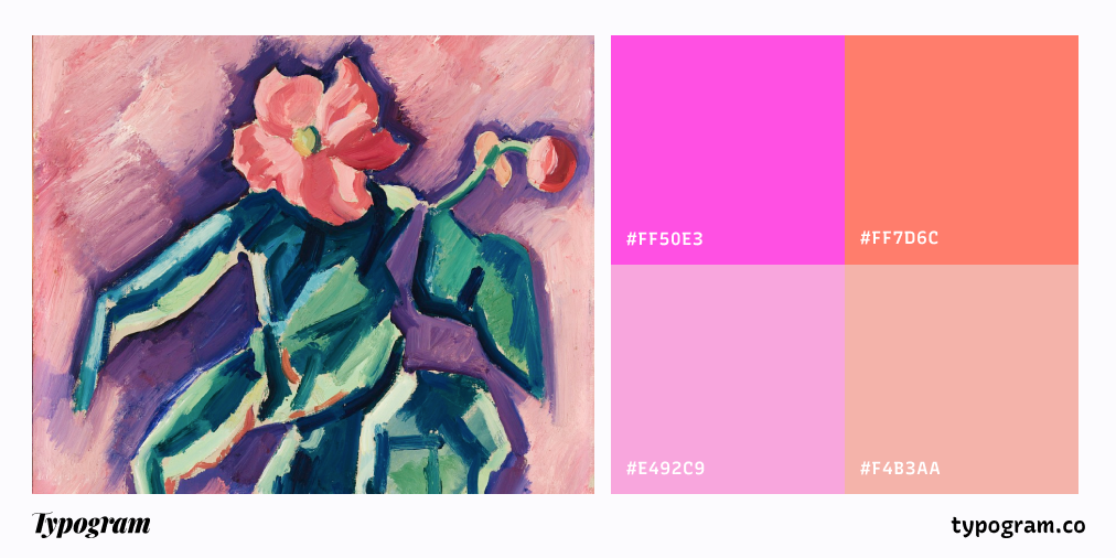
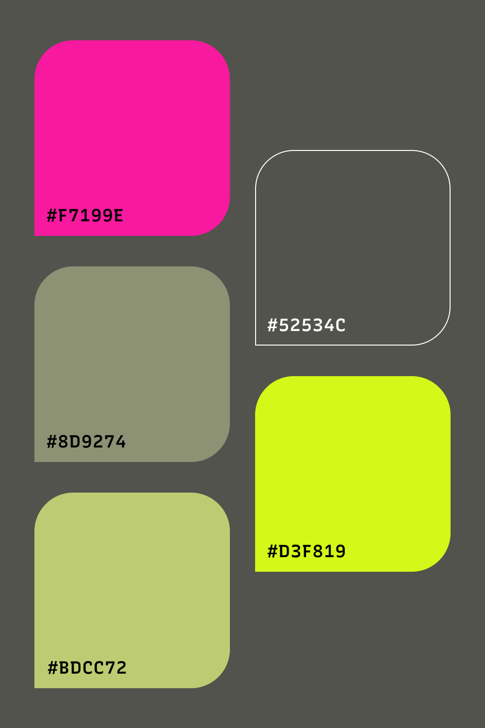
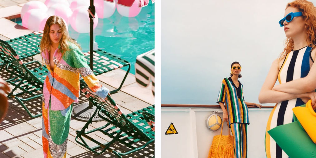
Hot Pinks and Corals
Hot pinks and corals bring a fun, bold pop of color to the summer palette. They’re bright, energetic, and full of personality— perfect for designs that need to feel lively, playful, and exciting. Hot pink, in particular, is a statement color that immediately grabs attention and adds a sense of fun and irreverence to any design.
Coral, a more muted version of pink, adds warmth and depth to the palette. Coral feels fresh, lively, and sophisticated, making it a popular choice in fashion and interior design for creating bold yet balanced looks.
These shades are perfect for summer branding, particularly in the fashion, beauty, and entertainment industries. They’re ideal for products looking to convey a sense of fun, confidence, and adventure.
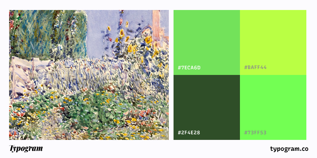
Fresh Greens
Green is a color that represents nature, growth, and vitality, and in the summer palette, it takes on a bright, refreshing quality. Fresh greens evoke the lushness of summer gardens, forests, and fields, bringing a sense of calm and rejuvenation to the palette. These greens are bright and crisp, offering a refreshing contrast to the warmer tones of yellow and pink.
Lime green, apple green, and fresh grass green are all common choices in the summer palette, representing vitality and the vibrancy of the natural world. These shades are perfect for designs that need to feel energetic, fresh, and invigorating. Green also works well in eco-friendly or sustainable brands, as it represents nature and growth.
Brighter, more saturated greens can be used as accent colors in branding or design to create a sense of balance and energy. When paired with brighter hues like yellow or pink, they help to ground the palette and add a refreshing touch.
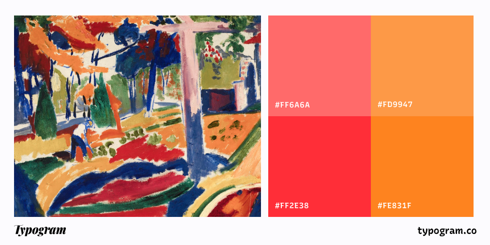
Bright Reds and Oranges
Red and orange capture the essence of summer—glowing sunsets, ripe fruits, and lively outdoor festivals. These fiery hues infuse designs with energy, passion, and warmth. Bold reds evoke power, urgency, and excitement, while vibrant oranges evoke playfulness, enthusiasm, and approachability.
Ideal for eye-catching designs, red is a staple in food and beverage branding, stimulating appetite and creating a sense of urgency. Meanwhile, orange shines in entertainment and retail, radiating fun and friendliness. Together, these colors create dynamic, attention-grabbing visuals that exude warmth and vitality.
How Summer Colors are Used in Design
Summer colors are ideal for creating bold and energetic designs. Whether you’re designing for a seasonal campaign, a product launch, or a brand identity, summer colors can help you infuse energy and activation. Here are a few ways in which summer colors are used in design:
Digital Design
In web and graphic design, summer colors are used to create lively, engaging websites that capture the energy and vibrancy of the season. Bright yellows, tropical blues, and hot pinks can be used for backgrounds, buttons, and call-to-action elements, while fresh greens and coral can add balance and contrast.
Summer colors are also popular for seasonal brand campaigns, particularly for events, sales, or promotions. These colors help create a sense of excitement and anticipation, drawing in customers and encouraging them to take action.
Interior Design
In interior design, summer colors are used to create vibrant, energetic spaces that feel open, fresh, and lively. Bright yellows and oranges can be used to create bold accent walls or feature pieces, while tropical blues and greens add a refreshing touch to any room. These colors work particularly well in spaces designed for relaxation and fun, like living rooms, kitchens, and outdoor spaces.
To balance out the boldness of summer colors, designers often incorporate neutral tones like white, beige, or light gray. These neutrals help create a sense of harmony and allow the brighter colors to shine.
Branding and Marketing
Brands in the fashion, beauty, and lifestyle industries often use summer colors to convey a sense of energy, fun, and adventure. A summer campaign might feature vibrant pinks, blues, and yellows to capture the vitality of summer, while tropical greens can add a refreshing touch to branding materials.
These colors are also ideal for products that need to feel lively and energizing, like beverages, sports gear, or vacation destinations. The summer palette is perfect for promoting fun, excitement, and a carefree attitude.
Fashion Design
Summer fashion is all about light, comfortable styles in bright, energetic colors. The summer color palette is ideal for creating vibrant clothing collections, with hot pinks, corals, and bright yellows making bold statements. Tropical blues and greens are often used in swimwear and resort wear, while fresh greens and oranges can add a playful touch to accessories and casual wear.
Summer fashion is known for its boldness, and the colors in this palette help designers create looks that are full of life, personality, and excitement.
Combining Summer Color Palettes with Other Colors
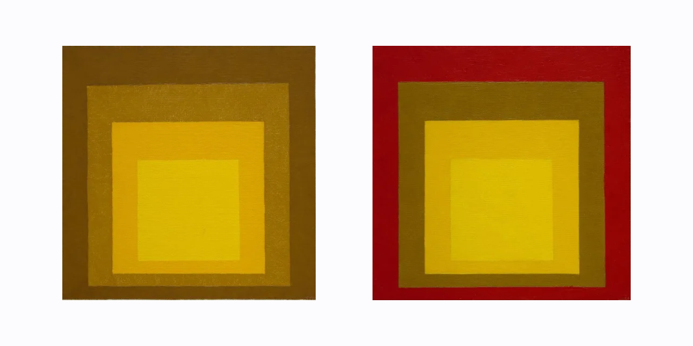
When working with summer palettes, it’s also essential to consider accessibility and legibility, especially since these vibrant colors can sometimes clash or create visual noise. High contrast between text and background is crucial for readability, so pairing bright colors with darker or muted tones helps ensure that content remains clear and accessible to everyone. For example, if you use a bright orange for headlines, pairing it with a deep gray or navy background can create a striking contrast that’s easy to read. Josef Albers highlighted the importance of contrast and color interaction in Interaction of Color, illustrating how colors can influence perception and legibility. In Shape of Design, Frank Chimero echoes this idea, noting that “colors aren’t just colors; they have a context.”
Additionally, incorporating neutral shades can provide visual breaks, making the design more inviting and comfortable for all viewers. Keeping accessibility in mind not only enhances the overall aesthetic but also ensures that your designs are inclusive and effective for a wider audience.
Conclusion
The summer color palette is all about bold, vibrant hues that capture the energy, warmth, and excitement of the season. Whether you’re designing for a seasonal campaign, refreshing your brand, or creating a space that feels full of life, the summer colors—bright yellows, tropical blues, hot pinks, fresh greens, and warm reds—are sure to bring energy, joy, and vibrancy to your designs. By using these colors in thoughtful and dynamic ways, you can evoke the spirit of summer and create designs that feel as lively and refreshing as the season itself.