Sans Serifs Classifications You Must Know to Improve Your Designs
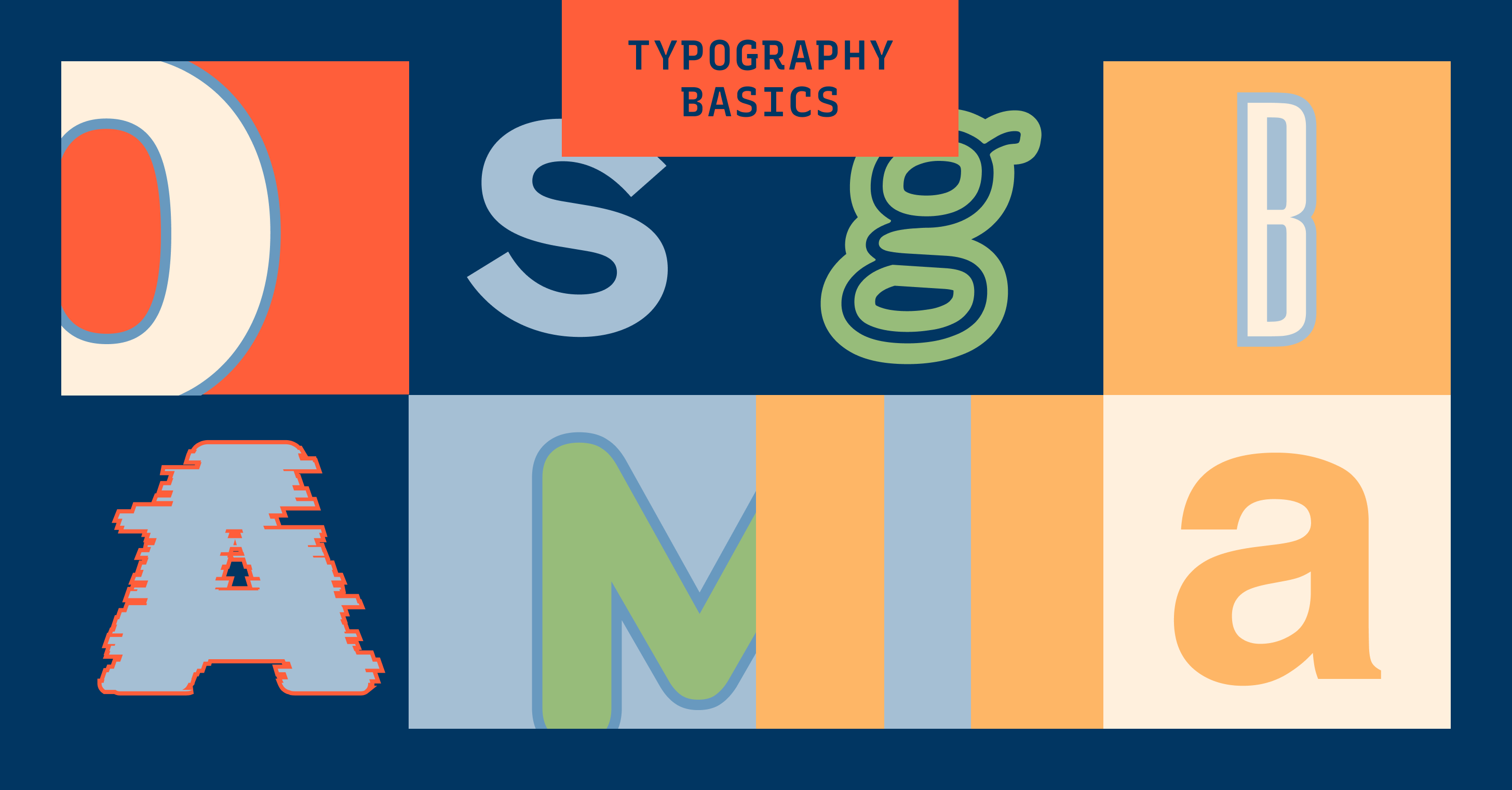
A Word About Sans Serifs & Their Classifications
Due to their simplistic appearances often devoid of fancy flourishes, sans serifs are considered bold and modern. We have talked about them in our post about luxury and tech brands. They are seen in many brands looking to appear artsy, creative, and contemporary.
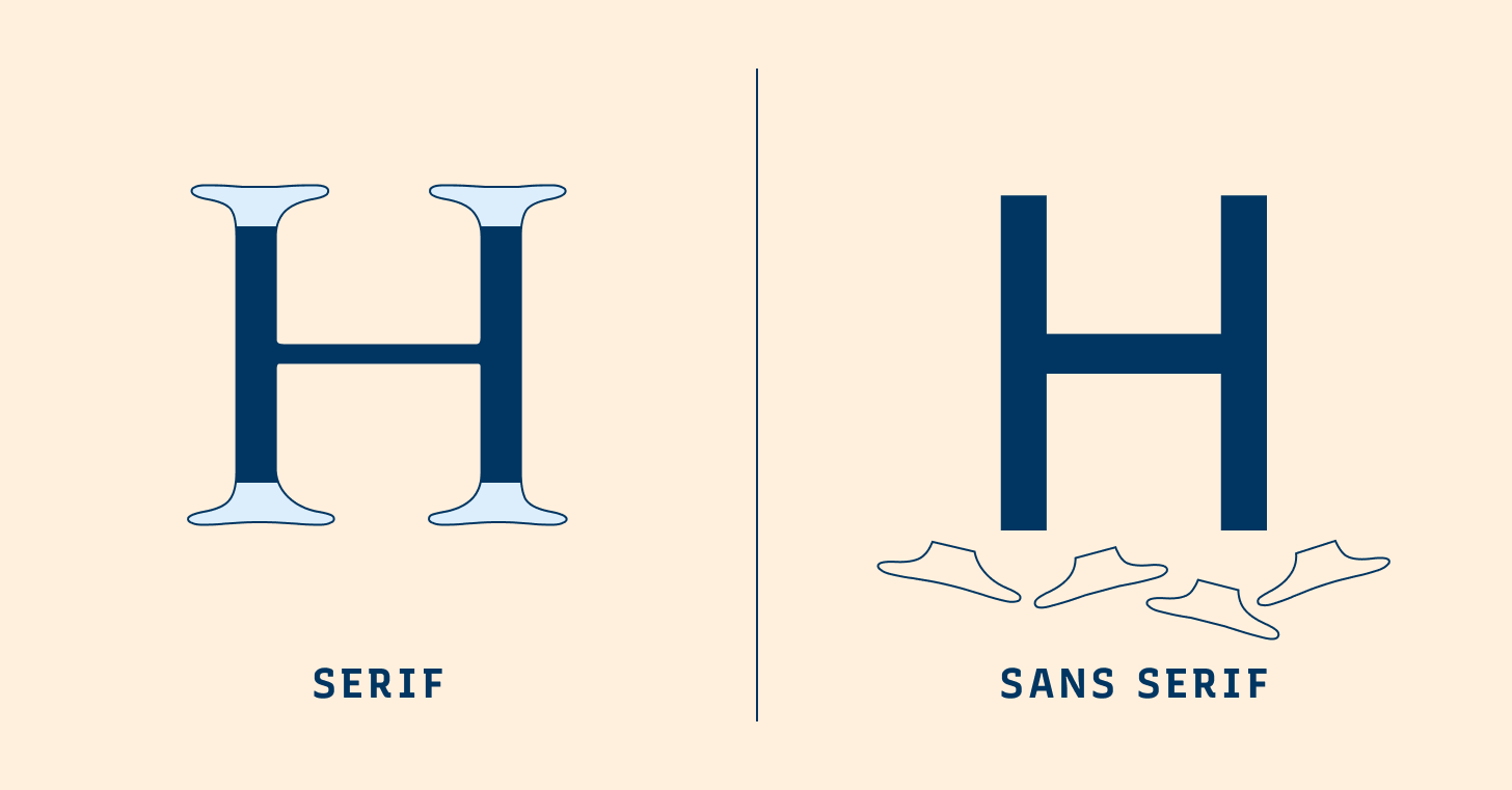
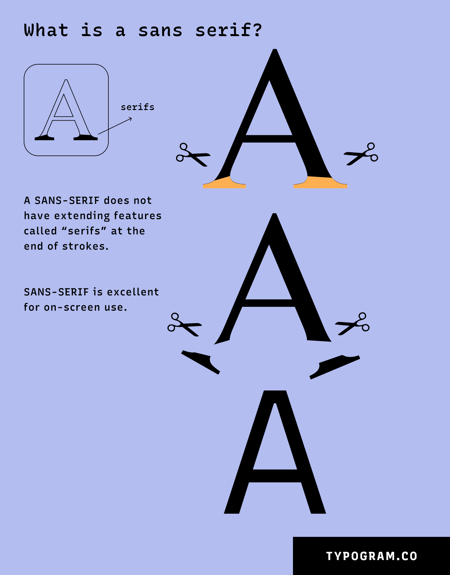
Sans Serif
Sans means “without.” Sans Serifs were invented long after serifs typefaces, and they do not have serifs extending at the end of strokes. In 1816, William Caslon IV created the first official sans serif typeface, Caslon Egyptian , for commercial use. Though Caslon Egyptian didn’t become popular immediately, Sans Serif boomed in popularity decades later. Furthermore, They break down into smaller style categories: Grotesque, Neo Grotesque, Humanist, and Geometric.
Grotesque Sans Serif
Grotesque sans serifs were the earliest sans serif, influenced by the Modern style serif. Grotesque sans serif received its name from the Italian word grottesco, meaning “belonging to the cave,” because the idea of not having serif was considered bold, shocking, and ugly at the time. Grotesque sans serif is the first generation of sans serifs, with many weird (wonky) visual traits compared to other sans serifs.
Reference Sans Serif: Libre Franklin


Neo-Grotesque Sans Serif
Neo-Grotesque sans serif is tweaked and evolved version of Grotesque sans serif, first appearing in the mid-twentieth century. Akzidenz-Grotesk, a well-known Neo-Grotesque typeface released in 1898, is the best spokesperson for this style, a balancing act of cleanness and calligraphic touch, which many later fonts of this style tried to emulate.
Many of the most popular sans serifs we use presently, like Helvetica, San Francesco, and Roboto, belong to this category.
click to see the difference between grotesque and neo-grotesque sans serifs


Humanist Sans Serif
Humanist sans serif takes inspiration from traditional letterforms. Because of this, you can often find calligraphic elements, such as stroke variation, and more organic structural elements, like a double-story lowercase “a” or “g” in Humanist sans serifs.
Reference Serif: EB Garamond


Geometric Sans Serif
The letter shapes of Geometric sans serifs are derived from geometric shapes like circles, rectangles, or triangles. In most Geometric sans serifs, the letter strokes have very little contrast. Because they often appear bold (due to their strokes), more angular, and shapely, Geometric sans serifs are often considered avant-garde.
click to see geometric influence

