Winter Color Palette in Design: A Guide to Cool and Elegant Inspiration
Winter has a quiet charm that seems to inspire designers everywhere. From soft snow whites to deep midnight blues, the winter color palette captures the calm beauty of the season while giving plenty of room for creative ideas. In graphic design and typography design, these cool tones can bring a sense of clarity, serenity, and a touch of luxury. Whether you are designing a website, refreshing a brand, or working on a seasonal campaign, winter-inspired colors can give your projects a timeless yet modern feel.
In this guide, we’ll take a closer look at the winter color palette, explore popular color schemes, and show you how to use them in graphic and typography design.
Understanding the Winter Color Palette
Winter colors are cool, crisp, and clean. Think snow white, soft gray, icy blue, and rich purple. These shades feel calm and sophisticated, which is why so many designers turn to them when they want their work to feel polished and refined.
Winter colors also love contrast. Alongside lighter shades, you’ll find bold jewel tones like ruby red, emerald green, and sapphire blue. These colors add depth and energy, creating combinations that balance light and dark in a way that’s visually striking.
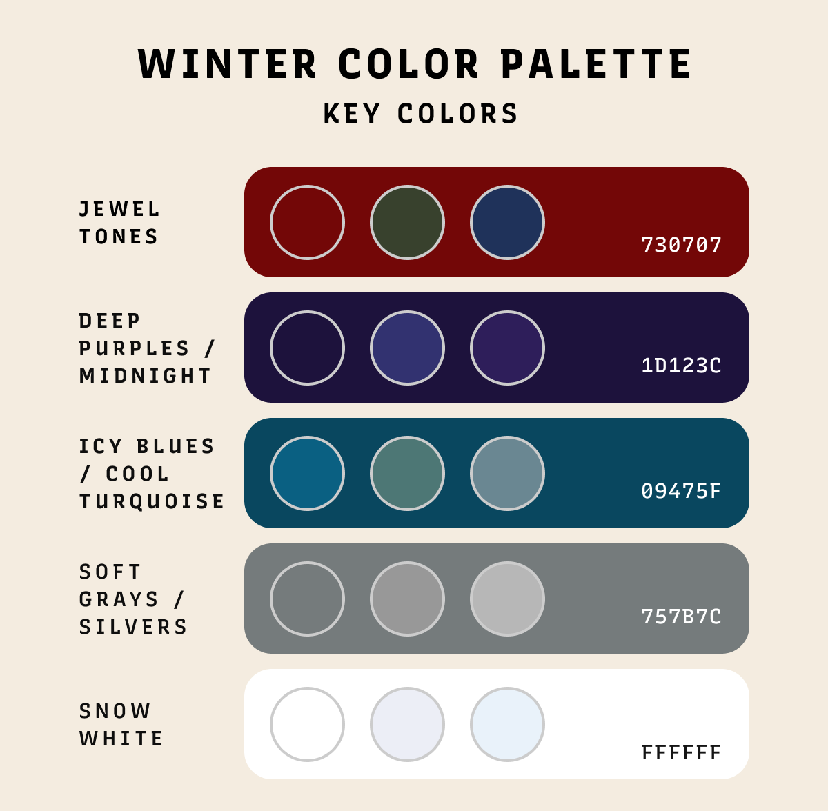
Key Colors in the Winter Palette
Snow white is fresh, clean, and minimal. It pairs beautifully with soft grays, ranging from light silver to deep charcoal. Together they create neutral backgrounds that let typography and visuals shine.
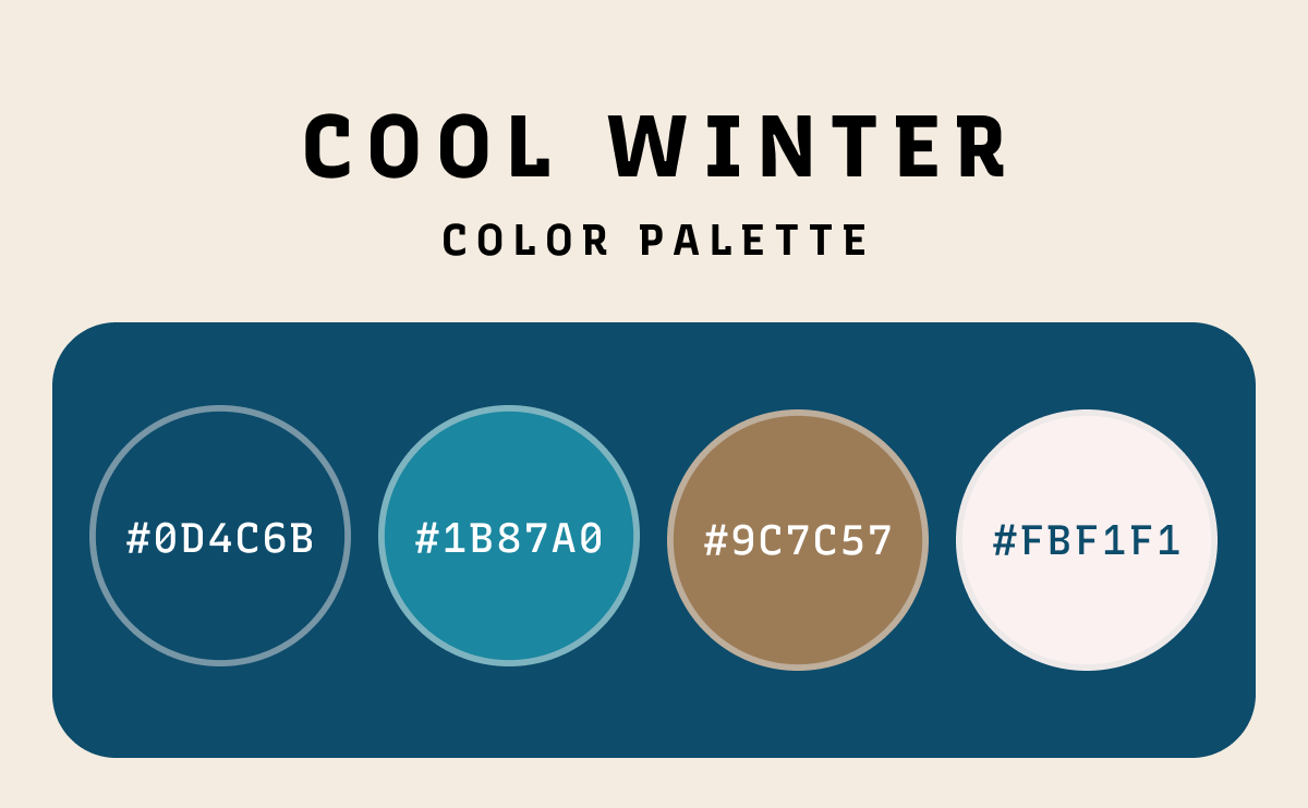
Cooler shades are vital to to a cool winter color palette. Icy blues and cool turquoises capture the sparkle of frozen lakes and winter skies. They bring freshness and clarity to digital and graphic design. Lighter blues feel soft and airy, while turquoise tones add vibrancy and energy.
Deep purples and midnight blues add drama and sophistication. They are ideal for typography-focused projects where you want type to feel bold and refined. These shades are often seen in luxury branding and editorial layouts.
Jewel tones such as ruby, emerald, and sapphire bring richness and glamour to winter designs. They work beautifully as accent colors in branding, packaging, and typography. Even a small touch of emerald green or ruby red in a headline or logo can add visual impact.
Silver adds shimmer and sophistication, while charcoal gives depth and balance. Together, they create a sleek, modern look that works well in both digital and print design.
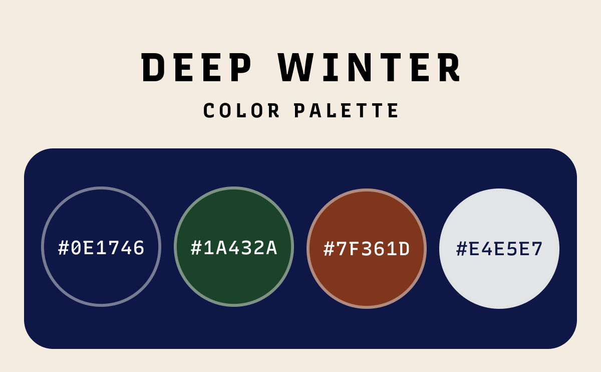
Deep Winter Color Palettes
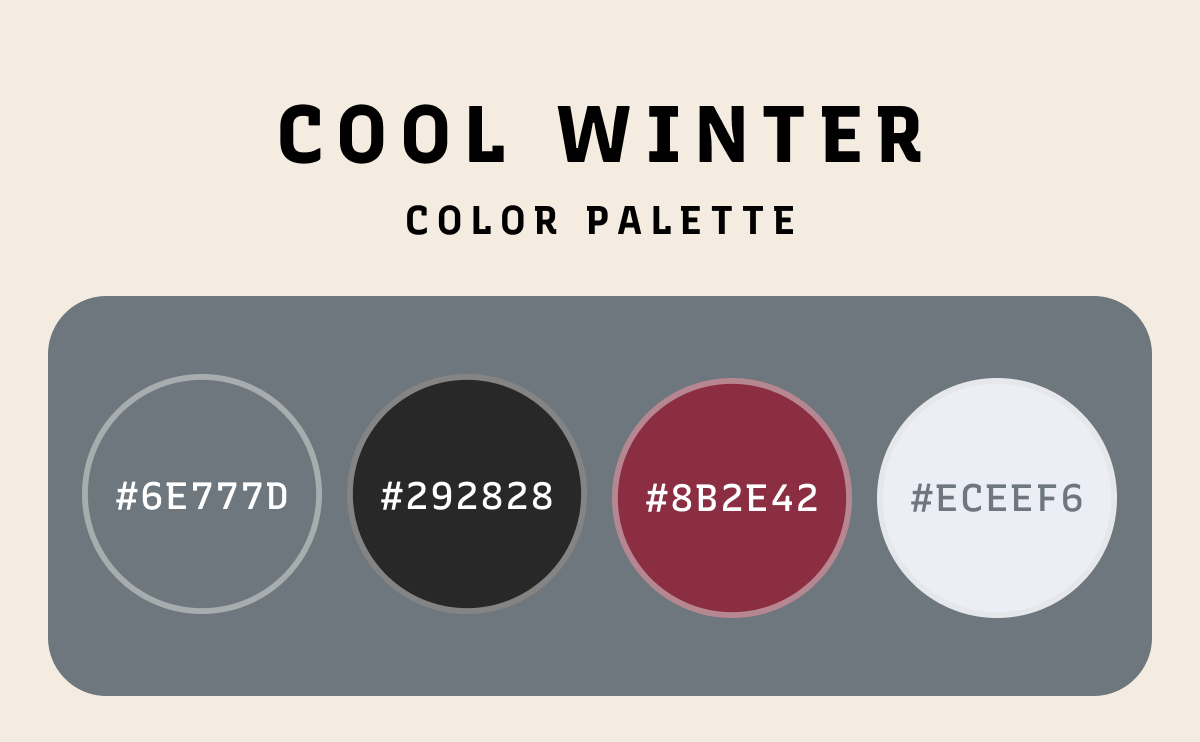
The deep winter palette is confident and bold. It leans on jewel tones and darker neutrals like emerald green, ruby red, sapphire blue, and charcoal gray. These shades bring instant richness and elegance to any design.
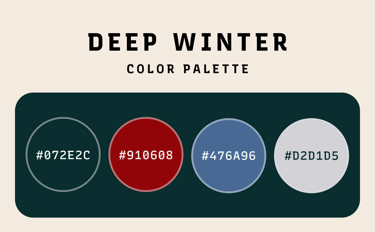
Graphic designers often use deep winter colors in branding, packaging, or holiday campaigns when they want to make a strong, seasonal impression. Designers can use them in headlines, logos, or seasonal accents that need to stand out while still feeling luxurious.
How Designers Use Winter Colors
In web and graphic design, minimalist websites often use icy blues, whites, and grays to keep layouts clean and spacious. Jewel tones or silver accents are great for highlighting buttons, call-to-action elements, or logo details. Seasonal campaigns also use winter palettes to evoke a calm, elegant atmosphere.
Typography comes alive with winter colors. Soft grays and whites make clean backgrounds for text, while jewel tones highlight key type elements. Serif fonts in deep purples or blues feel classic and luxurious, while sans-serifs in icy shades feel modern and approachable.
Winter palettes are also powerful in branding. Fashion, beauty, and hospitality brands often use these colors to create a refined identity. Seasonal campaigns make the most of icy whites, jewel tones, and metallic accents to connect with audiences in a memorable way.
Fashion designers pair cozy winter whites and grays with jewel tones for dramatic effect. Interiors styled with snow whites, deep blues, and silver accents feel serene while adding a touch of luxury.
Conclusion
Winter color palettes have some of the most interesting and dynamic colors. Its cool tones, bold contrasts, and jewel-inspired accents can bring clarity, elegance, and sophistication to any project.
Whether you are designing a minimalist website, creating a seasonal brand campaign, or experimenting with bold typography, winter colors provide endless inspiration. By thoughtfully pairing whites, blues, grays, purples, and jewel tones, you can create designs that feel timeless, elegant, and perfectly suited for the season.