Nine Branding & Design Terms Startup Founders Should Know
When you design your brand, it may be helpful to know some key concepts. Here is a list of relevant terms and ideas for branding and design that could be helpful as you work through your design and marketing projects.
Brand Identity
Brand identity is the visual aspect of a brand. Brand identity includes your logo, imagery, typography, colors, and creative assets. Together, these elements make your brand recognizable to your customers. Your brand identity is one of the most important parts when it comes to creating your brand.
Logo
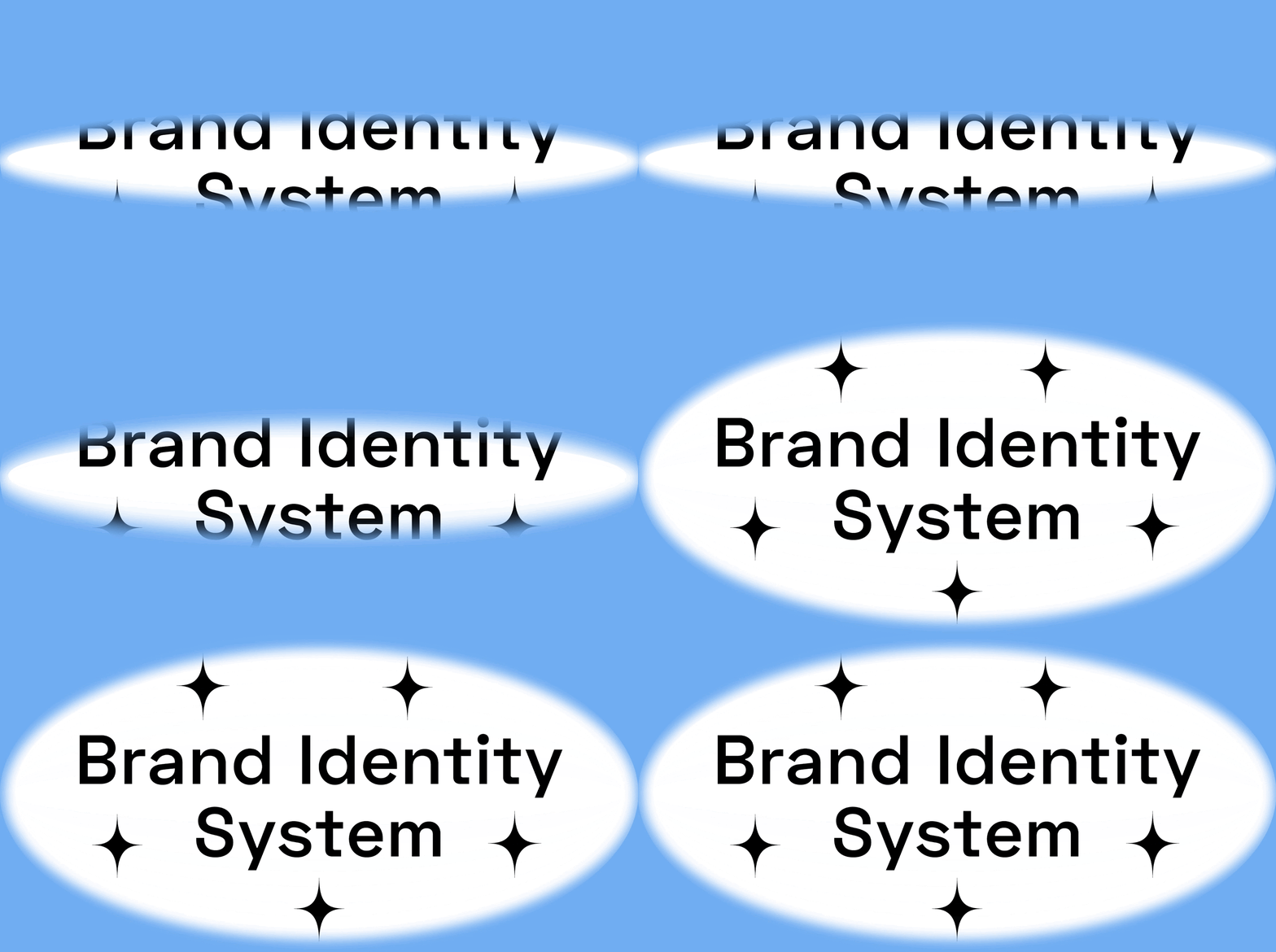
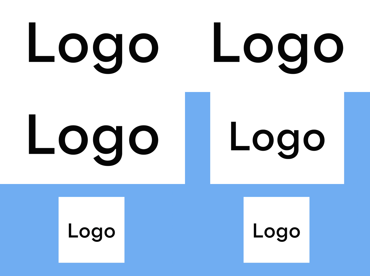
The logo is the piece of artwork that represents your brand. While a logo is only a single piece of artwork, it is used everywhere on your brand, like landing pages, social media for marketing, and ads. That’s why when you create your logo, you should think about its usability in different environments. There are times when you may have to display your logo in a small size. There might be times when your logo will end up in a dark background. Keeping those restrictions in mind at the beginning will save you troubles later on.
Brand Color
Brand color is the primary color associated with your brand. It can be on logos, business cards, decks, social media posts, websites, and other branding materials.
It’s also the color your audience will associate your brand with. For example, Home Depot’s brand color is orange.

White Space/Negative Space
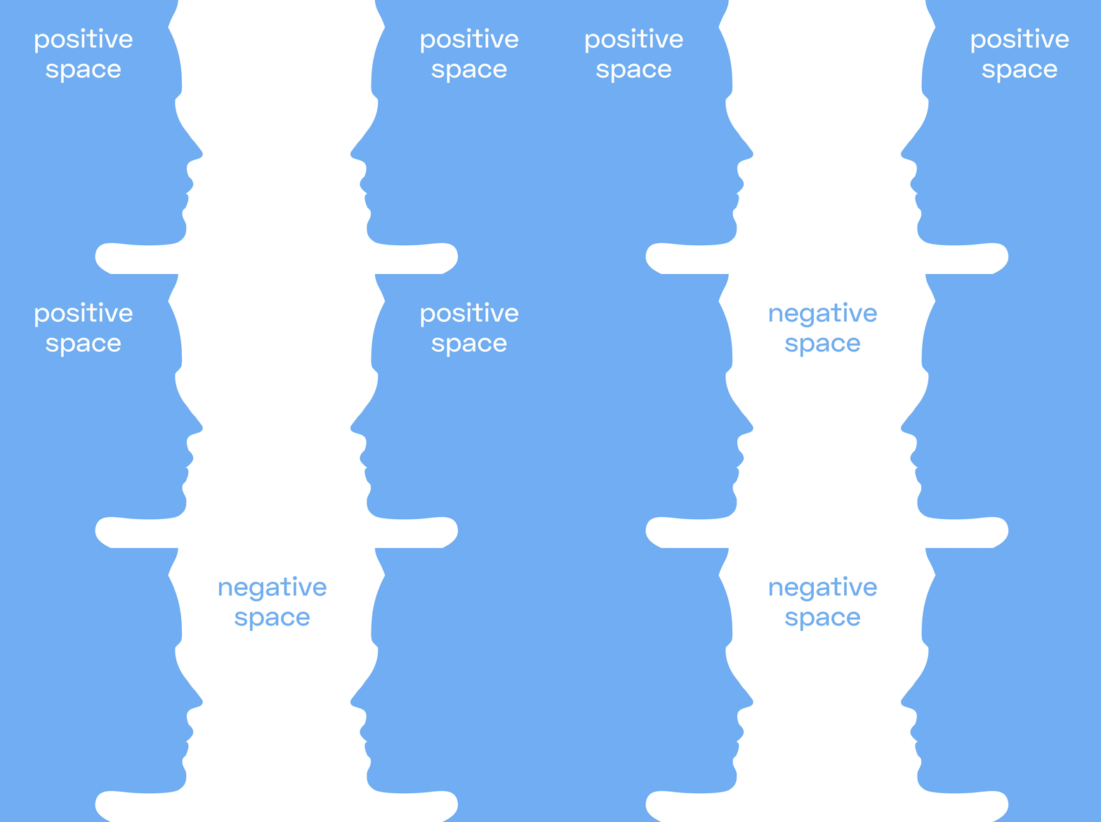
White space, also called negative space, is the area that is left empty in design. It could be around the content or artwork(like a photo), inside the content, or in-between two pieces of content. White space is crucial because it gives the elements in your design breathing room and provides ease for the viewer when they look at the information. Good use of white space also guides the audience’s eyes from one piece of content to the next, creating a hierarchy of information.
Positive Space
Positive space is the counterpart of negative space. The positive space is the space that the subject (this can be the content, or artwork) takes up.
Design Composition
Design composition is how design elements are placed on a page. Since elements are positive space and the unused space is negative space, we can also say that composition is the overall distribution of positive and negative spaces in the design.
A general rule for creating good composition is to find balance between negative and positive space. When there is a lack of balance between negative and positive, there is tension. However, tension can also be explored to create powerful compositions.
Design Grid
Grids in design are systems for creating and organizing layouts. The layouts can be for print or screen. In design, “form follows function,” and layout is the perfect example of this. Different grids(layouts) suit different purposes.
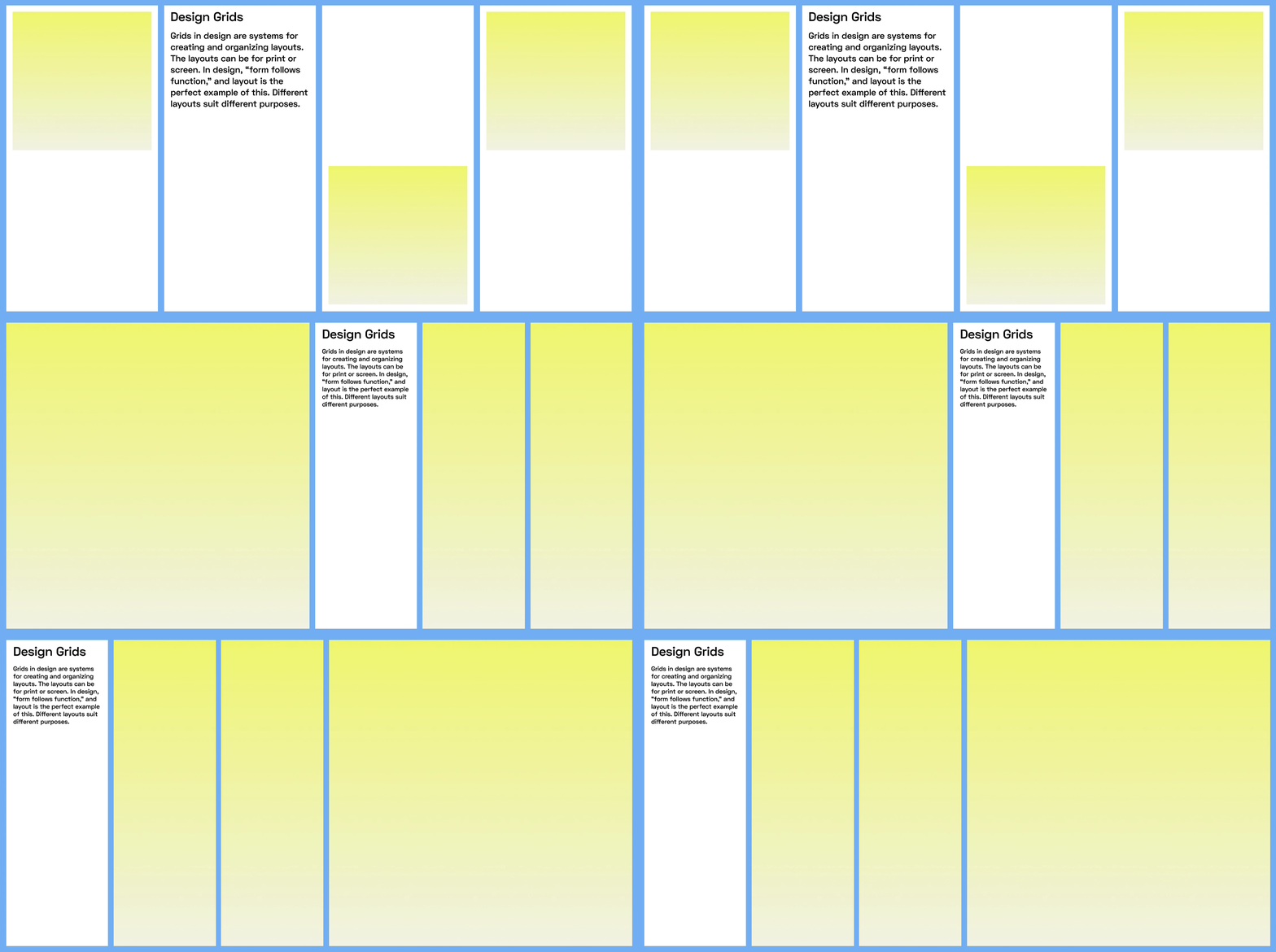
img: Different grids have different uses.
Typography System
Typography System is the combination of fonts and font styles that create your visual branding system. For example, you typically have corresponding fonts and font styles for headers, subheads, and body copy on the landing page. For branding, we will normally use the same typography system across most of the branding assets to create a consistent message.
Typographic Hierarchy
Typographic hierarchy is the visual cue of scale and spatial relationship between the specific font styles. Typography hierarchy is crucial. It shows the audience which information is the most important and which is the least. For example, on your landing page, you probably want to capture the customers’ attention by first guiding them to the product’s unique value, then offer them a detailed description.
To achieve this visually, you can make the header containing the copy for values of the product to be bigger and bolder in style than the detailed description of the product. That way, the eyes traveled to the header first, then to the description of the project.
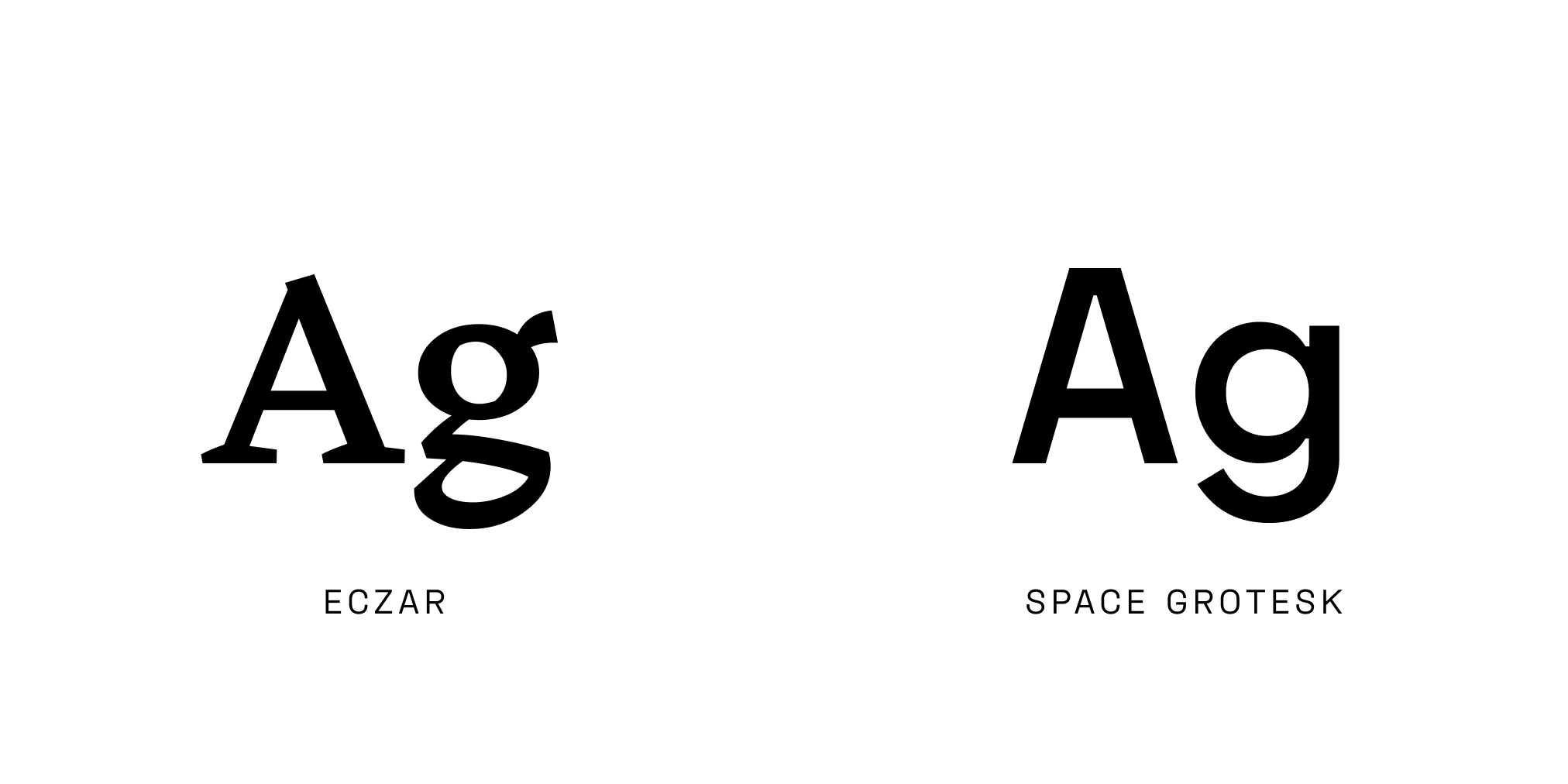
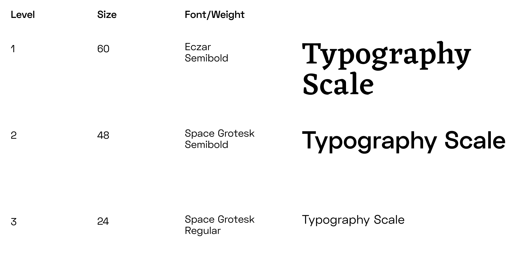
img: Information hierarchy is establish through scale relationship using fonts and font pairing.
Hopefully these can help you as you work on design projects for your startup!
Do you have any additional questions or suggestions? Let me know via Twitter @typogramco
