Essential Terms You Must Know About Typography
Typography
Typography is the art of arranging pieces of text via typefaces to make information legible, readable, and pleasing to the eye. Typography is more important than ever because information today is more readily available. Typography shapes language and helps us communicate a clear message.
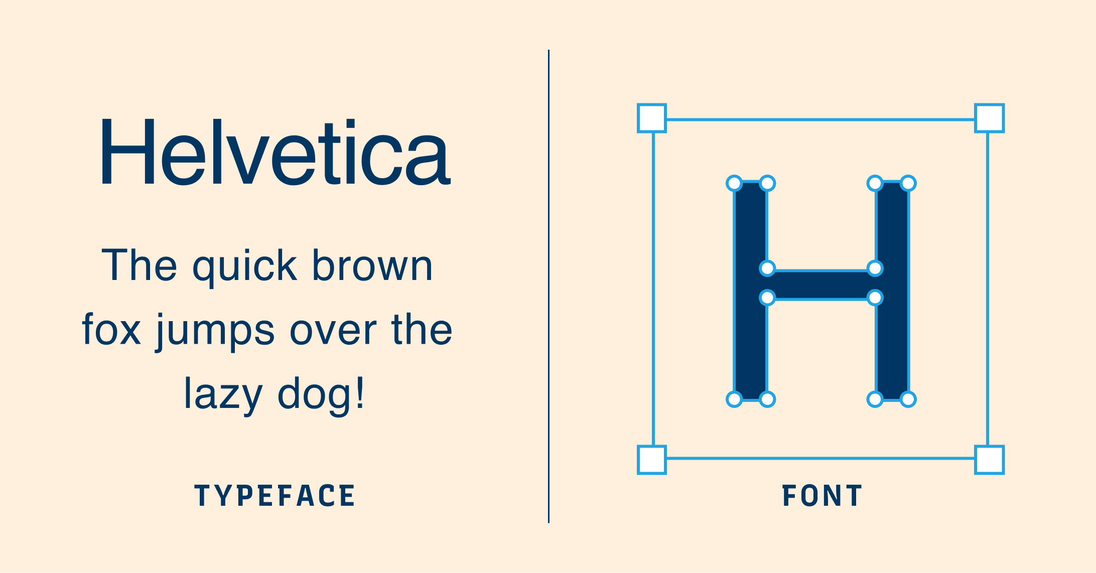
Typeface
A typeface is a set of glyphs or characters sharing a common and cohesive design. For example, the Helvetica typeface shares the visual commonalities of lacking a serif, a stroke attached at the end of a larger stroke in a letter, and having little to no variation between stroke width.
Font
A font is the digital, graphic representation of a typeface. It includes the particular size, weight, and style of a typeface that makes up the displayable set of characters. Nowadays, Fonts and typefaces are often used interchangeably.
Font Family
Font Family is several fonts sharing a broader design characteristic. Each font within the same family can differ in font weight, the thickness of the characters, font style, such as being normal or slanted, font width, the width of letterforms being condensed or extended, and more. In CSS (code provides visual styles to web pages), font-family defines the font applied to a selected HTML (code giving structure and content to web pages)element for the web page.
Font Weight
Font weight is the overall thickness of the character relative to their height. Font weight can come in Thin, Light, Regular, Roman, Medium, Semi-Bold, Bold, Black, and Ultra Black. Thin is usually the lightest weight, while Ultra Black is the heaviest.
Font Style
Font style is a particular style of font within a font family. For example, usually, there is the italic style within a font family - a group of letters with a degree of slant. Font style can come in normal, italic, and oblique. The Normal style is when the text is upright. The italic style is usually calligraphic, cursive-influenced, and slanted. The Oblique style is slanted version of the Normal style.
Faux Font Style
Faux Styles happen when text editors or web browsers fake a font style because the original font does not have one. For example, a faux italic, or a “fake” italic, is created by browsers when the web fonts used lack italic styles. Avoid Faux versions if the appropriate styles are available.
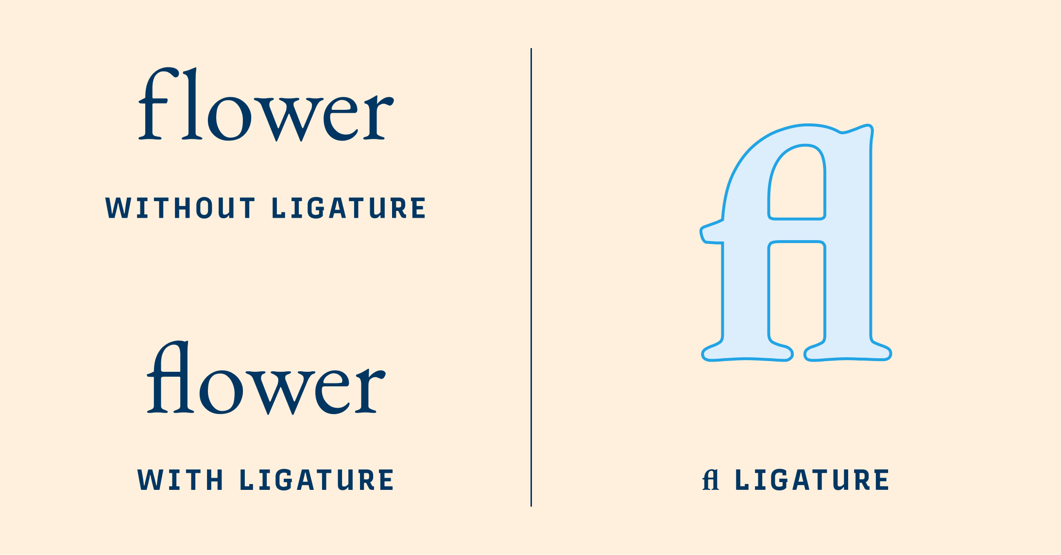
Ligature
Ligatures are unique characters created from multiple letters of common letter combinations to improve readability in a font. For example, the letter "f" has a high frequency of occurring with "i" and "l", as in words like “figure” and “flower.” To improve the readability in these specific cases, "fi" and "fl", would be combined to create a unique character that would replace the two letters when typed together.
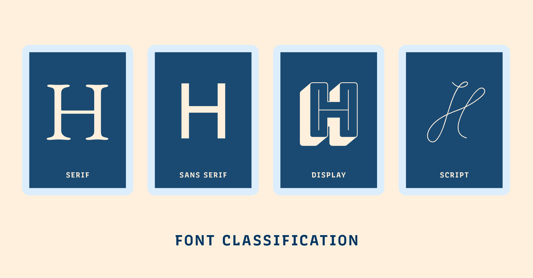
Font Classification
Fonts are commonly classified into four main categories based on their appearances. These categories are –– fonts with serifs (Serif), fonts without serifs (Sans Serif), fonts with highly decorative characteristics (Display), and font that looks like handwriting (Script).
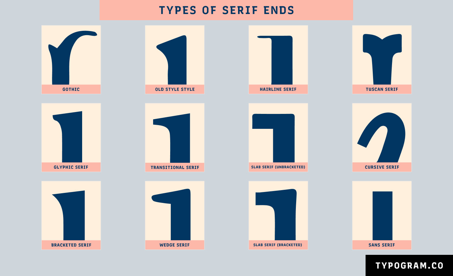
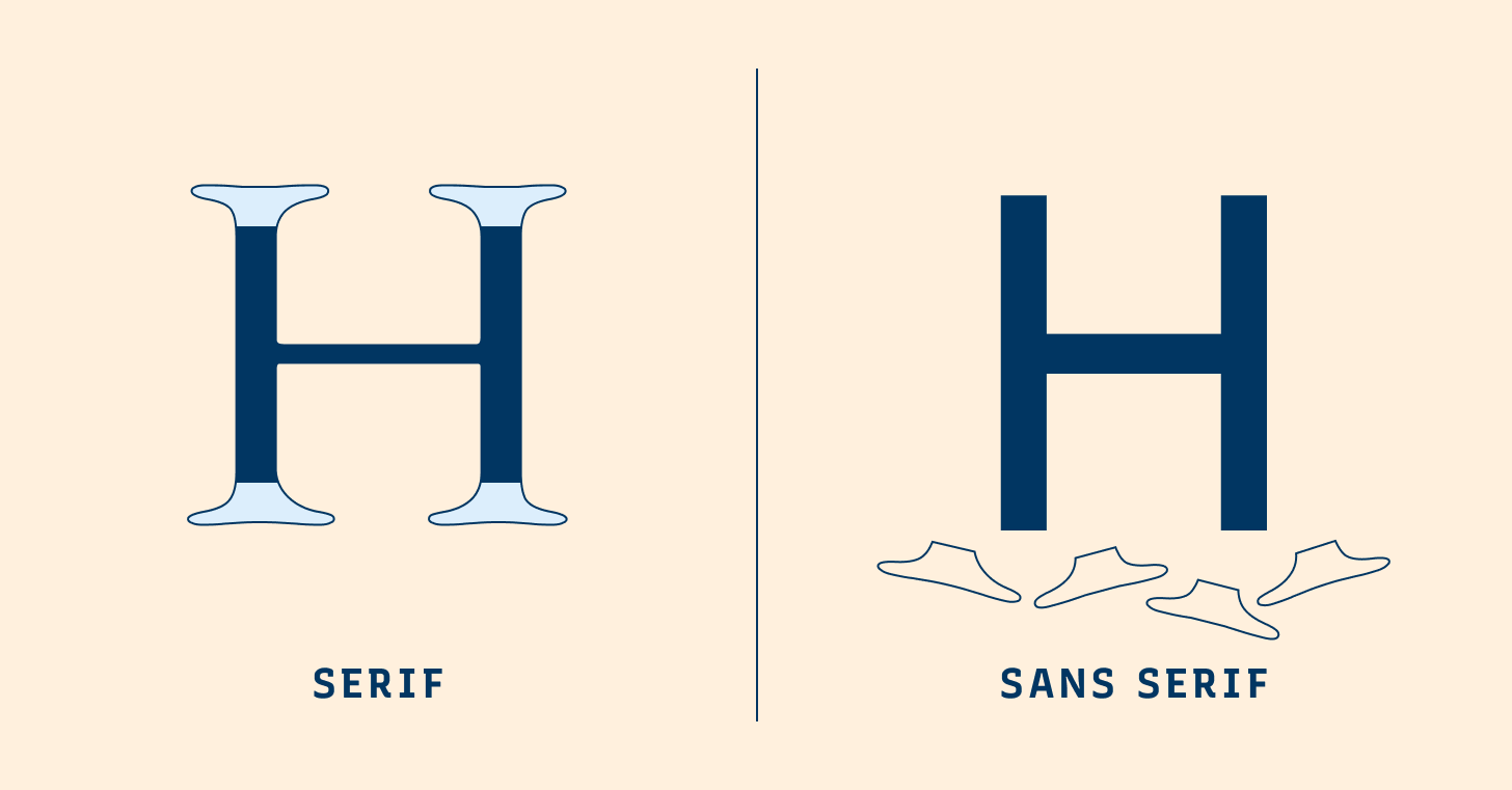
Serif
Serifs are letterforms with small lines or strokes, or “serifs,” attached at the end of larger strokes. Serifs originated from inscriptional lettering: Words were first painted with a brush, then carved into stones in Roman antiquity. Serifs are classified into several smaller categories: Old Style, Transitional, Modern, and Slab Serif.
Sans Serif
Sans means “without.” Sans Serifs do not have serifs extending at the end of strokes. Sans Serifs were invented long after Serif. In 1816, William Caslon IV created the first official sans serif typeface, Caslon, for commercial use. Though Caslon didn’t become popular right away, Sans Serif boomed in popularity decades later. Sans Serifs are also further broken down into smaller style categories: Grotesque, Neo Grotesque, Humanist, and Geometric.
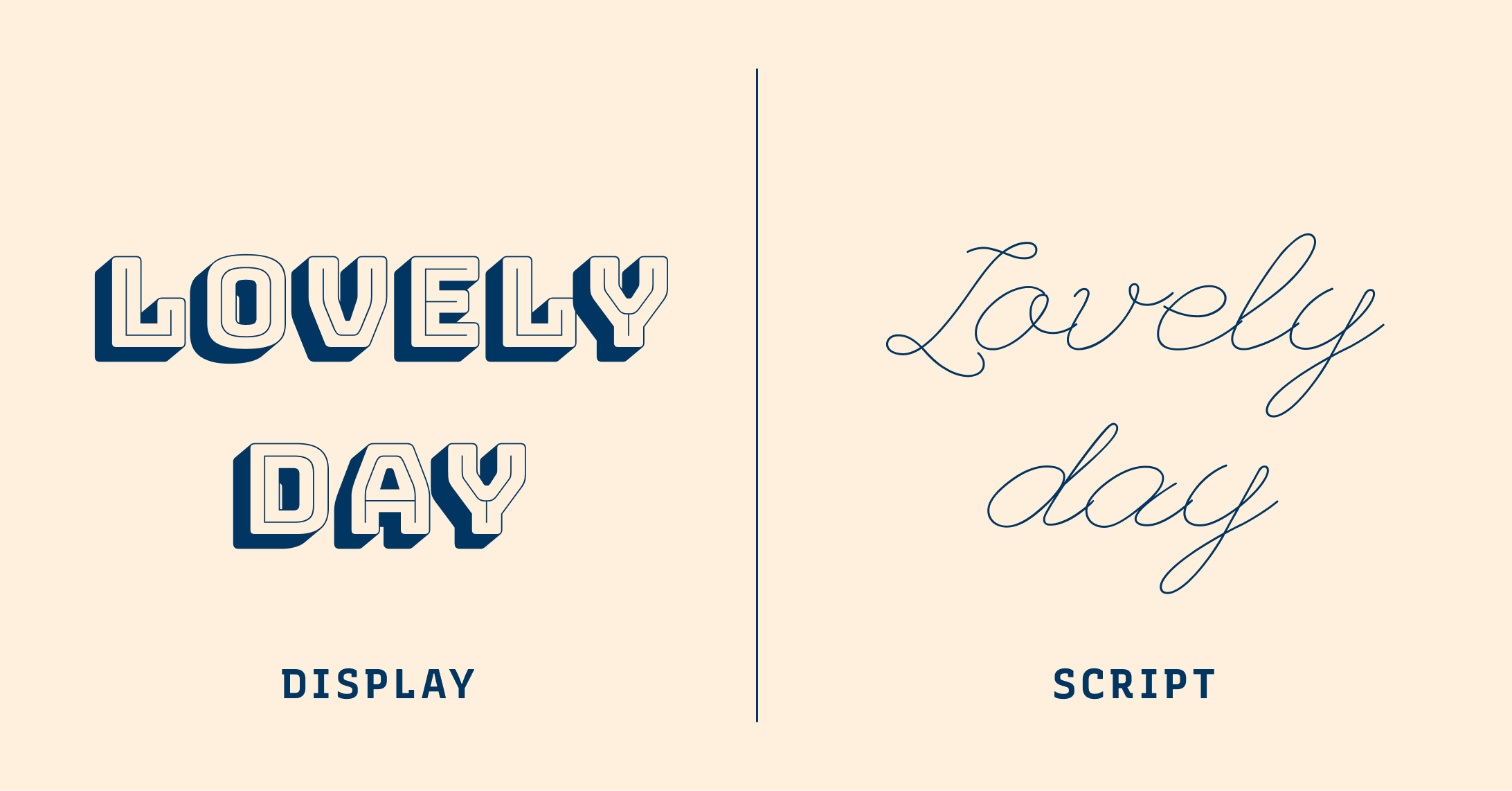
Display
Display fonts are often fonts with unrestrained, decorative details. They look more visually stimulating than restrained, simple fonts used for paragraph text. Display fonts are used at header sizes, grabbing people’s attention right away. Many display fonts do not have good readability in small sizes because of their more ornate shapes. Their font details get lost in small sizes, thus decreasing their legibility.
Script
Scripts are fonts mimicking handwriting. Influenced by cursives and calligraphy, scripts can be considered formal or casual. Formal scripts tend to be highly decorative, with swashes and exaggerated curls. Casual scripts are more subdued with less exuberant details.
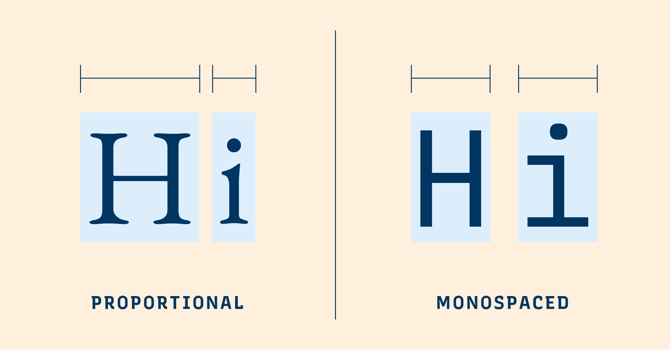
Monospaced Fonts
Most fonts are proportional, where each character takes as much width as it needs. Monospaced fonts are fixed width: all characters have the same letter width and occupy the same horizontal space. They were customary on typewriters and computer terminals. Nowadays, they live in code editors and science periodicals. They are perfect for displaying code and data.