Common Serif Styles You Must Know to Improve Your Designs
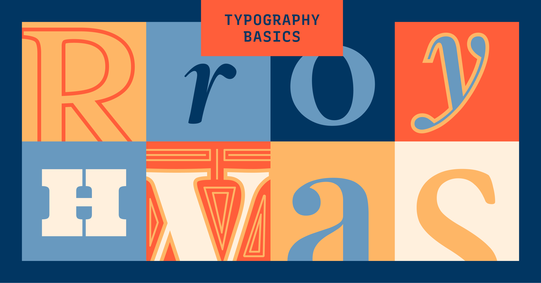
Serif Typeface
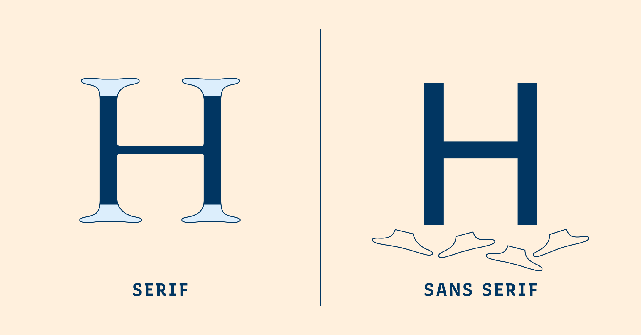
Serif typefaces are letterforms with small lines or strokes, or “serifs,” attached at the end of larger strokes. Serif typefaces originated from inscriptional lettering: Words were first painted with a brush, then carved into stones in Roman antiquity. Serifs are classified into several smaller categories: Old Style, Transitional, Modern, and Slab Serif.
Old Style Serif
Old Styles serifs have minimal contrasts between the width of thick and thin strokes. They also have a left inclining curve axis –– if we trace the thinnest parts of the strokes in letters, we can draw a left-leaning diagonal axis. An example of Old Style serif is EB Garamond.


Transitional Serif
Transitional serif's origin can be traced back to John Baskerville, who developed this style in the mid-18th Century. Stylewise, Transitional serifs are in between Old Style and Modern serifs. In Transitional serifs, the contrast between thick and thin strokes is more pronounced. Sometimes you will see ball terminals and vertical stress. The capital letter R can have a curved tail. An example of Transitional serif is Times New Roman, which is the default font for many applications.


Modern Serif
The Modern style, also called Didone, emerged in the late 18th Century. One of the most recognizable serif types, the Modern serif is a stark difference from the Old Style with its large contrast strokes and vertical stress axes. A favorite for magazines and editorials, Modern Serifs are considered elegant and graceful; However, many can render poorly in small sizes and low-resolution displays due to their high contrast appearances. An example of Modern Serif is Playfair Display, a popular display font.


Slab Serif
In the early 19th Century, slab serifs made their way to adverting posters and headers for magazines, grabbing attention with their thick, block-like serifs. A large and diverse genre, slab serifs can look vastly different from each other. Some can have a more geometric design with minimal stroke-width variation, while others have significant stroke contrasts. An example of slab serif is Zilla Slab, used in Mozilla's branding.

