Design to Please

Saying that I am a type nerd also slips the information away that I am a design minimalist - I like simple, black and white, typography-centric design. I hesitate to incorporate photography into my work. I prefer Adobe Illustrator over Photoshop.
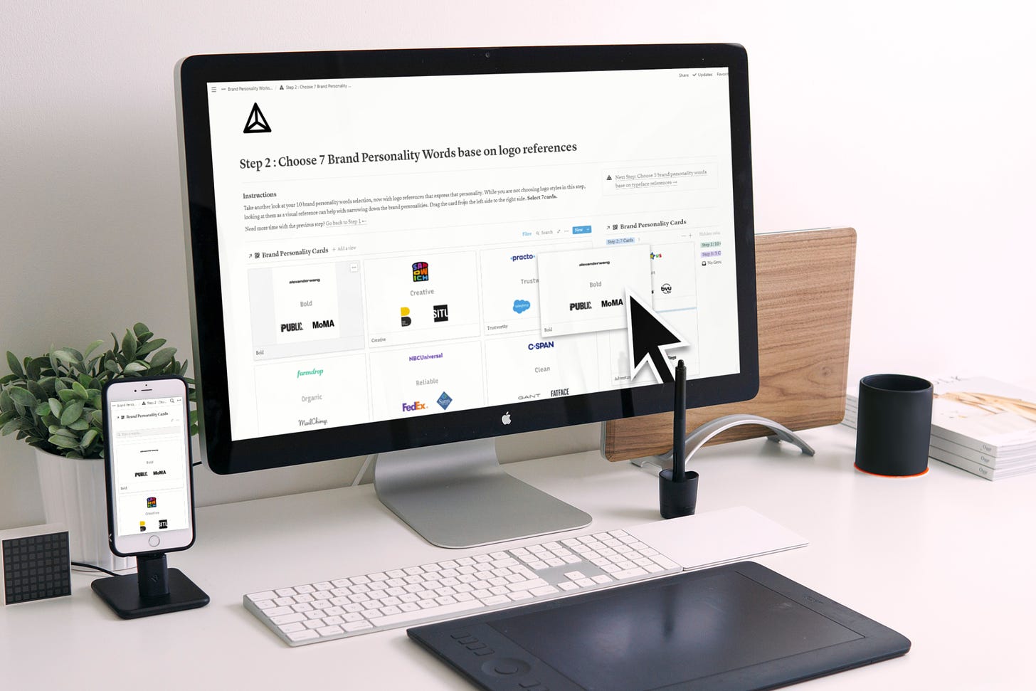
Today, merely day #8 into my startup life, all of that have changed! I spent a whole day designing this:

and this:

These are the images for the Brand Personality Workshop Kit sales page. When I kicked off today’s work, I started by looking at marketing design examples. A few trends I noticed:
Colorful, highly saturated colors
Incorporate photography or 3D objects
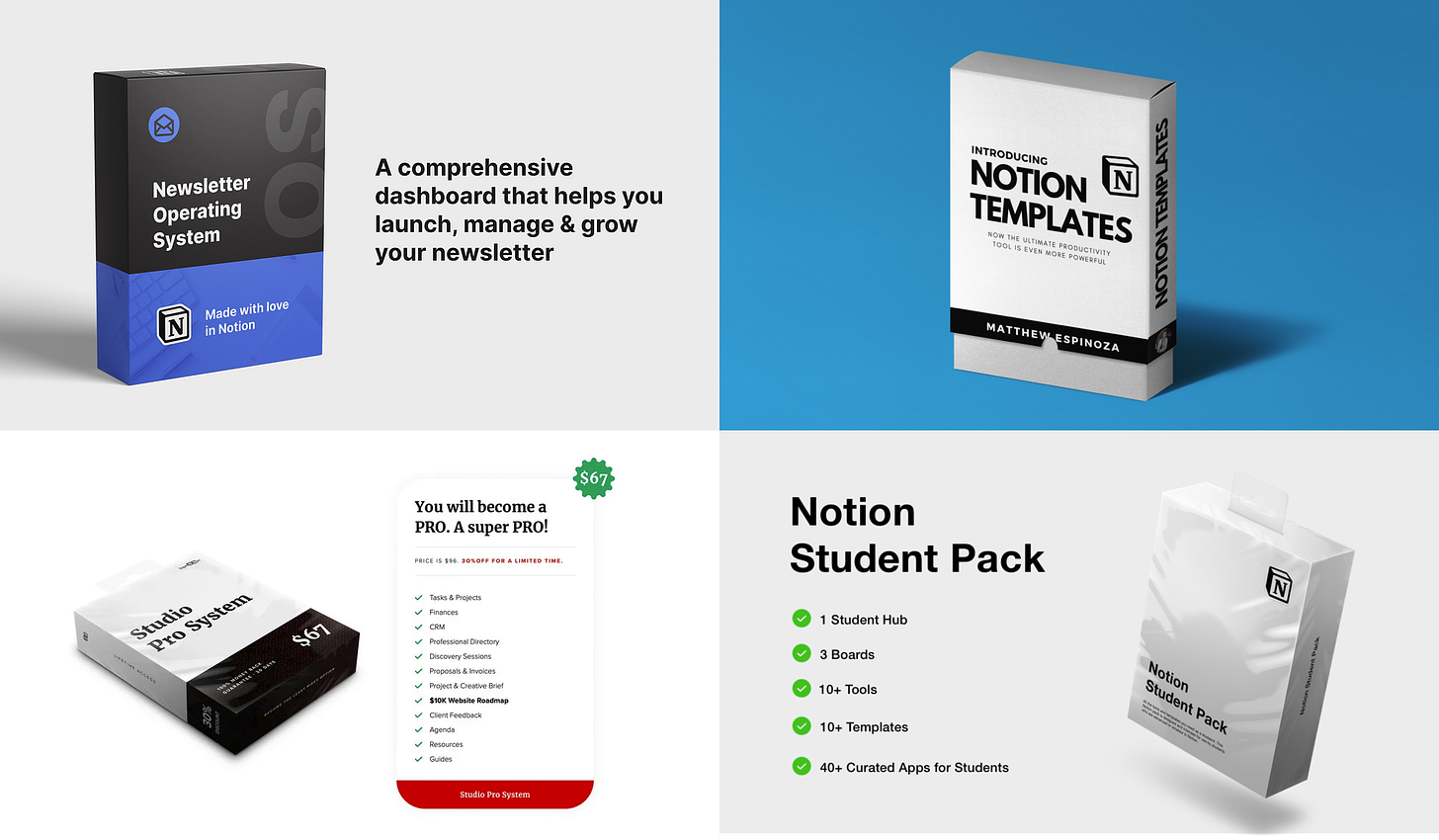
In other words, I discovered that a prettified version of a real-life scene is more marketable than a pure 2D digital style. That made sense! In a digital product marketplace, everything is digital inherently; digital style doesn’t draw attention anymore. I see a lot of people are calling back the old-school “software in a box” to their digital product marketing, for example:

I teach design at the School of Visual Arts in New York. In one of my classes, I tell students always to be aware of trends, to serve two purposes:
avoid the trend when needed
follow the trend when needed
Today is one of the situations that I have decided to follow the trend. I am designing to please the eyes of site visitors. No, there is no shame in that! Design is to solve a problem. Today the problem is how do I grab people’s attention in a busy marketplace, so they would stop and look at what I am offering. The solution I found is “Design to Please.”
Designers should develop their styles, and I do have a style preference, shown in the work I linked in the first paragraph. But it doesn’t hurt to do something else when the problem needs me to. It was an enjoyable break from the style I am familiar with.
Yesterday, I got some great tips and advice! Thank you! Let me know what you think of the graphics I designed by replying to the email. Is there any way I can improve them before launching the product page? Is it clear that I am selling a brand personality workshop kit in the form of printable PDF and Notion templates?
