A Day in the Life of a Growth Hacker

Marketing on Twitter, IndieHackers, and HackerNews helped a little, but it also brought down my productivity; hence yesterday’s newsletter subject “Fighting Unproductivities.” I need to brainstorm new strategies to growth-hack. I started by listing my unique advantages and disadvantages.
Disadvantage
Low Twitter engagement
I have 3,700 followers, accumulated over five years via passion projects – I launched each project with a link to my Twitter profile. However, I rarely tweeted; my tweet count is lower than some accounts with three months of history. I failed to create engaging tweets to keep followers interested. Now I have suddenly become actively promoting my content on Twitter, but the engagement is low.
Idea: I should not growth-hack on Twitter. Instead, I should create original non-self-promo tweets to get back on track first.
Advantage
I own a few popular sites
One thing I did right over the years was passion projects. I have a few project sites with consistent visitor streams.
Idea: maybe some of the visitors could be interested in my recent work? I can add a modal to these sites that lead visitors to my latest work.
I took a look at google analytics to see which site is the most popular. The most popular sites that I own are:
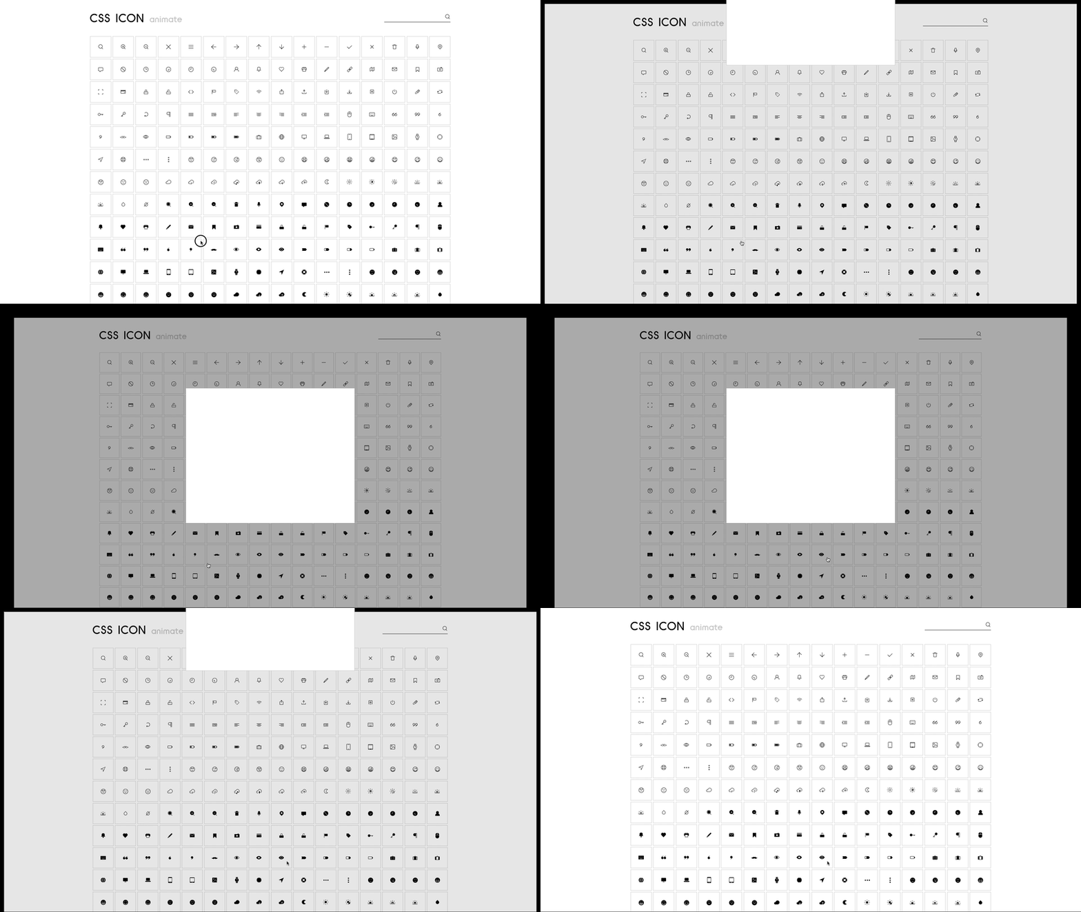
I started to design the modal pop-up interaction. My favorite place to get inspiration for interactive animation is Codrops. This is what I ended up with after experimenting with a few different options:

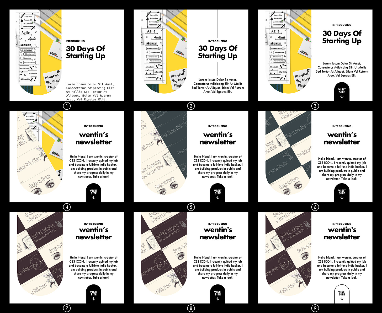
Now I need to design an eye-catching, convincing modal layout with a call to action. I want it to have a non-standard look so that people won’t mistake it as an ads at first glance. I went through a series of small changes until I settle at last:

The three iterations in the last row don’t look very different, do they? What I changed between 7 and 8 was the font for the apostrophe. I like the more traditional look and think it is more fitting for the rest of the letters:

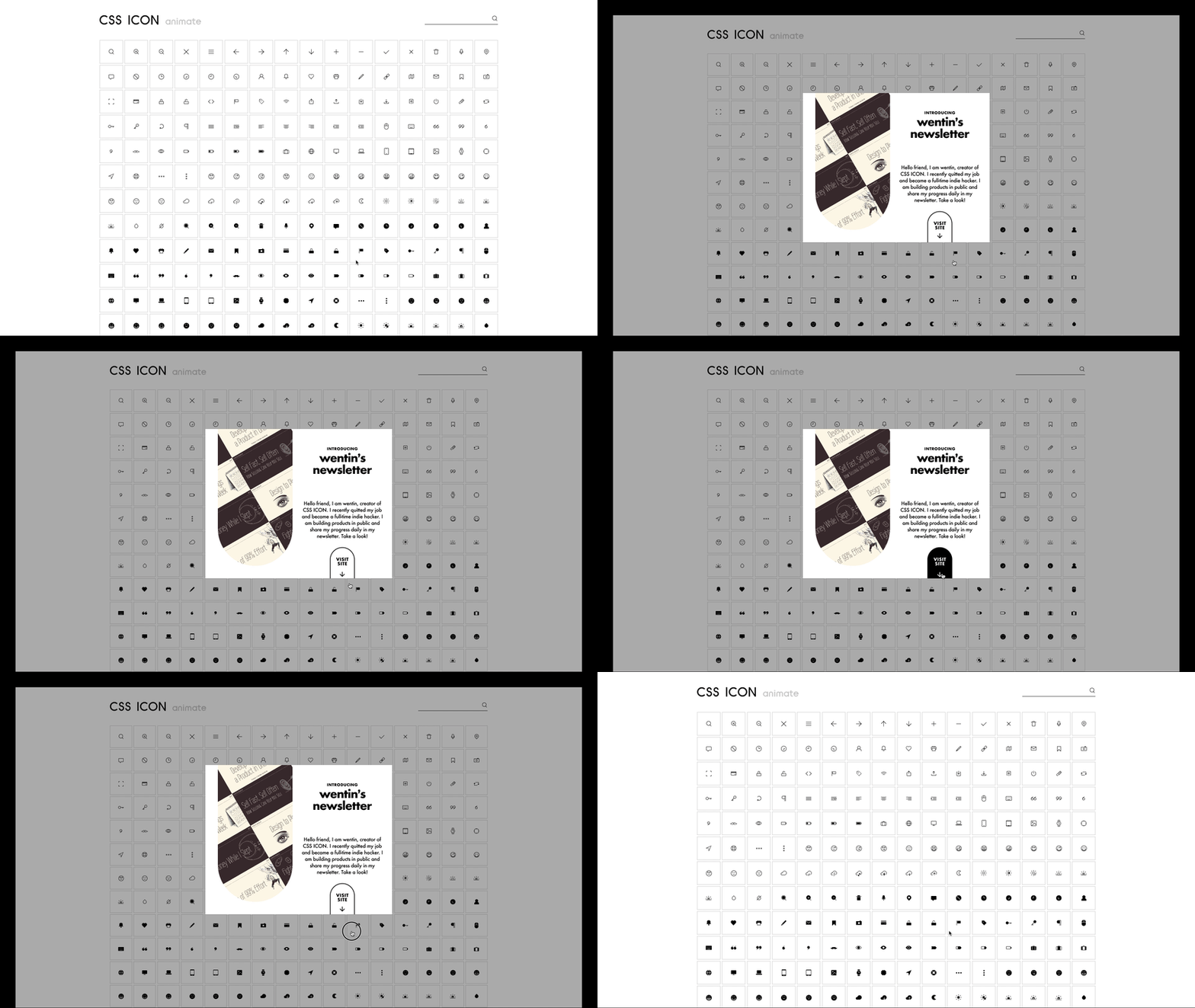
Combine the modal interaction with the layout design; this is what I ended today’s work with:

Tomorrow I will code this up and make it modular so that I can customize the font and color schemes to fit different sites that I own. Stay tuned for my progress reports on the coding part!
