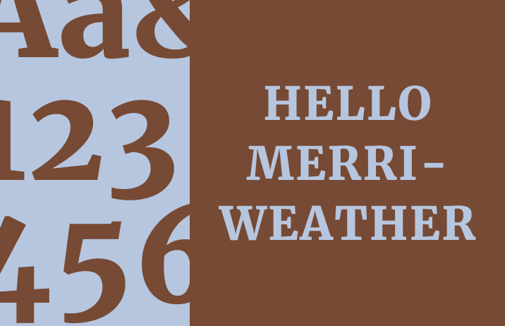
How to Use Merriweather: A Fantastic Text Font For Blogs

In This Issue…
- Font of the Week: Merriweather
- What’s New in Branding: Zooplus
Font of the Week
Inspiration Behind Merriweather
Merriweather is a serif font created for on-screen reading. It is characterized by its slightly condensed letterforms and strong presence, offering both traditional style and modern legibility. With its condensed letterforms and traditional serif style, it is ideal for long-form content such as books or articles. The font’s sturdy, classic appearance offers a perfect balance between elegance and readability for on-screen text.
Font Details
- Classic Serif: Merriweather’s serif design brings a sense of tradition and reliability to any text.
- Optimized for Screen: Despite its classic look, it’s optimized for digital reading, making it perfect for web and e-book content.
- Readable at Small Sizes: Its slightly condensed letterforms and high x-height make it highly legible even at small sizes.
How to Use Merriweather for Logo
Merriweather is a serif font that evokes tradition, reliability, and sophistication. It’s perfect for logos of heritage brands, publications, or any company that wants to convey a classic and trustworthy image. Its readability makes it suitable for both bold and refined logo designs.
How to Use Merriweather for Branding & Marketing
Merriweather’s classic and reliable style is great for branding that emphasizes heritage and trust. It works well for financial services, law firms, and traditional industries. Use it in print ads, corporate materials, and editorial content where a timeless and credible look is essential.
Merriweather Font Pairings:
- Merriweather + Raleway
- Merriweather + Open Sans
- Merriweather + Montserrat
Brand Identity Example of the Week
Zooplus
Zooplus is a leading online retailer specializing in pet supplies across Europe.Zooplus' old design featured a more conventional pet-focused identity, with straightforward branding elements. The new design introduces playful touches, such as a refreshed logo with distinctive “eyes,” while keeping the familiar green color palette This updated look emphasizes fun and personalization.
