Reviewing Monoton: A Graphic Display Font That Demands Attention
In This Issue…
How to Use Monoton for Logo and Branding

Font of the Week
About Monoton
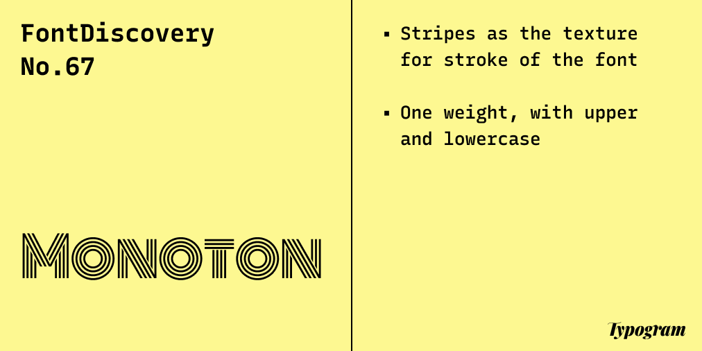
Monoton first captured my attention with its fantastic, highly geometric shapes. It is the perfect font to use for a funky logo or marketing. The look and letter construction of Monoton is influenced by Prisma, an earlier font created in the 1930s, inspired by the unique stripe neon letter found at night across Germany. This font creates a funky and retro vibe.

Font Detail
- Stripes as the texture for strokes of the font
- One weight (usually a similar display font can lack lower case, but Monoton has an entire upper and lowercases).

How to use Monoton for logo?
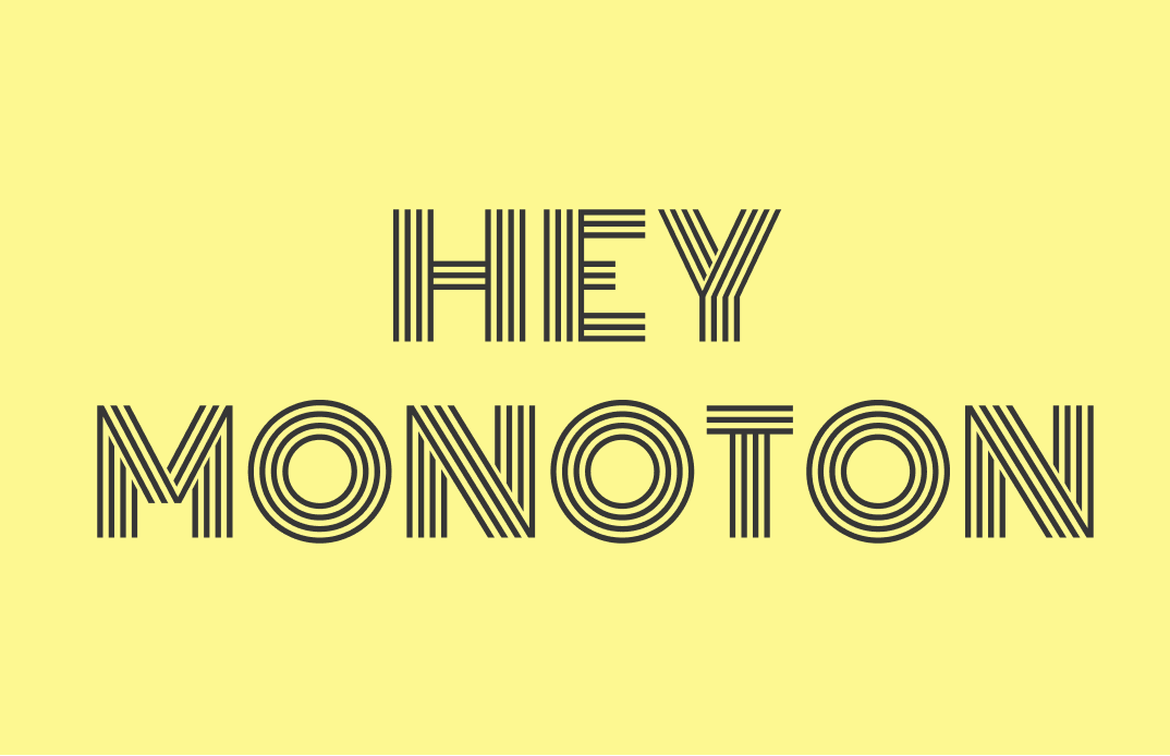
Though a highly graphic display font, Monoton is pretty readable in small sizes. It is great for logos and graphics. It can be great for projects about something retro.
How to use Monoton for Marketing and Branding?
Monoton is an excellent visual font for posters, swags, patterns, and packaging. It performs visual trickeries - our eyes are automatically drawn to them due to the optical illusions. With that said, it is not a good font for small text and paragraphs.
Design Idea of the Week
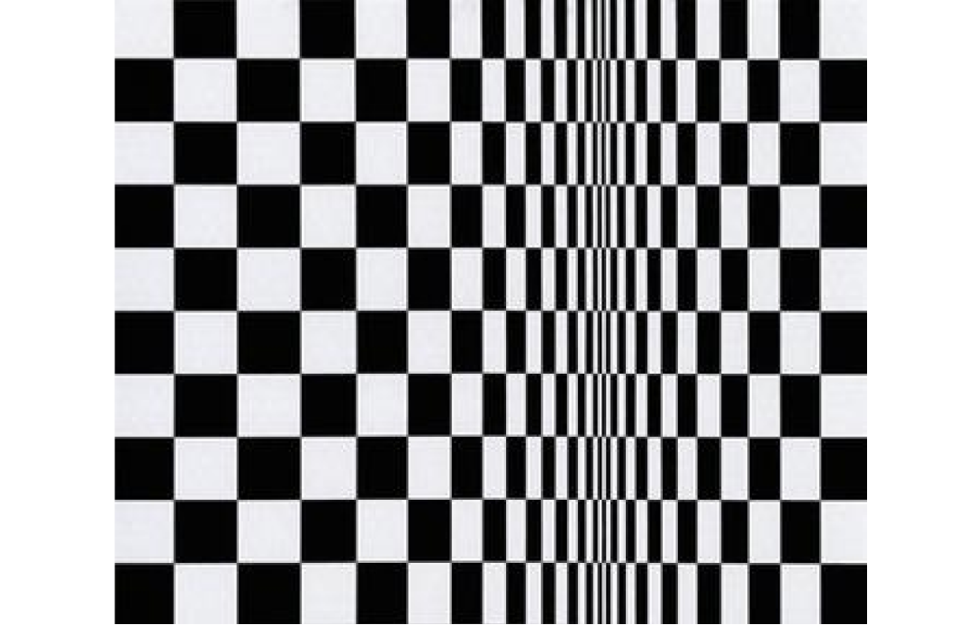
Opt Art
Opt Art, or Optical Art is a visual art moment that uses optical illusions. Many well-known Opt Art paintings are black and white, giving viewers optical illusions of moments. Using inspirations from Opt art can be a great start to making exciting visuals.
Color Inspiration of the Week
Quiet Country
This week, enjoy this simple, muted color palette of a quiet town.
Cool Gray #7F90A2 | Mocha #9C8871 | Beige #E4CDB0 |Lemon #FDF891
Typography Jargon Buster
Word Spacing
Adjustment of space between words.

Creative Prompt
Create something with Monoton!
Thank you
…for reading and hanging out here this week! Monoton is available here.