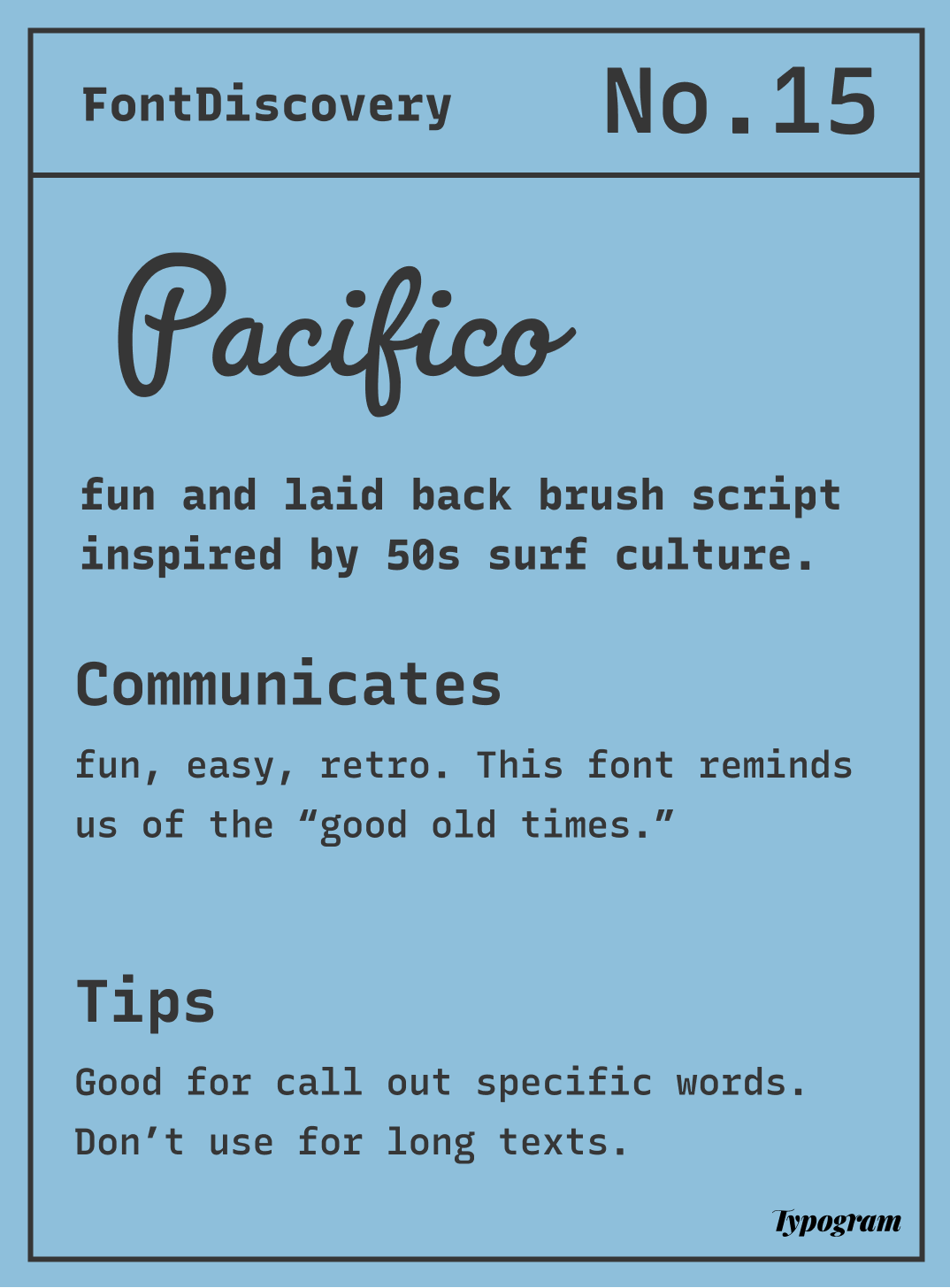
How to Use Pacifico: a Casual Script Font Looking Retro and Relaxed
In This Issue…
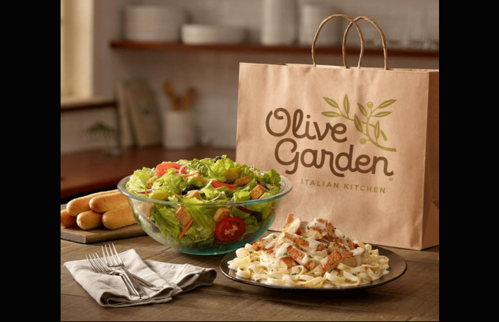
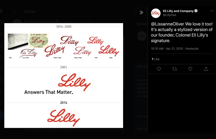
How to Use Pacifico for Logo and Branding

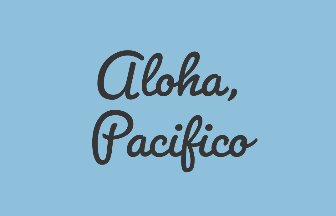
Aloha, Pacifico!
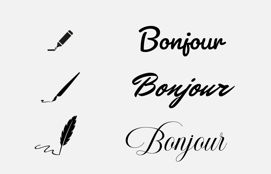
The way our writings look is affected by the tool we use. Script lettering is an excellent example of this. The voice of a script font is very dependent on its writing instruments. For instance, a script written with a fountain pen appears formal, while a script written with a marker, ball-point pen, or brush appears casual.
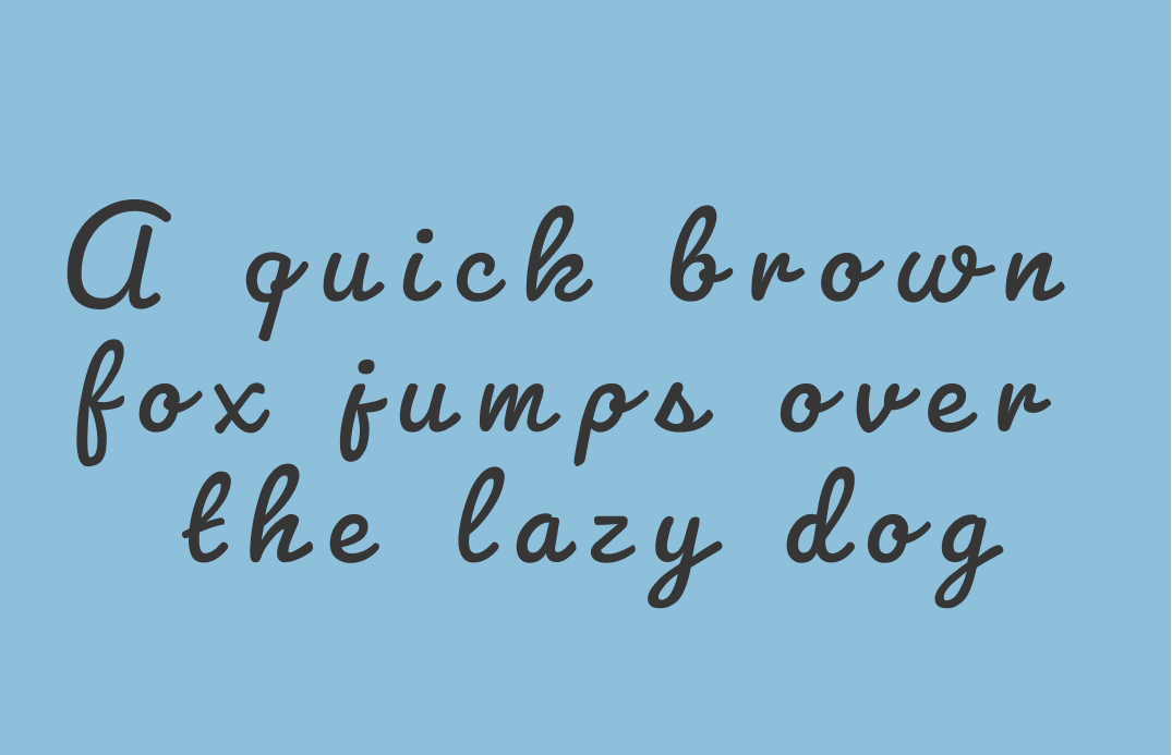
Scripts like Pacifico fall in the latter category and have enjoyed a rise in popularity in recent years. Pacifico was very popular in the 2010s and was updated in 2016 to include light and bold weights thanks to its popularity. It is a casual and fun brush script that takes inspiration from 1950s American surf culture. The roundness in the strokes makes this script popular among brands that want to appear laidback and fun. We feel at ease when we look at something that feels personalized, welcoming, and effortless. Pacifico also brings a sense of retro due to its inspiration from an earlier time.
Font Details
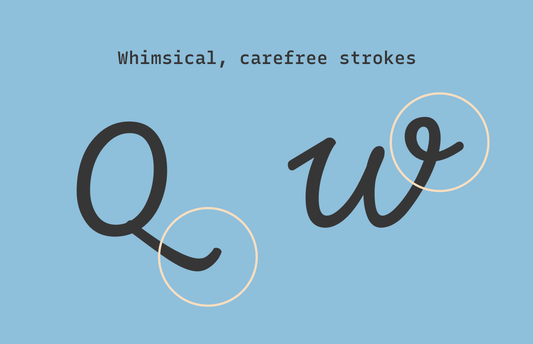
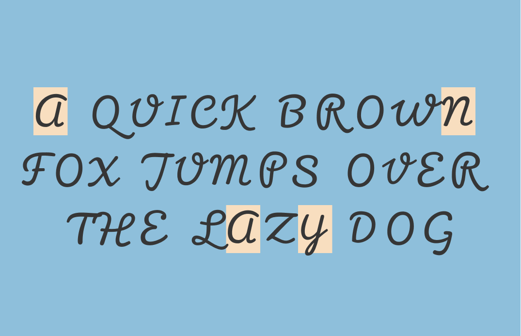
It's all about casualness. Pacifico has several uppercase letters drawn in lowercase form, to appear extra laidback. The round and exaggerated stroke also make us feel at ease.
How should I use Pacifico for branding?
This font communicates fun, easy, and retro. If your brand is looking to communicate these values to your audience, Pacifico could work for you. The light and regular are the most refreshing of the weights and can be great for logos. The bold is very thick and more suitable for statement-making items, like social media posts or packaging.

How should I use Pacifico for Marketing?
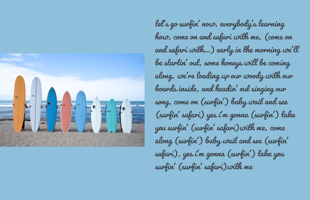
Pacifico is fantastic for big display text. It has a lot of character, so try using it sparingly. A good use case is when you have a few words you want to highlight on a marketing graphic. It is not best for longer pieces of text since it can be tough to read.
Quick Overview
Font Details
- Some uppercase letters are drawn in lowercase forms, like ‘a’ for ‘A’
- Brushstrokes in uppercase letters are drawn to show a relaxed look
Logo & Branding
- Perfect for brands that want to look laid back with a bit of retro
- Good for making statement
Typography System
(marketing, presentation, and website)
- Use sparingly
- Do not use on long pieces of text
- Best pair with a simple sans serif, like Roboto, Helvetica Neue
Cautiously Avoid
Avoid adding letter space between letters to completely “disconnect” a script.
Creative Prompt
Try designing a Throwback Thursday post with Pacifico font on Twitter or Instagram!
Phew, you made it
Pacifico is available here and here
* You can use this font for free on adobe by making a free account (without buying a creative cloud membership).