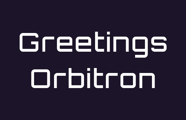
How to Use Orbitron: A Retro Futuristic Looking Font Perfect for Tech and Sci-fi
In This Issue…
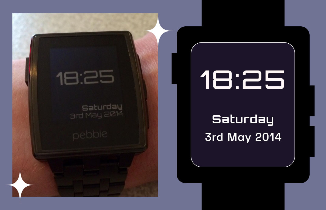
How to Use Orbitron for Logo and Branding
In this issue
- Font of the Week: Orbitron
- Design idea: Size, Content, and Engagement
- Color Inspiration: Osaka World Fair, 1970
Font of the Week
A New Style for Sci-Fi
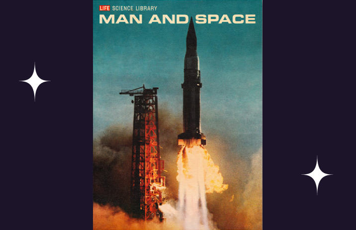
In the 1960s, fonts with square shapes, like Eurostile (below), dominated covers of science fictions. Fonts like these blew up. Its square shape reminded the audience of television screens. It was perfect for illustrating content about technology.
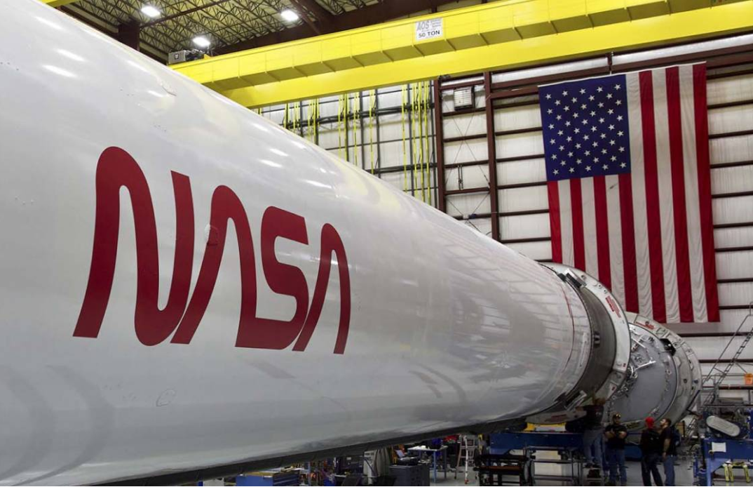
Since then, these square-shaped geometric sans serifs have been associated with technology and strength. Modern technology companies use these square fonts, like NASA, Tesla, Space X, and Subaru.
About Orbitron
Orbitron is a geometric sans serif modeled after these moments. It has post-apocalyptic inspirations with potential usage like spaceship exteriors, space station signages if humans were ever to escape Earth. Comparing to Millimetre, which we covered previously, the square characteristic of Orbitron is more prominent. It evokes a sense of strength and power. Orbitron is perfect for branding for tech companies.

Font Details
Minimum stroke contrast, along with the square shapes help Orbitron communicate strength and power. It has four weights and no italic styles.
Counters are the negative space in a letter. It comes in two ways: closed or open. Closed counters are completely closed negative spaces (like inside O), whereas open counters are open negative spaces (like C). Orbitron has rectangular closed counters. and large open counters.


How to use Orbitron for logo
- Square Communicates futuristic, techy, strength
- Bold is perfect for logo
- Tech brands love to use fonts like Orbitron
How to use Orbitron for marketing
- Black bold weights, in addition to style alternates, are perfect for marketing graphics
- Not suitable for body copy, the square shape jumps out at paragraphs

Design& Marketing Idea of the Week
Size, Content, and Engagement
Digital marketing materials come in different sizes. Wrong size graphics get less engagement because people cannot access the information properly. This also goes for videos. Content that fills up the entire available space is better optimized for engagement. For example, some platforms (like Tiktok) are better suited for vertical videos.
Once you have figured the size, you should put the important information in the center or a highly visible area so that your audience can easily digest it.

Color Inspirations of the Week
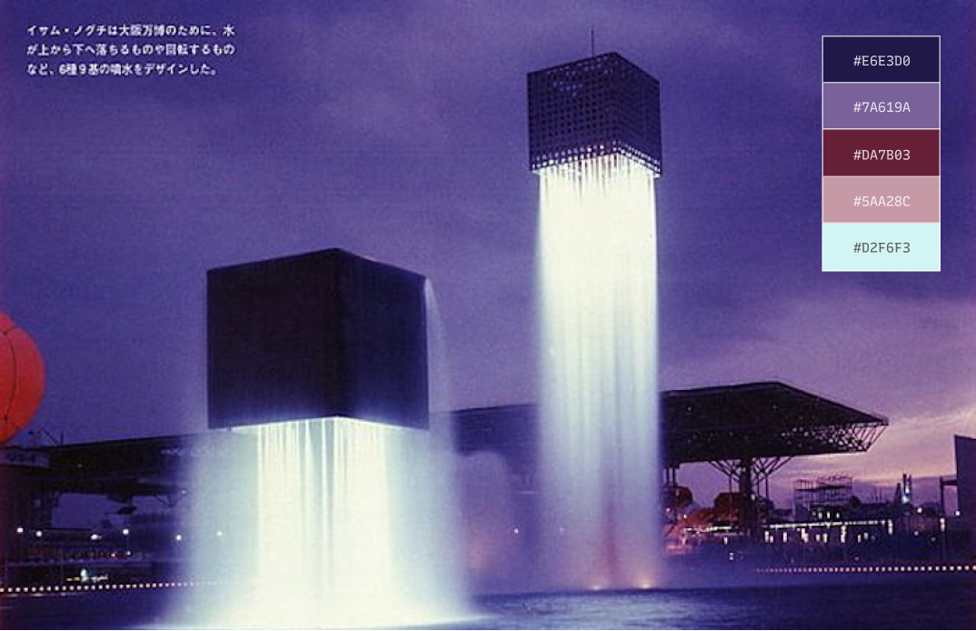
Osaka World Fair, 1970
Futurism is an art movement that originated in Italy in the early 20th Century. It emphasized speed, technology, and objects that symbolized these ideals, such as cars, airplanes, and industrial cities. When the World Trade Fair happened in Osaka, Japan in 1970 with the theme “Progress and Harmony for Mankind,” it went crazy with this futurism aesthetics and sci-fi inspirations.
Jargon Buster!
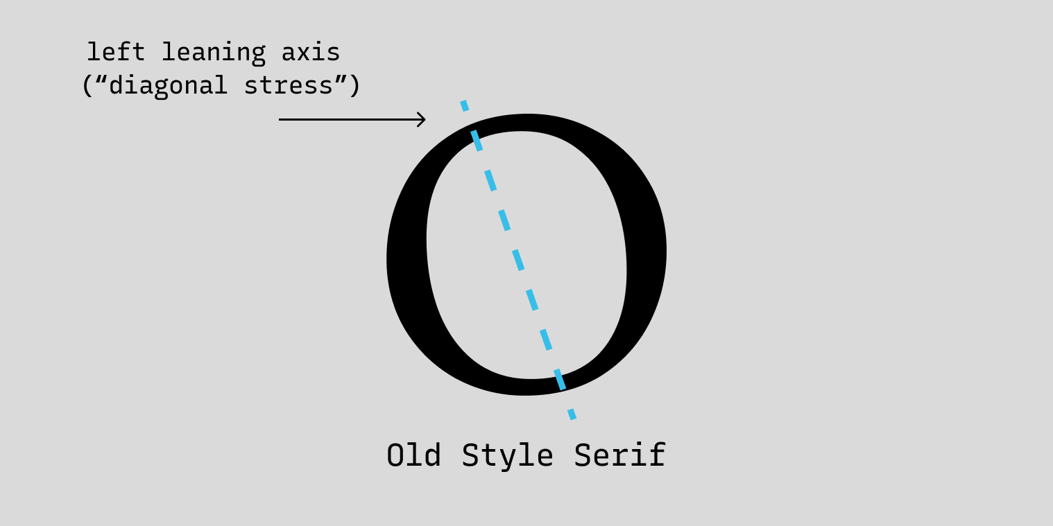
Old Style Serif
late 15th century, ~1465
Old Style is the earliest serif style. Old Style serifs usually have a left-leaning curve axis with very little contrast between the thick and thin strokes.
Creative Prompt
What’s your crazy tech invention? Create a simple diagram explaining how it works.
Thank you!
Thanks for being here for another week. Orbitron is available here.
