Reviewing Ultra: A Bold Slab Serif Font to Stand Out From the Crowd

In this issue...
How to Use Six Caps for Logo and Branding

Big Bold Font: Ultra
Upon the first look, you would suspect Ultra to be a serif. And you would be kind of right!Ultra is a specific kind of serif, called slab serif. A slab serif has thick, block-like serifs. Initially, printers used woodblock printing process to create slab serifs.


When advertising started booming in the early nineteenth century in the US, slab serifs became popular because they caught customers’ attention with their strong appearances. Nowadays, you can find them in various settings like lifestyle magazines and food branding.


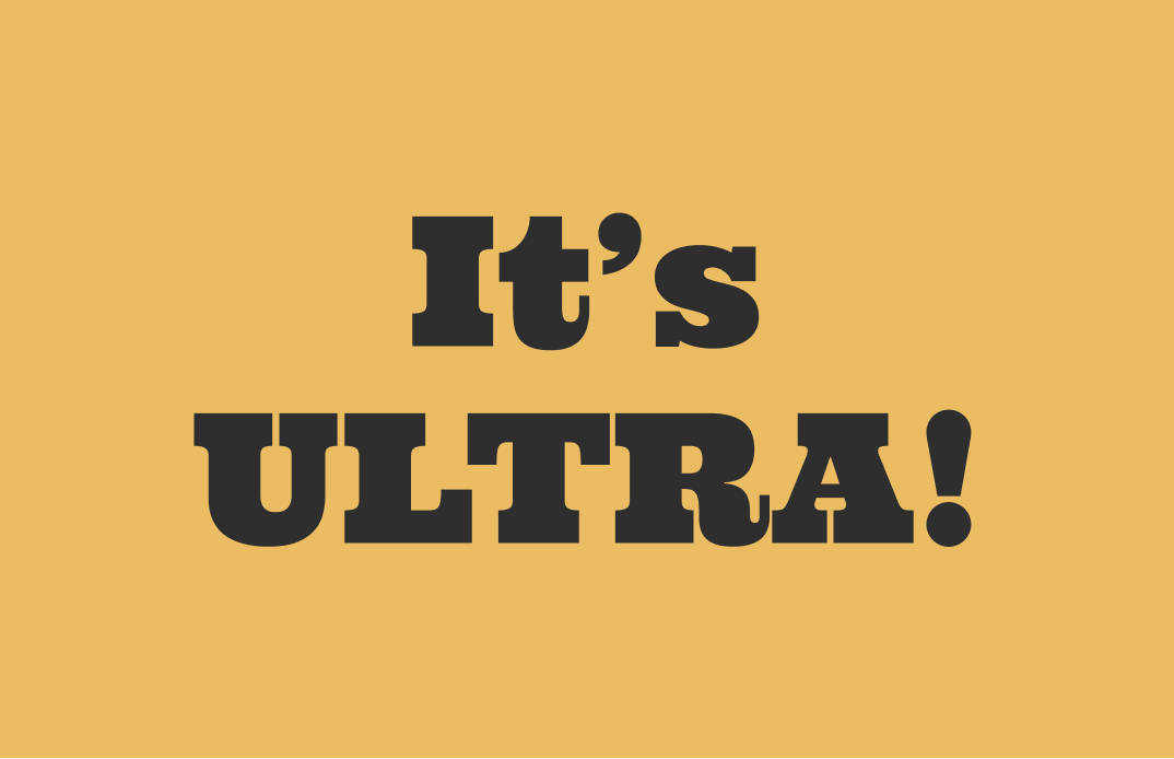
There is no doubt that Ultra is a close cousin of the newspaper slab serifs you see above. However, if we look at the curved tail in the lowercase “a” and ball terminals in lowercase “y”, we can conclude that Ultra is perkier and friendlier than most slab serifs.
It’s perfect for a children’s book, a call-out quote in a fashion magazine, or a new kind of grocery store. If you are creating a friendly brand in the editorial space, give Ultra a try!

How to use Ultra for Logo and Branding?
Logo
The ball terminals make the font very organic, almost like it’s bearing fruits. Great for friendly brands.
Typography System
This font is attention-grabbing, great for marketing and social media. It is most optimal in large sizes.
Cautiously Avoid
Avoid using body text or anything small.

You Made it!
That’s all folks. Ultra is available here.


