Reviewing Saintjean: An Ampersand Only, Decorative Icon Font for Marketing Graphics

In This Issue…
How to Use Saintjean for Logo, Branding & More
- Fonts: Saintjean, a font with only ampersands and lots of them!
- Design idea: The Object Poster
- Color Inspiration: The Colors of Legos

Font of the Week
All About Ampersands
This week, we focus on micro-scale things by tackling a single character: ampersand. What I am about to tell you next might make a good story for your next dinner party.
The ampersand symbol had been spotted first as anonymous graffiti in the ancient ruins of Pompeii. While the exact date of the sighting is unknown, we know the symbol’s appearance was a ligature, a character created from two or more letters joined together. In this case, it was “e” and “t” from the Latin word, “et”, meaning “and.” The appearance of “&” has not changed much since then.

Why are we talking about this?
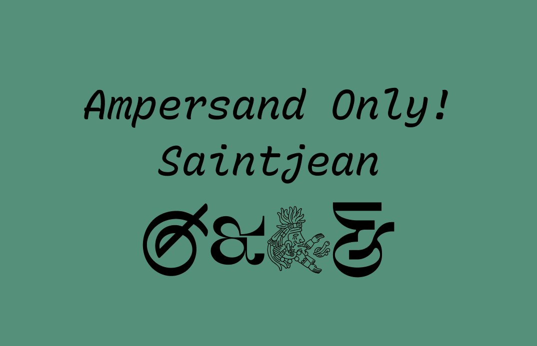
Today’s font, Saintjean, is unique because it is a font with only ampersands and, lots of them. It contains no other letters or characters.
That’s right. Any letters you press on your keyboard, you will get a different ampersand. Each ampersand is in a different style, so you can easily find one that matches the specific style you are looking for.


Why do I need Saintjean?
Creative hacks. Saintjean gives you more options when it comes to using ampersand. If you create a landing page or a logo with an ampersand, using a decorative, eye-catching ampersand can be a good tactic to get more attention. Also, if the ampersand in your current font is not to your liking, Saintjean is extremely handy. It offers you a fantastic little catalog of the ampersand to choose from. You can pick your unique toppings.
Here are some of my favorites from this collection. I also paired them with specific fonts to give you an idea of what you can do with them.


This one I especially love (lowercase h ampersand). It’s a little illustration of an ampersand king giving away an ampersand, paired with the font Nunito.
Font Details
- Features over 250 functional and decorative ampersands.
- Each ampersand is unique and accessible by typing different letters.
How can I use Saintjean for Logos?
Each ampersand is fun and communicates something different. Some are more illustrative and fun, some are more calligraphic and warm, and some are more suited for editorial. If you are choosing ampersands for your logo, you can either pick one that completely blends in or stands out. To blend in, you might want to choose a “&” that matches the thickness and contrast of your logo font so that things look balanced and consistent.

How can I use Saintjean for Branding and Marketing?
In a visual like social posts, playing with the scale of the ampersand can create the graphic punch. It adds extra flairs that attract attention to your message. Lastly, if you choose an illustrative ampersand, make sure it works on a smaller scale.

Design Idea of the Week
The Object Poster
Do you need a simple trick that makes any visual look good? The object poster might be it. Sachplakat, or the object poster, was an idea that originated from Germany and became super popular in the design and advertising world in the early 20th Century. This type of poster, often featuring one central subject, uses scale to create drama, tension, and emphasis. The subject can be placed diagonally in the center, to keep the graphic interesting, help guide the viewer's eyes across the graphic.
Can your next marketing piece incorporate this idea?

Color Inspiration of the Week
The Colors of Legos
Continuing the theme of micro, we look at lego bricks this week. In this handy guide, the color palette of lego’s brick collection is organized based on rarity. If you love data and want to learn more about the specifics of lego colors, check out this fabulous article about the colors of lego bricks.

Creative Prompt
Can you create a visual for Twitter or Instagram using Saintjean, poster object technique, or the color palette we featured today?
Thank you
…for reading and hanging out here this week! Saintjean is available here.

