10 Inspiring Fonts for Graphic Design: Typography Design Ideas for Designers
Fonts aren’t just tools for setting words on a page — they’re personalities, moods, and tiny pieces of design history. In graphic design, typography design is what gives projects their voice, whether it’s clean and modern or bold and nostalgic. Some fonts slip quietly into the background, shaping the identity of brands and websites we see every day, while others shout with character, dripping with vintage charm or experimental flair. In this roundup, we’re spotlighting a range of typefaces that designers love — from the quiet confidence of Proxima Nova to the neon glow of 1970s Glowworm. Whether you’re chasing versatility, retro appeal, or full-on drama, these fonts prove there’s always a new way to let your words speak.
№ 1. Mastro Sans: A Humanist Sans for Modern Graphic Design
Mastro Sans, designed by &discover, is a contemporary humanist sans serif that balances personality with versatility. Its lowercase forms are simple yet distinct, while the italics feature an organic rhythm rooted in varied stroke modulation ideas. The uppercase draws from Roman capital proportions but maintains the lowercase’s modulation, creating a cohesive system across all 16 styles (plus italics). With extensive language support and a wide range of OpenType features — from small caps and superscripts to fractions, tabular figures, and case-sensitive forms — Mastro Sans is both expressive and functional. Ideal for branding, editorial, web, and motion design, it offers warmth, clarity, and flexibility for modern typography needs.
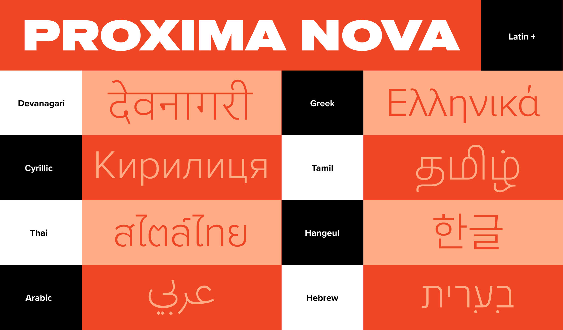
№ 2. Proxima Nova: The Typeface That Redefined Typography Design on the Web
Proxima Nova, designed by Mark Simonson and released in 2005, has become one of the most widely used typefaces on the web, often described as the font that quietly replaced Helvetica. Its origins trace back to Simonson’s early sketches in the 1980s, evolving through iterations like Zanzibar, Visigothic, and Proxima Sans before reaching its definitive form as Proxima Nova. Blending influences from classics like Helvetica, Futura, and Akzidenz Grotesk, the typeface balances geometric precision with a warmer, more approachable humanist touch. With its extensive 48-style family, expanded character set, and refined on-screen performance, Proxima Nova offers both technical versatility and visual appeal. Its professional yet friendly tone has made it a favorite among designers and a staple in digital branding and web design worldwide.
№ 3. Aetna: Bold Americana for Designers Who Love Vintage Style
Aetna (also known as HWT Aetna), revived by Aaron Bell for the Hamilton Wood Type collection, is a contemporary take on the 19th-century Roman wood type style that defined bold American display typography. Available in four widths based on historic variations, it retains the weight and confidence of its origins while expanding functionality for modern design. What makes it especially distinctive is its four-layer, all-caps chromatic version, inspired by Wm. Page Chromatic Types, which allows designers to create vibrant streamer, shadow, and dimensional effects easily. Perfect for retro branding, posters, signage, and packaging, HWT Aetna combines the spirit of early Americana with the versatility of digital type.

№ 4. Glowworm: A 1970s Display Font with Retro Graphic Design Flair
Glowworm, first released by Mecanorma in 1975, with a Compressed version following around 1977, is a distinctive display typeface known for its bold, eye-catching, and soft, glowy, bubbly style. Sometimes spelled Glow Worm, Glow-worm, or GlowWorm, it embodies the experimental energy of 1970s typography. Designed to stand out in posters, logos, and advertising, Glowworm pairs vintage flair with graphic punch. A related style, Black Shadow Black, shares the same designer’s expressive approach, making Glowworm a unique choice for projects that call for retro character and visual impact.
№ 5. Aire: A Serif Typeface with Whimsy and Elegance for Typography Design
Aire, created by Sproviero, is a contemporary serif typeface that blends the refined elegance of Bodoni with a softer, more playful sensibility. With its crisp contrast, sculptural curves, and open shapes, Aire captures both sophistication and lightness, offering a whimsical charm that feels expressive yet timeless. Available in three weights with italics and a wide range of alternate glyphs, it gives designers the flexibility to craft dazzling editorial headlines, sparkling title sequences, or elegant packaging. Aire’s graceful balance of refinement and flourish makes it a true showstopper for display typography.
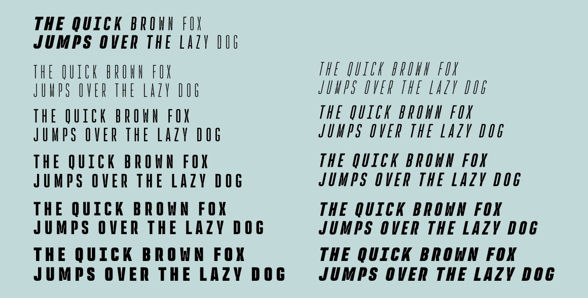
№ 6. Rocinante Titling: High-Impact Typography for Bold Designers
Rocinante Titling, created by XO Type, is a bold display sans that transforms functional details into striking design. With its compressed proportions, sharp ink traps, and sculptural rhythm, it commands attention while maintaining a refined, modern edge. Available in five weights, obliques, and a variable version, it adapts seamlessly to branding, editorial, and cinematic applications, especially in tight spaces where its condensed frame shines. Originally a practical fix for messy printing, the exaggerated ink traps here serve as a deliberate stylistic feature, adding energy, tension, and a distinctive graphic character. Rocinante Titling is typography built for impact — dramatic, versatile, and unforgettable.
№ 7. Lubaline: Art Deco Drama Reimagined for Contemporary Graphic Design
Lubaline, created by Sproviero, is a decorative all-caps typeface that channels the bold theatricality of Art Deco with a modern, maximalist twist. Designed by Maximiliano Sproviero as an homage to legendary typographer Herb Lubalin, it fuses semi-serifs, geometric forms, and extravagant swashes into a layered system built for impact. Available in Light, Regular, Shadow, and Shine styles, along with a rich set of ornate alternates and expressive ligatures, Lubaline gives designers the freedom to craft dazzling, high-impact typography. Perfect for book covers, editorial headlines, branding, and packaging, it’s confident, lavish, and unapologetically designed to steal the spotlight.
№ 8. Alexon: a Serif Classic with Authority and Clarity for Designers
Alexon, designed by Les Usherwood, is a refined serif typeface balancing clarity, authority, and elegance, making it a timeless choice for professional and editorial design. With crisp serifs, balanced proportions, and excellent readability across Light, Medium, Bold, and Small Caps styles, it brings polish and composure to everything from magazine mastheads to brand identities and academic publications. Its standout small caps add sophistication and harmony to titles, labels, and subheads, elevating all-caps settings with grace. Originally designed by Les Usherwood and later expanded by Steve Jackaman in 1992, Alexon traces its roots to Markus J. Low’s award-winning Basilea, carrying forward its modern sharpness while embodying a confident, enduring voice.
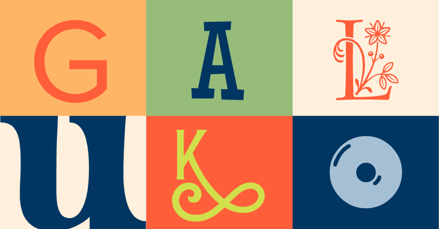
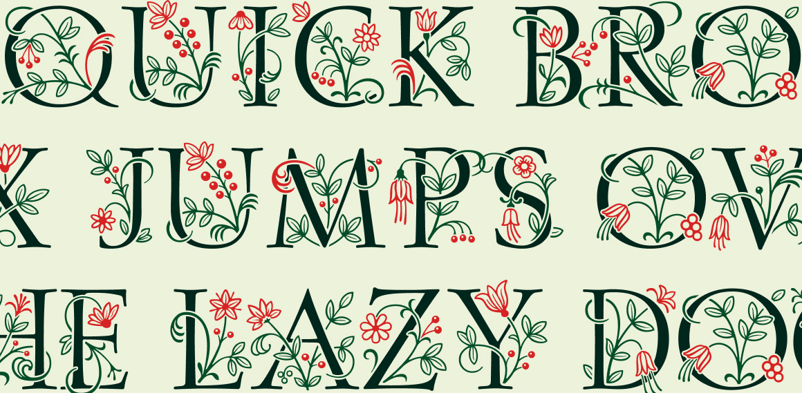
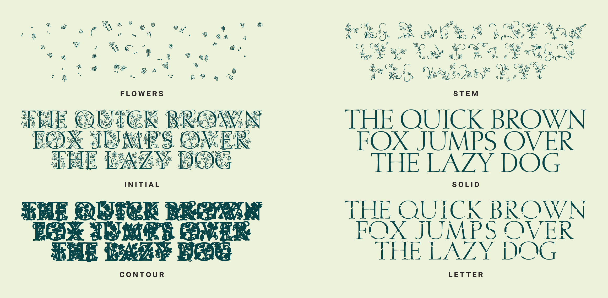
№ 9. Posies: Decorative Typography Design with Historical Charm
Posies (or P22 Posies; P22 foundry is the creator) is a decorative typeface inspired by the ornate initials of illuminated manuscripts, blending historical charm with a modern, customizable design system. Playful and poetic, it offers six styles — Flower, Stem, Initial, Solid, Contour, and Letter — that can be layered to create lush, multicolored drop caps or used individually for elegant simplicity. With four stackable layers and a ready-made Initial font, Posies adapts seamlessly to editorial openers, fairy-tale packaging, or wedding invitations. Its modular structure allows designers to isolate and edit individual illustrative elements, making precise vector adjustments or applying custom colors with ease. More than just a font, Posies is a vibrant toolkit that turns typography into art, offering refinement, magic, and expressive control.
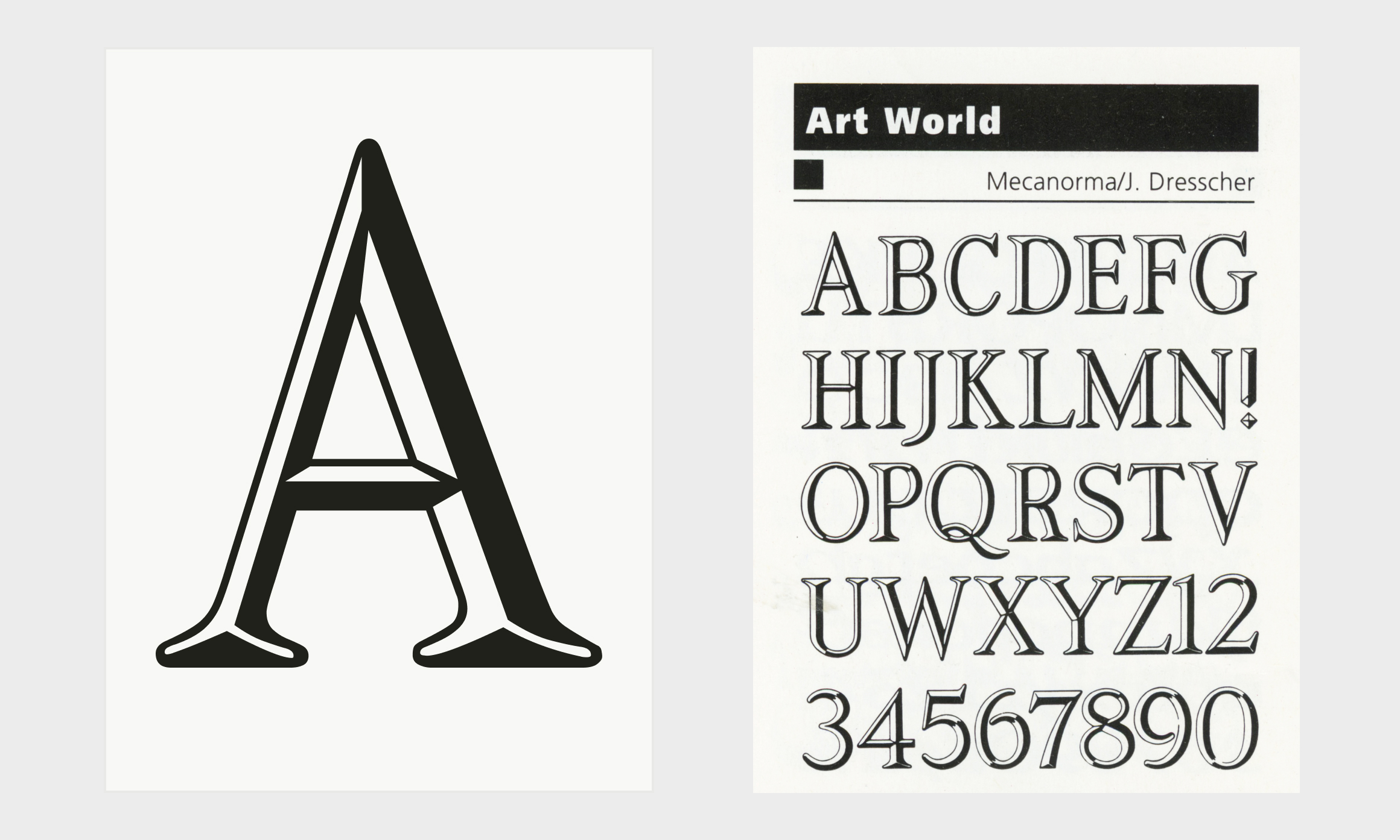
№ 10. Artworld: 1980s Nostalgia in a Modern Digital Typeface
Meet Artworld, a bold, nostalgic display typeface that captures the vibrant, expressive spirit of 1980s graphic design. Originally a rub-down lettering style, it has been digitally preserved for modern creators looking to channel vintage flair. Ideal for album covers, event posters, fashion branding, or projects that require a loud, confident headline, Artworld features sleek beveled edges and sculpted light-and-shadow effects that bring the nostalgia of a bygone design era into a fresh, modern context. A rare gem that blends vintage charm with versatility, it even allows designers to select and style individual shapes within each letter for added dimensionality. First released in 1984 by French company Mecanorma and later digitized by International TypeFounders in the early 2000s, Artworld continues the legacy of rub-down lettering while standing out as one of the collection’s most distinctive expressive display styles.
Typography is one of the most powerful tools in graphic design — it sets the mood, defines the voice, and shapes how a message is received. Whether it’s the timeless elegance of Alexon, the playful charm of Posies, or the bold energy of Rocinante Titling, each typeface shows how typography design can transform words into visual storytelling. For designers, the wide range of options today means there’s always a font that fits the project — from clean, versatile sans serifs to expressive display faces that steal the spotlight. Exploring these typefaces isn’t just about aesthetics; it’s about finding the right balance of clarity, personality, and impact to bring design ideas to life.