A Design History of Mother’s Day
Mother’s Day hasn’t just shaped how we celebrate moms—it’s also been a fascinating journey in visual culture. From heartfelt postcards to high-tech animations, Mother’s Day design has mirrored the way we communicate love, gratitude, and family values across generations.
In this article, we explore the evolution of graphic design for Mother’s Day, touching on everything from nostalgic color palettes to memorable ad campaigns. We'll dive into typography trends, fonts, and visual themes, with an international perspective. Whether you’re a brand designer, typographer, or just curious about visual storytelling, this deep dive offers inspiration for future Mother’s Day marketing.
1910s–1930s: The Origins of Mother’s Day Design
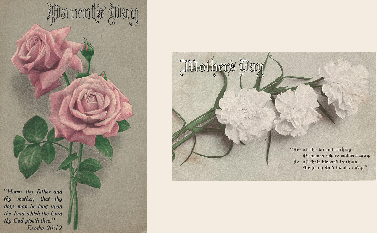
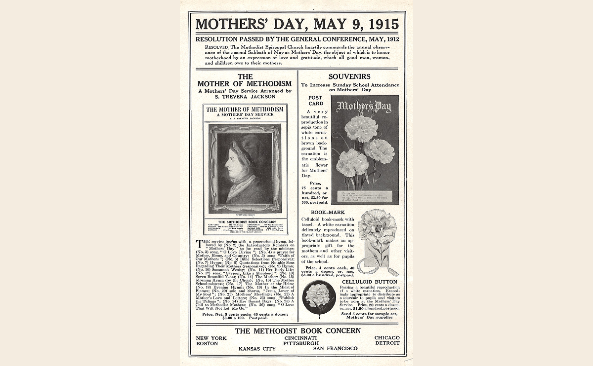
Anna Jarvis organized the first official Mother’s Day service in 1908. The visual language of the time was soft, sentimental, and deeply symbolic. Early Mother’s Day postcards often featured delicate carnations (Jarvis’s tribute to her own mother), soft pastels, and ornate calligraphy.
- Typography design for Mother’s Day leaned heavily on Victorian and blackletter scripts.
- Fonts for Mother’s Day in this era were typically hand-drawn serif types, evoking church bulletins or formal invitations.
- Color palettes for Mother’s Day focused on muted pastels—rose, lavender, and faded blues.

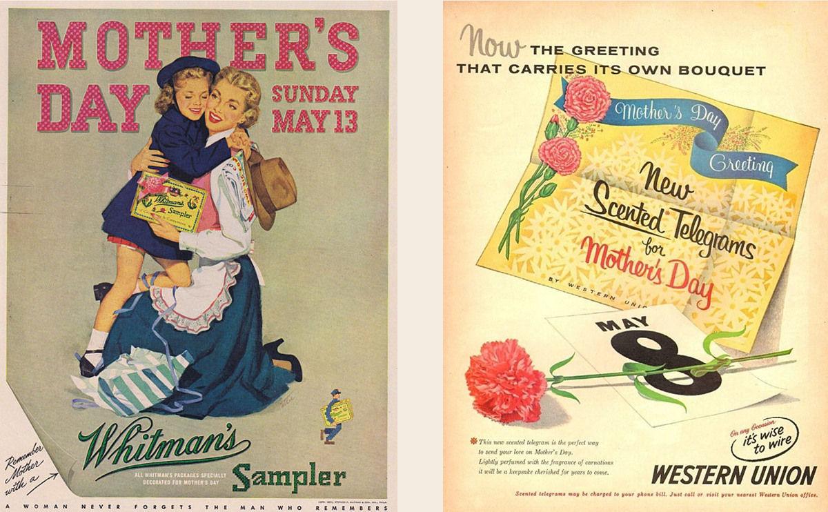
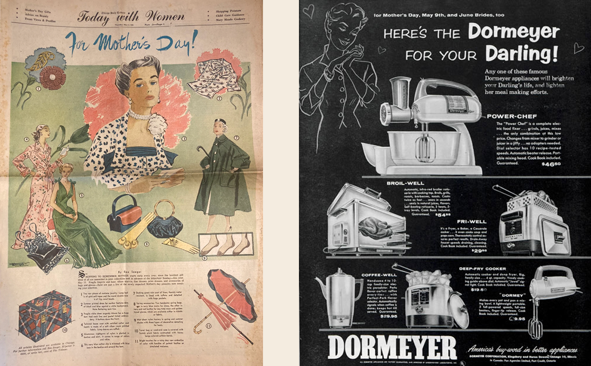
1940s–1950s: Print Advertising and Domestic Imagery
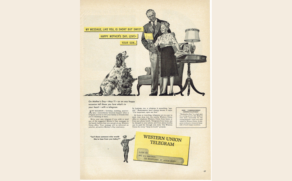
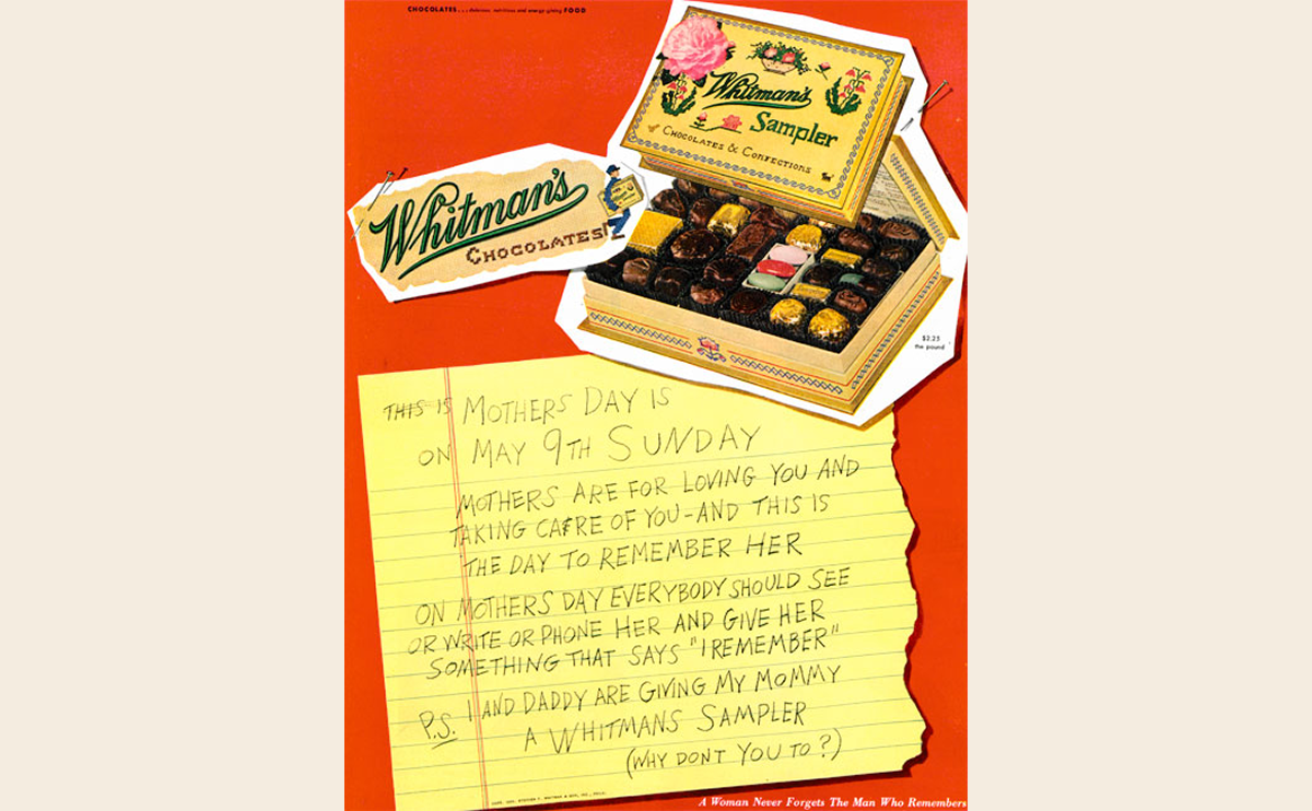
Post-WWII America saw a boom in consumer culture, and Mother’s Day marketing became mainstream. Greeting cards, chocolate ads, and telegram services used increasingly sophisticated design.
- Ads like Western Union's 1947 telegram campaign featured spot color layouts with serif headlines and idealized family imagery.
- Typography for Mother’s Day shifted toward more readable slab-serifs and early sans-serifs.
- Graphic design for Mother’s Day included charming family scenes, ribbon graphics, and hand-lettered greetings.
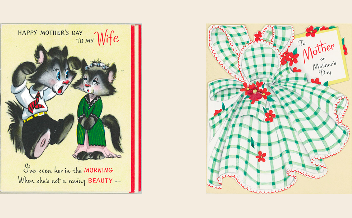
1960s–1970s: Changing Roles, Changing Design
As social roles evolved, so did the aesthetics. Greeting cards included feminist humor, workplace scenes, and even cheeky typography. Some brands introduced groovier, more expressive styles reflecting the pop culture of the era.
- Fonts for Mother’s Day became playful: psychedelic letterforms, bold slab serifs, or bubbly scripts.
- Mother’s Day color palettes took on warmer tones—tangerine, mustard, earth tones—reflecting the cultural mood.
- Card interiors began incorporating storytelling, humor, and emotional nuance.
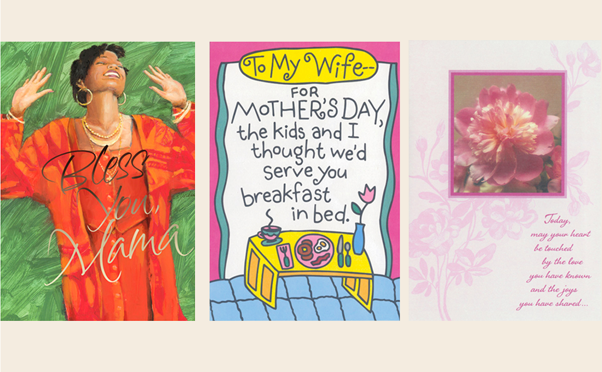
1980s–1990s: Diversity, Humor, and Digital Tools
Designers in this era embraced both computer-generated graphics and heartfelt analog styles. Greeting cards used photo collage, 3D embossing, foil stamping, and increasingly diverse messaging.
- Mother’s Day design now included cards for single moms, grandmothers, and chosen family.
- Greeting card brands like Hallmark launched inclusive lines like Mahogany celebrating Black motherhood.
- Popular Mother’s Day marketing leaned into humor (e.g. “Mom, the original seatbelt”) using bold sans-serifs and retro styles.
2000s–Today: Digital, Personalized, and Emotional
With the rise of e-commerce, mobile apps, and Instagram, graphic design for Mother’s Day became interactive, shareable, and emotionally cinematic. Brands began blending personal storytelling with sleek design systems.
- Google created a Mother’s Day Doodle that turned into an interactive card-maker.
- Typography design for Mother’s Day now includes handwritten fonts, variable typefaces, and modern calligraphy.
- Fonts for Mother’s Day online often mimic brush scripts, UI fonts, or quirky serif display types.
- Color palettes for Mother’s Day vary by mood: soft pastels for heartfelt cards, saturated hues for digital campaigns, and minimalist neutrals for luxury brands.
International Mother’s Day Aesthetics
While the U.S. celebrates in May, other countries observe different dates with distinct design languages. For example:
- In the UK, Mothering Sunday has a floral, springtime aesthetic with more traditional typographic layouts.
- In Mexico, Día de las Madres often features vibrant folkloric art, bold type, and marigold-heavy color palettes.
- In Japan, red carnations and watercolor-style art dominate Mother’s Day design, with delicate calligraphy-style fonts.