Font Details You Must Know to Improve Your Designs
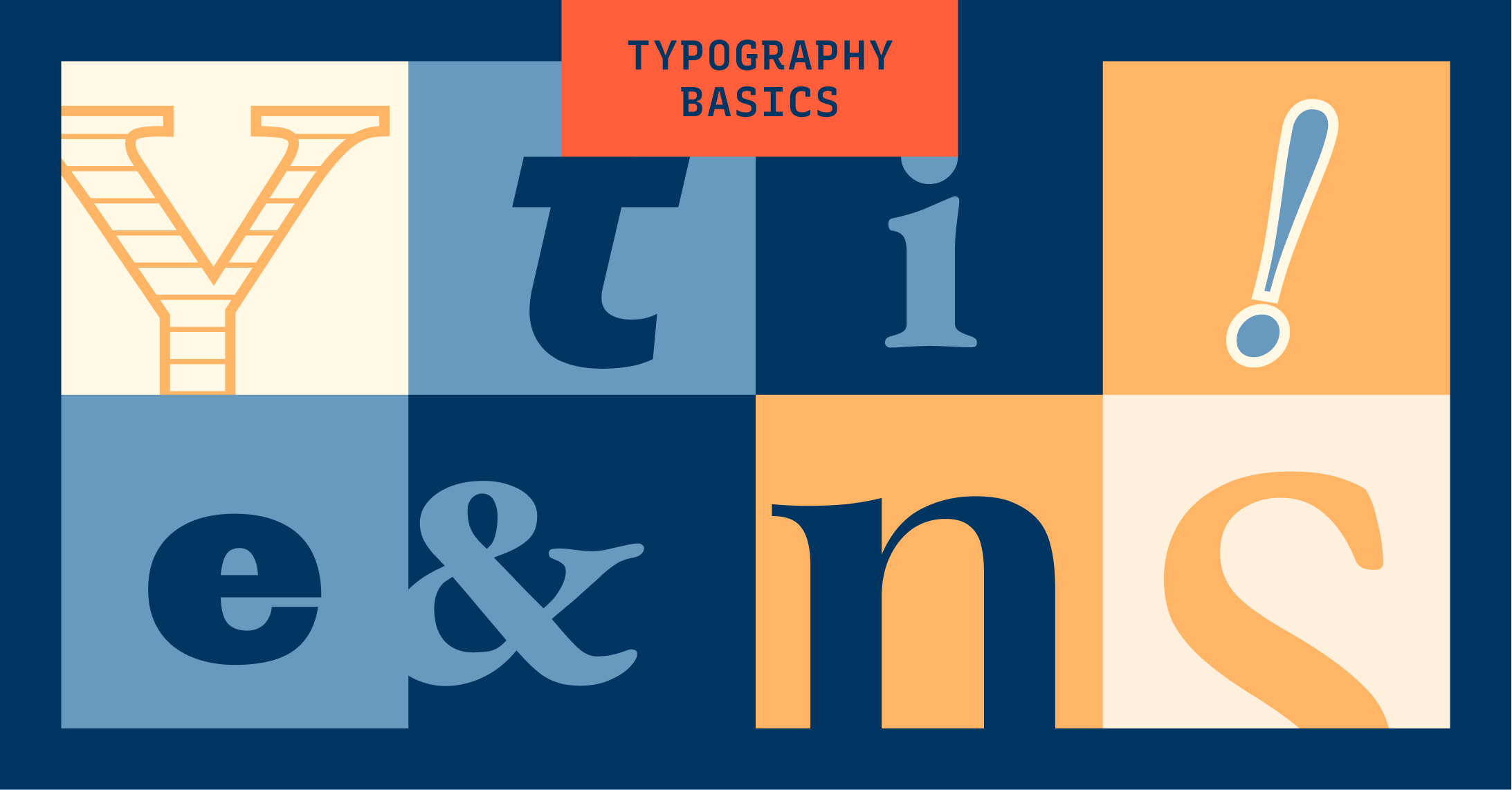
We are continuing our Typography Jargon Buster series! This time, we go over type detail terms describing constructions of letters. These visual elements make fonts different from each other to communicate different meanings.
Want to read more Typography Jargon Buster? Check out Essential Typography Terms, Serif, and Sans Serifs Classifications You Must Know.
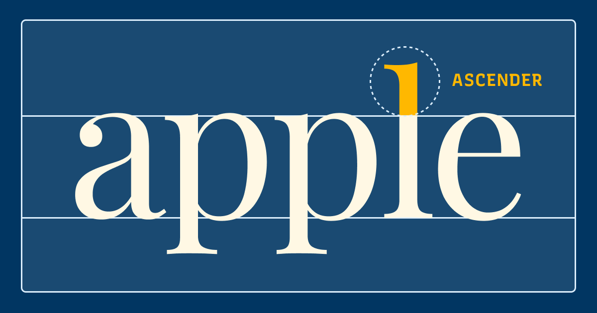
Ascender
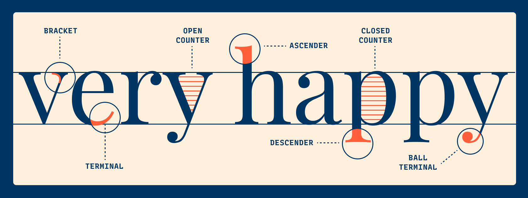
An ascender is a vertical stroke of a lowercase letter extending upwards, beyond the x-height, sometimes beyond the cap height. For example, “h” is a lowercase letter with an ascender. In general, typefaces having long ascenders and descenders help with readability. Long ascenders help make a lowercase more distinguishable as long as the other parts of the letters are legible.
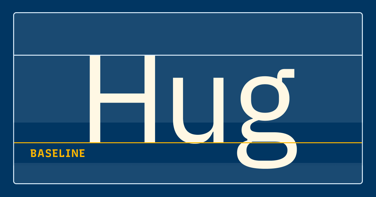
Baseline
The baseline is the horizon line (sometimes invisible) on which the letters sit. In most typefaces, curved letters, like “O,” “e,” and “s,” sit slightly below the baseline to create optical balance and alignment with other letters. Letters with descenders like “p” and “q” extend below the baseline.
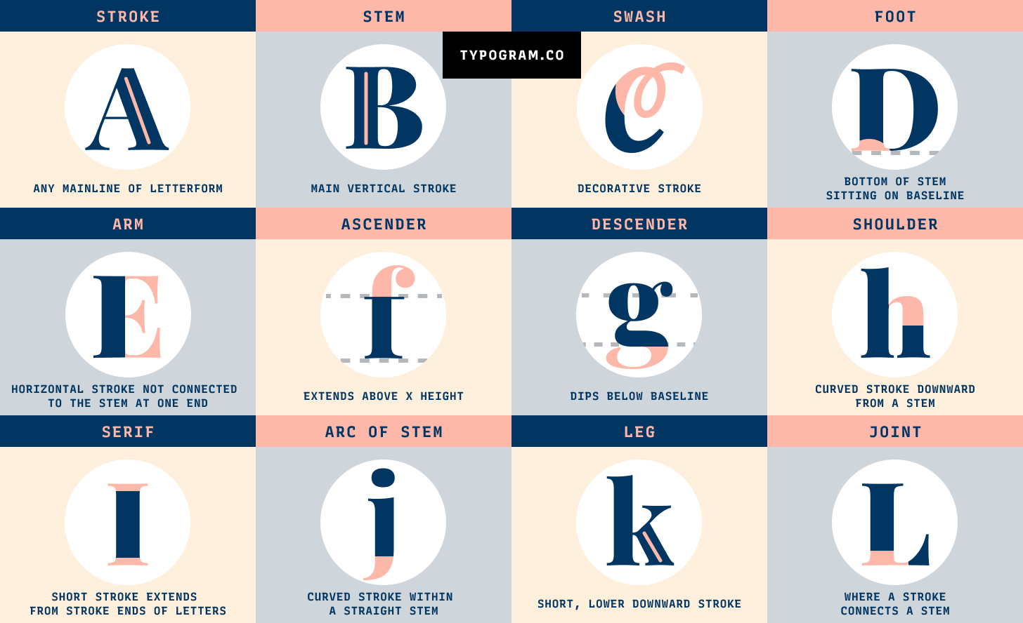
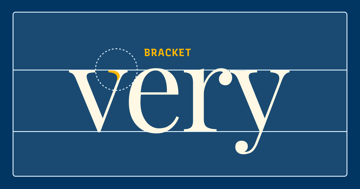
Bracket
A bracket is a curved or wedge-like area connecting a serif and a stroke. This curve area can be large or small. Typefaces with large areas of curves are said to have large bracketing. Those with small curved areas have small bracketing. Some serif typefaces have no bracketing.
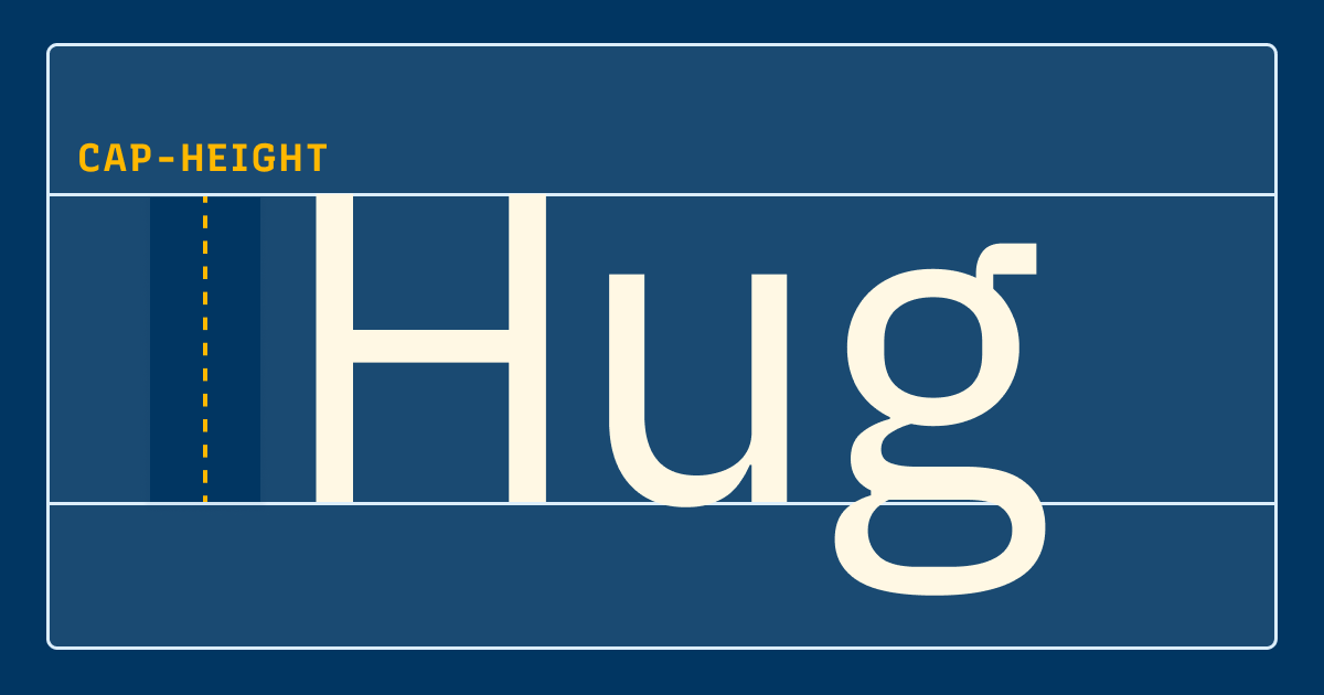
Cap Height
Cap Height is the height of a capital letter, measured from the baseline to flat capitals like “H.” Letters like “S” and “O,” have a slight overshoot over the cap height. This is done so that curve-topped letters like “S” or “O” look optically aligned and balanced with flat-topped letters like “H.”
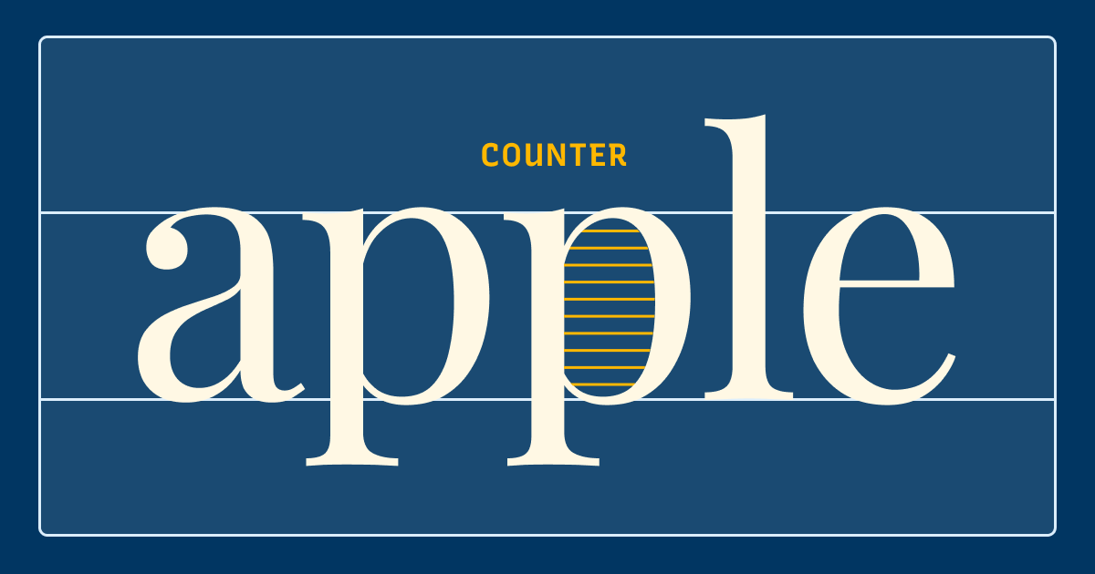
Counter
A counter is an unfilled (white or negative) space partially or entirely closed by other parts of the letters. For example, lowercase “b” and uppercase “U” both have counters. The stroke creating a counter shape is known as a “bowl.” There are two types of counter spaces: open and closed. An open counter means the unfilled space is partially closed, like “U.” A closed counter happens when the unfilled space is completely sealed, like “b.”
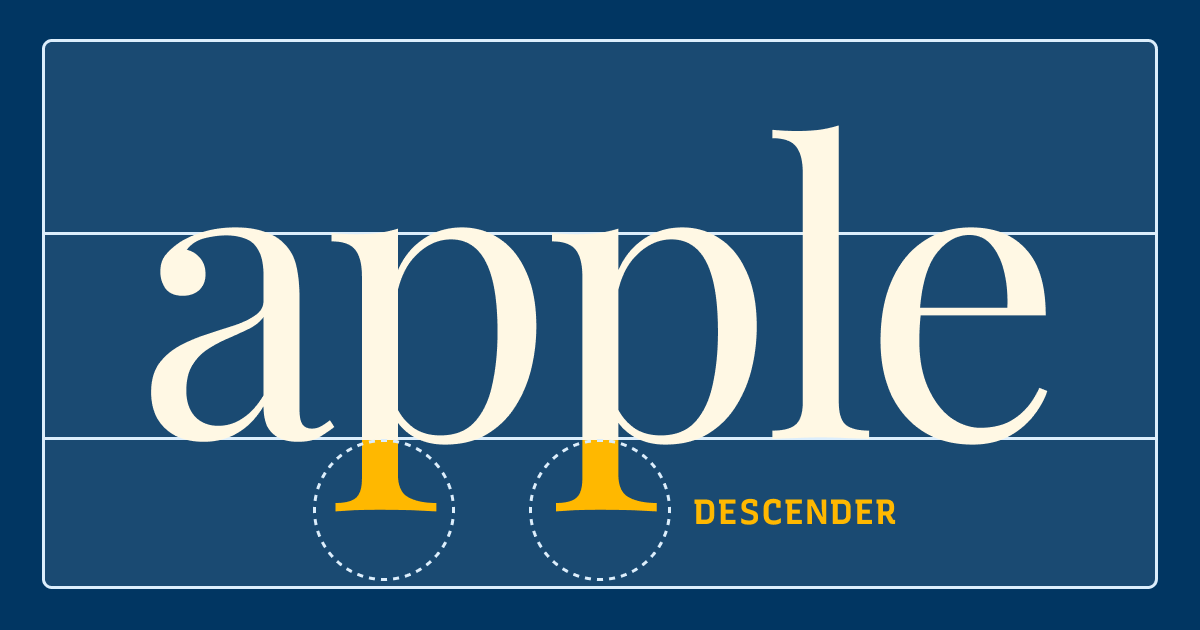
Descender
A descender is a vertical stroke of a lowercase letter extending below the baseline. For example, “p” is a lowercase letter with a descender. Like ascenders, long descenders make lowercase letters more distinguishable, improving readability.
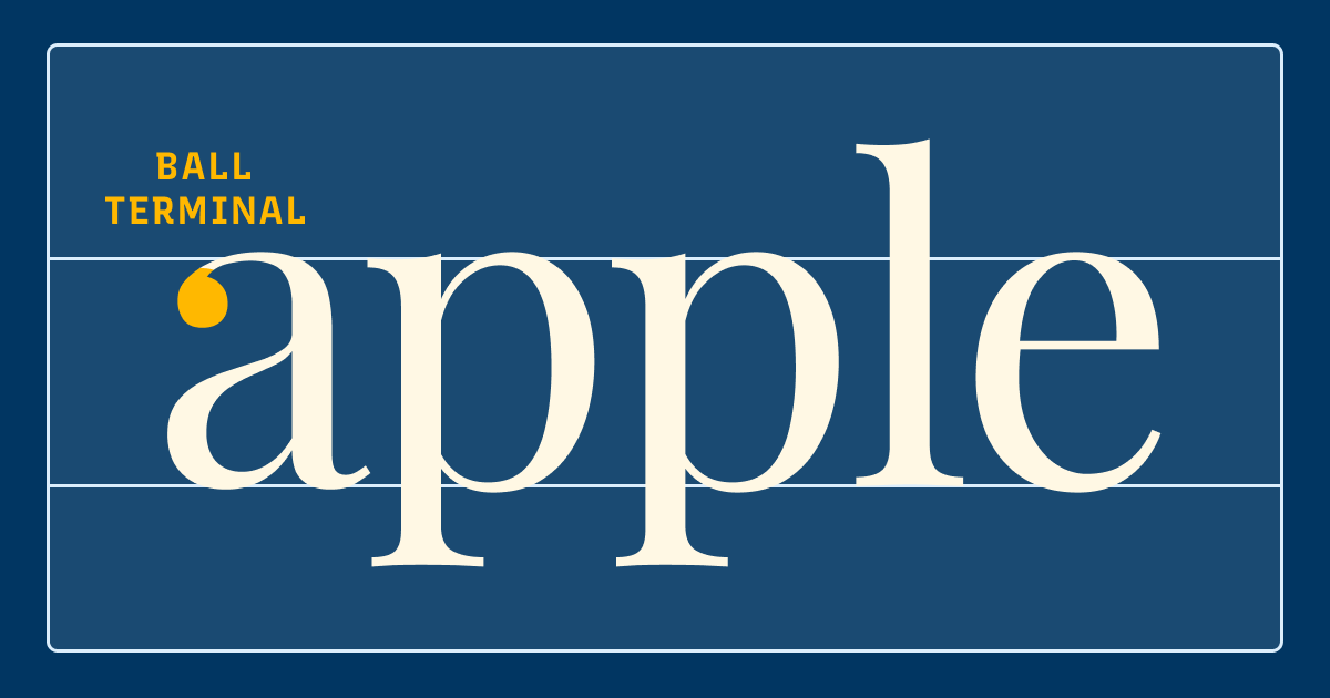
Terminal
A Terminal is an end of a straight or curved stroke without serifs. The terminal can be a place where a typeface showcases its stylistic elements. For example, in some letters, like “a,” there can be a droplet shape at the end of a stroke. This is called a ball terminal.
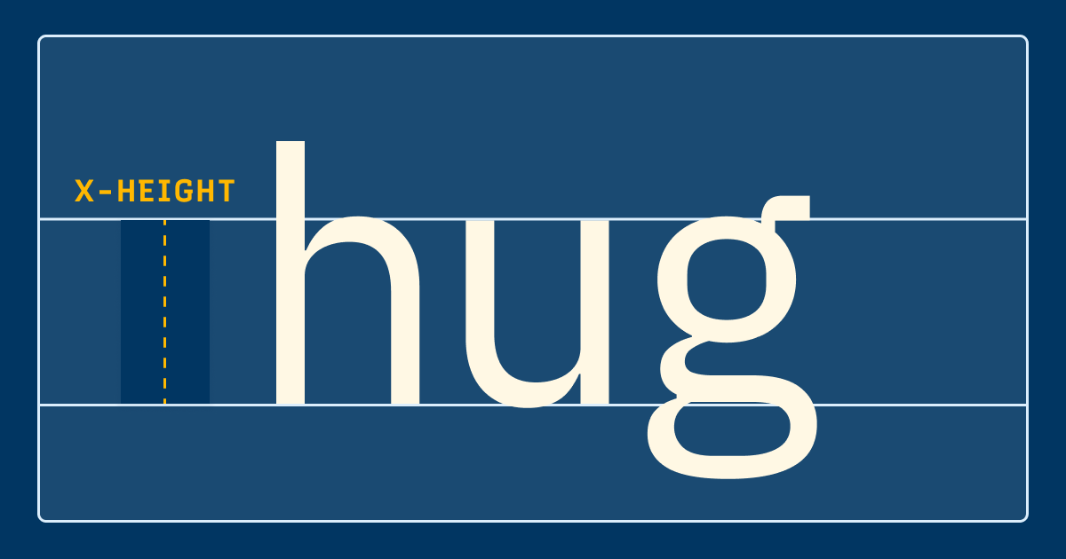
x-Height
The term x-height describes the distance from the baseline to the top of a flat-topped lowercase letter, like the lowercase “x.” x-height is a stylistic choice and varies for different typefaces. However, x-height also is a factor in readability. As the x-height increase, the length of ascenders and descenders usually decreases. This causes the letters to become less readable.
Want more Typography Jargon Buster? Check out Essential Typography Terms, Serif, and Sans Serifs Classifications You Must Know.