Create a Stellar Pitch Presentation with These Five Tips
Presentation Counts
There are many types of presentations. This article primarily addresses pitch presentations since there is a significant focus on storytelling. The tips here can be helpful for other types of presentations as well. Consistent design and compelling storytelling can play a huge role in creating a powerful presentation.
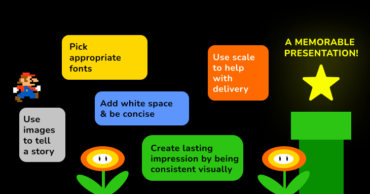
These five rules can be good starting points:
- Use images to tells a story
- Use appropriate fonts
- Add white space and be concise
- Use scale to help with delivery
- Create lasting impression by being consistent visually
Remember, presentation is storytelling. When you design a presentation, you are using visual language as a tool to tell the story.
Use images to tells a story
A picture is worth a thousand words. Ask yourself these questions:
- What is the story of your presentation?
- What message or emotion do you want to leave the audience with?
- How can this specific slide help you in getting that message across?
- How can the image on that particular slide maximize this role?
Once you figure out these questions, start searching for images. images that tell story about processes, illustrate pivotal moments, and associate with specific emotions are particularly helpful to presentations. If you want to learn more about how to visualize ideas, check out this post.
A good tactic is using full bleed (edge to edge) images to illustrating pivotal moments, visions, impressive examples. It is more effective if the images are in high resolution.

img: left- centered image on a slide; right- full bleed image. The full bleed image on the right will usually work better than on the left. It pulls in the audience a lot more since it is bigger in scale.
Use appropriate fonts
If you have a brand typography system, this can be an excellent place to use it. If you don’t know what font to use, choose Helvetica or a neutral serif, like Plex Sans or Libre Franklin.
When you do a presentation, you want people to take you seriously. Display fonts generally are too decorative and distracting to use in a formal setting. You probably want to save your scripts and handwriting fonts for the presentation most of the time.

img: left- handwriting font is not appropriate for formal presentation. right- a fairly neutral sans serif is better suited and more clear.
Improve readability by adding white space
When you are creating a presentation, you are presenting a body of information clearly to your audience. An effective presentation is concise. This means shorter sentences, less text, and more white space. Considering adding space:
- Between lines of text
- Between bullet point and text
- Between bullet point and bullet point
If your text can breathe, the reader’s eyes can breathe.
If a reader’s eyes can breathe, they will have an easier time understand and remember your story.
img: left- too much information and overcrowding. right- concise information with lots of white space create better readability.
Use scale to help with delivery
Scale is one of the most effective tools you can use to create dramatic visual imageries. If you want to emphasize a statement, consider making the sentence bigger on a separate slide because this creates anticipation and grabs attention. It is like a punch line.

img: bigger text feels more impactful to audience.
Create lasting impression by being consistent visually
In the end, your presentation is a visual document that tells a story about your ideas. The way it looks is the method you use to tell the story.
When I make a presentation, I try to be consistent with how I show(design) the information on each slide. This means:
- Use the same fonts for header and body texts.
- Keep the spacing between texts consistent.
- Keep track of all the different sizes of text you are using and stay consistent with text sizes between different levels of information.
Consistency will erase lots of needless frictions in your presentation, which will create more effective, straightforward storytelling.
Phew. That was it.
I hope this is helpful if you need to fundraise, or create presentations for work. Presentation is storytelling. If you master this well, it is a powerful skill that translates into many other areas.