Reviewing Playfair Display: an Elegant Serif Font Perfect for Fashion & Editorial
In This Issue…
How to Use Playfair Display for Logo and Branding
- Font of the Week: Playfair Display
- Design idea: The Perfect Reading Font for Everyone?
- Color Inspiration: Spring Peony

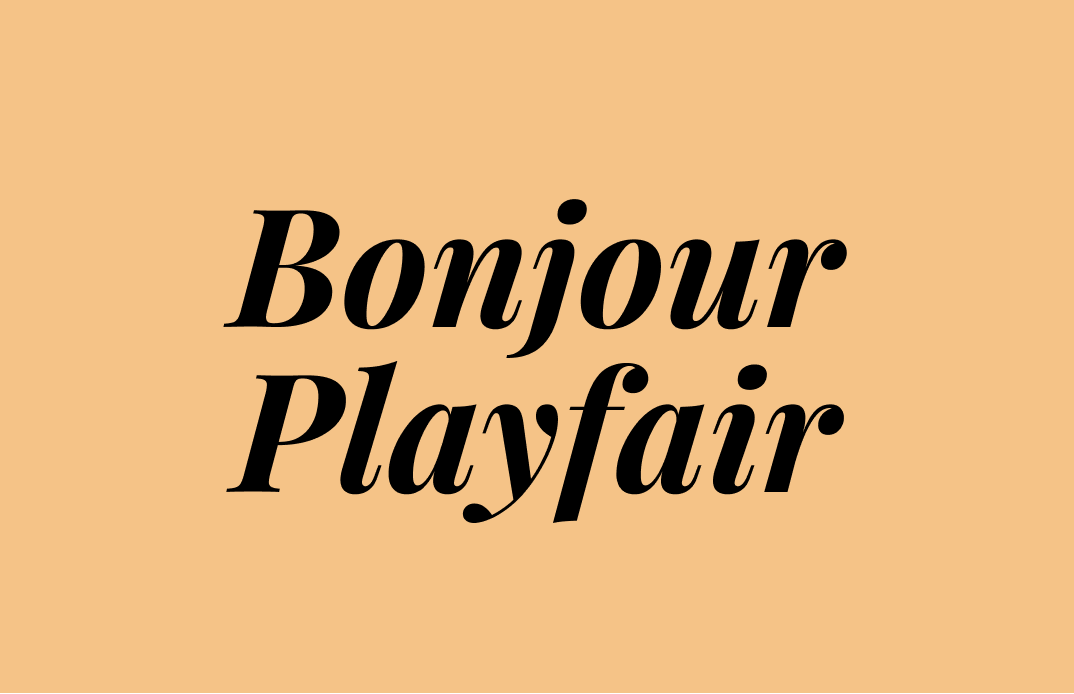
Font of the Week
About Playfair Display
Playfair Display is the perfect serif for fashion and editorial. This style of font for editorial comes from Bodoni, a font designed in the late eighteenth century. High-stroke contrast serif fonts are darlings of fashion branding because they come off as elegant and graceful.
They have a sophisticated editorial voice that attracts and demands your attention. That’s why fashion and lifestyle magazines adore fonts like Bodoni. Magazines brands and even blogging platforms, like Medium, love to use high contrast serifs as part of their brands. Previously, we also covered luxury branding, where you see many luxury logos use high contrast serif fonts, like Bodoni.

The core strength of Playfair Display is it has many weights for you to choose from, which means that you will be able to use it in various ways for a range of creative materials. Also, Playfair Display is pretty versatile when it comes to styles. The regular style is clean and objective. The italic version, however, is very decorative— a very nice contrast. This can be very advantageous when designing graphics on social media (for example, when you emphasize, as I did with the Give in to it in the Instagram image at the beginning of this post). With the right brand colors, Playfair Display is perfect for more classic fashion brands.
Font Detail
High contrast between thick and thin strokes
- Six weights with regular and italics

How to use Playfair Display for logos?
Editorial or fashion brands. For example, Online magazines, fashion-focused communities, or marketplaces.
How to use Playfair Display for marketing and branding?
Playfair Display is a display font. Use for showy purposes only, like social media. The thinnest parts of high contrast fonts will break down at small scales. Don’t use this font for small texts, like paragraphs.

Design Idea of the Week
The Perfect Reading Font for Everyone?
So that we all read faster, especially when it comes to reading in screen-based environments?
Recently, Nielsen Norman Group researched this exact topic. They conducted a reading-speed study with 352 participants. The participants were asked to read several short passages of text; each passage had 300–500 words and simulated US 8th-grade reading level. The texts were shown in 16 different fonts.
The Result? There isn’t a single best font for everyone. It varies from person to person. However, even among fonts with good legibility, reading speeds differ substantially, so it really matters to get the font right. Read more about the research.
Color Idea of the Week
Spring Peony Colors
This week, please enjoy this calm color palette from a lovely lotus flower illustration.
Bubble Gum #D683CB | Blush #D9BFE2 | Butter #F5C387 | Sage #9CC198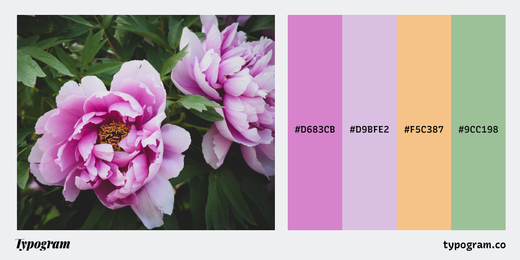
Creative Prompt
Create a social media post with Playfair Display.
Thank you
…for reading and hanging out here this week! Playfair Display is available here.
