Typography Advent No. 4: Seven Display Fonts Worth Using This Month
Typogram Studio offers a rotating collection of free premium fonts for designers through our monthly font freebie calendar. Each release features a carefully curated display or text typeface you can use in personal or commercial projects. Bookmark our freebie font calendar to discover new high-quality fonts added every month.
Ivy Presto: Editorial Elegance with Real Restraint
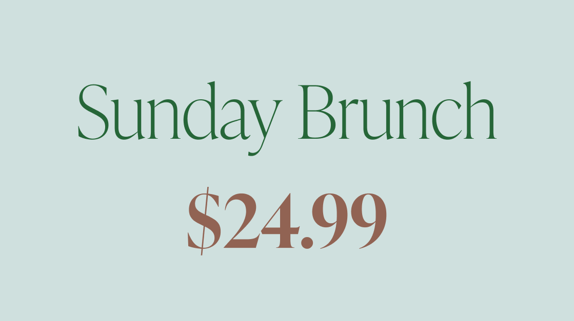
Ivy Presto is an Old Style serif with unusually high contrast and narrow proportions. Where many Old Style serifs feel round and approachable, Ivy Presto reads as distinctly polished: the letterforms are tall, the spacing is considered, and the overall effect is closer to a luxury magazine masthead than a body text workhorse.
It excels in headlines, invitations, and editorial layouts where you want sophistication without coldness. If you're working on a brand that lives in the fashion or wellness space, Ivy Presto earns its place immediately.
Mastadoni: Didone Drama, Controlled
Mastadoni works in a similar register to Ivy Presto but pushes the contrast further into Didone territory. The hairline serifs are sharp, the thick strokes are confident, and the overall structure has a cinematic weight to it.
Think fashion layouts, bold poster headlines, or luxury branding where you want the type to command the page. Pair it with something minimal and the contrast does all the work.
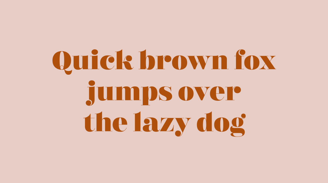
Posada: A Living Print Tradition
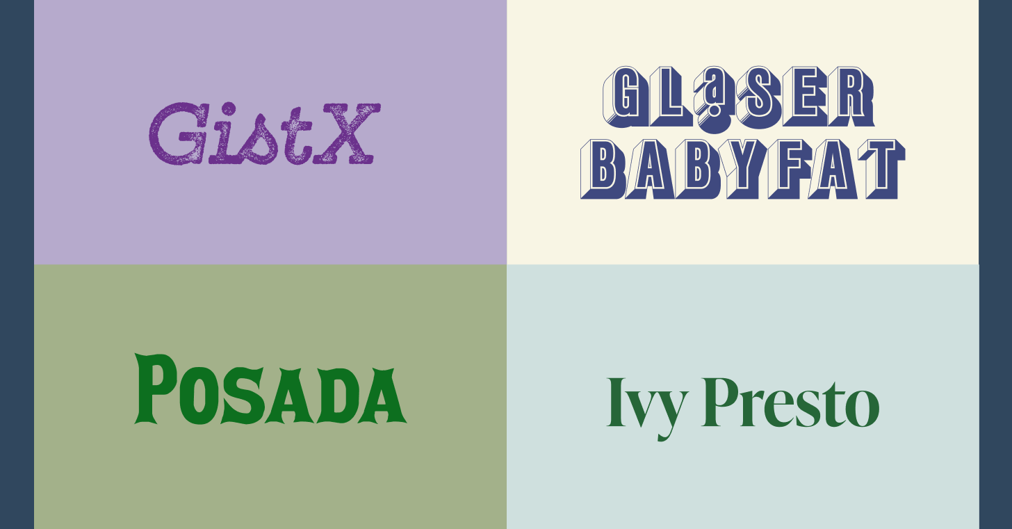
Posada takes its name and character from José Guadalupe Posada, the influential Mexican printmaker whose broadsheet lettering and illustration work shaped an entire visual culture. The typeface carries that lively, slightly irregular energy: it feels hand-touched without being sloppy.
It suits posters, cultural branding, packaging, and any project where you want expressive personality rooted in craft history. There's a warmth here that purely geometric decorative faces rarely achieve.
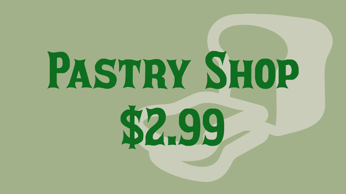
Goudy Text: Blackletter Done Right
Frederic Goudy's blackletter is one of the most thoughtfully constructed in the English-language tradition. Goudy Text includes shaded variants, ligatures, and alternates, giving it genuine versatility beyond the typical single-weight blackletter.
It reads as both historical and contemporary, which is harder to pull off than it sounds. Use it for editorial headers, brand wordmarks, or any context where you want to invoke tradition with precision rather than pastiche.
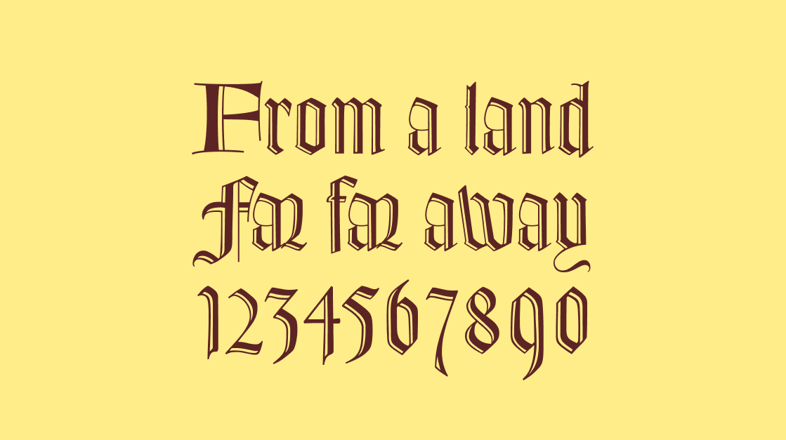
Glaser Baby Fat: Retro Without Being Nostalgic
Milton Glaser's rounded, chunky letterforms have a specific kind of optimism baked into them. Glaser Baby Fat captures that energy: the forms are bold and playful, but the proportions are tight enough to avoid feeling naive.
It works beautifully for packaging, logo treatments, posters, and any project that benefits from a retro personality with real graphic punch. Lean into its roundness and it rewards you.
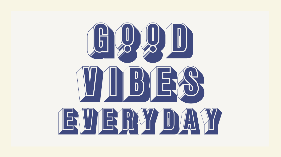
GistX: Letterpress Confidence, Modern Range
GistX is part of the Gist slab family, and the letterpress-inspired texture gives it a tactile quality that's hard to fake with a standard slab serif. The forms are solid and direct, the overall color on the page is even and strong.
It handles headlines and branding work equally well, especially in contexts where you want a confident, contemporary feel without reaching for something purely geometric. It pairs well with both clean grotesques and softer humanist sans serifs.
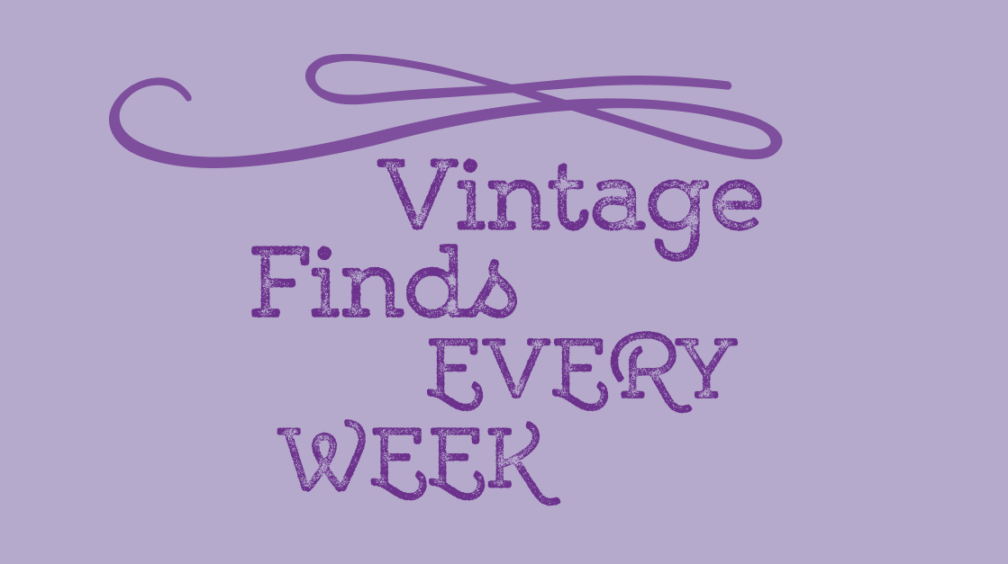
Ginsburg: Geometry That Moves
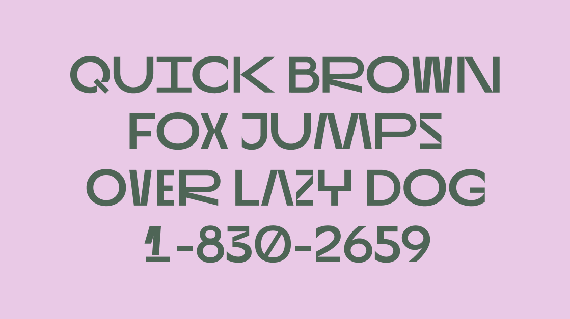
Ginsburg is an all-caps sans serif display typeface with a distinctive visual trick: the wavy baseline geometry that cuts through the letters. It's bold in concept, but the alternates give you enough variation to keep it from feeling one-note.
This one is built for contexts where the type itself is part of the visual statement: poster work, TV titles, podcast covers, logos that need to hold attention. It has the kind of graphic energy that reads immediately at large sizes, and the alternates let you tune how far you push it.