Quality Triangle of Startup Branding
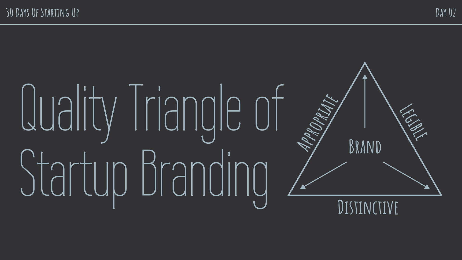
There is a list of things startup founders are concerned about. Branding may not be the top item on that list. Nor should it be, arguably. Startups should be busy finding product-market fit and creating value for their customers first.
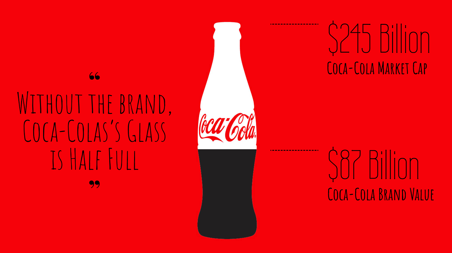
Unlike valuable brands like Coca-Cola, whose brand value is $87 billion, more than ⅓ of its market cap, startup brand doesn’t carry the equivalent weight. The brand value will grow alongside the startup.
It is not economical to spend a lot of resources to design a brand identity that doesn’t carry a lot of intrinsic value or longevity. But you need a brand to start a company. At the minimum, you need a logo for the pitch deck, business cards, landing pages, and Email signature.
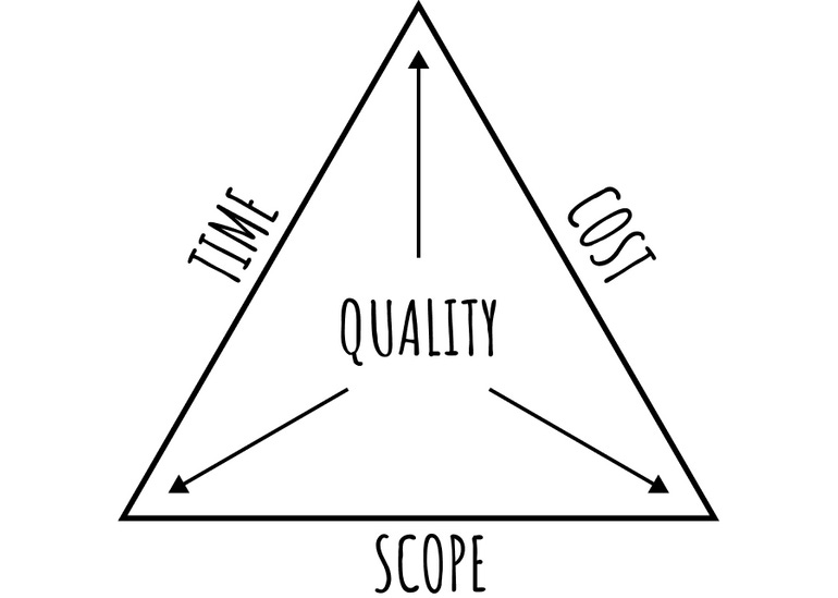
In other words, startups need brand identity quickly but for cheap. Those are the two lines in the quality triangle: time and cost. To maintain quality, startup founders need to cut down the scope. Where to cut in the scope?
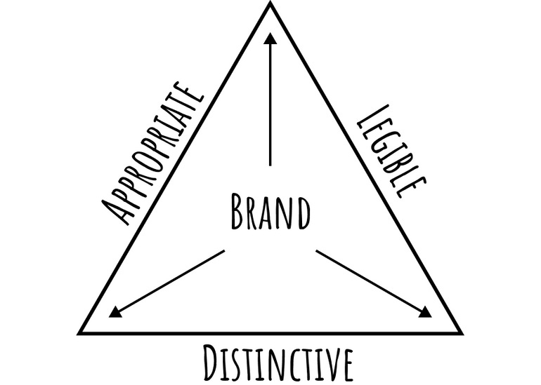
There are three main criteria to judge a brand identity's effectiveness:
➸ Appropriate: the brand personality is fitting to what the company does
➸ Legible: people can read the brand name easily
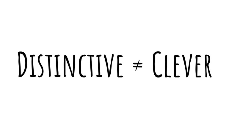
➸ Distinctive: the brand image is unique and memorable
My advice: prioritize appropriate and legible. This will be counter-intuitive to most people. Amateurs spend too much time coming up with clever logos. Be warned: clever logos are not necessary and are potentially harmful. Take a look at mature brands; clever logos aren't common
Clever logos are not scalable. As the company grows, the brand needs to evolve. Clever logos are challenging to rebrand. With a subtle visual change or an update to the brand name, the cleverness disappears. Clever logos are like dad jokes: very peculiar, hard to pull it right.
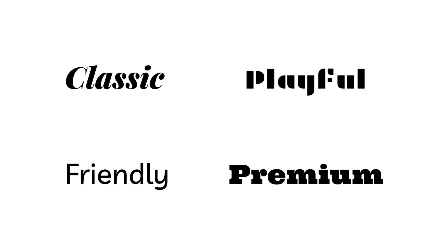
Instead, devote the limited resource to identifying your audience and what brand personality they are drawn to. Should it be Friendly or Premium, Classic or Playful? Then choose a brand typeface that expresses those personalities while being legible.
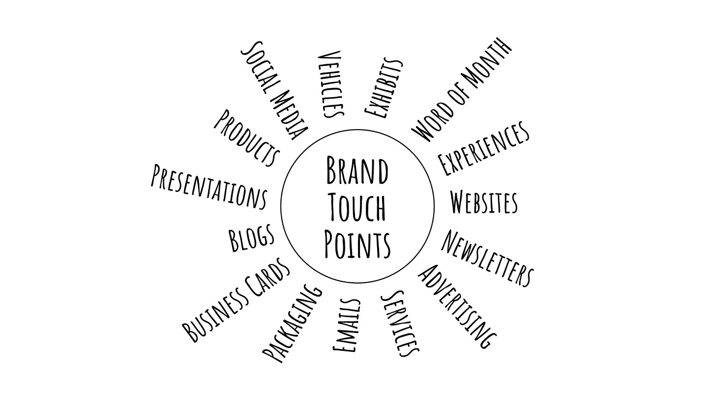
Take a softer approach to distinctiveness. Let your brand personality shine through first. Speak a distinctive and consistent brand voice at every touchpoint with your customer. Combine it with a unique value proposition; your brand will stand out.
I am sharing daily for the first 30 days about my journey as a founder. My startup aims to solve the brand problem for startups. Follow me on Twitter to follow along my journey.
