Reviewing Public Sans: A Neutral-Tone Font For Your Next UI
In This Issue…
How to Use Public Sans for Logo, Branding & More
- Font of the Week: Public Sans
- Design Idea of the Week: The Emotional Journey of Creating Anything Great
- Color Inspiration of the Week: Graphic Sunrise

Font of the Week
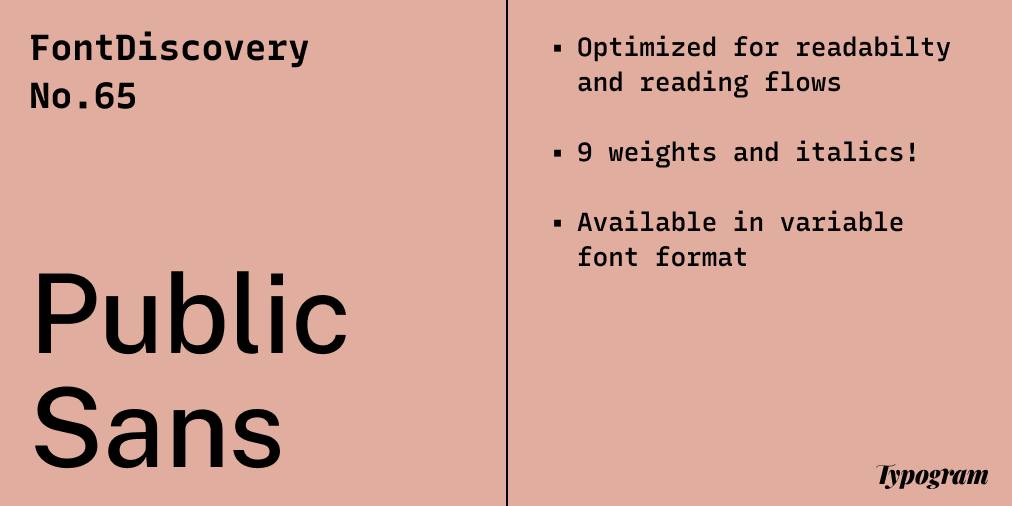
Go Public with Public Sans
At the beginnings of our newsletter, we covered Libre Franklin . It is one of my favorite open-sourced fonts because it is full of quirky little details, and I love the calligraphic touch this sans serif brings.
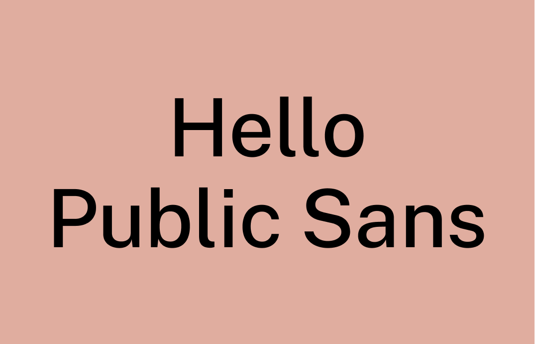
Public Sans is the objective counterpart of Libre Franklin, it is inspired partly by Libre Franklin’s design. However, Public Sans has a neutral tone optimized for readability. Because of this, Public Sans has minimal quirks, void of any stand-out visual characteristics.
Font Detail
- Minimized quirks and narrower than Libre Franklin
- Nine weights and italics!
- Available in variable font format


How to use Public Sans for logo?
Despite the lack of quirk, there are leftover calligraphic touches that give this found a humanistic touch. Public Sans is neutral yet inviting to read. The medium, semibold, and bold weights are great for logos. On the other hand, black weight is a little too bold to use if your logo contains letters with small counter spaces like lowercase “e.”
How to use Public Sans for marketing and branding?
Public Sans is very versatile. It works well for UI, headlines, and text. Due to the lack of visual quirks, Public Sans doesn’t interrupt reading flows. Its neutral tone objectively communicates a message with clarity and optimum reading experience, which is excellent for UI for web apps and complex interfaces.

Design Idea of the Week
The Emotional Journey of Creating Anything Great
This infographic has stuck with me ever since I randomly stumble upon it. Whether it’s a business, a website, an app, or creative work, creating something of your own is never simple. It takes a lot of tryings, starting-overs, pivoting, and perseverance. It pairs nicely with the quote from Ira Glass at the beginning of this post.

Color Inspiration of the Week
Graphic Sunrise
This week, enjoy this gradient color palette of sunrise for your creative projects!
Florentine #64778A | Hydrangea #7D96AC | Hibiscus #A47380 | Red Wood #B7948B
Jargon Buster
Letter Spacing (Tracking)
The adjustment of space between letters, evenly across the whole word.

Want more? check out the jargon buster glossary page.
Creative Prompt
Create something with Public Sans!
Thank you
…for reading and hanging out here this week! Public Sans is available here.