Reviewing Savate: A Brushy & Crafty Sans Serif Perfect for Creating Marketing Graphics
In This Issue…
How to Use Savate for Logo, Branding & More
- Font of the Week: Savate
- Design idea: Parody
- Color Inspiration: Nan, Northern Thailand
Font of the Week
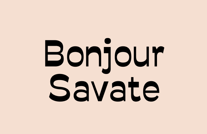
Something is Different about Savate
Are you looking for something, artsy but different? Savate has it. Savate was inspired by hand lettering found in the suburbs of Paris. There is a strong calligraphic vibe and quirkiness that jumps out to the audience. There is a secret to this extra funkiness – it has reverse stress.
Hold on, what is Stress?
When painters paint, the medium and method they choose affect the outcome. Similarly, the tool and its process of mark-making affect the way our letterforms looks. For example, if you look closely at serifs like Times New Roman, you’ll notice there are thick and thin parts in the strokes of the letters. The strokes appear this way because of the calligraphic process: the brush was held at an angle to create the letters you see. We call the change of stroke width across letters, stress.

What is Reverse Stress?
Reverse stress means the thicks and thins of the letter are switched. Where the letter is supposed to be thin, it’s now thick. You can see how normal and reverse stress compare below.

Because we are used to the normal stress of the letters, the reverse stress causes us to pay more attention to the letterforms.
How to use it for logo?
Savate communicates quirky and crafty. Its casual voice is created by slick, calligraphic characters and reverse stress. Its casual tone is suitable for a brand that has something to do with cities or urban environments, artsy or creative.
How to use it for marketing?
Savate has one weight and is available in both normal and italic. It is best for simple marketing projects like graphics and simple landing pages without levels of information. Savate’s quirky personality will come through at large sizes for marketing graphics. It can pair with Work Sans.
As for body sizes, it works, but its quirky personality will jump out in paragraphs. consider if this is appropriate for the information you are expressing before use.


Design Idea of the Week
Parody
When we talked about memes, we mentioned parody as a technique to create memes. Parody is a “visual satire” that relies on the audience’s recognition of the original material. For example, the “Steve Jobs in a black turtleneck” picture is parodied by HBO.
Design writer Steven Heller said, “parodies are not designed to insult the target, but rather, trigger recognition, providing satisfactions that they are in on the joke. ” Is parody a technique you can use in your projects?

Color Inspiration of the Week
Nan, Northern Thailand
Today we have an image contribution from the community. This image is taken in Nan, in Northern Thailand, by Nic. Thanks for the photo, Nic!

Typography Jargon Buster
Today we’ll be sharing a set:
Typeface
A typeface (or type for short) is a set of glyphs that share a common design. For example, Helvetica.
Font
A font is a particular size, weight, and style of a typeface. For example, 12 point Helvetica bold.
Creative Prompt
What can you imitate? Write down a plan of action.
Thank you!
Thanks for being here for another week. Savate is available here. It is designed by Wech.
