Reviewing Basteleur: A Quirky Modern Font Inspired by Tarot
In This Issue…
How to Use Basteleur for Logo and Branding Design
- Font of the Week: Basteleur
- Design idea of the Week: Dark Pattern
- Color Inspiration of the Week: Spring Tulips

Font of the Week
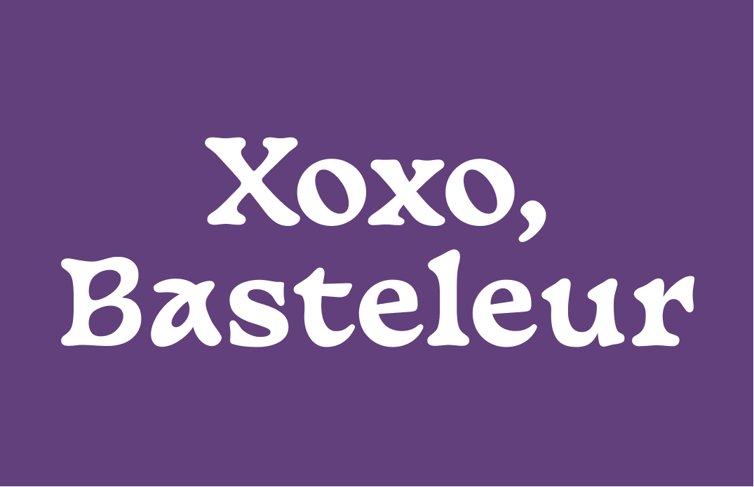
About Basteleur
Basteleur is a font inspired by Tarot de Marseille style tarot cards. Though it has medieval roots, it also has nods to modern fonts like Cooper Black with large, swelled-up bracketing ( Bracket is the area where a serif and a stroke are connected. ). It works as an excellent display font for attention-grabbing marketing materials.
Fun Fact: Tarot cards existed as early as the 15th century (some sources claim even before then) as playing cards, not for fortune-telling. In the 17th century, tarot cards first began attaching with magic and fortune-telling (source) in France.


Font Detail
Slightly twisted characteristics like “a”, “K”
Swelled bracketing
One weight, bold and no uppercase “A”


Specific Usage Tips
How to use Basteleur for logo?
Basteleur is a fun mix of old and new visual characteristics. Its boldness, along with its funky, novel vibe makes it perfect for a creative or urban-influenced project.
How to use Basteleur for marketing and branding?
Bastelelur is a display font. Because of its inspirations and visual qualities, it has a nostalgic yet novel voice, perfect for marketing materials looking to create similar tones attracting customers. Avoid using it for body text as it is too decorative and affects readability.
Design Idea of the Week
Dark Pattern
Dark Patterns are deceptive design elements and user experiences in websites and apps designed to confuse users into doing things they don't intend, like sharing data, buying, or signing up for things.
A dark pattern I commonly come across is Forced continuity which happens when you are being charged after a free trial without notification or warning and becomes incredibly difficult to cancel. There are other types of dark patterns and a hall of shame.
Color Inspiration
Spring Tulip
Days are finally getting longer. This week, enjoy this wonderful color palette of spring tulips for your design projects!
Grass #C9DDFD|Persimoon #F34E19|Soft Blue #7387DE|Grape #7D599A
Typography Jargon Buster
Terminal
Any end of a stroke that does not include in a serif.

Want more? check out the jargon buster glossary page.
Creative Prompt
Create something with Basteleur!
Thank you
…for reading and hanging out here this week! Basteleur is available here.
