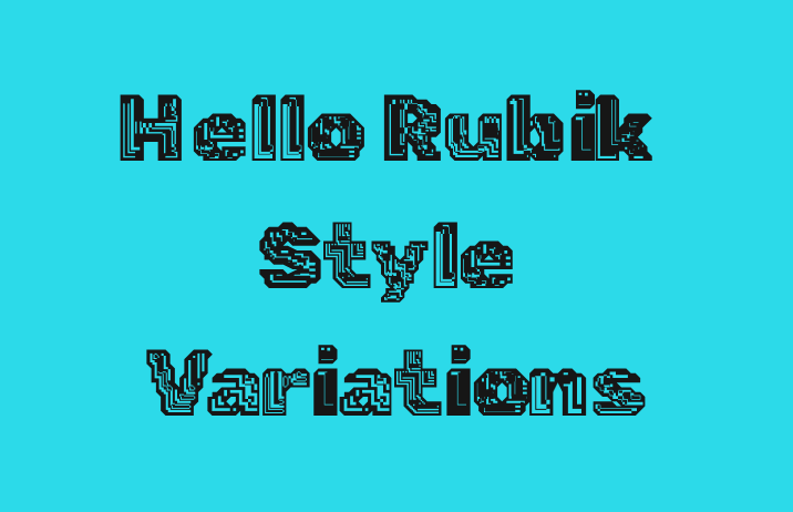
How to Use Rubik Style Variations For Attention Grabbing Designs
In This Issue…
- Font of the Week: Visual Rubik
- Design idea: AI as Creator?
- Color Inspiration: Chefchaouen, Morocco
Font of the Week
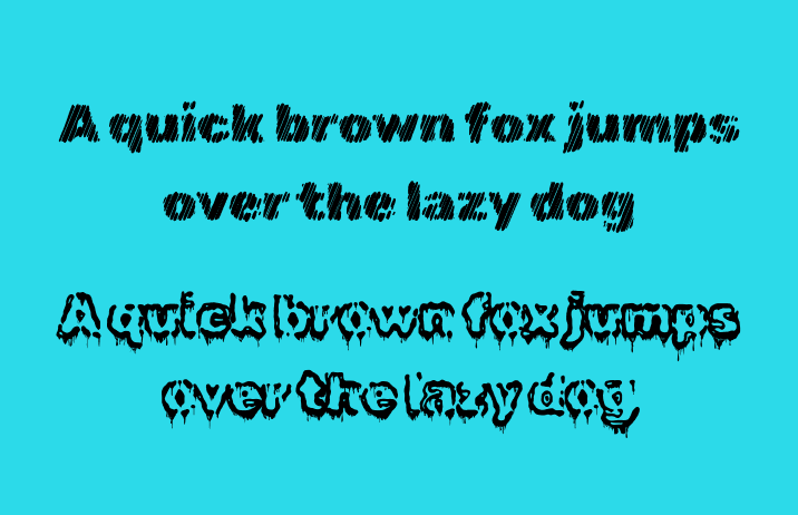
About Visual Rubik
Previously, we shared an excellent sans serif, Rubik. Rubik is a humanist sans serif with a neutral tone and minimal calligraphic details. Its slightly rounded corners make it inviting to read, but it is minimal enough to blend into the background. Compared to Nunito, a similar font we covered, Rubik is much more neutral and toned down.
What we didn’t cover in the previous issue are the stylistic variations of Rubik. Rubik has 28 stylistic versions built based on its sans-serif skeleton.
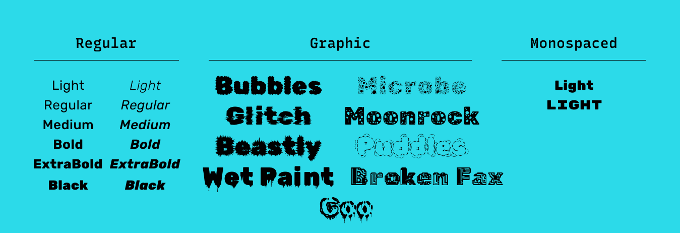
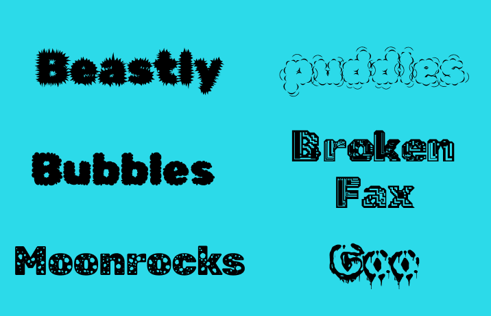
A couple of selected styles: Vinyl, Mono One, Broken Fax, Goo, Gemstones, 80s Fade, Storm, Spray Paint, Puddles, Moonrocks, Dirt, Distressed, Iso, Marker Hatch, Burned, Maze, Glitch, Microbe, Bubbles, Wet Paint, Beastly.
The designers used a script to help create the stylistic variations; each has its distinct flavor and is perfect for eye-catching graphics. My personal favorite is Rubik Broken Fax and Rubik Goo.
Font Details
28 style variations
Display Font, best used for marketing graphics, animations, or backgrounds.
Some letters are more visual textures and not as readable as others.
How to use Rubik style variations for logos?
Some style variations are harder to read than others, for example, Rubik Goo. If you use style variations for logo, make sure the letters are legible and readable.
Also, each style variation communicates a different tone. For example, Rubik Marker Hatch gives off a crafty vibe, whereas Rubik Goo feels cheeky. Ensure that your font is the appropriate tone for your logo and brand.
How to use Rubik style variations for marketing and branding?
Style variations of Rubik’s are perfect for graphic materials, like social media graphics, patterns, and backgrounds. Since the fonts are very expressive and display fonts, they may be best for primarily visual purposes, like posters or graphics. They can pair with Rubik's Regular or a more neutral sans serif, like Nunito.
Design Idea of the Week
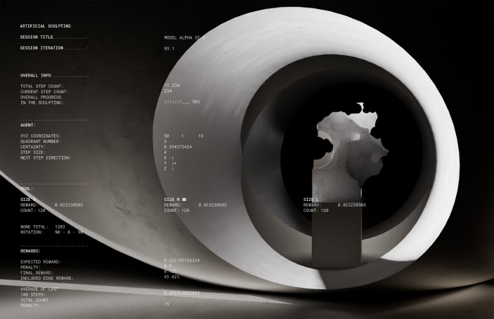
AI as Creator ?
What happens when AI becomes the creator? How can human creativity and machine-made output feed each other? Those are the questions onformative studio seeks to answer when they created an AI Sculpture. Read more here.
Color Inspiration of the Week
Chefchaouen, Morocco
This week check out colors from Chefchaouen, Morocco.

Typography Jargon Buster!
Script Fonts
Scripts are fonts mimicking handwriting. Influenced by cursives and calligraphy, scripts can be considered formal or casual. Formal scripts tend to be highly decorative, with swashes and exaggerated curls. Casual scripts are more subdued with less exuberant details.

Want more typography jargon buster? Check out this post!
Creative Prompt
Create something with Rubik.
Thank you
…for reading and hanging out here this week! Check out Rubik style variations.