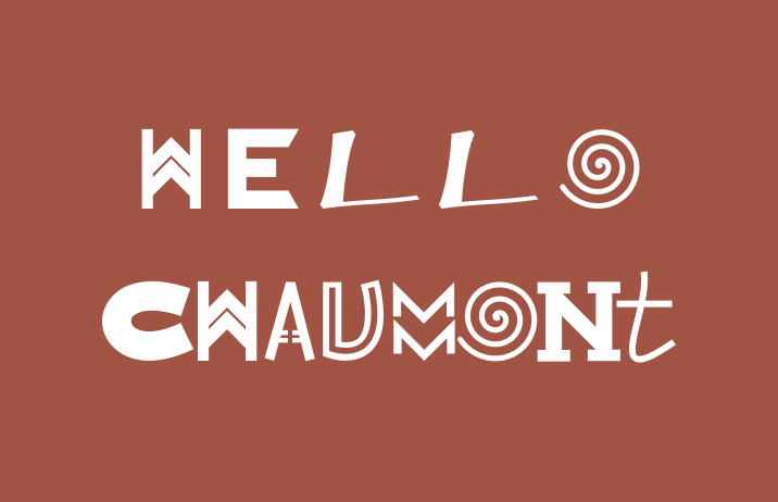
Reviewing Chaumont: An Artsy Display Font Perfect for Funky Visuals

In This Issue…
How to Use Chaumont for Logo, Branding & More
- Font of the Week: Chaumont
- Design Idea of the Week: Collected Objects
- Color Inspiration: Jackson Pollock
Font of the Week
Font of Chaumont
One of the most innovative graphic design festivals is the Chaumont Poster Design Festival in Chaumont, France. Every year, there are tons of eye-opening visual treats and creativity. It features works of beauty, from up and coming to renowned designers.

The creativity of the Chaumont Poster Design Festival inspired today’s font, which is also named Chaumont. It captures the design festival’s spirit with its kook. It is a graphic display font that you can use in any project to showcase a funky personality.
Font Details
- Quirky graphic letterforms
- No punctuation marks in this font
How to use it for logo?
This font communicates funkiness. It is perfect for an artsy and creative project looking to be visual and attention-grabbing.
How to use it for marketing?
Chaumont is great for funky landing pages and statement-making graphics. It has fantastic visual textures for graphics. You can use it to create an interesting visual statement or animation by combining it with a more readable font like Roboto. It is only available in one weight.
Would readability become an issue?
It can. While it’s readable, it’s not the clearest. It’s probably better to use it for large-size copies with a “graphic punch.” Avoid using it for important information.

Design Idea of the Week
Found Objects
Do you save interesting objects you encounter?
It is a habit of mine to collect different currencies from the countries I traveled to. These things you collect can become design assets through photography and scanning to create additional textures, visuals for your projects. Using your own photography and interesting objects can be more attention-grabbing and authentic than using stock images and online photos.
Color Inspiration of the Week
Jackson Pollock
Jackson Pollock was known for painting like these, which is called “action” painting. He did things like using his body to paint, splashing paint directly onto the canvas. His painting was significant because it was direct documentation of his invented process. It made people pay attention to the ways of creation.
Brick red #A15444 | Charcoal #2B2A2A | Mustard #CDC048 | Cobalt #4062AC Jargon Buster!
Slab Serif
early 19th century, ~1817
Slab serifs have very thick, block-like serifs.
Example: Roboto Slab
Stroke Contrast: various
Creative Prompt
Set a song lyric to Chaumont. If you feel like sharing, I would love to see it!
Thank you!
Thanks for being hanging out here this week. Chaumont is available here. It is designed by Frank Adebiaye.


