How to Use Koho: A Square Shaped Calligraphic Font Speaking Openness

In This Issue…
How to Use Koho for Logo, Branding & More
- Font of the Week: Koho
- Design Idea of the Week: Gif Yourself!
- Color Inspiration: Chainat Bird Park, in Thailand

Font of the Week
Overview about Kaho
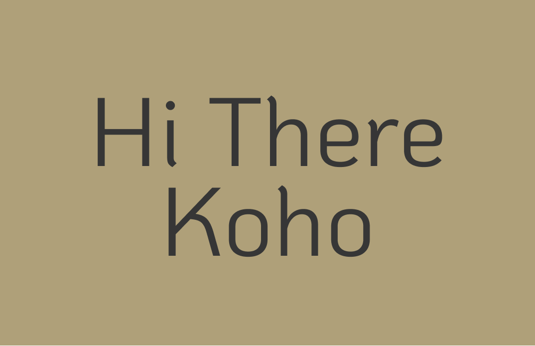
Koho is a humanist sans serif mixing calligraphy with modern influences. It has characteristics of both monospace fonts and humanist sans serif. If we look closely at the letterforms, we see a slight turn right at the beginning of each stroke. Little details like this bring us a calligraphic feel. After the turn, the stroke width remains consistent, which feels functional and mechanical. This harmony between the organic and functional creates a unique vibe that is inviting to the user. Kaho also supports Thai characters.
Font Details
- Oblong close counters
- Single story “g”: to showcase its modernness, as opposed to a double-story “g”
- Slight turning at strokes to hint at its calligraphic influence
- large x-height (forgot what x-height is? Check out here)

How to Use Koho for Logo?
- Oblong shapes, consistent stroke, calligraphic influence, and large x-height communicate warmth and openness
- Perfect for tech brands
How to Use Koho for Marketing and Branding ?
Koho can be used for display and for smaller sizes and more complex reading and information rendering. It has regular and italic in six weights. It can support complex projects like product landing pages and app interfaces. It can pair with Daubenton.
Design Idea of the Week
Gif yourself!
You probably encounter gifs every single day. Making your own custom animated gifs can be fun and memorable for marketing your product. It is also simple to do with online tools like ezgif by uploading a video and edit it down to a gif.
My hack is to use Figma’s prototype feature to auto animate quickly (this video does a good job of overviewing this feature if you are looking for one.). Then use screen recording to make a video and edit it down to a gif. This trick allows me to create simple yet custom gifs from scratch when I’m in a pinch.
Color Idea of the Week
Chainat Bird Park
Today we have some beautiful colors from Chainat Bird Park, in Chai Nat Province, Thailand.
Tree Bark #AFA079 | Grass #CFCF7D | Grass #98AC55 | Petal #EED0D3
Jargon Buster!
Sans Serif
Sans Serifs are first seen before the 18th century but weren’t used as widely. Sans Serif fonts do not have serifs extending at the end of strokes. By the early 19th century, Sans Serif became more popular.
Creative Prompt
Create a graphic with Koho!
Thank you!
Thanks for being hanging out here this week. Koho is available here. It is designed by Cadson Demak.


