Reviewing Disko: A Nostalgic Graffiti Font
In This Issue…
How to Use Disko for Logo, Branding & More
- Font of the Week: Disko
- Design Idea: Sticking to Your Words
- Color Inspiration: Psychedelic Poster
Font of the Week
Lettering in the Street
Look at neighborhood walls, under bridges, and inside tunnels. The chances are, you will find some graffiti. But, what is their story?
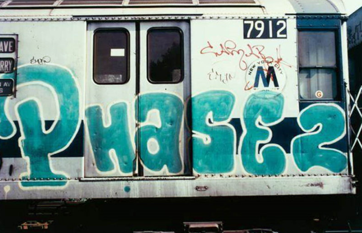
It is only recently that I start digging into graffiti's rich, underground histories. The "bubble letter" style of graffiti writing, characterized by fat, marshmallow-like shapes, is known as softies. It was developed by the graffiti artist Phase 2 (real name, Michael Lawrence Marrow) in New York in 1972. Phase 2 also embellished his softies, creating stylistic variations by combining elements such as arrows, stars, clouds, and drips. Other graffiti artists soon begin to copy and parody the softie, adding their takes in the process.
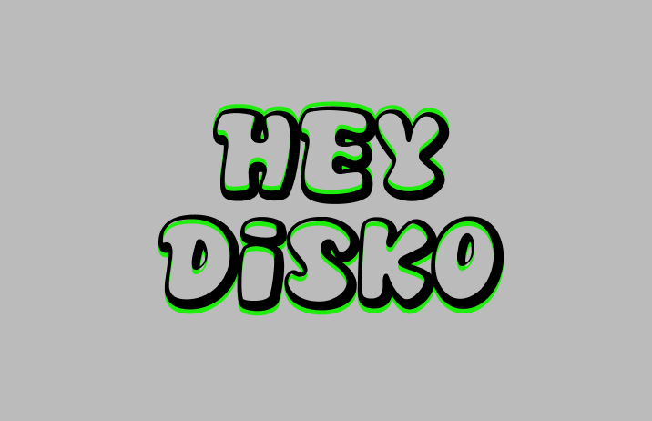
About Disko
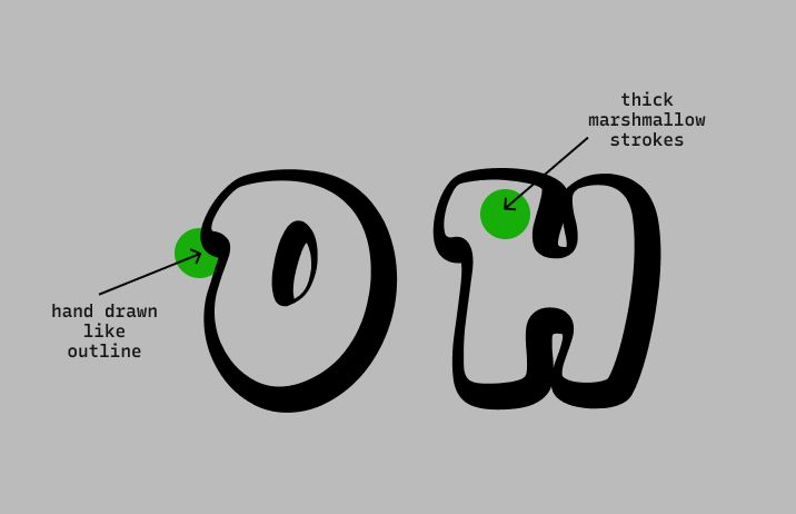
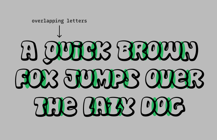
Disko is a fat, graffiti-inspired font that feels a little old school. The letters, puffy like marshmallows, remind you of softies. At its natural state (if you don't manipulate the letter-spacing), Disko letters overlap to create a hand-drawn vibe. It's a loud, urban outline font.
Font Details
- Fat strokes with hand-drawn like outlines
- Letters slightly overlap
- Uppercase letters only (except i and e)
How to use Disko for Logos?
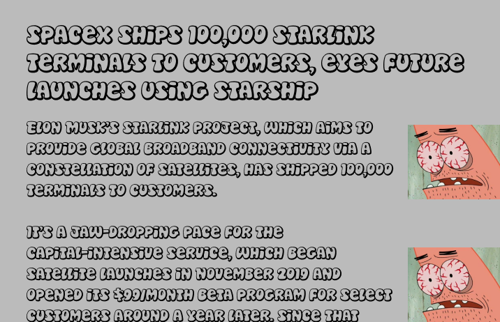
Disk communicates loud, funkiness, urban in a bold and colloquial tone. Because it has a colloquial, urban tone, it is only appropriate for particular brands. For example, those focusing on youth, pop culture, urban spaces, or similar. It may not be right for something that looks to be classic or serious. Imagine setting a research paper in this font, it would be hard to take the research findings seriously!
How to use Disko for marketing?
Disko is great for eye-catching graphics and large-size copies. It is excellent for swags like stickers, t-shirts, and posters, where its boldness can add an extra graphic punch.
While the outline and overlapping letters add a fantastic visual touch to Disko, both also make Disko hard to read in small sizes. The outline can break down in small sizes, which makes Disko a poor choice for body copy. Disko can pair with Montserrat because Montserrat is also an urban-inspired typeface.
Design Idea of the Week
Sticking to Your Words
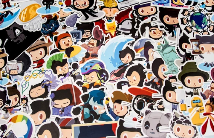
We see stickers every day, but do you ever wonder who invented them?
The concept of stickers can go back as far as the ancient Egyptians (they pasted pieces of paper onto the walls to display prices of goods for trading). However, modern stickers may have come from Sir Rowland Hill, who invented the adhesive paper in 1839. Stickers are a great way to get your business name out there. At conferences and events, you will see stickers all over. Businesses also send them to customers. They are easy to distribute, and people can put them up anywhere. They increase brand awareness.
Stickers are relatively easy to DIY. If you have a printer, you can even make them at home with adhesive paper. While you could be using your logo, the design can also be an opportunity to build up emotional connections with your customers. What if you use a word or catchphrase? What if you create a cute mascot? What if you use custom memes for your brand?
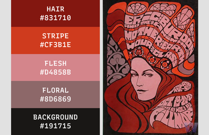
Color Idea of the Week
Psychedelic Posters
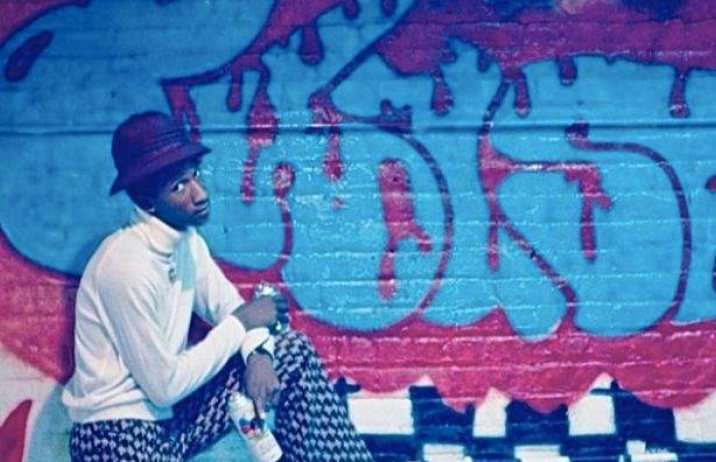
While Phase 2 is revolutionizing graffiti on the streets in the 1970s, Bonnie MacLean was conquering the design world with her ornate psychedelic posters for The Filmore, an iconic music venue in San Francisco. These vibrant posters advertised concerts of famous musicians back in the day.
Typography Jargon Buster!
Font Weight
How thick or thin the character is: the weight of a particular font is the thickness of a character’s strokes relative to its height.
Creative Prompt
Can you draw a plan for your customized sticker? I would love to see what you create via Twitter or Email.
Thank you!
Thanks for being here for another week. Disko s available here. It is designed by Jess Latham.