Reviewing Inter: A Versatile Font for Web and User Interface

In This Issue…
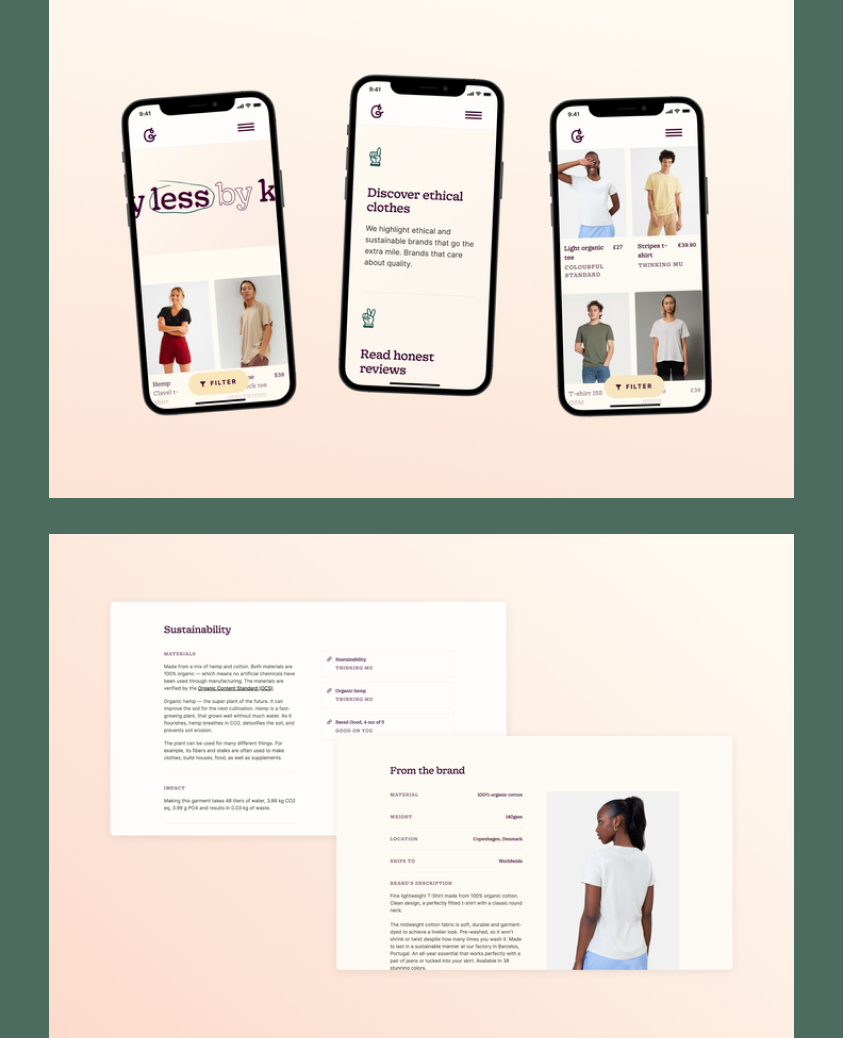
How to Use Inter for Logo and Branding
- Font of the Week: Inter
- Color Inspiration: Milwaukee, Wisconsin
Font of the Week
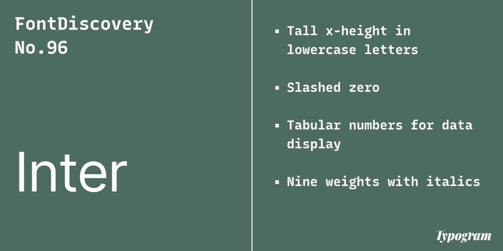
About Inter
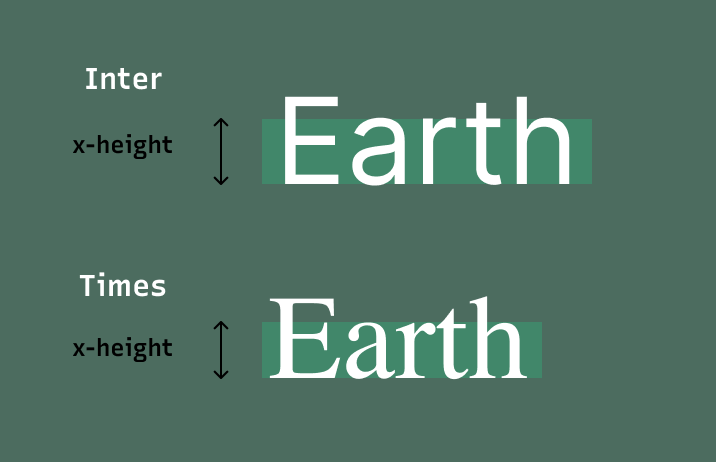
This week we share inter, a highly versatile neo-grotesque sans-serif font perfect for digital things like the web and apps. My favorite part about Inter is that it has features optimizing screen-based reading experience. For example, Inter’s lowercase letters have a tall x-height to aid the readability of sentences with mixed-cased texts. This makes Inter perfect for blogs, app interfaces, and even video screens. Information can be read quickly, with ease and clarity.
Font Details
Tall x-height in lowercase letters
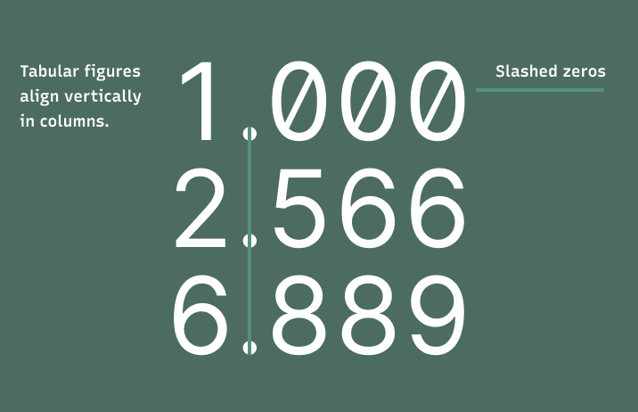
Slashed zero
Tabular numbers for data display
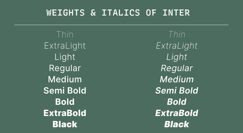
Nine weights with italics
How to use Inter for logos?
Inter is a versatile font communicating with a neutral tone. The bolder weights, such as Medium, Semi Bold, and up are perfect for logos for brands looking to be objective and modern.
How to use Inter for marketing and branding?
Inter is perfect for blogs, newsletters, and user interfaces. Its design features optimize the reading experience, and its many weights can support complex information hierarchy to ensure good user experiences.
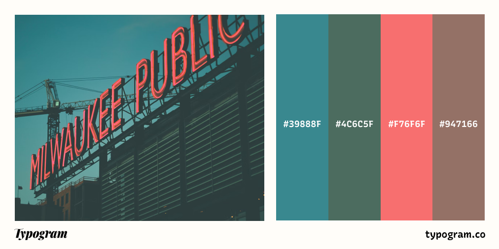
Color Inspiration of the Week
Milwaukee, Wisconsin
This week, check out colors from Milwaukee, Wisconsin.
Typography Jargon Buster!
Display Font
Display fonts are often fonts with unrestrained, decorative details. They look more visually stimulating than restrained, simple fonts used for paragraph text. Display fonts are used at header sizes, grabbing people’s attention immediately. Many display fonts have poor readability in small sizes because of their more ornate shapes. Their font details get lost in small sizes, thus decreasing their legibility.

Want more typography jargon buster? Check out this post!
Creative Prompt
Create something with Inter.
Thank you
…for reading and hanging out here this week! Inter is available here.