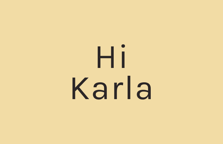
How to Use Karla: A Versatile Sans Serif with Multiple Weights
In This Issue…
- Font of the Week: Karla
- Color Palette of the Week: Spring Bloom
Font of the Week
About Karla
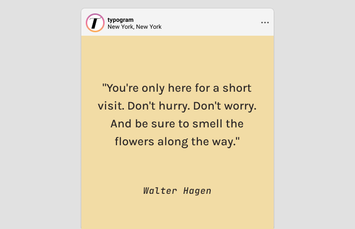
Karla is a contemporary sans-serif typeface. Released in 2012, Karla was created to provide a versatile and modern typographic solution that blends geometric and humanist elements, making a fantastic, versatile font for all kinds of projects. Its design was driven by the need for a functional with strong visual appeal that could be used across various media and languages.
Originally designed for body text, Karla features a refined and balanced structure, offering excellent readability across various digital and print platforms. Its humanist influences give the font a subtle warmth, setting it apart from more geometric sans-serifs. The font's inspiration lies in the balance between functional clarity and friendly character, making it ideal for brands that seek to communicate both professionalism and approachability.
Karla Font Details
High x-height, and clean, legible lines enhancing readability
Quirky features like tail on the uppercase Q and lowercase q
- Multiple weights and styles, perfect for complex information system

Though Karla is fairly neutral, it has quirky font features that bring a friendly tone to your brand. The heavier weights are perfect for logo creation.

How to Use Karla for marketing?
Karla is perfect for marketing projects. Because it has multiple weights, Karla is fantastic for projects with complex information hierarchy, like a text heavy website or a magazine.

Color Inspiration of the Week
Spring Bloom
This week check out amazing colors from a blooming Hoya!

