How to Use Lato for Design Ideas
In This Issue…
- Branding Example of the Week: Lloyds Bank
- Font of the Week: Lato
- Spring Color Palette: Lime
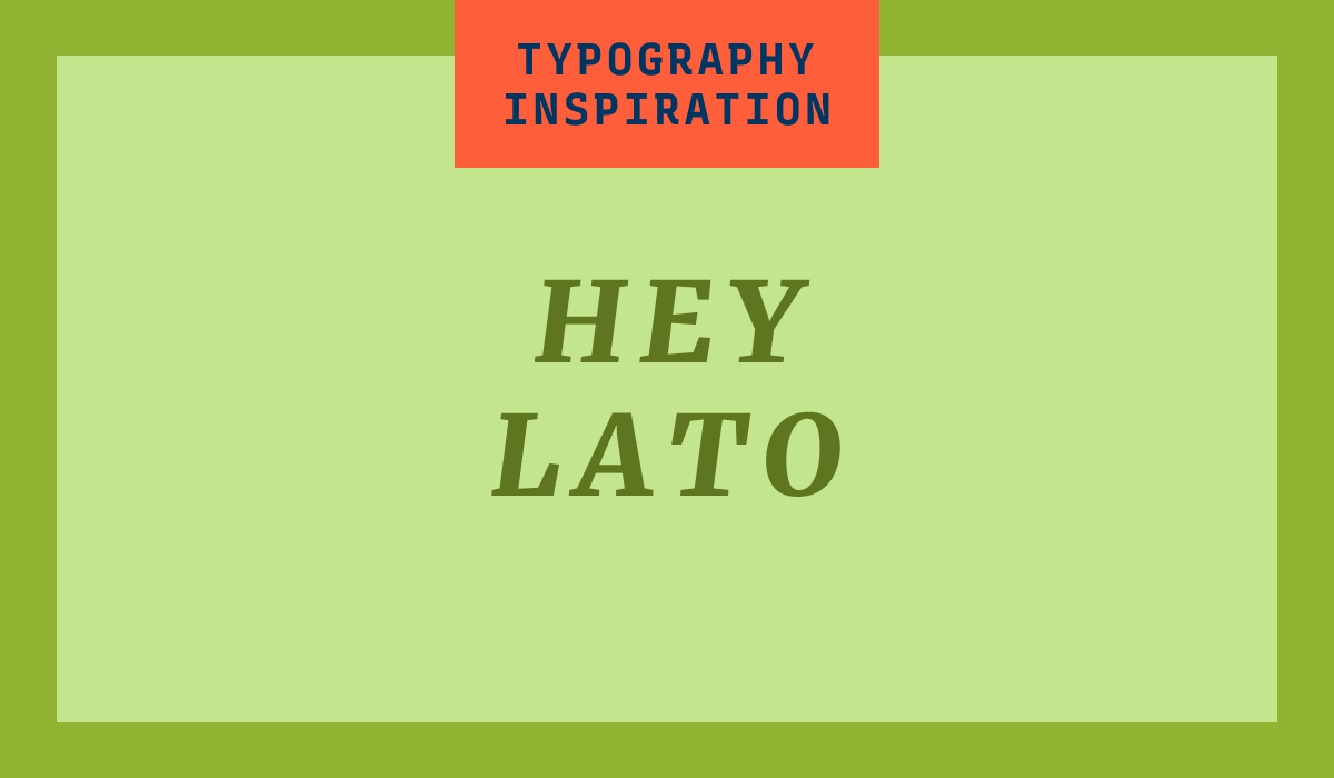
Font of the Week
All About Lato
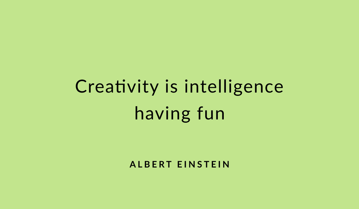
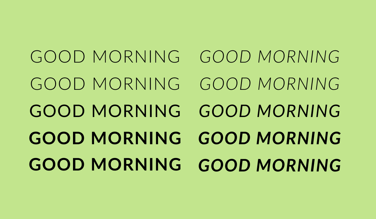
Lato means 'summer' in Polish, reflecting its warm and friendly nature. It is well-balanced between classic and modern, giving it versatility for both body text and headings. Lato is warm, stable, and professional, with a slight twist of friendliness. It blends traditional letterform proportions with modern aesthetics, making it versatile for many uses, from body text to logos and headings. Lato italic also adds to the quirk of this font family.
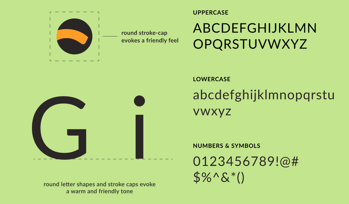
Lato Font Details
- Warm and Friendly: Lato’s semi-rounded letters give it a warm, humanistic touch while maintaining professionalism.
- Balanced Design: Lato’s slightly round stroke caps balance seriousness and playfulness, making it suitable for serious or friendly branding.
- Versatile Weights: With multiple weights and styles, Lato works well in different design contexts, from headers to body text.
How to Use Lato for Logo?
Lato features a warm, humanistic feel with semi-rounded letters that give off a friendly vibe. It’s great for brands that want to balance professionalism with approachability. This font works well in logos that aim to reflect openness and positivity, and it pairs nicely with playful or dynamic design elements.
How to Use Lato for Branding & Marketing?
Lato’s approachable yet professional tone is well-suited for branding that emphasizes friendliness and transparency. This makes it ideal for use in customer-facing materials, such as emails, websites, and packaging, where an inviting and relatable feel is important for the brand's identity.
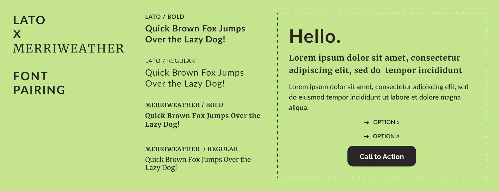
Lato Font Pairing
- Lato + Merriweather
- Lato + Oswald
- Lato + Poppins
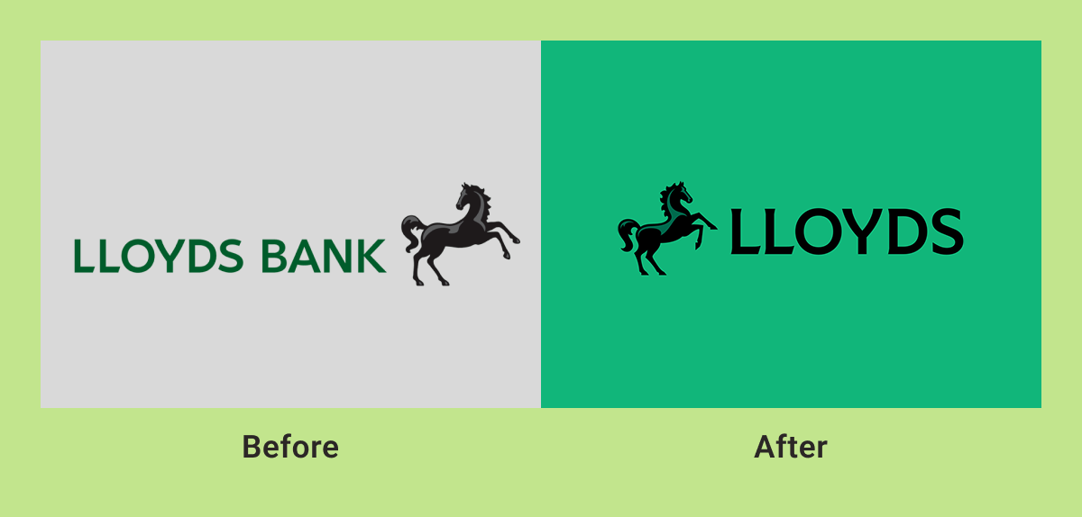
Branding Example of the Week
Financial Services Branding for Lloyds Bank
Lloyds Bank is one of the leading retail and commercial banks in the United Kingdom. Lloyds Bank’s latest logo redesign modernizes the brand with a custom font while retaining the black horse symbol in the original branding. The horse symbol is also made sleeker and larger to reflect momentum and progression. The refreshed design focuses on updating the bank to feel more approachable.
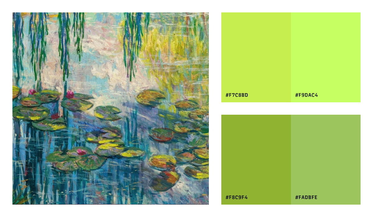
Color Inspiration of the Week
This week enjoy this the lime shades of spring color palette.