Antic: A Calligraphic-Inspired Sans Serif Perfect for Graphic Design

Antic – A Modern Calligraphy-Inspired Sans Serif for Designers
If you're a graphic designer searching for a clean, elegant typeface with personality, Antic might be your new favorite. Designed by Santiago Orozco, Antic blends the graceful flow of traditional calligraphy with the simplicity of a modern sans serif font—making it a strong choice for everything from logo design to branding projects.
About Antic
Antic is a calligraphic sans serif font bringing the elegance and fluidity of traditional calligraphy into a modern sans serif form.
This creative fusion gives Antic a distinctive character that appeals to graphic designers and creatives looking to infuse their work with a touch of classic sophistication and contemporary style. Inspired by the fluid motion of handwriting, it offers soft curves and low-contrast strokes that feel refined yet approachable.
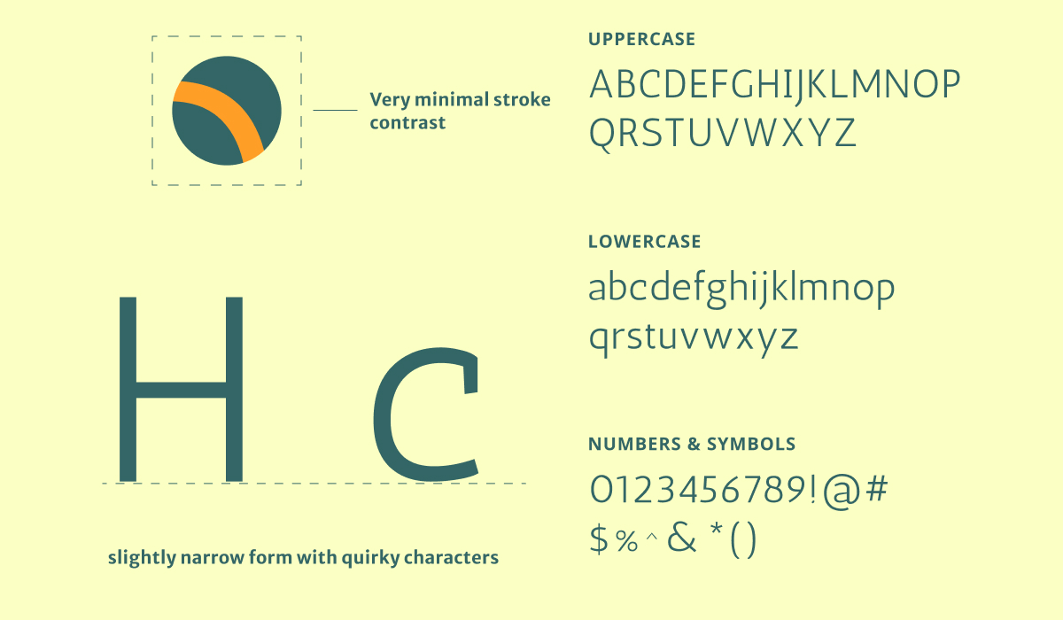
Antic Font Details at a Glance
Ideal for graphic designers, UI/UX designers, and creative marketers looking to add warmth and personality to their work, Antic brings a unique visual rhythm to your typography. Its gentle, kind presence makes it an excellent choice for typographic design mostly as display font for headers and call-out copies.
Style: Calligraphy-inspired sans serif, there is also a high contrast serif version of Antic and a Antic Slab Serif
Tone: Elegant, human, modern
Best for: branding, editorial, packaging, digital content
Font Features: Soft curves, mono weight strokes, moderate thin appearance
Font Weight: One regular weight (no italics)
Why Designers Love Antic
Antic is an excellent font for designers looking to create branding systems that feel both sophisticated and approachable. Whether you're working on a high-end beauty brand or a wellness startup, Antic brings visual warmth and emotional depth to your typography.
Antic is Great For:
Lifestyle brands
Creative businesses and agencies
Wellness and health brands
Premium product packaging
Minimalist and heritage-inspired identities
Using Antic for Logo
When it comes to logo design, Antic stands out without trying too hard. Its subtle calligraphic touches give logos a timeless and authentic feel while remaining clean and professional.
Designer Tip:
Because Antic has only one weight and thinner strokes, it can appear too light in small sizes. Consider outlining the type or pairing it with a bolder font for enhanced legibility at small scales.
Use Antic in logos that aim to communicate:
Elegance and ease
Authenticity
A modern take on heritage branding
Using Antic in Branding and Marketing
Antic is a versatile font that brings warmth and approachability to branding. Its gentle, calligraphic curves help create a human connection—ideal for content that builds trust and emotional engagement.
Best suited for:
Lifestyle brands
Wellness products
Creative businesses
Boutique and premium offerings
Antic strikes a rare balance: it’s refined enough for upscale markets, yet relaxed enough for inclusive, approachable branding.
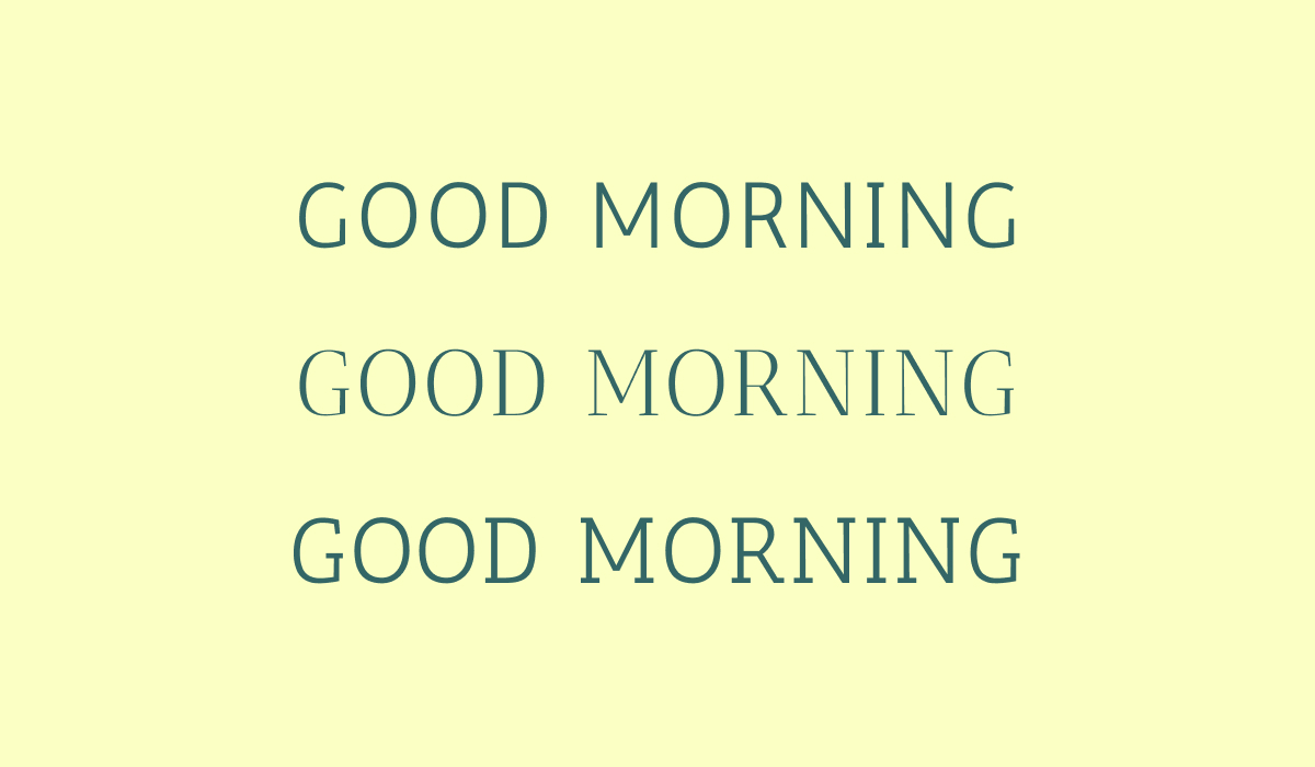
Typography Tip: Use Antic for Headlines, Not Body Text
While Antic is beautiful in display sizes, it's not ideal for long-form reading. Its thin lines may reduce legibility in small text.
Use Antic for:
Headlines and subheads
Hero sections
Taglines and callouts
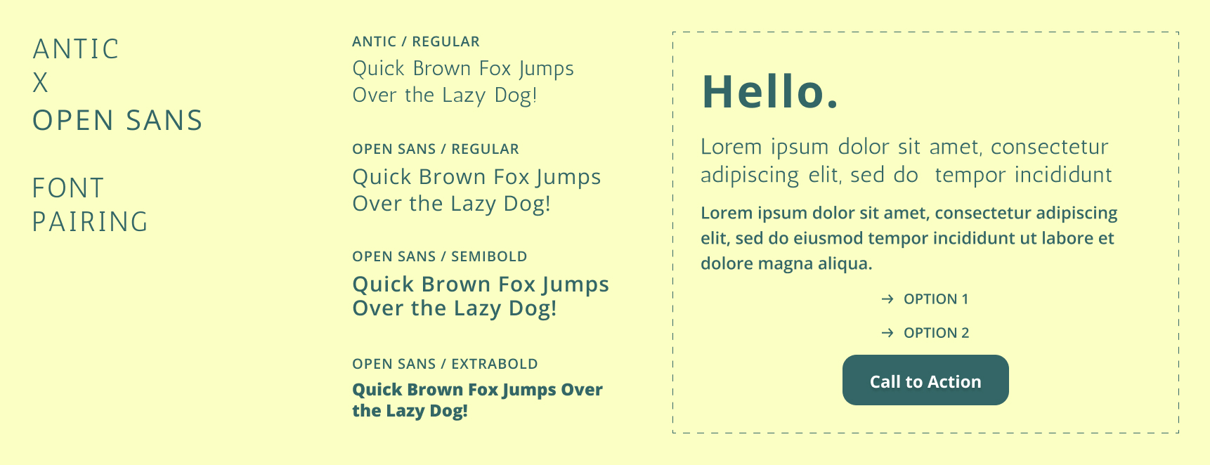
Antic Font Pairings
- Roboto: This clean and modern sans serif complements Antic’s calligraphic nuances by offering fresh clarity, perfect for informational content.
- Merriweather: The serif form of Merriweather adds a traditional counterpart to Antic’s modern calligraphic features, making it great for sophisticated typographic design.
- Antic Didone: An elegant single weight modern serif version of Antic.