A Font for Meetings: Try this Font If You Need a Permanent Marker
In This Issue…
How to Use Permanent Marker for Logo, Branding & More
- Font of the Week: Permanent Marker
- Design idea: An Ergonomic Approach to Extensive Sitting
- Color Inspiration: Summer Palms

Font of the Week
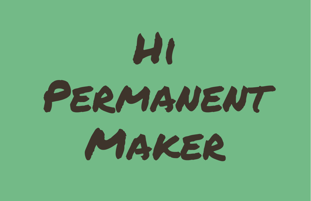
About Permanent Marker
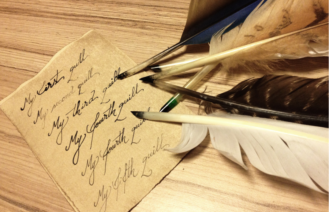
The writing instruments often impact the shape and tones of our handwriting. The quill pen can create a formal or casual script. Constructed from a feather, the Quill is as light as a feather (literally) and has aerodynamics that many other writing tools lack, often producing swift, graceful, and long strokes(source). (If you want to check out a quill script, check out our previous feature, Nathalia Script).
A more common modern writing instrument is the dutiful pencil, often used in school. Because it is a hard round tip, the letters created from pencils have strokes with little width variations and sometimes even a rounded tip at the strokes’ ends.
This week’s font mimics the favorite tool of meetings and whiteboard exercises: permanent markers. Permanent Marker font imitates the casual, carefree, thick-stroked handwriting created with a permanent marker.

Font Details
- All uppercase, with small caps for lowercase letters
- Thick strokes mimicking markers
- One weight only
How to use Permanent Marker for Logo?
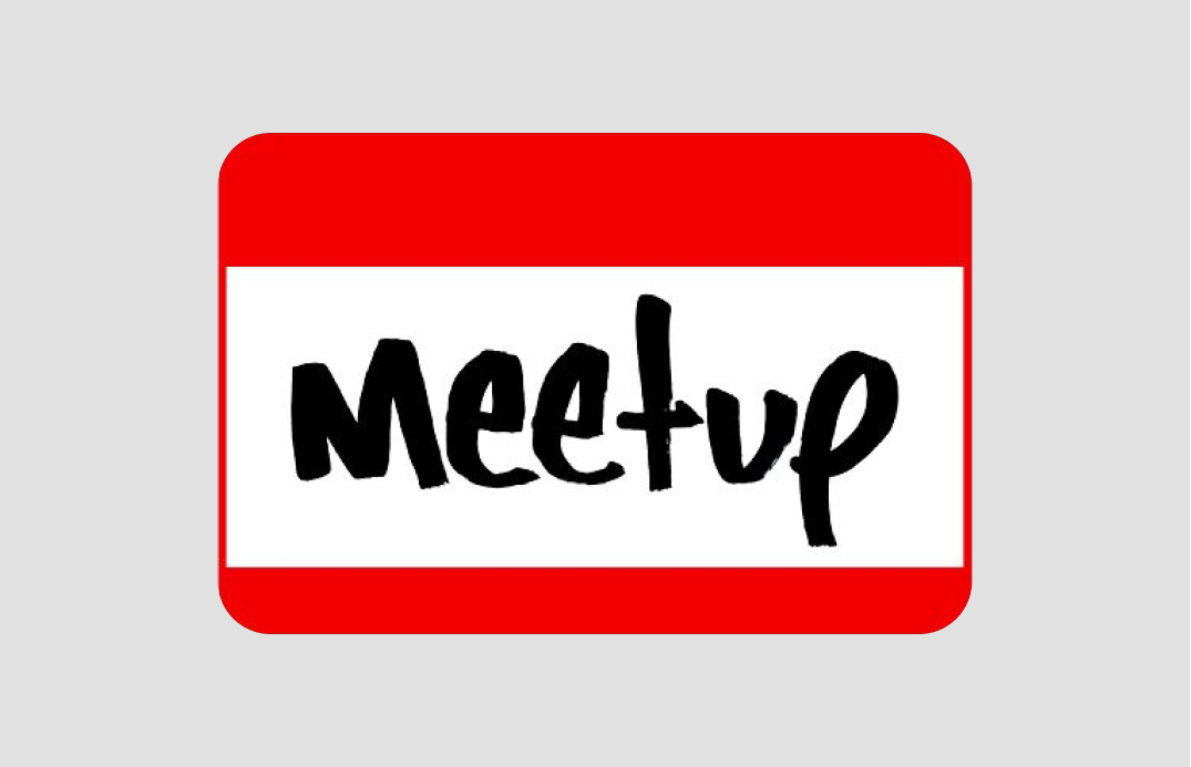
A well-known example of a similar vibe logo is Meet-Up’s original logo. Permanent marker brings a casual and inviting touch to designs. Because of this casual tone, It may be inappropriate to use for certain subjects, like a serious newspaper. Make sure the logo is legible in small sizes since Permanent Marker is a bold display font.
How to use Permanent Marker for Branding?
Due to its casual tone, Permanent Marker is better for visual show pieces like marketing graphics than quotes or copies that require serious or professional tones. Being a display font, it is also hard to read in small paragraph sizes.

Design Idea of the Week
An Ergonomic Approach to Extensive Sitting
Over the weekend, I came across this insightful read from Cornell Ergo lab for those of us who spent a lot of time sitting while working. Apparently, sitting longer than even one hour causes biochemical changes in enzymes responsible for fat metabolism and other health risks. 😬
Fixes? Build frequent movement variety into the typical workday, like a sit and stand combo, read more here.
Color Inspiration of the Week
Summer Palms
This week, enjoy this wonderful summer color palette of palm trees!
Coco #3E342B | Sand #CBB282 | Fern #73BA87 | Cornflower #6990A3

Typography Jargon Buster
Typeface
A typeface is a set of glyphs or characters sharing a common and cohesive design. For example, the Helvetica typeface shares the visual commonalities of lacking a serif, a stroke attached at the end of a larger stroke in a letter, and having little to no variation between stroke width.

Want more Typography jargon busters? See here.
Creative Prompt
Create something with Permanent Marker.
Thank you
…for reading and hanging out here this week! Permanent Marker is available here.
