How to Use Stick No Bills: An Excellent Stencil Font to Grab Attention
In This Issue...
How to Use Stick No Bills for Branding and Logo Design
- Font of the Week: Stick No Bills
- Design Idea of the Week: SEO Resources
- Color Inspiration of the Week: Sunset in the Rocky Mountains
Font of the Week
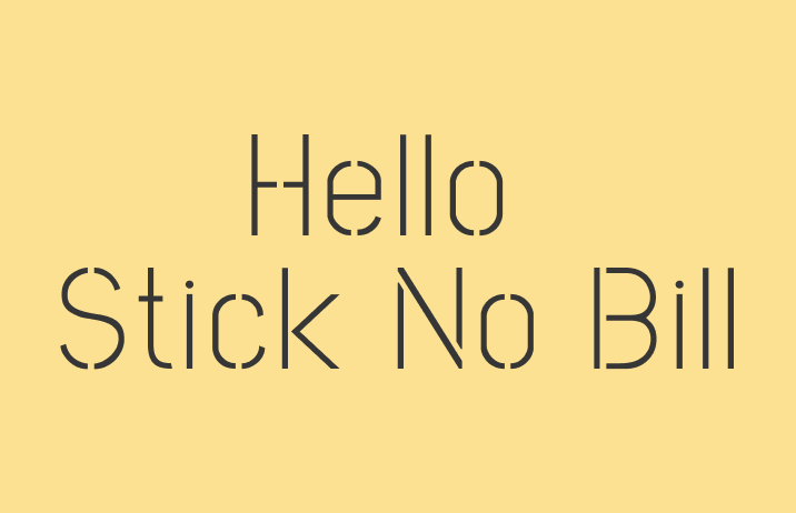
Stick No Bills the Stencil Font
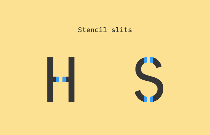
If you see a font with slits in its strokes, that means it’s a stencil font. The earliest stencil, cut from leaves, dated as early as 30,000 BC (source). Stencil-style fonts are my favorite fonts because they are easily replicable across different materials. You can use them on the computer or make them into actual stencils to spray paint onto another surface. The versatility of stencils has inspired generations of artists and DIY enthusiasts.
The creativity of DIY is what inspired the maker to create Stick No Bills. Stick No Bills was used initially as the brand typeface of Stick No Bills Poster Gallery In Sri Lanka because they felt inspired by the Sinhala and Tamil stencils fonts found there. A nod to the urban landscape and DIY, Stick No Bills is a modern, sleek stencil with an edgy streak.
Font Details
Stencil slits
Seven weights

How to use Stick No Bills for logos?
Stick No Bills is a great font for an artsy, creative brand. The letter width is slightly narrow, giving a long, modern appearance. The lighter weights feel sleek, while the bolder weights appear edgy and urban. While the letters are perfectly legible as logos, the thin stroke of extra lightweight does get a little hard to read under small scales.

How to use Stick No Bills for branding and marketing?
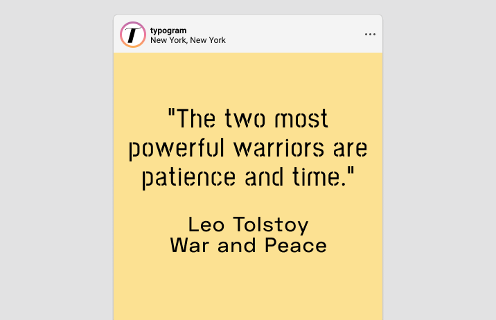
Stick No Bills is a display font and should only be used for headers and large sizes. It is best to avoid using smaller body copies because it makes the information look distracting. Stencils already appear decorative with slits, so they generally pair better with sans serifs because there is less visual noise. Stick No Bill pairs well with Space Grotesque.

Design Idea of the Week
SEO Resources
Recently I am learning more about SEO. SEO is the study of how to optimize your projects for search engines. In the beginning, I was hesitant to learn it because it seems dry. Forcing myself to learn this topic has made me understand a lot about how search engines work, which has been very illuminating. It is definitely very useful to know something about SEO if you create any work online.
Course: SEO for Devs
This free SEO course is created for developers with short, easy-to-follow videos. It’s easy to grab a snack and watch these.
Videos: SEO Snippets
A list of bite-sized video content created by the “officials” at the “Search Bureau,” aka. Google. I recommend watching these videos after knowing some background for SEO.
Article: Subdomain vs. Subdirectory – Which Is Better for SEO?
A handy guide that settles the debate about subdomain vs. subdirectory, as well as the technical SEO considerations.
Color Inspiration of the Week
Enjoy this beautiful sunset color palette from Rocky Mountains from the Canadian side!
Dark Night #0B1524 | Snow Purple #6E638E | Melting Sun #FFA510 | Soft Yellow #FCE192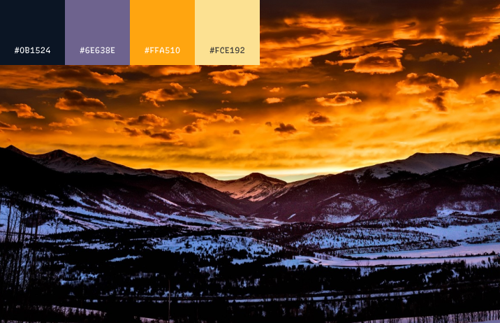
Typography Jargon Buster!
Baseline
The baseline is the horizon line where the letters sit.

Creative Prompt
Try creating a holiday graphic with Stick No Bills! Use Catogram if you need some graphics! (remember to use the coupon code, “font” ).
Thank You
Thank you for reading this week! Here is Stick No Bills.
