Reviewing Enriqueta: Quirky Inviting Slab Serif Perfect for Blogs
In This Issue...
Reviewing Enriqueta: Quirky Slab Serif with Inviting Details Perfect for Blogs
- Theme: Reserved Creativity
- Font of the Week: Enriqueta
- Design idea: Tools for Self Publishing
- Color Inspiration: Niagara Falls, New York


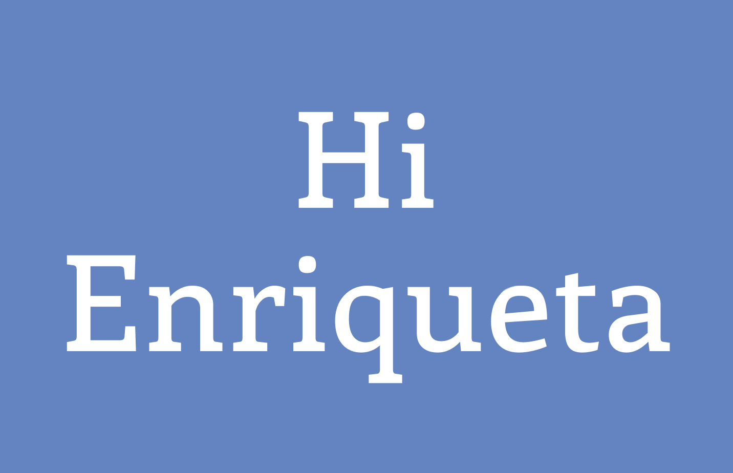
Font of the Week
All about Enriqueta
Enriqueta is a beautiful slab serif with a crafty spirit. Initially, it was created for silk screen printing. A slab serif is a serif with large, block-like serifs. Ultra is a slab serif we covered in the past in this newsletter. Due to their large serif sizes and wide letter width, slab serifs usually come off warm and inviting. Many brands love this agreeableness. Brands like Martha Stewart, Medium, even the US Postal Service have used slab serifs for their warmth.

Design-wise, Enriqueta communicates forthrightness and warmth with a reserved creative spirit. There is a slight contrast between the strokes and bracketing, adding a human touch to the letters. The tails on letters like “k” also are flowy, but with control. The pleasant and inviting visual qualities of Enriqueta make it great for projects in service, hospitality, and publishing spaces.
Font Details
- Large block-like serif
- Calligraphic influence with varied stroke width and controlled flowy tail
- Four weights and no italic

How to use Enriqueta for logo?
Medium and bold weights work great for logos. It can be great for projects that want to communicate warmth with a creative kick.
How to use Enriqueta for marketing?
Enriqueta has no italic and four weights and is legible in text size. Because Enriqueta has no italics, I prefer to pair it with a sans serif with italics for projects. Enriqueta makes excellent pairs with humanist sans serif like Noto.


Design/Marketing Idea of the Week
Tools for Self Publishing
Self-publishing is an excellent technique for marketing. It is ubiquitous in the design industry to self-publish magazines and photobooks (and they are beautiful too!) for personal projects. This week, we share free self-publishing resources:
Lulu Self Publish
A great self-publishing site for printing and making books. Physical books are created by uploading a pdf. The Platform is free to use, and Lulu charges for printing and shipping. I have only used the paperback service, and the quality is ok for the price.
Self Happy, Be Happy
This nonprofit organization focuses on helping photographers and creative people to self-publish their zines. They have free lectures and online classes available on Vimeo on demand. If you want to get creative with books and photos, this might be an excellent place to start.
Color Inspirations of the Week
Niagara Falls, New York
Enjoy the colors from Niagara Falls in New York, US.
Winter White #E3E9F0 | Icy Blue ##9EB4C8 | Deep Blue #6385C0 | Dark Blue #456F8D
Typography Jargon Buster!
Humanist Sans Serif
First seen around 1916
Humanist sans serif is characterized by calligraphic influence. You can see it in the stroke contrast. Overall, it has a more organic structure such as a double-story “a” or “g.” (A double-story “g” has a circular bottom part, like below. See Libre Franklin post for a review.)

Creative Prompt
Create a quick graphic with Enriqueta!
Thank You
Thank you for reading and hanging out here this week! You can find Enriqueta here. It is designed by FontFuror.
