Proxima Nova: A Must-Have Sans Serif for Web Typography
About Proxima Nova
In the world of typography, few fonts have had the cultural reach and quiet dominance of Proxima Nova. Designed by Mark Simonson and released in 2005, this geometric sans serif has earned a reputation for being both beautifully neutral and quietly stylish. So much so that it’s been called the typeface that replaced Helvetica as the world’s most popular font.
But how did it get here? Let’s dive into the story behind Proxima Nova — from its early sketches to web font stardom.
From Zanzibar to Proxima Nova: The Origin Story
The journey of Proxima Nova started back in 1981, when Mark Simonson first sketched a typeface he dubbed Zanzibar, a name chosen simply because he liked the way it sounded. This early version already showed hints of what Proxima Nova would become, with familiar lowercase forms and evolving uppercase designs.
Fast forward to 1991. While working as art director at Business Ethics magazine, Simonson frequently used Gill Sans, but longed for a cleaner, more neutral geometric sans serif with similar charm. Unable to find exactly what he wanted, he revisited his old sketches of Zanzibar and began work on a new typeface.
A Hybrid of Classic Inspirations
The second iteration of the font was called Visigothic, modeled after American Gothic styles. It drew inspiration from a range of classics — Helvetica, Akzidenz Grotesk, Futura, Kabel, and even U.S. highway signage. This mash-up of influences created a unique blend of modern proportions and geometric structure.
In 1994, Simonson released the typeface commercially under the name Proxima Sans with just six styles. But with a full-time job, a new child, and lackluster sales, the project went on pause.
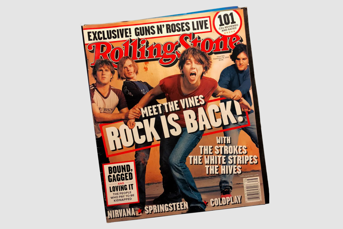
The Nova Moment
That changed in the early 2000s. Designers began reaching out, requesting an expanded family. The key turning point was also when Rolling Stone magazine selected Proxima Sans during a redesign. Proxima Sans was featured extensively for headlines, captions, subheads and small texts. The renewed interest inspired Simonson to overhaul the design completely.
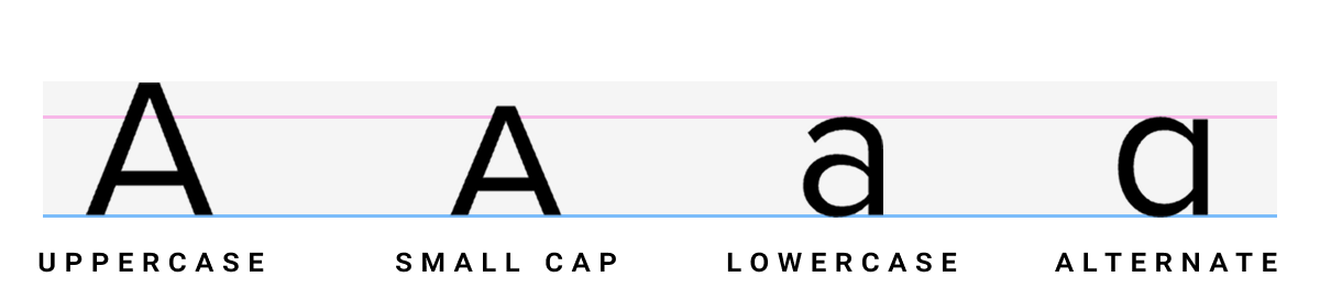
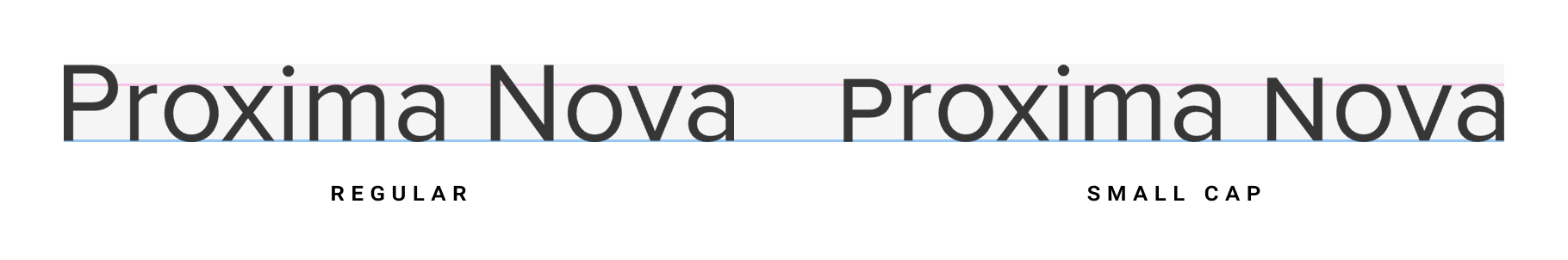
This wasn’t just a refresh. Simonson redrew nearly all the characters, reworked the font weights, rebuilt the hinting for sharper on-screen performance, and increased the character set from 245 to over 1,400 characters. He added OpenType features like small caps, multiple figure styles, fractions, case-sensitive forms, and alternate characters. Kerning and spacing were meticulously refined.
The redesign was so extensive that mark quickly realized the new design was ot goin ot be backwards -compatible with Proxima Sans, so he came up with a new name for the redesigned typface - Proxima Nova - because in his own words, the new typeface took “a cue from Century Nova, the final addition to ATF’s Century family in 1964, and one of the last foundry typefaces to be released.” In 2005, Proxima Nova was released.
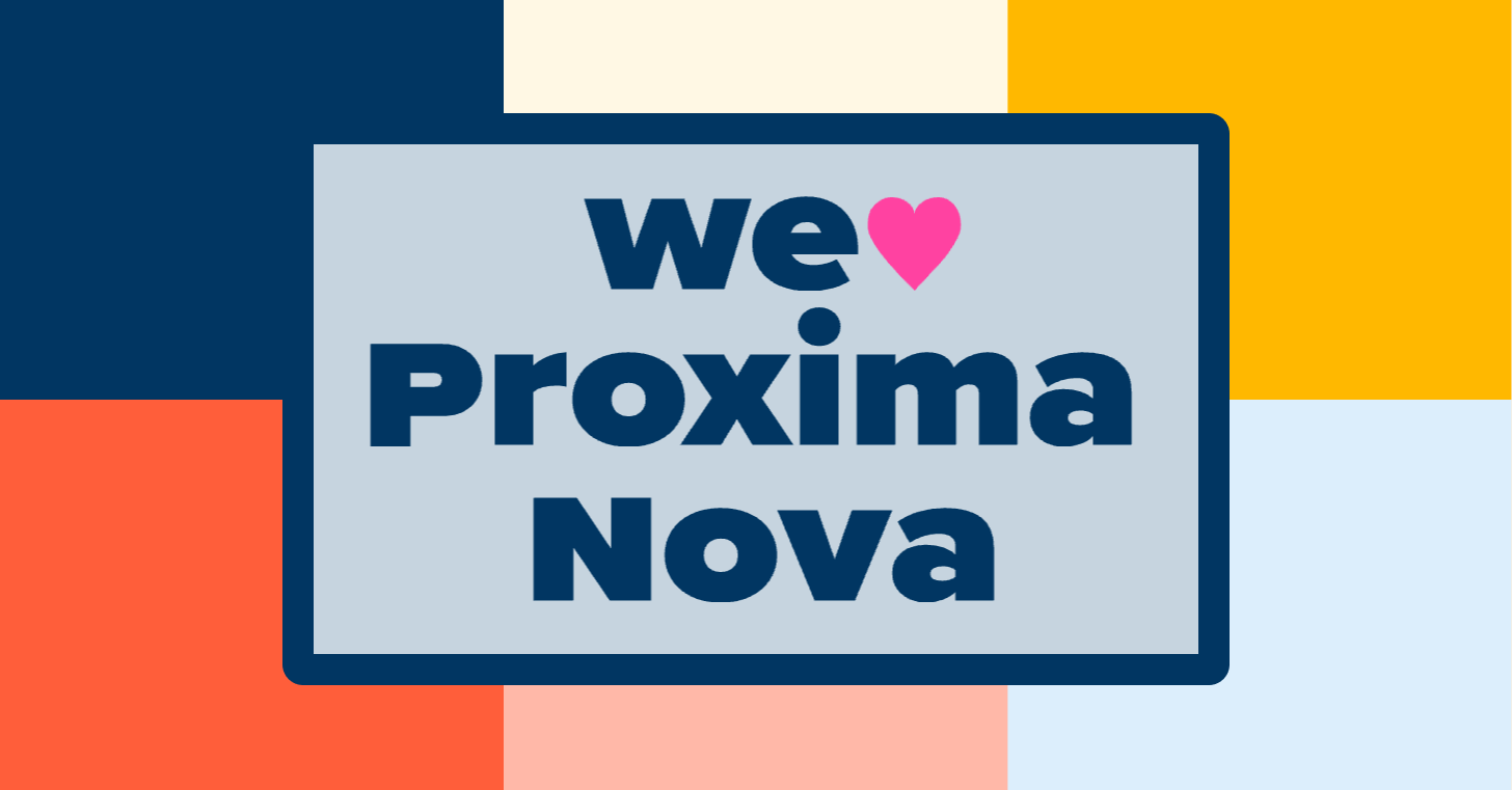
Why Designers Love Proxima Nova
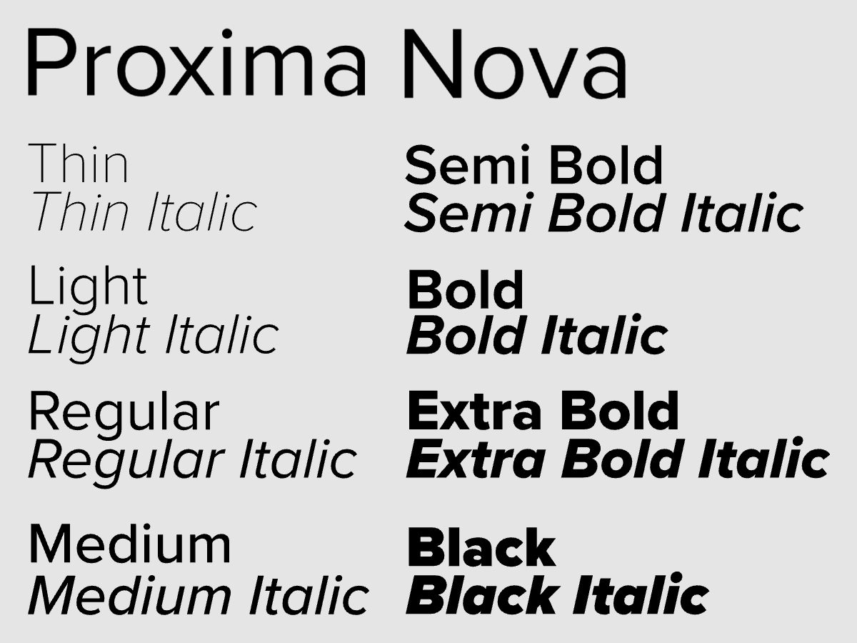
Proxima Nova has grown into a 48-font superfamily, available in eight weights (from Thin to Black) and three widths (Normal, Condensed, Extra Condensed). It supports a wide range of languages, including Greek and Vietnamese, and is widely available through platforms like Adobe Fonts and our very own – Typogram Studio.
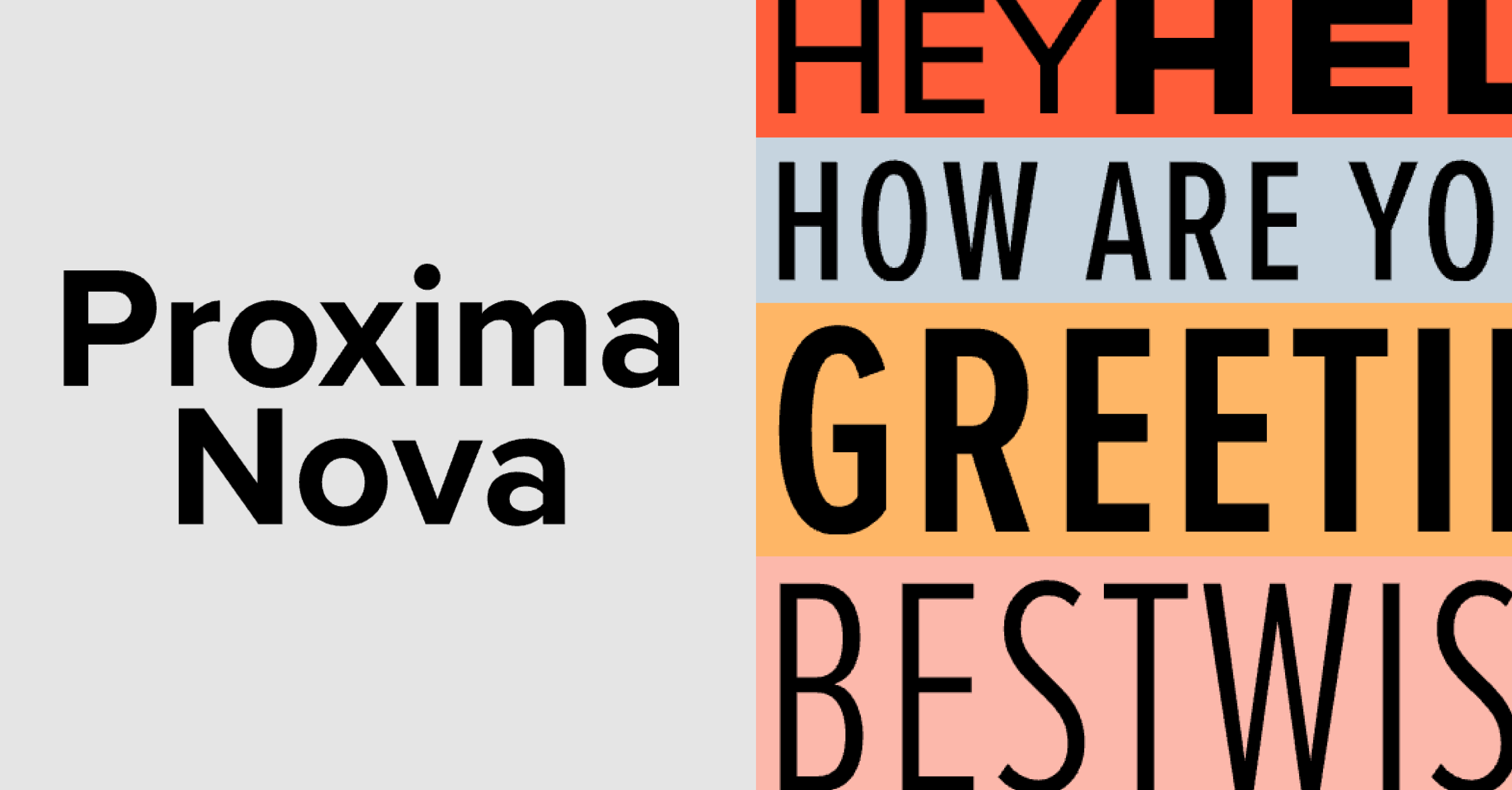
It’s not just technically robust — it’s visually satisfying. It offers the modernist clarity of Helvetica, but with a softer, more humanist touch. A great example? The lowercase “i”. In Helvetica, it’s dotted with a square. In Proxima Nova? A circle. It’s a tiny detail like this that really showcase Proxima Nova’s warmth.
The Typeface of the Web
Today, Proxima Nova is one of the most-used commercial typefaces on the web, appearing on thousands of websites and in countless brand identities. Its popularity is owed to its neutral versatility, excellent readability, and a tone that feels professional without being cold.
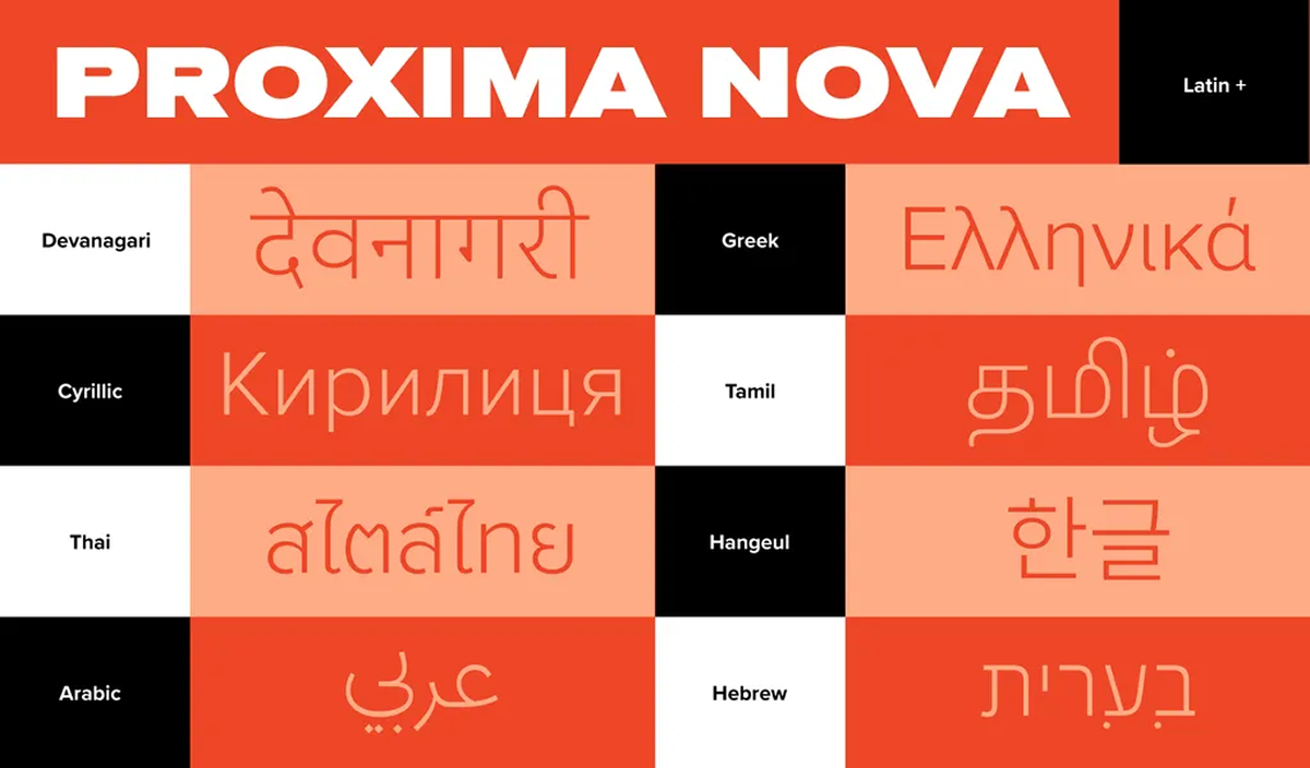
It has grown far beyond Mark’s original release, with a vastly expanded character set that now includes Greek, Cyrillic, Arabic, Hebrew, Thai, Hangeul, Tamil, and Devanagari. What began as a family of 42 fonts (seven weights, three widths, each with italics) has evolved into 80, boasting eight weights, five widths, and matching italics.
It’s no wonder Proxima Nova has become the go-to choice for designers looking for a modern sans serif that feels just right.