How to Use Noto Sans: a Fantastic Sans Serif Font for Multilingual Support
In This Issue…
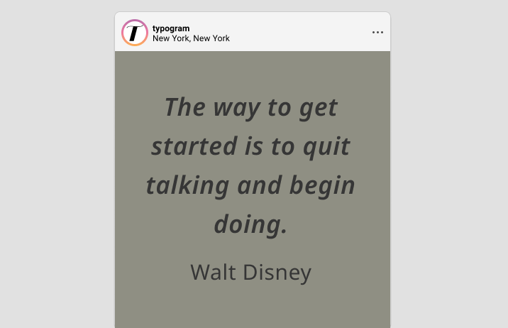
How to Use Noto Sans for Logo and Branding
- Font of the Week: Noto Sans
- Design Idea of the Week: Web Typography
- Color Inspiration: Rock forest in Kunming, China
Font of the Week
The Accessible Noto
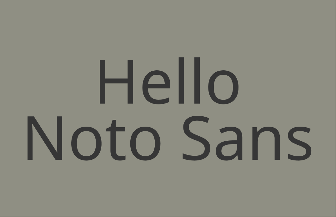
Noto is one of my favorite open-sourced font family of all time due to its extensive language support. Noto is a joint project by Google, Adobe, and Monotype to eliminate “Tofu,” which is the box that shows up when there is a missing character. Noto has italic styles, multiple weights, and widths, 3,741 glyphs, and supports 800 languages.
For this newsletter, we will focus on Noto Sans, which is the sans serif, and in my opinion, the most useful for projects. Noto also has serif and monospaced versions. Both are fantastic for pairing and for projects as well.


Font Detail
- Humanist Sans serif with calligraphy influence
- Support for numerous languages


Noto Sans communicates openness and has a neutral tone. The bolder versions are great for logos. Avoid using Thin, Extra Light, or Light for logos, as they may be illegible in small sizes.
How to use it for marketing?
Noto support over 800 languages and you can find the Noto font of the language you need. Noto Sans has a neutral tone. If you want to be bolder, You can pair it with a decorative or flashy serif, like Playfair Display, or Bluu Next. It can also pair with Noto serif to stay neutral.


Design Idea of the Week
Web Typography Resources
Last week I received an email from a reader asking about web typography. I thought this might be a good chance to share some resources. These three articles do a great job explaining web typography fundamentals, as well as the granular details.
This one does a great job of giving an overview of what makes great web typography for your projects, like scale.
If you have time and want a more in-depth read, Prowebtype is a great resource that gets into the thorny technical details (with CSS snippets). It also has a chapter on variable fonts.
Typewolf’s Typography Cheatsheet
A handy little list that shows you shortcuts for special characters like curly quotes, accents, and other nice details, because what makes a project great is all those special little things.
Color Inspiration of the Week
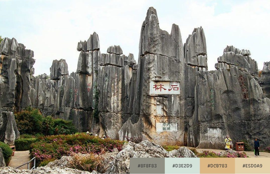
Rock Forest in Kunming, China
Last week, UN’s Biodiversity conference took place in Kunming, China. Hope you enjoy the week with this amazing gift from nature with these calming, earthy colors.
Typography Jargon Buster
Grotesque
seen around 1815
Grotesque sans serif got its name from the Italian word grottesco, meaning “belonging to the cave” because this sans serif had an overly simplistic appearance. Grotesque sans serif is the first generation of sans serifs, with a lot of weird (wonky) visual traits.

Thank you!
Thanks for being hanging out here this week. Noto Sans is available here.
