11 Most Popular Monotype Fonts Now Available on Adobe (and Why Designers Love Them)

At Typogram, we love digging into type history and the design decisions behind the fonts we use every day.
Few names in type carry more weight than Monotype. As one of the largest and most influential type foundries in the world, Monotype has been shaping visual culture for over a century. In a recent collaboration with Adobe Fonts, many of Monotype’s most iconic and previously exclusive typefaces are now available to anyone with an Adobe account—giving designers easier access to a treasure trove of typographic classics.
In this post, we’re highlighting 11 of Monotype’s most popular and widely used typefaces—exploring their design DNA and uncovering why these fonts continue to thrive in today’s graphic design landscape.
1. Helvetica
Why it’s iconic: The ultimate example of Swiss modernism, Helvetica is known for its neutrality, clarity, and versatility.
Where you’ve seen it: Corporate branding, signage, transportation systems, and UI design.
Design Features:
- Neo-grotesque sans serif with minimal contrast
- Uniform stroke widths and tight spacing
- High legibility across print and screen
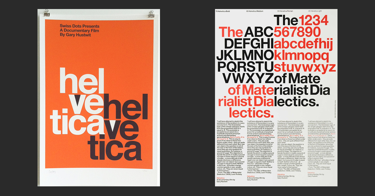
Right: Helvetica Poster. source: observatory.designobserver.com Experimental Jetset.
License: All Rights Reserved.
2. Gill Sans
Why it’s beloved: Britain’s answer to geometric sans-serifs, Gill Sans blends formality with humanist warmth.
Where you’ve seen it: BBC branding, Penguin book covers, and public transit.
Design Features:
- Humanist sans-serif with classical Roman proportions
- Rounded forms with subtle contrast
- Friendly yet authoritative tone
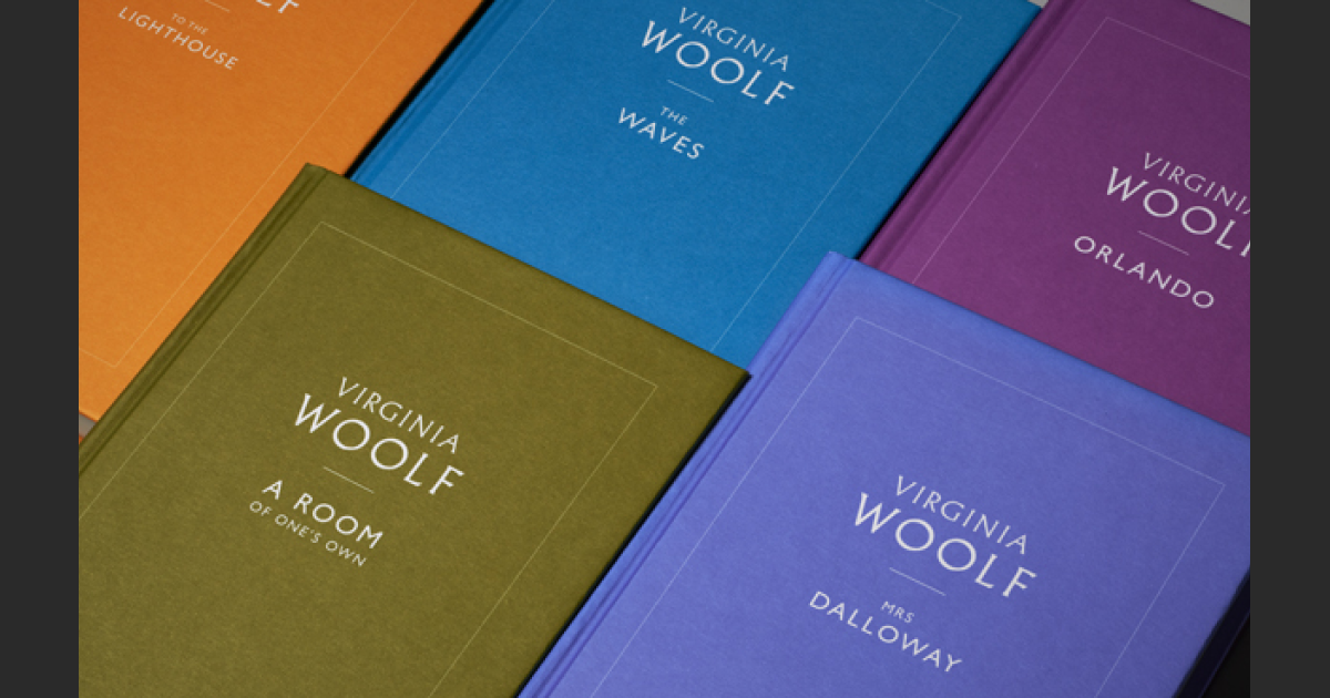
License: All Rights Reserved.
3. Rockwell
Why it works: Bold and grounded, Rockwell brings vintage energy with its strong geometric slab serifs.
Where you’ve seen it: Posters, logos, and editorial headlines.
Design Features:
- Monoline strokes and square serifs
- Strong vertical emphasis
- Perfect for retro or Americana-themed design
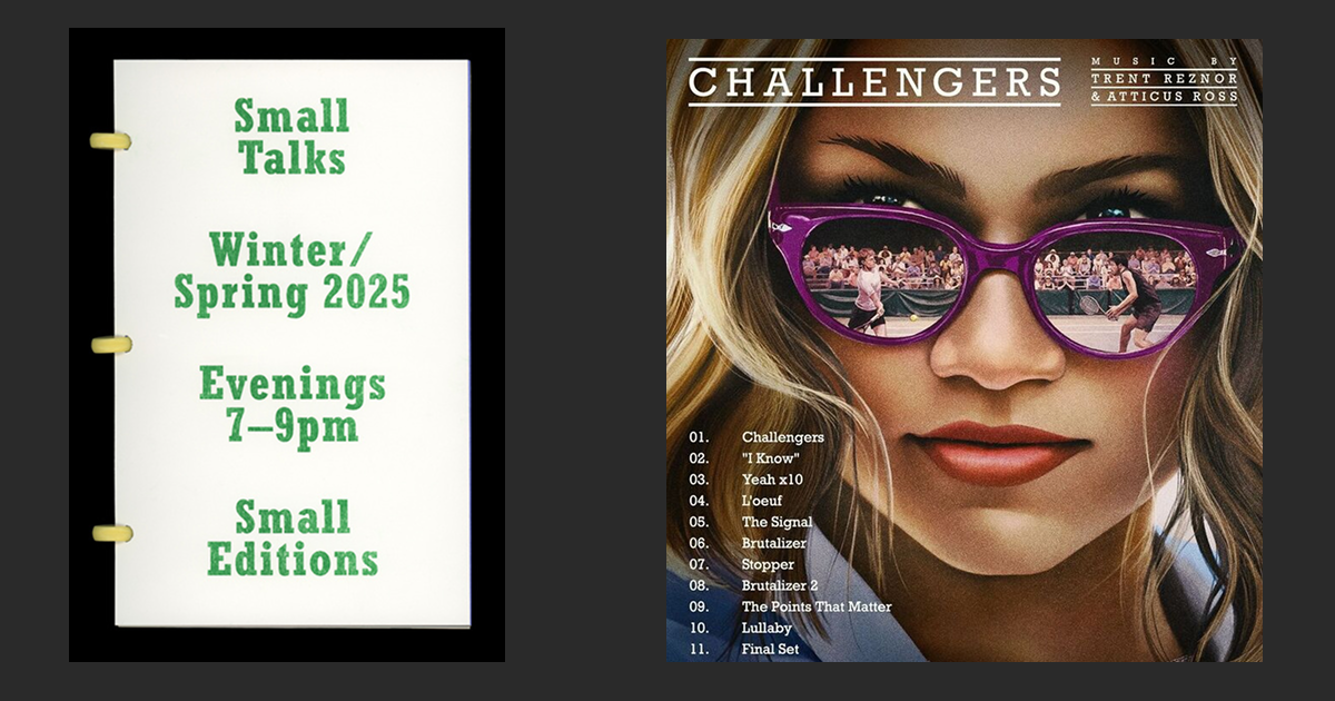
Right: Movie Challenger Poster featuring Rockville
Source: instagram.com License: All Rights Reserved.
4. Century Gothic
Why designers love it: A clean, modern geometric sans-serif ideal for digital interfaces and branding.
Where you’ve seen it: Tech branding, education, and minimalist packaging.
Design Features:
- Wide, open forms with soft edges
- High x-height and clear legibility
- Inspired by Futura, optimized for screen use
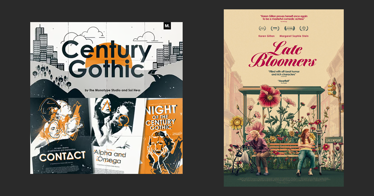
Right: Late Boomers movie poster featuring Century Gothic. source: www.imdb.com
License: All Rights Reserved.
5. Bembo
Why it’s timeless: A Renaissance-era serif that brings warmth, rhythm, and elegance to long-form content.
Where you’ve seen it: Academic publishing, book design, and luxury branding.
Design Features:
- Old-style serif with calligraphic influence
- Classic proportions and readable rhythm
- Perfect for body text and print
Right: Fashion editorial using Bembo Photo: Alex Hunting Studio.
License: All Rights Reserved.
6. Albertus Nova
Why it stands out: Sculptural and distinctive, Albertus Nova evokes stone-carved type and fantasy aesthetics.
Where you’ve seen it: Movie posters, fantasy book covers, and editorial headlines.
Design Features:
- Semi-serif with incised, flared forms
- Geometric with monumental feel
- A modern revival of a 1930s classic
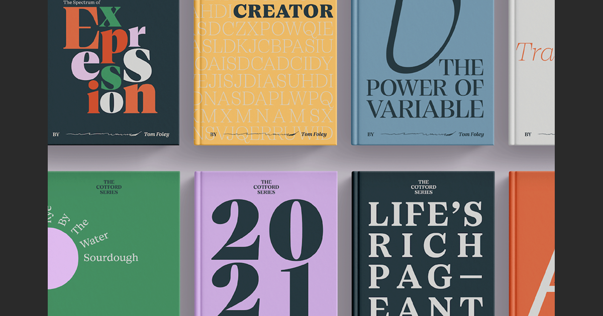
7. Cotford
Why it’s fresh: A new serif designed for expressive display typography and flexible brand systems.
Where you’ve seen it: Editorial, fashion branding, and identity systems.
Design Features:
- Modern serif with high contrast
- Sharp calligraphic curves
- Made for both large and small sizes
8. Avenir Next
Why it’s everywhere: A refined update of Avenir, optimized for digital readability and consistency across platforms.
Where you’ve seen it: UI/UX design, digital branding, and responsive layouts.
Design Features:
- Geometric sans with humanist details
- Rounded terminals and fluid rhythm
- Great for screen and print harmony
9. Frutiger
Why it’s trusted: Designed for signage at Charles de Gaulle Airport, Frutiger is optimized for legibility from afar and in motion.
Where you’ve seen it: Airports, hospitals, and public information systems.
Design Features:
- Humanist sans-serif with open apertures
- High legibility at small sizes and long distances
- Strong character differentiation
License: All Rights Reserved.
10. Sabon
Why it’s elegant: Based on Garamond and Old Style Serifs but with improved alignment and consistency for modern typesetting.
Where you’ve seen it: Literary publishing, invitations, and luxury packaging.
Design Features:
- Transitional serif with calligraphic flow
- Balanced proportions and refined curves
- Great for print and formal typography
License: All Rights Reserved.
11. Gotham
Why it’s iconic: A geometric sans inspired by NYC signage, Gotham is clean, bold, and trustworthy—made famous by Obama’s campaign.
Where you’ve seen it: Political campaigns (Obama being the most well known example), corporate identities, and editorial design.
Design Features:
- Broad, circular forms with generous x-height
- Clear, modern tone with a human touch
- Inspired by mid-century architectural lettering
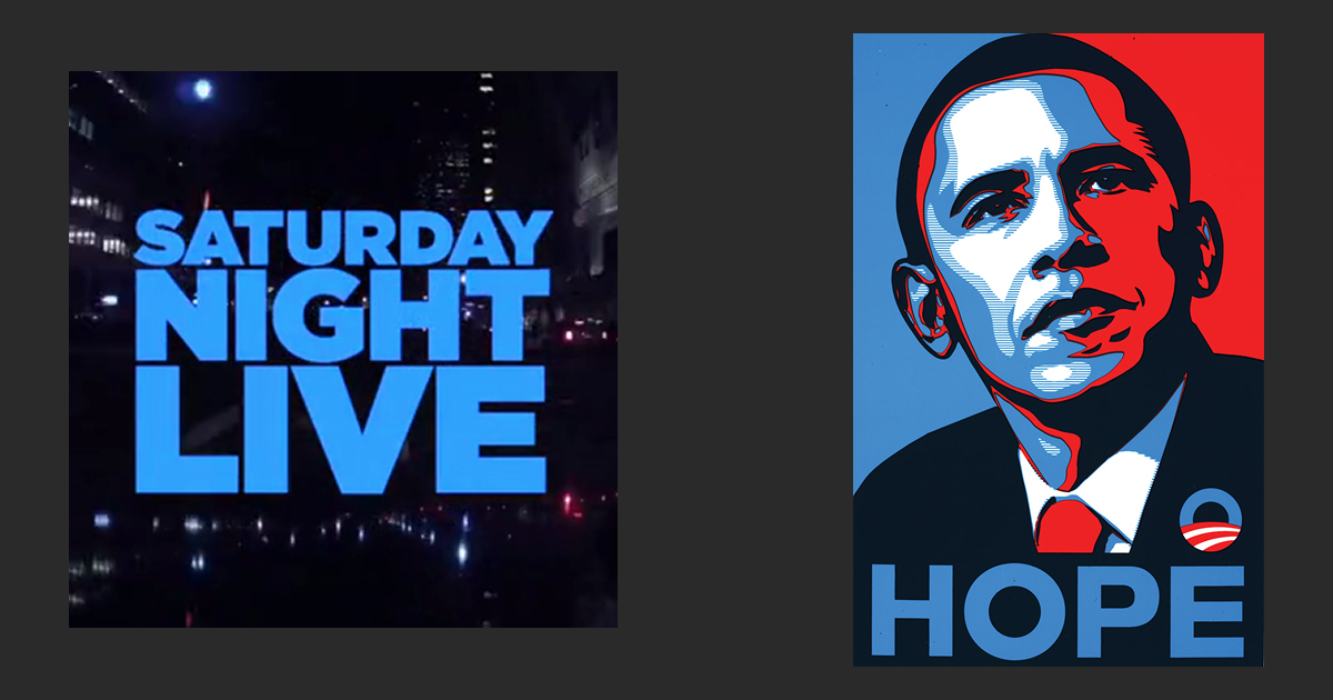
Right: Most famous example of Gotham from Obama's campaign. source: www.brainpickings.org Obey Giant.
License: All Rights Reserved.
With so many popular fonts from Monotype now available on Adobe, designers have more power than ever to create with timeless, high-quality typography—without licensing headaches or switching platforms. From the clean neutrality of Helvetica to the expressive flair of Cotford, these fonts bring history, personality, and precision to modern design work.