3 Essential Graphic Design Principles to Instantly Improve Your Work
Great graphic design doesn’t happen accidentally—it’s built on intentional and thoughtful choices. Whether you're creating a logo, social post, landing page, or brand identity, applying core graphic design principles can immediately improve how your work looks and functions.
In this post, you’ll learn three fundamental graphic design principles that are easy to apply and highly effective—even if you’re just starting out or looking to sharpen your visual skills.
Use Color Psychology to Create Emotion
Color is one of the most powerful tools in graphic design. It sets the emotional tone before your audience reads a single word. That’s why color psychology is considered a foundational graphic design principle.
How to apply this principle:
1. Choose colors based on emotion
When you are collecting design inspirations for mood boarding or building a brand color palette, consider how each color choice connects to emotion. Using color as an emotional language in your design is key to creating meaningful visuals.
You can ask questions like:
- What mood should this design create?
- Does this mood fit with the overall energy you are trying to create with your design?
- Is it legible with the rest of the design?
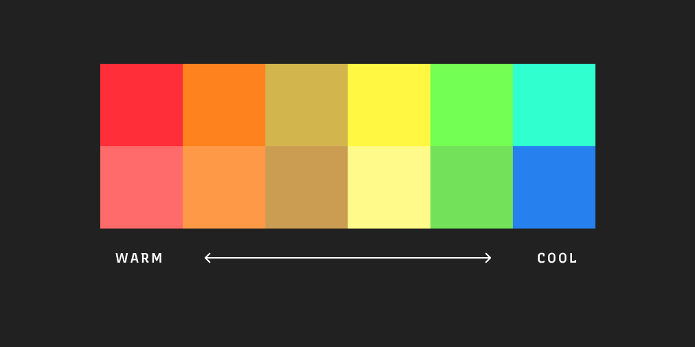
2. Warm tones usually communicate high energy.
In general, warm tones like reds, oranges, and yellows create urgency and excitement. They work well in calls to action, announcements, and promotional graphics.
3. Cool tones usually communicate calm and trust.
Blues, greens, and purples bring a sense of professionalism and ease. These are ideal for tech, wellness, or corporate branding.
Design tip: Think of color as your emotional language. Use it with the same level of intention as your typography or layout choices.
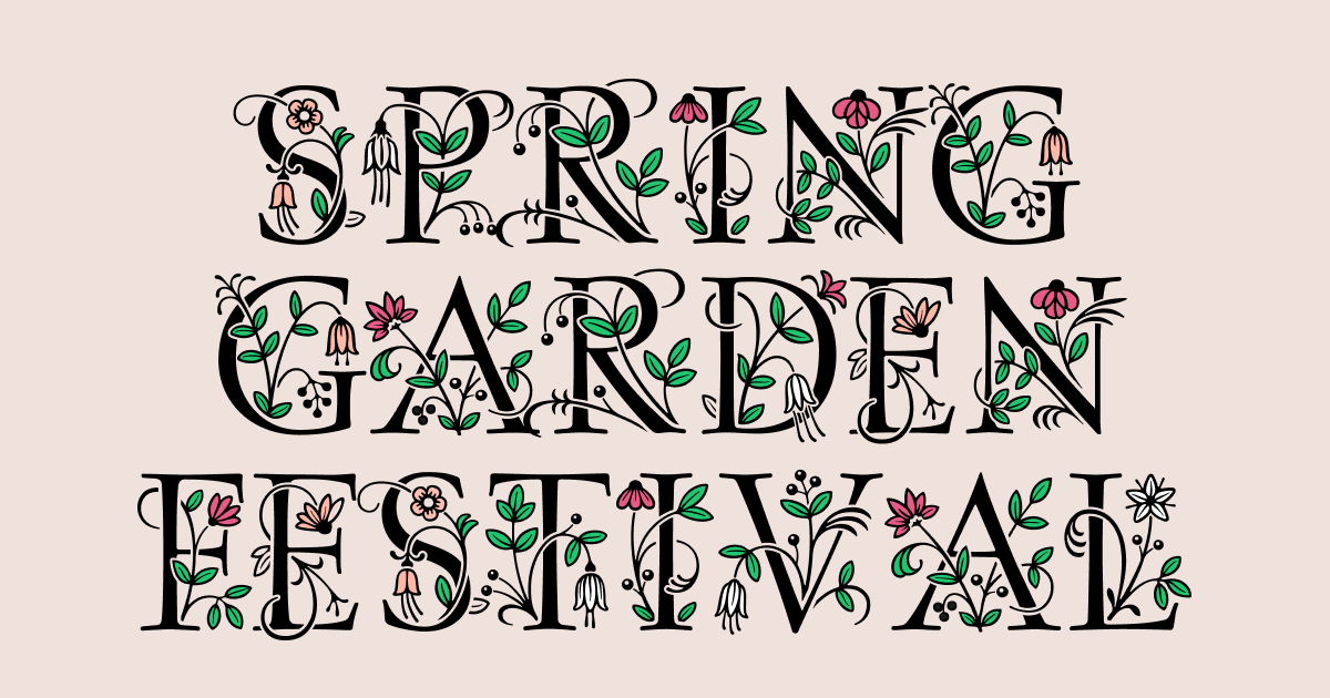
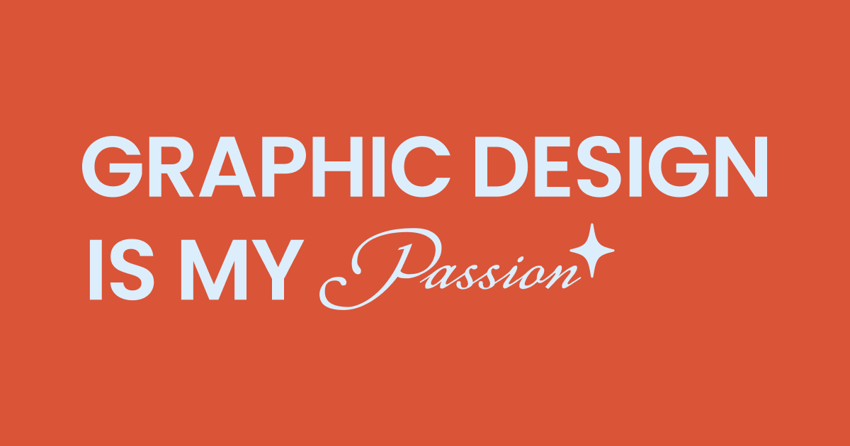
Use Font Pairing to Improve Typography
Typography is one of the most visible elements of any design, and it plays a big role in how your message is received.
Effective font pairing is a core graphic design principle that helps you build hierarchy and personality in your work.
How to approach font pairing:
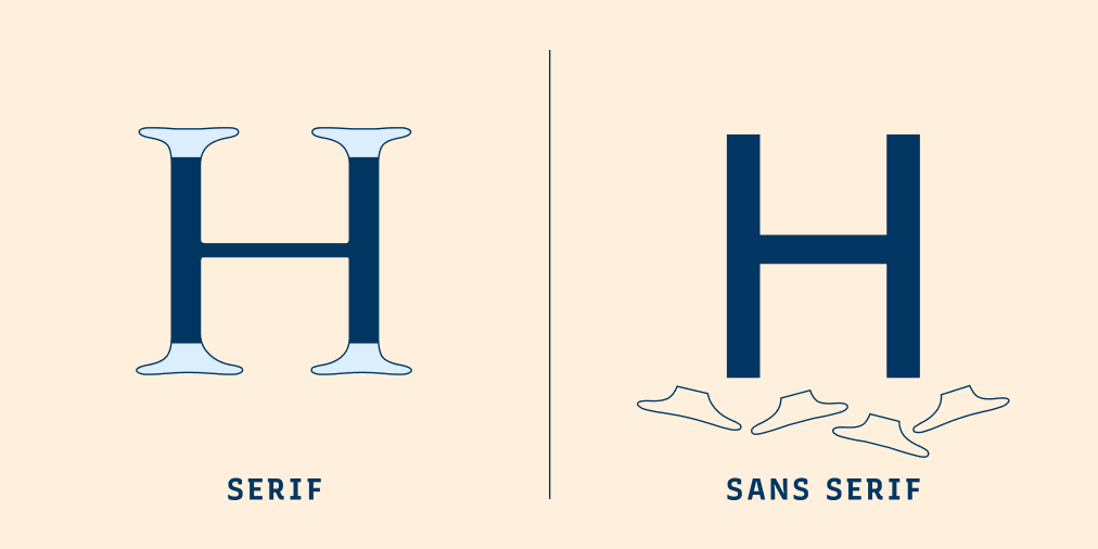
1. Choose a strong font for headlines
Use a bold, eye-catching sans serif or display typeface to create visual impact at the top of your design.
2. Pair it with a clean serif for body text
A serif font adds structure and elegance while improving readability for longer text.
3. Focus on contrast with balance
Avoid using fonts that are too similar as much as you can, unless you have a good reason. Instead, mix styles that complement each other but offer enough contrast to make each element stand out.
Design tip: Good font pairing is like a visual dialogue—each typeface plays a role, but together they create a unified voice.

Use Contrast to Guide the Viewer’s Eye
Contrast is a simple yet powerful graphic design principle that brings clarity and direction to your design. It helps you create a visual hierarchy and improves how easily your message is understood.
How to use contrast effectively:
1. Identify visual monotony
If everything on your page is the same size, color, or weight, nothing grabs your audience’s attention—and your design will feel flat.
2. Create clear focal points
Contrast is about tension created by differences in shapes, colors, and textures. Think about where in your design you can create moments of tension. This could be: Add more contrast to font pairings, like using serifs with sans serifs. Make headings larger and bolder. Use color or spacing to separate sections. Highlight important elements with different type weights or background colors.
3. Build hierarchy through contrast
Visual hierarchy tells the viewer where to start and what to notice next. It’s key for creating intuitive, communicative designs.
Design tip: When in doubt, add more contrast. It improves readability, guides attention, and strengthens your layout.

Final Thoughts: Mastering Graphic Design Principles
These three graphic design principles—color psychology, typography, and visual contrast—are the building blocks of clear, emotionally effective design. When you apply them with intention, your work becomes more cohesive, engaging, and professional.