Crafting Your Perfect Autumn Color Palette
Exploring the Autumn Color Palette
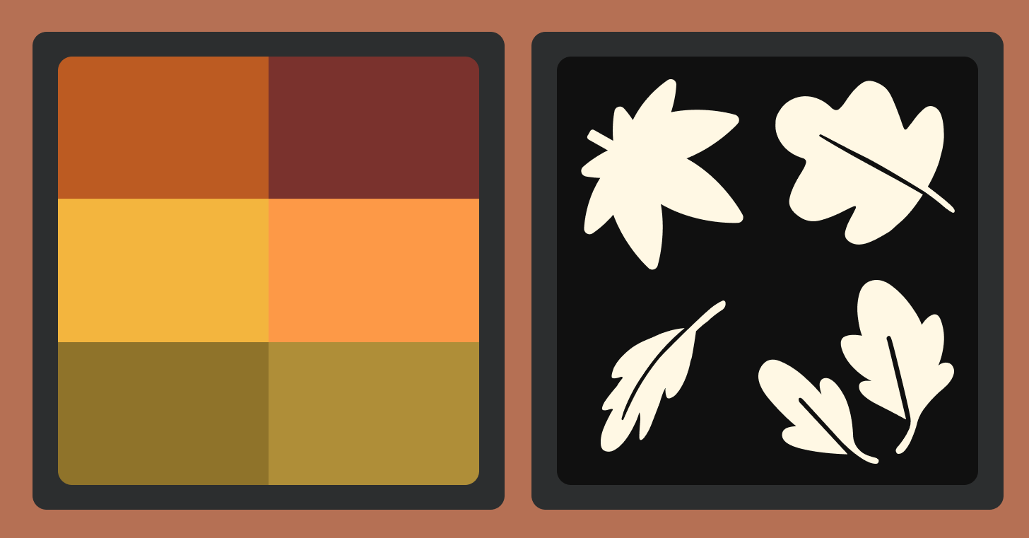
The autumn color palette is one of the most beloved seasonal themes in graphic design, marketing design, and branding. With its rich, earthy tones—burnt orange, deep red, golden yellow, and mossy green—this palette evokes warmth, nostalgia, and the cozy charm of fall. Whether you're designing a seasonal campaign or building a brand that leans into nature’s warmth, the autumn color palette offers a versatile range of color schemes that speak to comfort, abundance, and style.
In this guide, we’ll explore different types of autumn color palettes— including soft autumn, deep autumn, true autumn, warm autumn, dark autumn, and cool autumn palettes— and how to apply them in graphic design, branding, marketing design, typography, and more.
What Is the Autumn Color Palette?
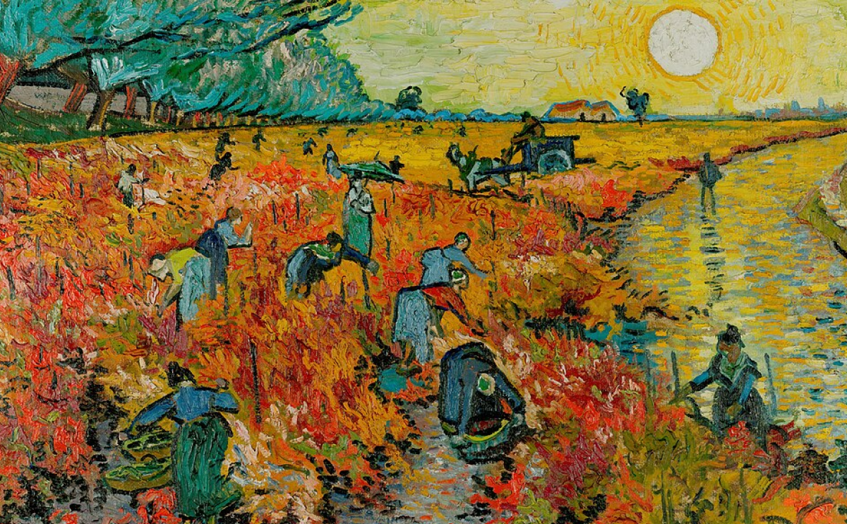
Van Gogh once said, “As long as autumn lasts, I shall not have hands, canvas, and colors enough to paint the beautiful things I see.”
The autumn palette is a designer’s comfort sweater—warm, textured, and rich with feeling. With hues pulled from crisp leaves, golden sunsets, and harvest earth, it sets the tone for visuals that feel grounded and nostalgic. Think burnt orange, burgundy, golden yellow, mossy green, and warm brown—colors that pair beautifully with soft serif fonts, subtle textures, and generous whitespace. Whether you’re creating seasonal branding or layouts meant to feel cozy and organic, this palette wraps your design in emotional warmth and visual rhythm.
Key Characteristics:
- Warm and earthy
- Rich in mid-to-deep saturation
- Natural and organic feel
- Evokes comfort, coziness, and abundance
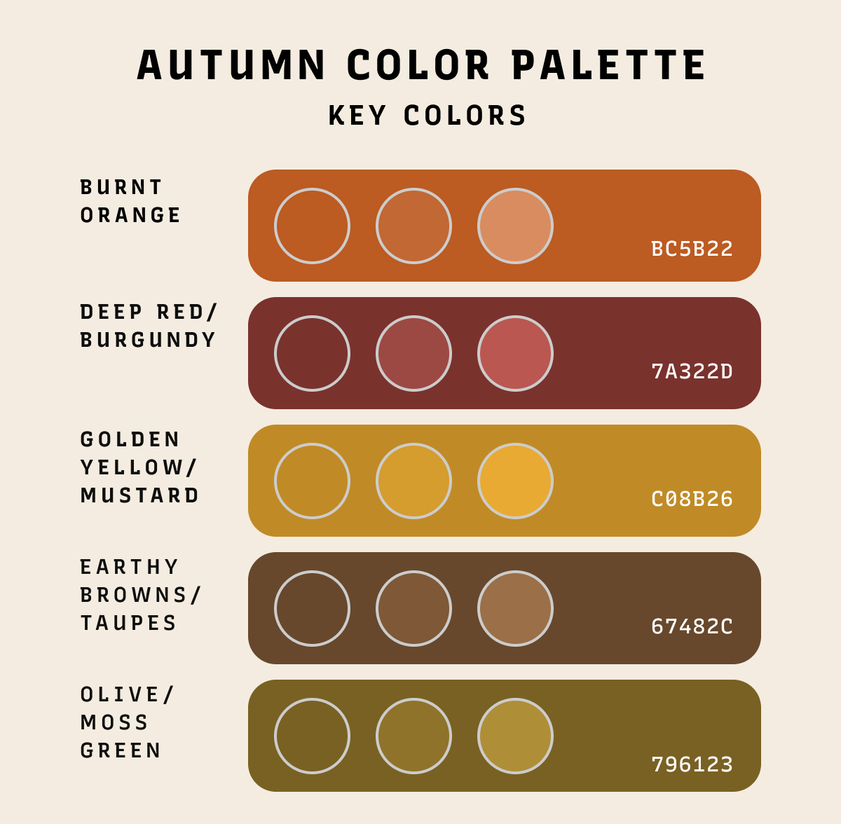
Key Colors in the Autumn Palette
- Burnt Orange — warmth, vitality
- Deep Red / Burgundy — richness, sophistication
- Golden Yellow / Mustard — joy, vintage feel
- Brown / Taupe — earthiness, stability
- Olive / Moss Green — nature, groundedness
Burnt Orange and Pumpkin Spice
Burnt orange is a bold, energetic color that captures fall’s vibrancy—think leaves and pumpkins. It’s great for seasonal marketing, especially around Halloween or harvest themes. Pumpkin spice, a softer version, feels cozy and nostalgic. It’s ideal for branding that wants to evoke warmth, like coffee shops or fall fashion.
Deep Reds and Burgundy
Deep reds and burgundy are rich, elegant colors inspired by fall foliage and fruits. Burgundy adds a luxurious feel, often used for upscale branding or events. These reds are also great for cozy, intimate interiors and pair well with neutral tones like cream or taupe.
Golden Yellows and Mustard
Golden yellow and mustard bring the brightness of fall sunsets and harvest. Golden yellow feels warm and joyful, perfect for uplifting design.
Mustard’s earthy tone gives a rustic, vintage vibe—great in interiors and branding that want a cozy, autumnal look.
Earthy Browns and Taupes
Earthy browns and taupes ground a design with warmth and stability. From tan to deep chocolate, these shades create cozy, welcoming spaces. They pair well with warmer hues and are ideal for organic, natural-looking brands in wellness, food, or eco products.
Olive Greens and Mossy Tones
Muted greens like olive and moss bring earthy calm to the autumn palette. Olive green is versatile—rustic or modern—while moss adds tranquility. They’re perfect for nature-inspired designs or eco-focused branding, and pair beautifully with fall oranges, browns, and yellows.
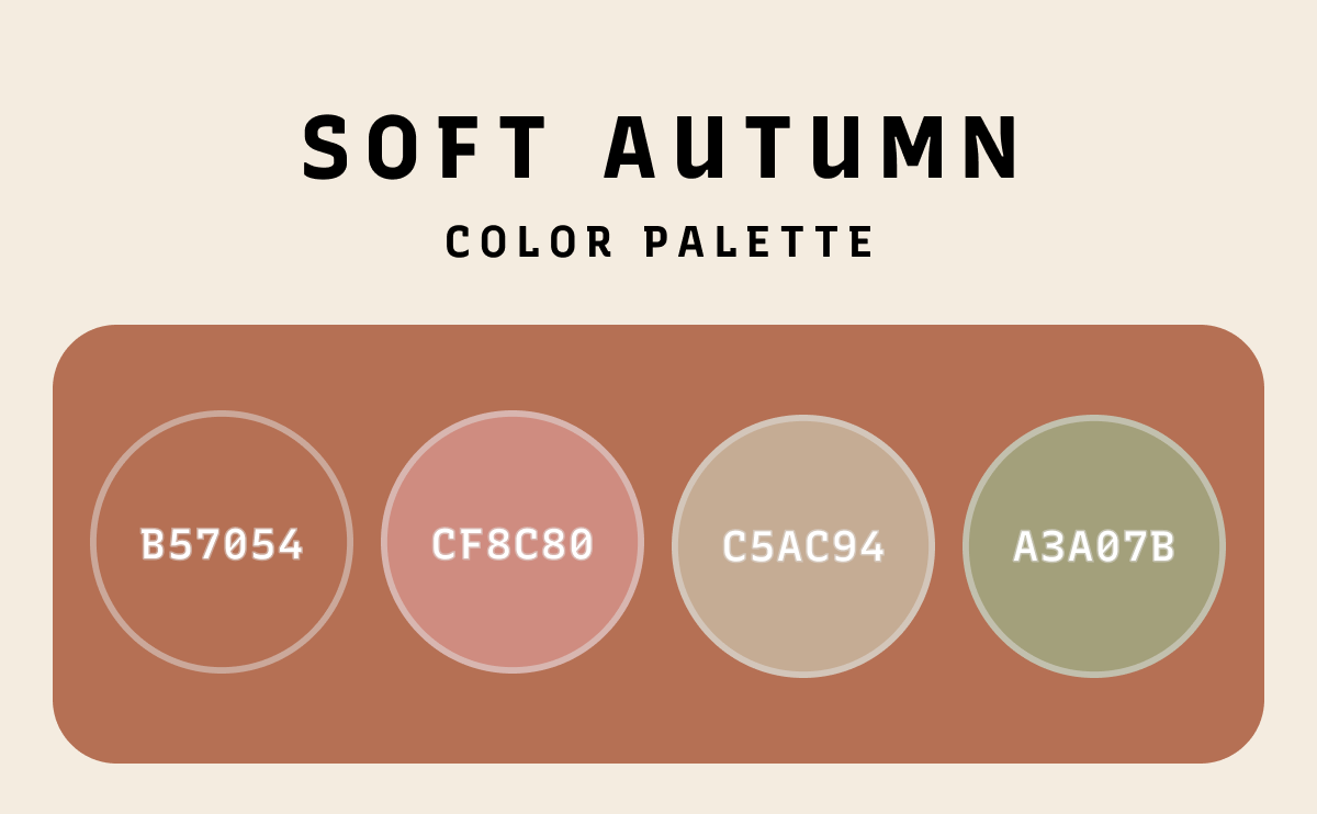
The Soft Autumn Color Palette
The soft autumn color palette is a muted, gentle version of classic fall colors. Think of dusty rose, soft olive, light taupe, and muted terracotta. These hues bring a quiet elegance and are perfect for designs that need warmth without boldness.
Where to Use:
- Graphic design projects that call for calm and serenity
- Minimalist branding or packaging
- Interior spaces that aim for a cozy, lived-in look
- Fashion lines that emphasize subtle sophistication
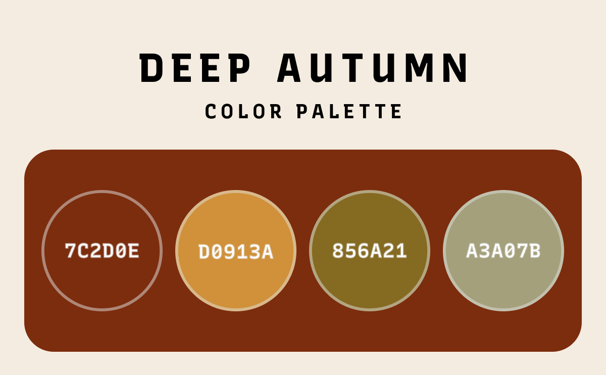
The Deep Autumn Color Palette
The deep autumn color palette features richer, more saturated hues—think burgundy, chocolate brown, deep olive, and burnt sienna. This palette communicates luxury, strength, and depth.
Best for:
- High-end branding and marketing design
- Editorial layouts and seasonal catalogs
- Fall product campaigns
- Typography pairings that favor bold, serif typefaces
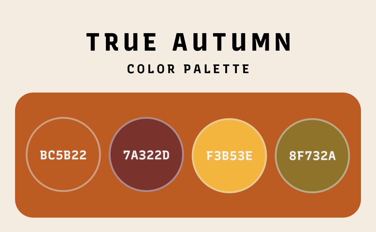
The True Autumn Color Palette
A true fall color palette captures the quintessential look of fall: pumpkin spice, maple red, sunflower gold, and warm olive. These colors are balanced, neither too soft nor too dark—just right for capturing fall’s natural beauty.
Great for:
- Graphic design with seasonal storytelling
- Nature-inspired branding
- Packaging for food, wellness, and lifestyle products that celebrates growth and harvest
- Typographic compositions with handcrafted charm
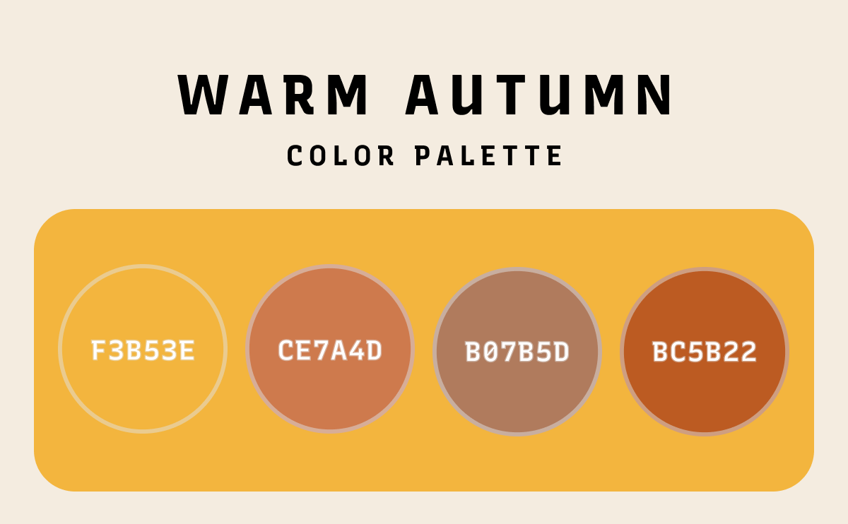
The Warm Autumn Color Palette
The warm autumn color palette leans into golden yellows, copper, rust, and camel tones. These hues radiate heat, sunshine, and comfort.
Use Cases:
- Marketing campaigns for cozy products (like coffee or knitwear)
- Graphic design for rustic and artisanal brands
- Warm, inviting web and mobile UI themes
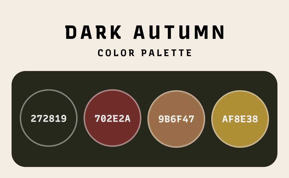
The Dark Autumn Color Palette
With tones like espresso brown, oxblood red, and forest green, the dark autumn color palette is rich and moody. It adds sophistication and drama to any design.
Use It In:
- Luxury fashion lookbooks and retail branding
- Dark-mode web design with seasonal contrast
- Typographic layouts using high contrast fonts and textures
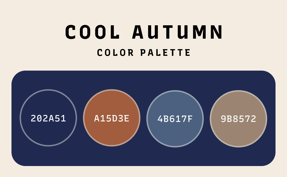
The Cool Autumn Color Palette
While fall is usually warm, the cool autumn color palette includes colors like smoky teal, muted plum, and cool taupe. These tones balance the warmth of fall with a touch of cool refinement.
Ideal for:
- Clean, editorial design work
- Branding that blends warmth with modern coolness
- Harmonious, color-balanced marketing design
How Autumn Color Schemes Enhance Design
Graphic Design & Marketing Design
In both graphic design and marketing design, autumn color schemes help convey emotion and story. For seasonal promotions—like fall sales, Thanksgiving, or Halloween campaigns—colors like burnt orange and golden yellow create instant visual appeal.
Autumn color palettes also support branding for artisanal, natural, or nostalgic products. These color schemes establish warmth and approachability, making them perfect for food, home goods, or wellness brands.
Editorial & Typography
Autumn tones pair well with typefaces that have organic or handcrafted aesthetics. Serif fonts, script styles, and rustic sans-serifs look beautiful when layered over backgrounds in soft autumn or warm autumn colors.
For an editorial layout, imagine using burnt‑orange accent blocks for pull quotes, a warm golden‑yellow wash behind full‑bleed images, and deep‑red headline type to anchor each spread—resulting in a unified, autumnal palette that guides the reader’s eye and feels both cozy and sophisticated.
Pro tip: Use dark text (like chocolate brown or deep burgundy) on light pumpkin or golden backgrounds for accessible, elegant contrast.
Interior and Fashion Design Inspiration
Autumn palettes inspire cozy, grounded interior spaces and stylish fashion collections. Layer warm autumn tones like mustard, terracotta, and olive with wood accents for a rustic modern living space. Add cozy textiles in soft autumn colors like dusty rose and light tan to complete the vibe.
From cozy autumn neutrals in bedroom designs to rich autumn reds in coats and accessories, these palettes can reflect the beauty of autumn anywhere.
Embrace the Beauty of Autumn in Design
The autumn color palette—whether you lean into soft autumn, deep autumn, true autumn, warm autumn, dark autumn, or cool autumn—offers endless inspiration for graphic designers, marketers, and creatives. These rich, earthy tones create warmth, depth, and emotional resonance in every design context—from seasonal campaigns to year-round branding.
Embrace the cozy elegance of autumn color schemes to elevate your typography, visual storytelling, and overall aesthetic.