Three Quick Typography Design Tips to Instantly Improve Your Design

Looking for good practices for typography in graphic design? Whether you're designing a website, creating a presentation, or building a brand identity, typography plays a crucial role. Clean, readable text enhances your design and ensures your message is clear. In this post, we’re sharing three quick typography design tips to help you instantly level up your typography game. Let’s dive in!
Tip 1: Enhance Readability for Clearer Typography
Increase Letter Spacing for Better Clarity
If your text looks cramped, try adding letter spacing (also known as tracking). This is especially helpful for all-caps text or small font sizes where tighter spacing can reduce legibility. A little breathing room goes a long way.
Use High-Contrast Colors
Ensure sufficient contrast between your text and background. Dark text on a light background or vice versa is ideal for readability. Avoid low-contrast color combinations that can strain the reader’s eyes or cause the information to become unreadable.
Adjust Line Height for Comfort
Line height, or leading, controls the space between lines of text. For body text, a line height of around 1.5 times the font size is generally a good starting point. This creates a comfortable reading experience and prevents your design from feeling cluttered.
Tip 2: Simplify Your Typography Choices
Limit Yourself to Two Fonts for a Cohesive Design
A clean design often uses just one or two fonts: one for headings and one for body text. This not only looks more professional but also improves clarity. Choose complementary fonts that reflect your design’s tone.
Choose Clear and Readable Fonts
Sans-serif fonts are an excellent choice for digital designs due to their readability on screens. On the other hand, serif fonts can add sophistication to printed materials. Whichever you choose, ensure it supports your message and is easy to read.
Maintain a Consistent Text Hierarchy
Guide your reader’s eye by establishing a clear text hierarchy. Use variations in font size, weight, and color to emphasize headings, subheadings, and body text and guide the reader’s eyes. Consistency in hierarchy enhances the visual flow and ensures a polished design.

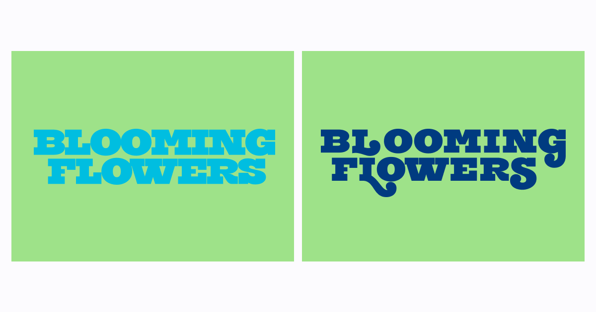
Tip 3: Master Kerning for Cleaner Typography
Kerning is the practice of adjusting the space between individual letters in a word to make the text look balanced and easy to read. It helps create a more polished and visually appealing design by ensuring the letters appear balanced and in harmony. Poor kerning can make your design look unprofessional, or worse, make the information convoluted and misleading.
Adjust Uneven Letter Spacing
When designing logos and other display text designs, manually adjust letter spacing to ensure balanced and even text, especially between certain letter pairs. We’ll explain more about these problematic letter pairs below.
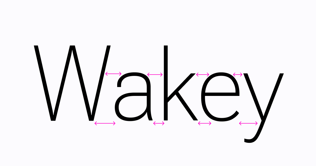
Fix Problematic Letter Pairs
We can organize letterforms into three general types: straights, diagonals, and curves. Certain letter pairs, like diagonal / diagonals (like ‘AV’ or ‘WA,’), diagonal / circle (like ‘WO’), or curve/diagonal (‘SA’) tend to create awkward gaps. Fine-tuning the kerning of these pairs can significantly improve the appearance of your text.
Improve Readability and Flow
Well-spaced letters improve text readability and overall aesthetics. Take the time to zoom in and make micro-adjustments. Your attention to detail will pay off in a cleaner, more professional design.

By applying these good practices for typography in graphic design, you’ll create more visually appealing and effective designs. For more actionable typography design tips and insights, stay tuned to the Typogram blog. Happy designing!