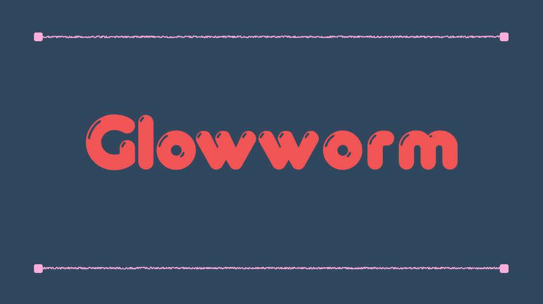
Glowworm Typeface: A Luminous, Friendly Round Sans Serif Full of Character
This February, Glowworm is part of our monthly font freebie calendar! Designers can claim this playful, rounded display font for free and use it in personal or commercial projects. Be sure to check out and bookmark our freebie font calendar to see all the fonts we’re giving away each month.
What is Glowworm?
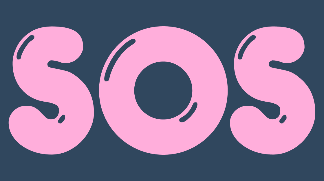
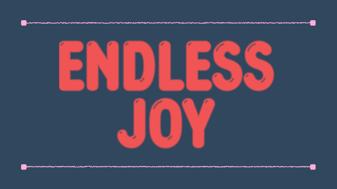
Glowworm is a standout rounded sans serif display font that combines bold, bubbly letterforms with a warm, approachable aesthetic, making it perfect for projects that want to feel playful, cheerful, and instantly inviting.
A display typeface known for its soft, rounded shapes and curves, Glowworm gives letters a luminous, almost “bubble-like” presence that feels delightful and fun. Its design evokes friendly motion and whimsy, like a glowing trail of light or a playful worm weaving through space, while still being clear enough for bold headlines and graphic applications.
Originally released in the mid-1990s and digitized from type foundry sources like Mecanorma, the font has become a go-to choice for designers looking to infuse personality and charm into their work.
Key Characteristics
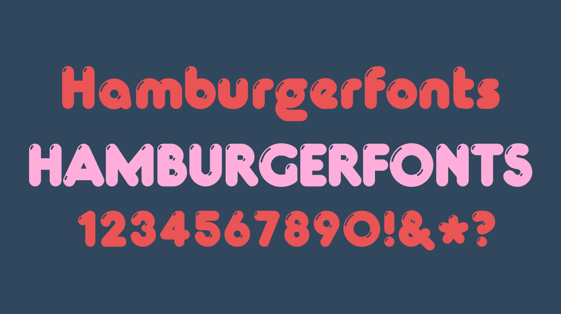
Classification: Rounded Sans Serif
Purpose: Display typography, headlines, quirky branding, children’s materials
Glowworm’s letterforms are uniformly thick and softly rounded, which contributes to its playful personality and high impact as a display font. It is designed to draw the eye, especially at larger sizes in posters, packaging, and titles. While not ideal for long paragraphs, Glowworm excels in short bursts like logos, book covers, kids’ book titles, invitation graphics, and quirky branding.
Where and How to Use Glowworm for Graphic Design
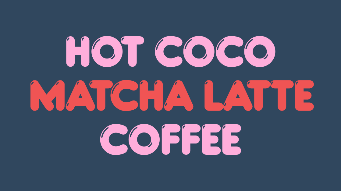
Glowworm fits beautifully in any project that benefits from fun, friendliness, and bold visual voice. Some examples include:
- Children’s books and educational graphics, where its soft curves and approachable style feel welcoming to young audiences
- Quirky brand identities, helping communicate playfulness in brand marks, packaging, and social graphics
- Posters, headlines, and event graphics, where its eye-catching form works well in large display contexts
Glowworm is best used sparingly and at larger sizes, where its unique shapes have room to breathe. For body text or dense copy, pairing it with a clean, simple sans serif keeps readability strong while letting Glowworm be the eye-catching headline.
Design Inspiration and Pairings
To make Glowworm shine in your layouts, pair it with a neutral sans serif like Helvetica or Arial for balance, use vibrant colors or playful illustrations to enhance its cheerful energy, and try contrast with minimal geometric shapes or flat color backgrounds for modern poster layouts.
Glowworm isn’t just a font — it’s a design voice. When you want your typography to feel friendly, approachable, and wonderfully bold, this rounded display face is a perfect choice.