How to Use Dosis: A Warm and Elegant Sans Serif Perfect for Writing Projects

In This Issue…
How to Use Dosis for Logo, Branding & More
- Font of the Week: Communicate warmth and elegance with Dosis
- Design Idea: Push your concept further with circles as symbols
- Color Inspiration: Orphism
Font of the Week
Rule of Consistency
Do you ever wonder why professional design has that extra magic?
In design school, I learned early on to be visually consistent with everything I do. This soon became an obsession. Today’s font, Dosis, is a result of this visual compulsive disorder. I discovered it while I obsessively searched for a solution.
In design, there are times when you want things to share similar characteristics. Ever noticed how Apple’s UI, like buttons, panels, alerts boxes, all have rounded corners? That’s because they are using the rule of consistency in their design. It has special magic. When all the design elements share a similar visual trait, they look like they belong together in a harmonious system.
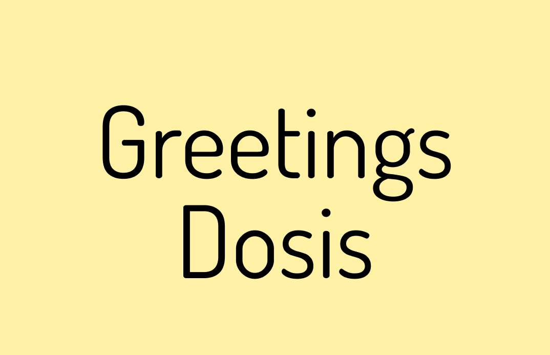
In my case, I was working on a branding project, and I wanted to try a font with rounded corners in front of a circular shape. This is how I discovered Dosis. Dosis is a sans serif with rounded corners. Its letters also appear to be more condensed than other fonts. The stroke widths are relatively consistent, and there is a sense of geometry. The stroke caps are rounded, resulting in a pleasing softness. Its slenderness and oblong shapes speak of modernity, grace, and warmth.
Font Details
- Seven weights to support more complex projects, like websites
- Elongated letterforms and rounded stroke caps
- Pairs well with serif like Piazzolla, Plex Serif


How to use Dosis for logos?
Dosis is great for brands that want to communicate warmth and grace. A font with rounded stroke caps also works well with other circular shapes. If your brand has these two things, give Dosis a try!
How to use Dosis for branding and marketing?
Dosis has many weights to support more complex projects like websites. Dosis Light and Regular look great in large sizes on their own or supported by other weights.
This font does have a personality and does not have a neutral tone. Be mindful if you want to use it for more complex things like app interfaces if you wish to have a more neutral voice.
Design Idea of the Week
Circular Symbols
Circular shapes are something we encounter every day, but how often do you consider their roles in visual creation? The circle has long been seen as a symbol with meanings such as fluidity, perfection, and wholeness.
Voltaire once said, “God is a circle whose center is everywhere and circumference nowhere.” Nadia Julien, the author of The Mammoth Dictionary of Symbols, said circle “implies an idea of movement, and symbolizes the cycle of time, the perpetual motion of everything that moves, the planets’ journey around the sun (the circle of the zodiac), the great rhythm of the universe.”
Are ideas of circles or circular motions and motifs, something you can use for your next marketing project?

Color Inspiration of the Week
Orphism
Orphism was an offshoot of the Cubism art movement. Many art historians suspect this movement is what drew us closer to Abstract Art. Orphism paintings often featured pure abstraction and bright colors.

Creative Prompt
Can you create a visual for Twitter or Instagram using the font Dosis, circle as a symbol, or the color palette we featured today?
Thank you
…for reading and hanging out here this week! Dosis is available here.


