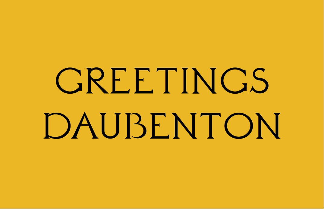
How to Use Daubenton: A Serif Font Perfect for Traditional Brands with A Flare

In This Issue…
How to Use Daubenton for Logo and Branding
Font of the Week: Daubenton
Design Idea of the Week: Dynamic Diagonals
Color Inspirations: Suprematism

Font of the Week
All About Daubenton
Typeface designers like to visit old cemeteries for inspiration. Morbid much? No surprise, this peculiar behavior is for academic purposes. It is a treasure hunt to find historical letterforms with unique combinations of formality and funk.
We first talked about engraving in our Piazzola issue. Though the history of engraving can be traced back to earlier times, Roman inscription lettering has a significant influence on the development of modern typefaces. The letter outlines were first painted onto the stone, and then the stone carver followed the brush marks. The flares carvers made at the end of the stroke and corners became the serifs you see now.
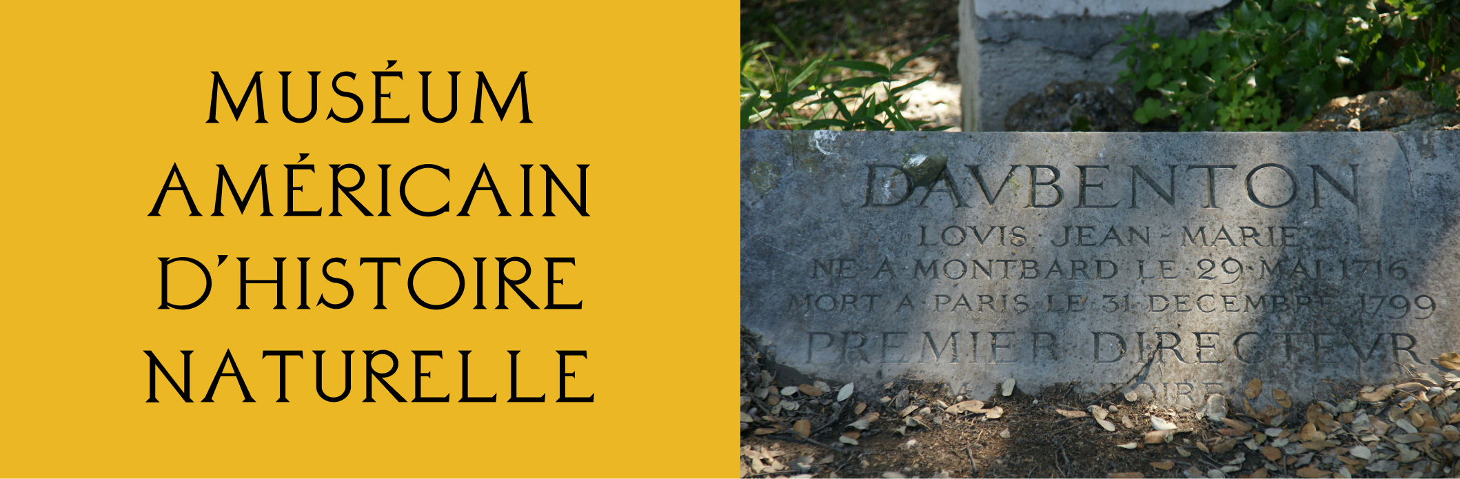
Daubenton, named after the first director of the Natural History Museum in Paris, is inspired by the engraved letters found in the Museum. The construction of Daubenton tells us that the inspiration was a traditional serif with a natural, calligraphic touch. The designer upgraded this traditional sensibility by decreasing the contrast in the strokes and exaggerating the geometric aspect of the letters. This resulted in an eclectic style that communicates modernity and elevation.
Font Details
- Geometric shapes
- Capital letters only
- One weight

How to use this for logos?
Daubenton is perfect for traditional brands with a flair because serifs are considered classic and reliable. The exaggerated geometric shapes also add a sense of chic. If you have a classic brand that wants to appear modern and elevated, give Daubenton a try.
How to use this for marketing?
Daubautoon only has capital letters, which means it is not always appropriate for longer pieces of copies. Because Daubenton only has one weight, it is best paired with another font for more complex projects like websites. Daubenton pairs well with sans serifs like Jost, which speaks to its geometric qualities, or classic serifs, like EB Garamond, which matches its traditional traits.


Design Idea of the week
Dynamic Diagonals
In 2015, Ellen Lupton, the senior curator at Smithsonian Design Museum, published a book that explains the magic behind what makes posters work as visuals. Her key findings? A majority of poster compositions relied on diagonals to cut across the composition to create eye-catching details. Diagonal lines make our eyes scan across a visual with ease and have a more engaging way of breaking up the negative and positive spaces (See this blog post if you need a review of negative and positive spaces). If you want to spice up your visual, consider creating diagonal lines in your design.

Color Inspiration of the Week
Pure Suprematism Art Movement

Have you ever looked at a painting and have zero ideas why it's at an art museum? I had this experience a few years ago when I visited the Museum of Modern Art in NYC. After some googling, I realized I was looking at a Suprematist painting. Suprematism is a seminal modern art movement that featured basic geometric shapes and limited colors. It was a desire to focus on "pure feeling or perception in the pictorial arts."

Creative Prompt
In this quote, James Clear talks about knowing the outcome and success.
You don't need to predict how everything will play out. Just master the next step and continue moving in the right direction.
Can you create a poster illustrating this quote using what we talked about today?
Thank you
…for reading and hanging out here this week! Daubenton is available here.
