How to Use Terminal Grotesque: An Edgy Sans Serif Perfect for Creative Tech Projects
In This Issue…
How to Use Terminal Grotesque for Logo, Branding & More
- Fonts: Terminal Grotesque
- Design idea: Know Your Memes
- Color Inspiration: Edward Tufte

Font of the Week
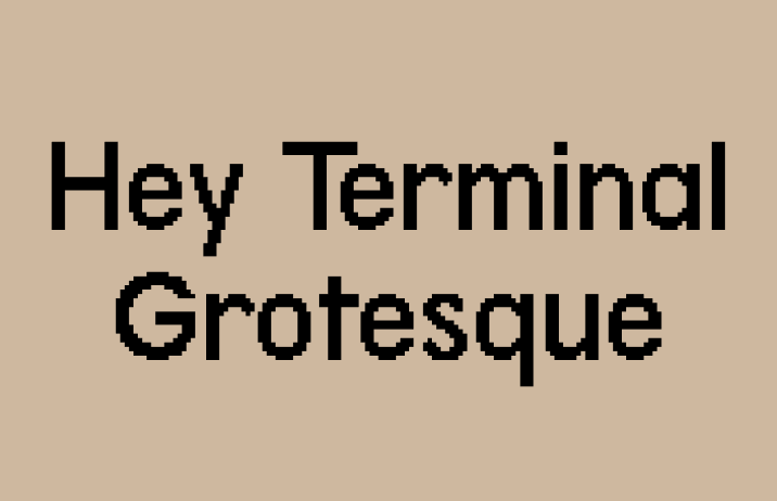
If Heritage Display is the geeky little brother, Terminal Grotesque is the cool, big sister with a nerdy streak. Continuing on our conversation about 8-bit graphics, Terminal Grotesque brings a nice, updated vibe to this style. If you are looking for something a bit new and weird, Terminal Grotesque might be right for you.
Font Details
Terminal Grotesque is a sans serif inspired by Futura (for a quick review about Futura, see Jost issue), which is a font that embraced simplicity, boldness, and geometric shapes. In Terminal Grotesque, the strokes are bold with very little contrast, the curves are exaggerated to emphasize geometric elements. Like Heritage Display, Terminal Grotesque has a pixelated twist. Its character set has normal, pixelated letters, and letters with both normal and pixelated traits.

How to use Terminal Grotesque for logos?
The eclectic combination of geometric letter shapes and the pixelated effect gives Terminal Grotesque a trendy and edgy vibe. It’s almost like a tech evolution is happening inside this font! It is perfect for tech companies with an unconventional twist or a project about something artsy, creative, and tech-related.
How to use Terminal Grotesque for marketing?
Terminal Grotesque has only one weight. Its pixelation effect creates a vibrating texture that is legible in body text sizes and header. Having only one weight makes it a great candidate for simple projects like marketing graphics. It can pair with Space Grotesque.


Design Idea of the Week
Know Your Memes
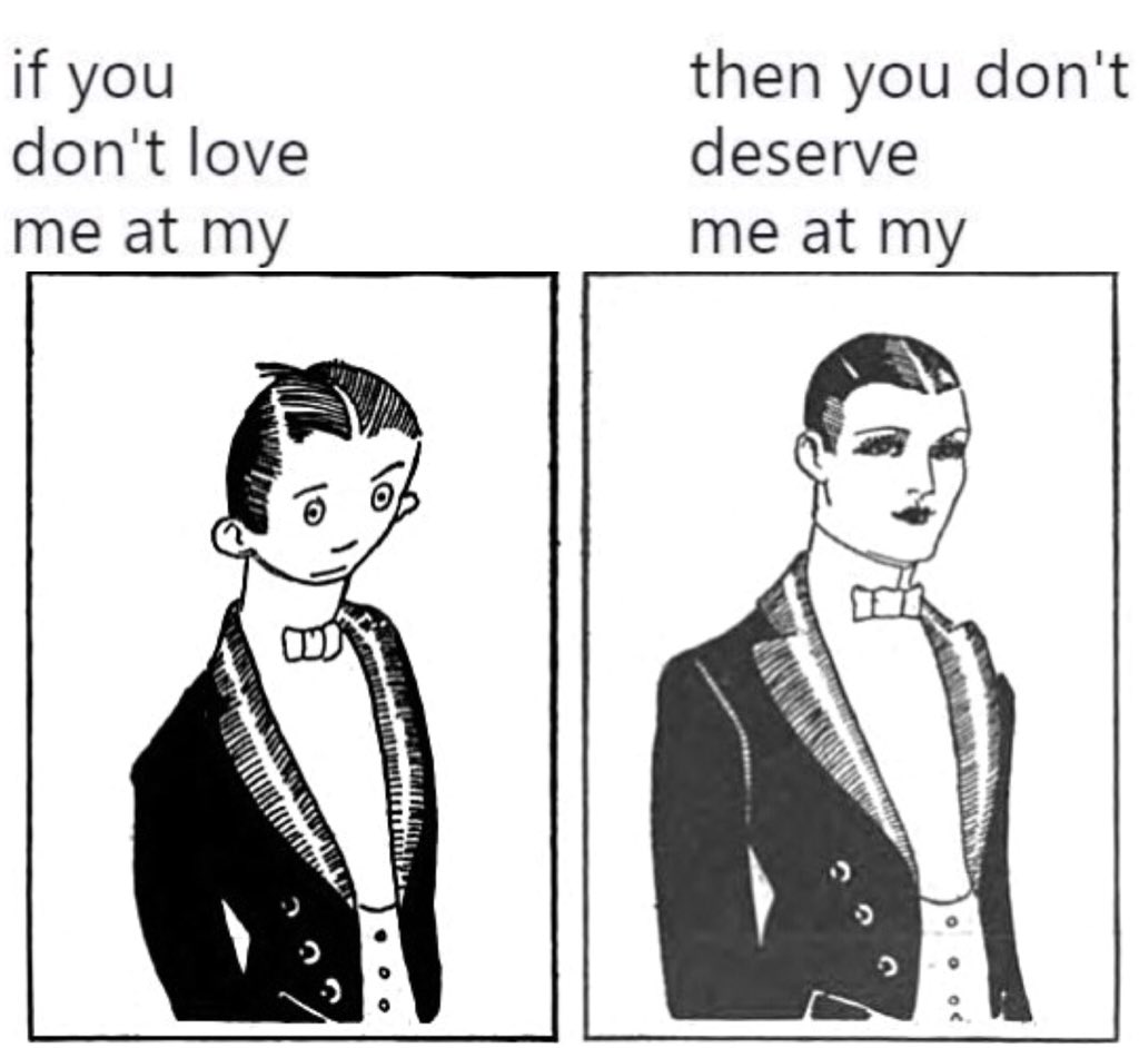
Memes are the language of the internet. It is a unit for carrying ideas from person to person through imitable acts with a parodied and mimicked theme.
The history of memes goes way back. Here is the Expectations vs. Reality format joke in the Wisconsin Octopus, published as early as 1919. A different magazine parodied this joke with a similar illustration in 1921. More representations of this joke followed later on, creating a meme phenomenal.


Color Inspiration of the Week
Edward Tufte
Edward Tufte is a leading expert in data visualization. He uses the term data-ink ratio to argue against using excessive decoration in visual displays of quantitative information. He sees colors as ways to avoid information mishaps. In most of his visualizations, you will find subtle and minimal colors.

Jargon Buster!
Typography
Typography is the art of arranging pieces of text via typefaces to make information legible, readable, and pleasing to the eye.
Creative Prompt
What would be your weird side of tech idea? Try creating a diagram and explain how it works.
Thank you!
Thanks for being here for another week. Terminal Grotesque is available here. It is designed by Raphael Bastide.
