Abel: the Versatile Condensed Sans Serif for Headlines, Posters, and Web Text
Font of the Week
About Abel Font
Abel is a condensed sans serif typeface inspired by traditional newspaper headlines and modern clean lines. Designed by MADType, Abel balances a strong structure with delicately crafted details, making it perfect for headlines, posters, and web text. Rooted in the design style of classic condensed fonts, Abel exemplifies how typography has evolved to enhance readability while maintaining aesthetic appeal.
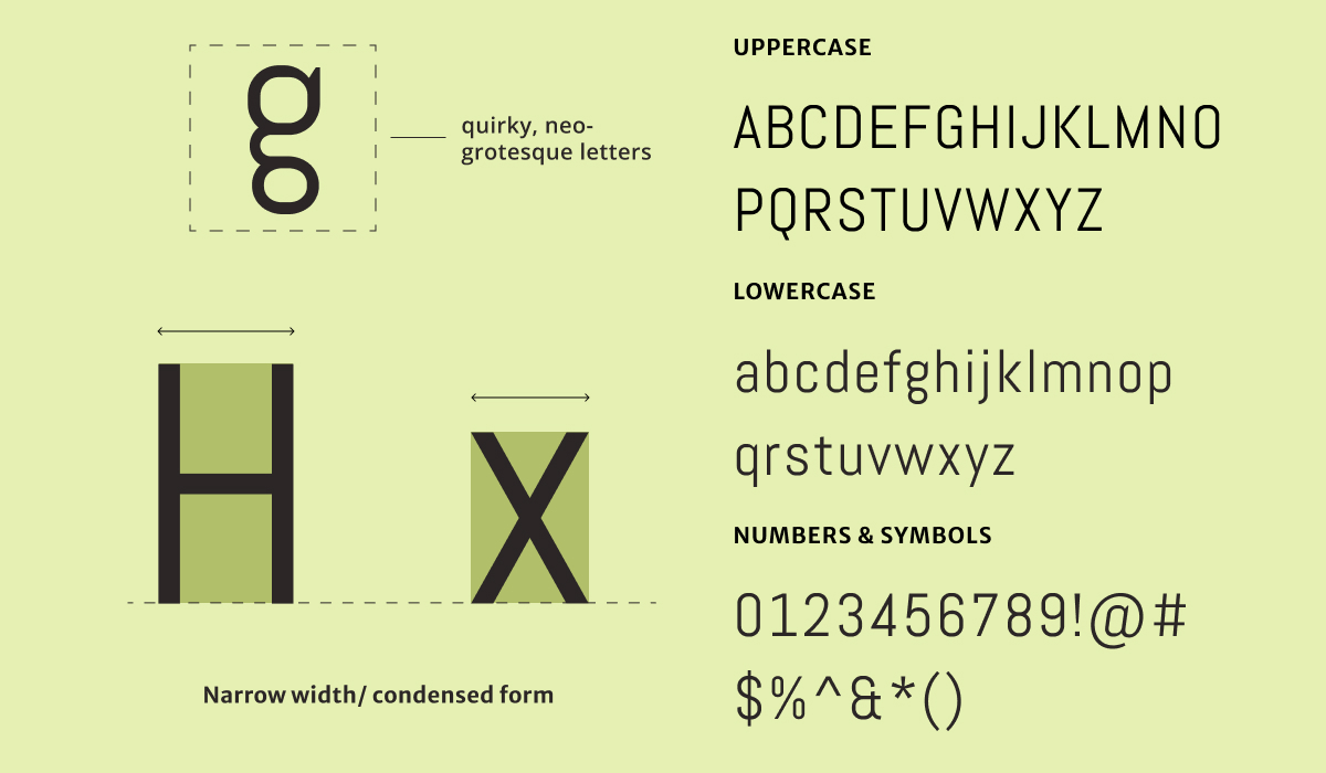
Abel Font Type Details
- Narrrow, condensed form
- Little to no stroke contrast / monoweight
- Quirky Neo-Grotesque letter forms
Abel font stands out with its narrow form and even texture, making Abel suitable for both print and digital environments. The font offers a modern and neutral look with its consistent weight and clear legibility. It's designed primarily for digital usage, ensuring great performance across devices. Ideal for attention-grabbing headlines and copy, Abel’s neutral tone pairs seamlessly with more expressive display fonts or more toned-down, functional sans serifs.
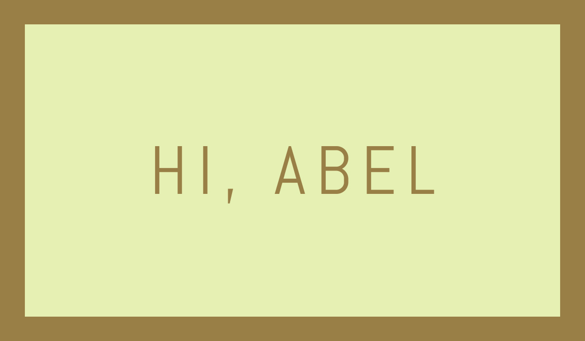
How to Use Abel Font for Logo
Abel font can be effectively used in logo design for projects that demand a contemporary and minimalistic style. Its clean lines and utilitarian aesthetic make it easily legible, even at smaller sizes. For logos, Abel’s monoweight appearance maximizes visibility and ensures the brand identity is strong and clear across various platforms. However, due to its condensed nature, pairing Abel with a more decorative typeface can add character to the overall brand design.
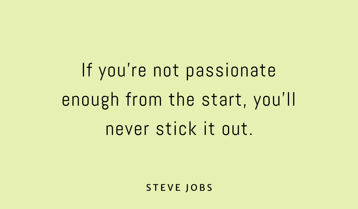
How to Use Abel Font for Branding & Marketing
In graphic design, Abel’s modern yet neutral tone offers the perfect blend of impact and professionalism. Its condensed form enhances readability and visual harmony, making it especially effective for multi-column layouts in both print and digital formats. Since Abel comes in a single weight, we recommend pairing it with another sans serif to create a more versatile typography system that supports complex information hierarchies.
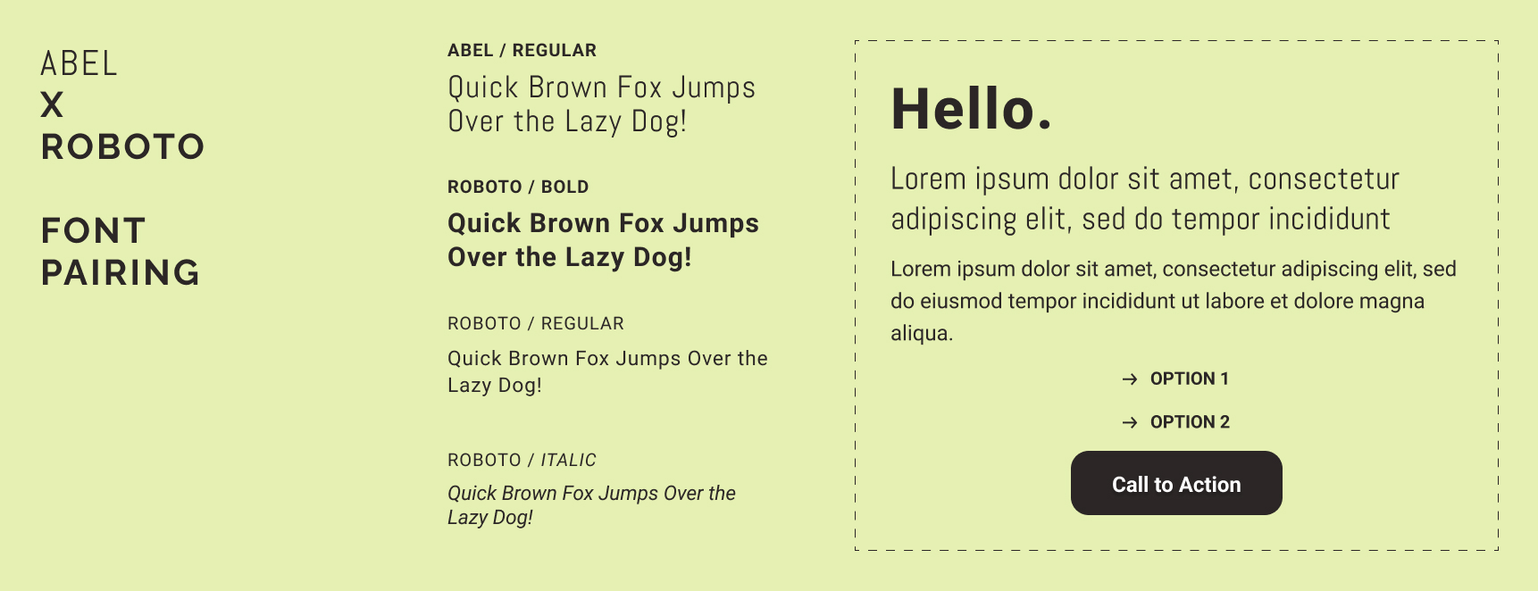
Abel Font Pairings
Finding a balanced font pairing for Abel is essential to creating a cohesive design. Here are three excellent pairings to consider for your next creative project:
- Roboto – The versatility of Roboto complements Abel’s condensed shape by bringing a friendly and open feel.
- Merriweather – This pairing adds a touch of elegance with Merriweather’s serif features, contrasting beautifully with Abel’s modern simplicity.
- Lato – The balance of humanism in Lato works synergistically with Abel, offering a harmonious visual experience for both digital and print applications.
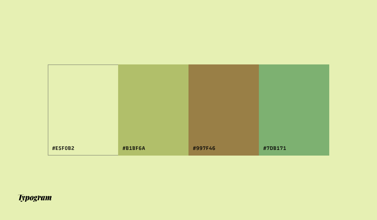
Color Inspiration of the Week
This week, enjoy this color palette featuring earthy neutrals and greens.