Reviewing Aire: A Whimsical Modern Serif with Effortless Elegance
About Aire
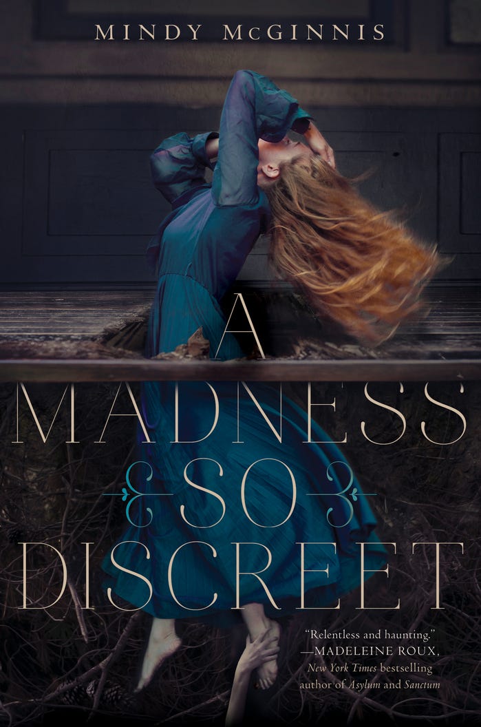
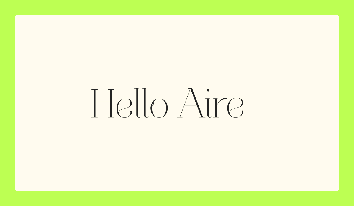
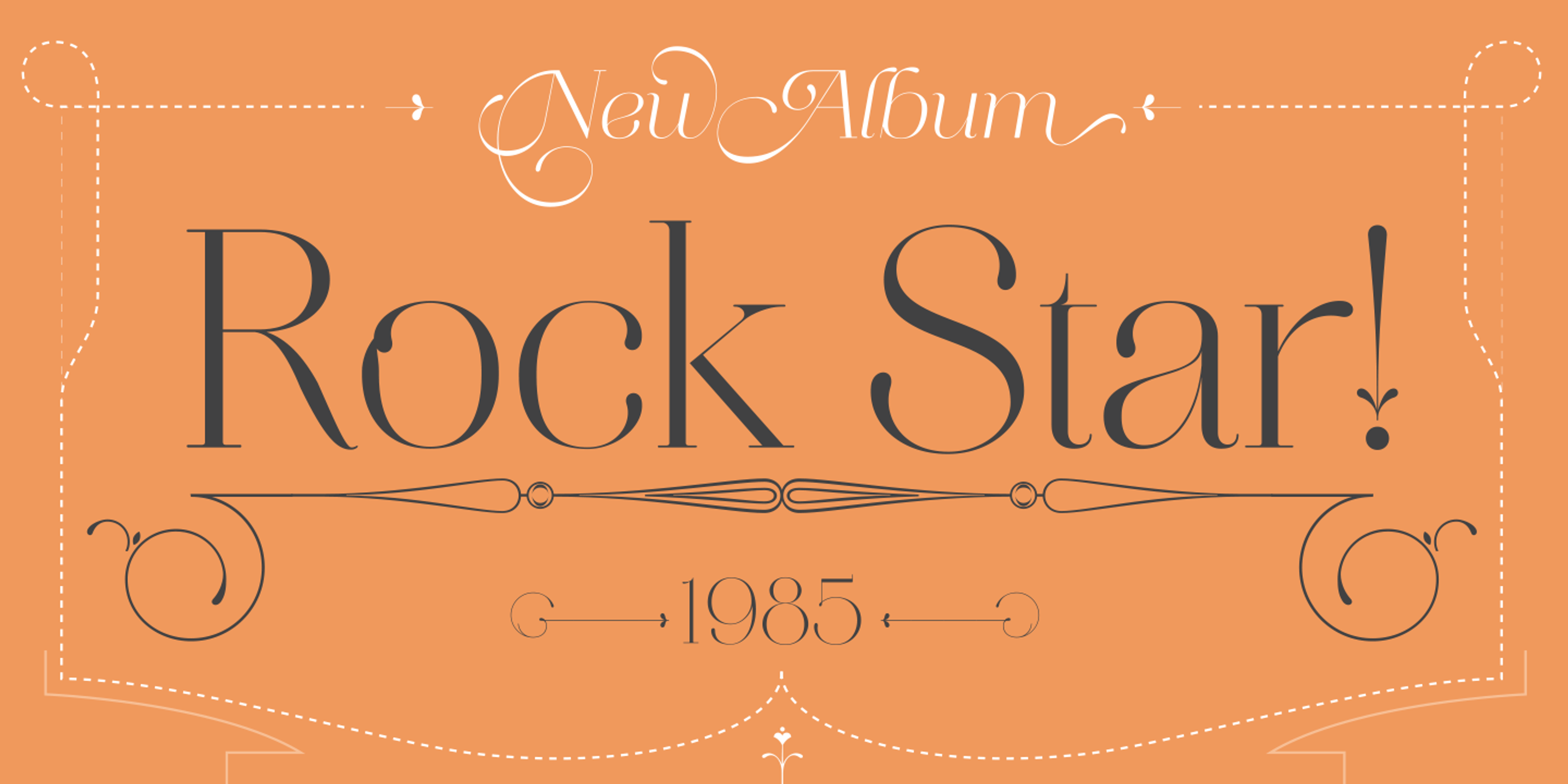
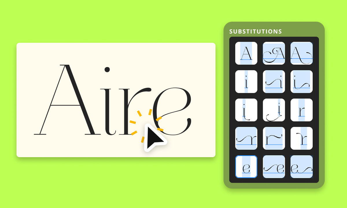
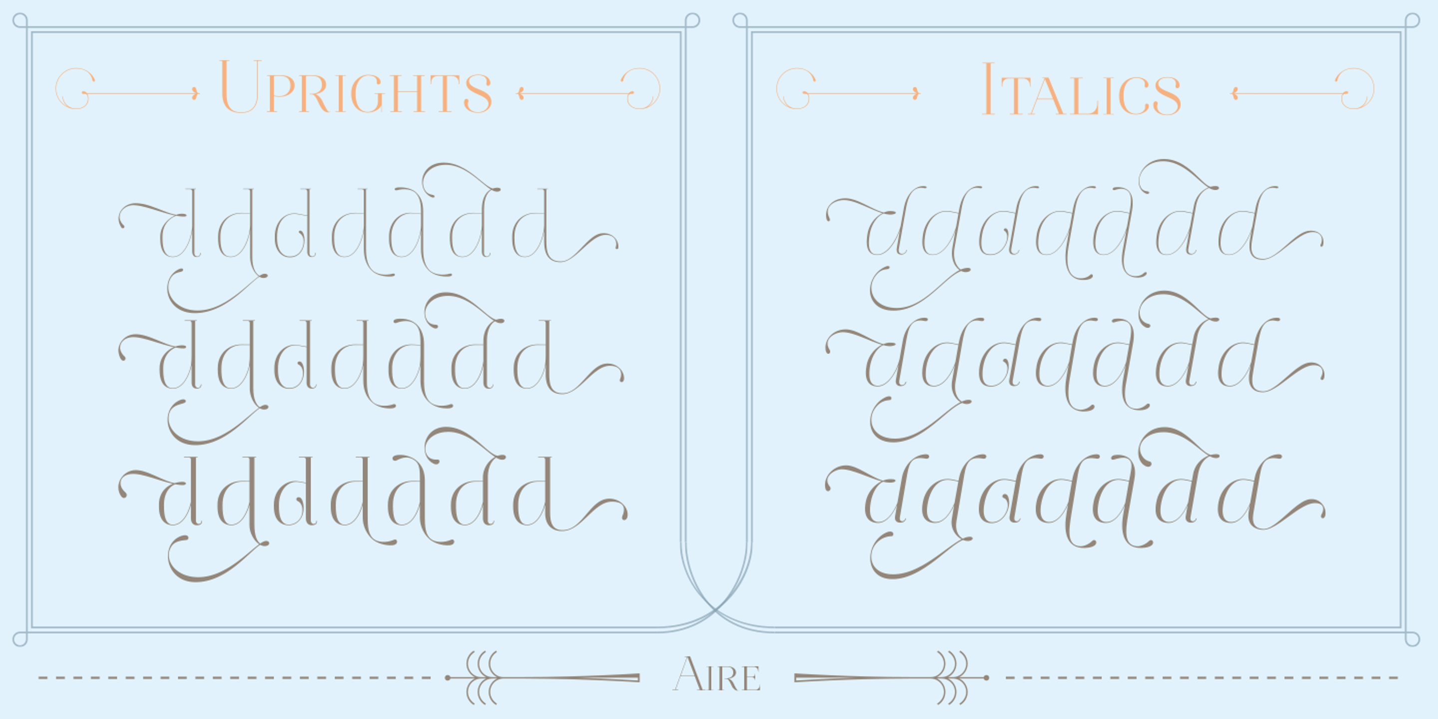
Aire is a delicately sophisticated serif typeface that brings elegance, lightness, whimsy, and a touch of playful charm to display typography. With crisp contrast, sculptural curves, open shapes, and whimsical style alternates, Aire offers a graceful balance of refinement and flourish, perfect for anchoring an entire composition.
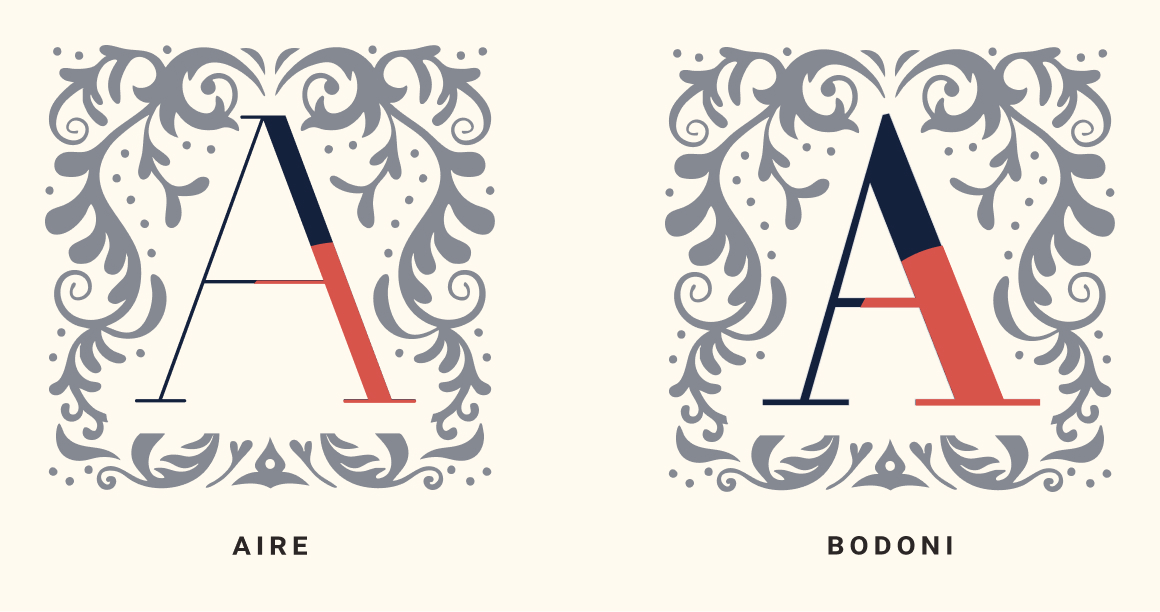
Created by Sproviero Type, Aire is a contemporary take on the modern serif tradition, drawing from the refined elegance of Bodoni while softening its rigidity. It retains the high contrast and sculptural forms of its historical roots but adds a sense of lightness, openness, and playful sophistication. Where Bodoni is formal and austere, Aire is expressive and graceful, bringing a more lyrical touch and a sense of whimsicalness to display typography without losing the timeless beauty of its origins.
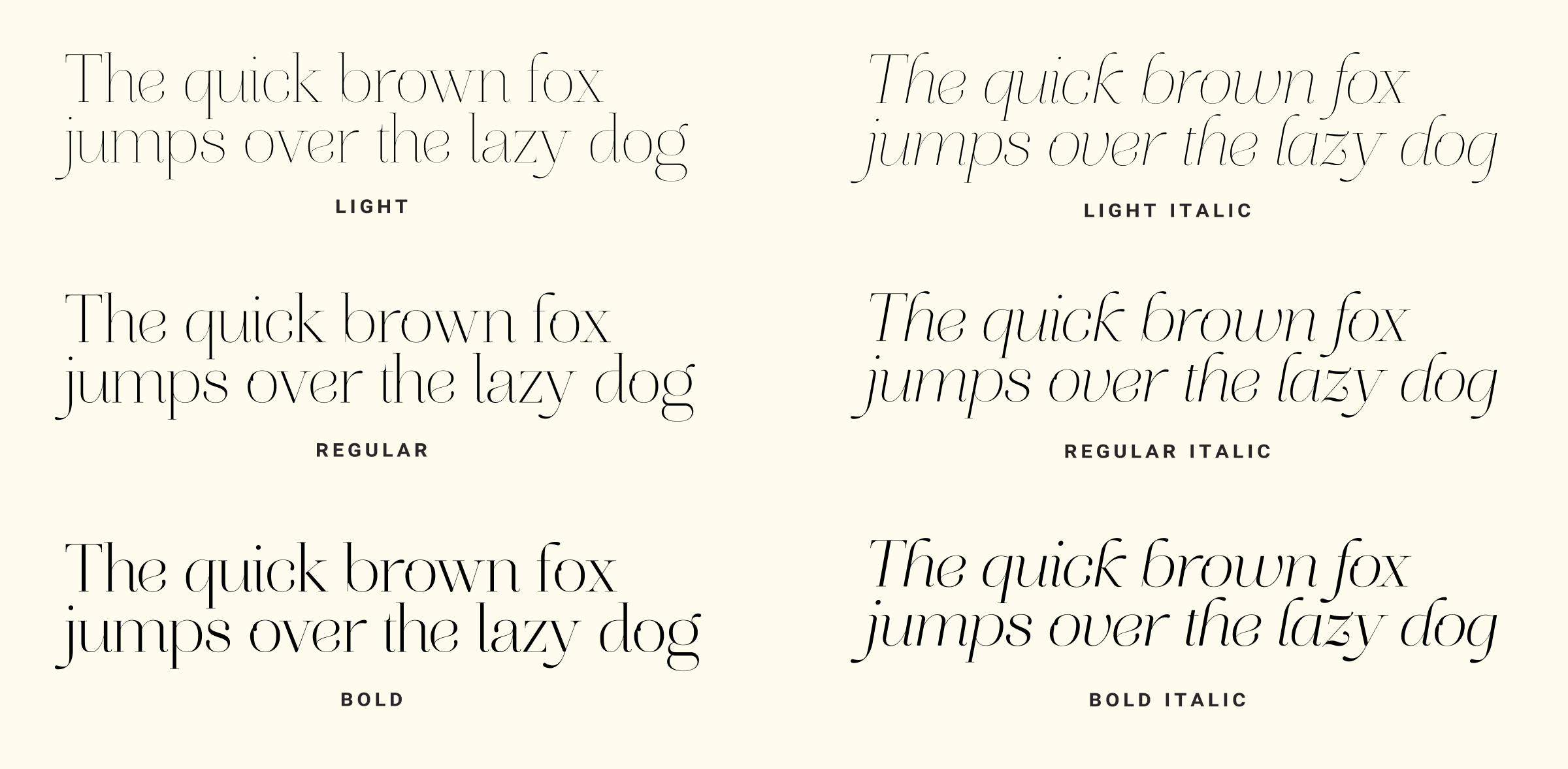
My favorite part about Aire is that it has many whimsical alternate glyphs, perfect for crafting the perfect airy and elegant tone. Aire features three weights in both regular and italic styles, complemented by elegant stylistic alternates and crisp strokes that bring a sense of grace and refinement. Whether for dazzling editorial headlines, a sparkling title sequence, or shimmering packaging, Aire is a showstopper.
Type Details
- Comes with 3 weights in regular and italic
- Many airy and whimsical ligatures
- High contrast with an elegant flare
Using Aire for Design
With its high contrast strokes, sculptural curves, and delicate details, Aire evokes a sense of sophistication while remaining approachable and airy. Its whimsical alternates and charming shape provide the perfect, graceful, and editorial look, perfect for typography design. Given Aire is a display typeface, it's wonderful details are best appreciated at large type sizes.