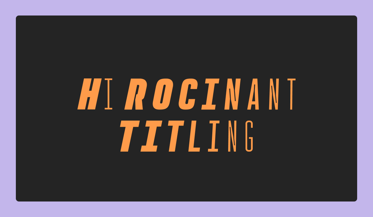
Rocinante Titling: A Utility-Driven Condensed Sans Serif with Unique Ink Traps
About Rocinante Titling
Rocinante Titling is a striking display sans serif with sharp ink traps, compressed proportions, and a sculptural rhythm that feels both refined and daring. Designed for drama and detail, it’s built to command attention at scale. With five weights, obliques, and a variable version, Rocinante Titling is a versatile choice for branding, editorial design, or cinematic titles. Its condensed frame makes it perfect for tight spaces, while the exaggerated ink traps and carefully carved light traps give the letterforms a distinct, high-contrast energy. Whether you're crafting a minimalist cover or a bold visual identity, Rocinante Titling brings both control and character.
Type Details
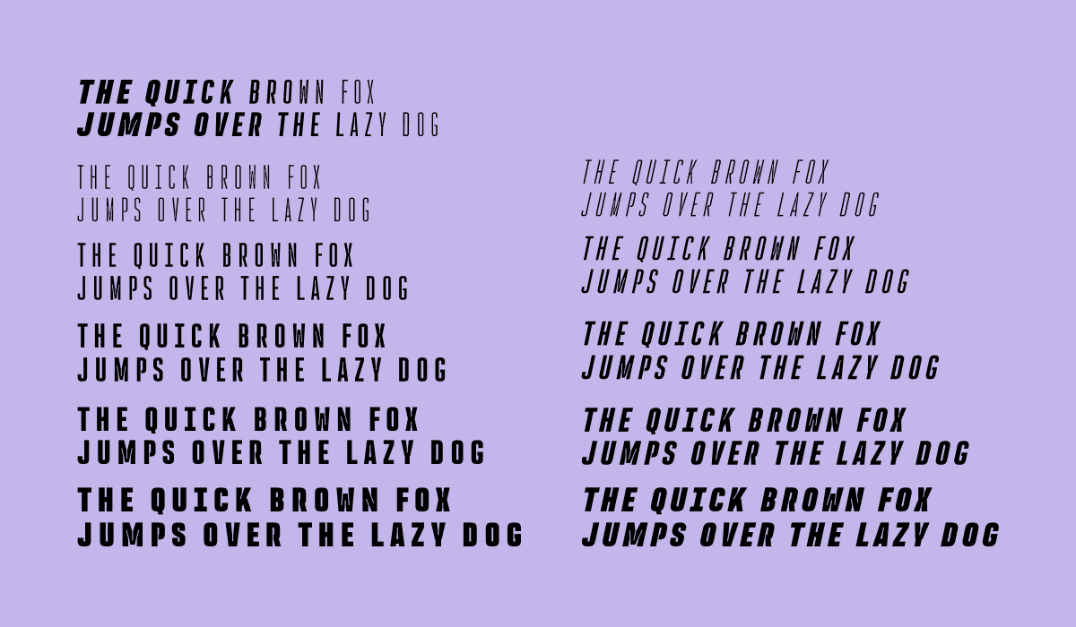
- 5 weights
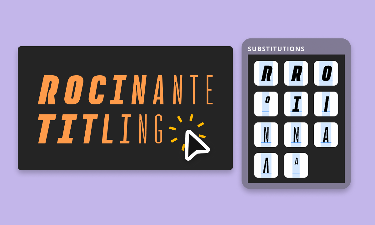
- Comes in obliques and variable versions
- Condensed frame with ink traps
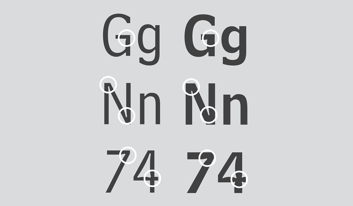
What Are Ink Traps in Type Design?
Ink traps are little notches or cutaways you’ll sometimes see at the corners or joins of letters in a font. They were originally a clever fix for a very analog problem: when type was printed on cheap paper (like newspaper), the ink would spread and blur together—especially in tight spaces. These notches gave the ink a place to "trap" itself, helping the letters stay sharp and legible.
Nowadays, we no longer have a desperate need ink traps for type to be legible, thanks to better technology like high-res screens and better printing methods—but ink traps have stuck around as a cool design detail. Some modern fonts use them purely for style, adding a quirky and utilitarian feel to the letterforms.
Behind the Typeface
Created by XO Type, Rocinante Titling is a study in contrast and tension. The interior spaces curve and stretch under the pressure of the letterform’s condensed structure, while its prominent ink traps elevate function into impactful design. Built for headline use, Rocinante Titling turns structural nuance into graphic presence, giving your typography a strong, modern edge.
Use Rocinante Titling for Design
If you're looking to add some serious punch to your typography, Rocinante Titling is a great pick. With its super condensed shape and dramatic ink traps, it’s built to grab attention whether you're designing a bold magazine cover, a sleek movie poster, or a sharp visual identity. Those little notches in the letters (also known as ink traps) add a cool, utilitarian vibe that feels both modern and retro. Plus, with five weights, obliques, and a variable version, Rocinante is flexible enough to fit the needs of many typography design projects.