Akronim: An illustrative Brushy Typeface with Flair
Font of the Week
About Akronim
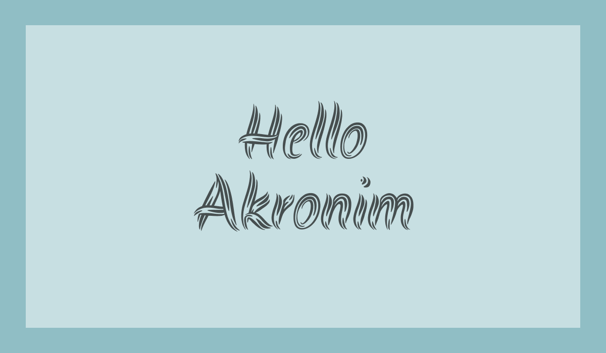
Akronim is an expressive brush script that captures the spontaneity of decorative hand-painted lettering with restraint. Its forms feel whimsy and gestural, but not chaotic. Akronim is the perfect choice if you are looking for an artistic, decorative brushy script without sacrificing legibility.
Akronim Type Details
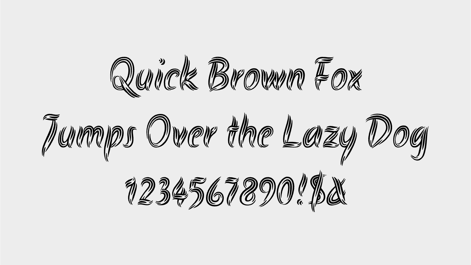
Defined by fluid strokes and shifting line weight, Akronim leans into a lively, hand-drawn texture. The letterforms have an illustrative quality, with sweeping curves and sharp turns that give the typeface a sense of motion.
How to Use Akronim for Logo
Akronim works best in logos that benefit from an expressive, illustrative touch. Set at larger sizes, its details come through clearly and add character. It’s less suited to corporate identities, but well aligned with creative, cultural, or boutique brands that want to feel personal and approachable.
How to Use Akronim for Branding & Marketing
In branding, Akronim introduces warmth and immediacy. It’s effective in headlines, packaging, and campaign graphics where you want to emphasize voice and tone. Pair it with restrained layouts or quieter supporting type to keep the overall system balanced.
Akronim Font Pairings
Akronim benefits from contrast—typefaces that are structured and calm, with just enough personality to hold their own:
- Spectral: A contemporary serif with crisp detailing that adds editorial structure alongside Akronim’s movement.
- Work Sans: Clean and modern, offering a stable foundation that keeps compositions from feeling overly expressive.
- IBM Plex Sans: Neutral with subtle character; its disciplined forms pair well with Akronim in both print and digital contexts.